Finding the perfect labels for your craft beer can be challenging. With so many printing companies to choose from, it can be difficult to identify one that truly understands your unique durability, design, and customization needs. We’ve worked with thousands of breweries and craft beer makers in your position.
Don’t sweat it. This guide is packed with tips to help you identify a printing partner who gets your brand and makes your beer stand out.
We’re covering the essentials: understanding materials and techniques, how to weigh costs, figuring out order sizes, and making sure your labels stay compliant. Plus, you’ll get a cheat sheet of questions to ask printers, making your decision-making process a whole lot smoother.
Understanding Your Custom Beer Label Needs
Successfully choosing a printing partner starts with identifying your goals. Consider the following:
Identifying Your Goals
Start with the end in mind—your goals will likely include brand recognition, cost efficiency, durability, legal compliance, and customer engagement. These will help potential partners understand how to strategically design custom labels aligning to your specific needs. Here are some tips:
- Brand Recognition: Share style inspirations or designs to collect feedback.
- Cost Efficiency: Provide expected order volumes for advice on printing options that match your budget.
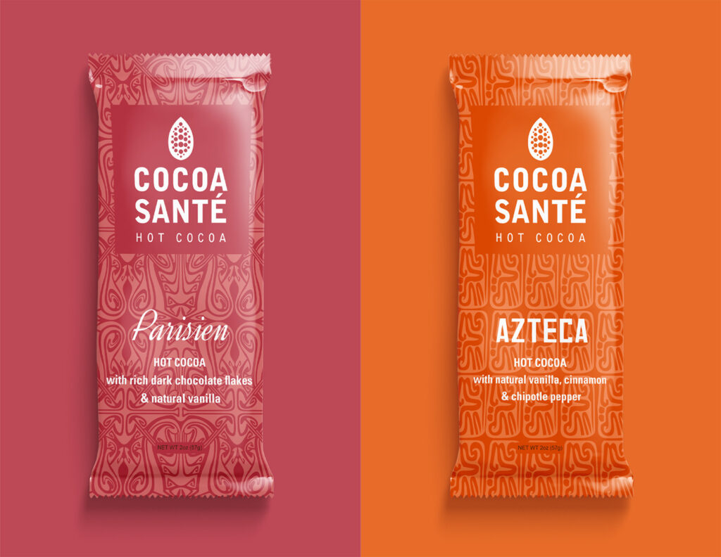
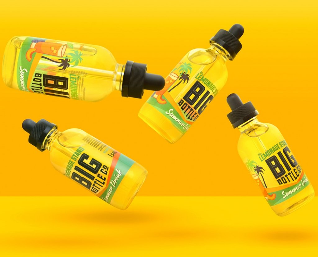
- Durability: List product varieties like beers, seltzers, and ciders that require durable wet labels. Communicate the different environments that your product might have to endure.
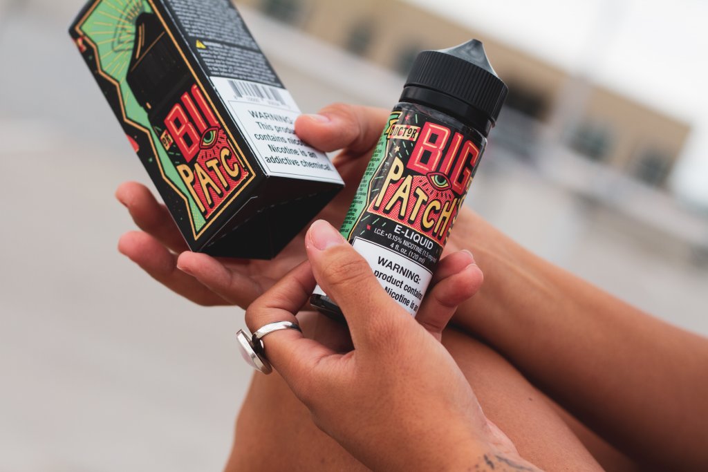
- Legal Compliance: Specify label content needs like government warnings supporting industry compliance (tip: we can help with this).
- Customer Engagement: Discuss target demographics and labeling ideas to captivate them.
Decide What’s Most Important
Like any major business decision, it’s important to determine what matters most, whether it’s exceptional customer service, competitive pricing, the ability to create standout labels, conveying your brand story, eco-conscious materials, or a combination of those.
- Standout Label Designs: Will custom shapes, special effects like foils or specialty printing techniques be featured? Determine must-have aesthetics.
- Storytelling Through Labels: What brand narratives do your labels need to convey? Share themes inspiring designs.
- Eco-conscious Practices: Do you require sustainable printing methods and materials? Ask about green production options.
- Customer Service: How important is an expert team available for technical support? Assess level of involvement expected.
- Printing Cost Factors: Will you print high volumes for cost efficiency or need flexibility for small batch prototyping? Request rate breakdowns.
Comparing capabilities in key areas helps identify ideal printing partners matching must-haves. Weigh whether you will compromise on certain preferences if strengths align well in other dimensions.
Key Considerations in Choosing a Craft Beer Label Printing Company
Choosing the Right Materials
When assessing the quality and materials capabilities of a printing partner, breweries should evaluate factors like durability, material options, and print quality.
The choice of material for your craft beer labels plays a significant role in their overall look, feel, and durability. Here are some considerations to keep in mind:
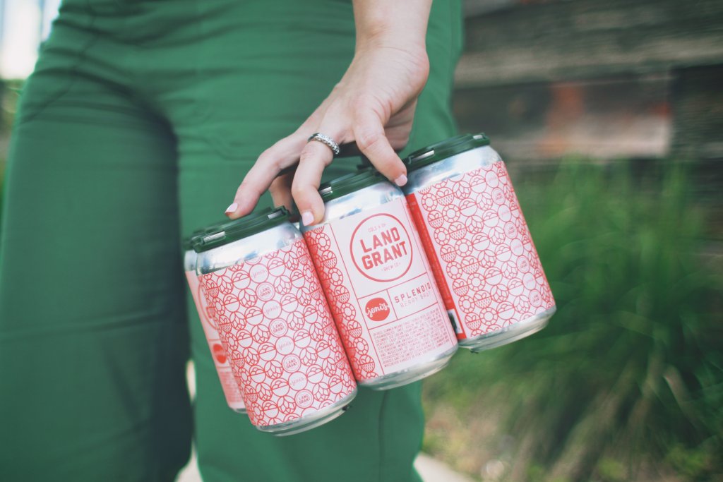
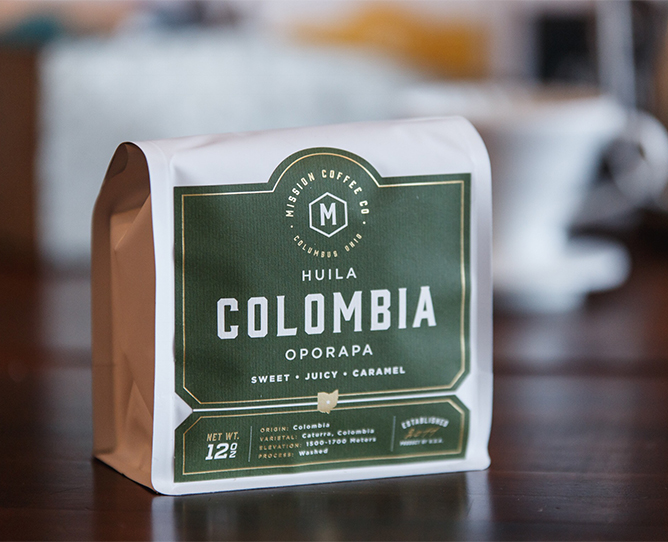
- Water-Resistant Materials: Given the conditions that craft beer bottles and cans are often subjected to, from ice buckets to refrigerators, selecting water-resistant materials is crucial. Options like BOPP (biaxially oriented polypropylene) and vinyl offer excellent moisture resistance, ensuring your labels remain intact and visually appealing, no matter the environment.
- Durability Against Moisture and Cold: It’s not just about water resistance; the material should also withstand cold temperatures without losing its integrity. Materials that can endure these conditions without peeling off or getting damaged are vital for maintaining a pristine look from the brewery to the consumer’s hand.
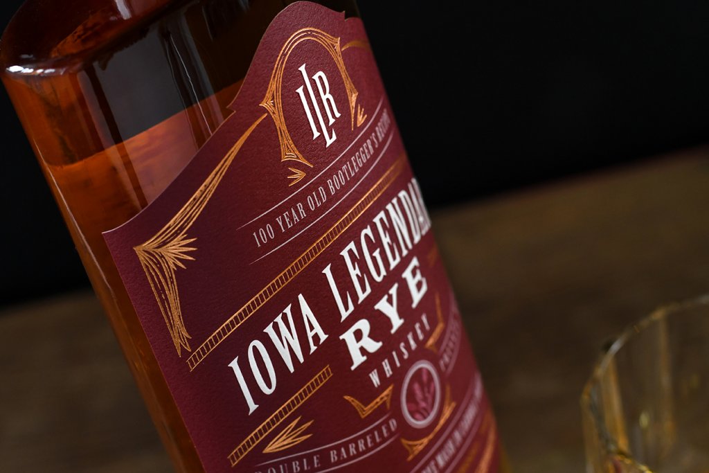
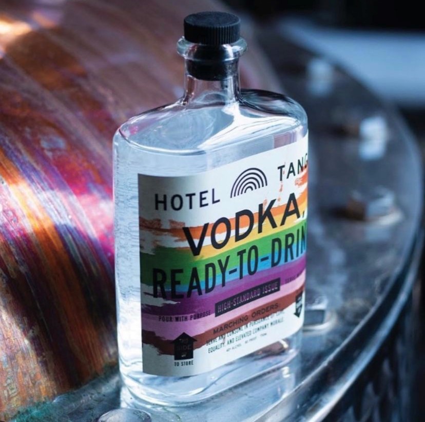
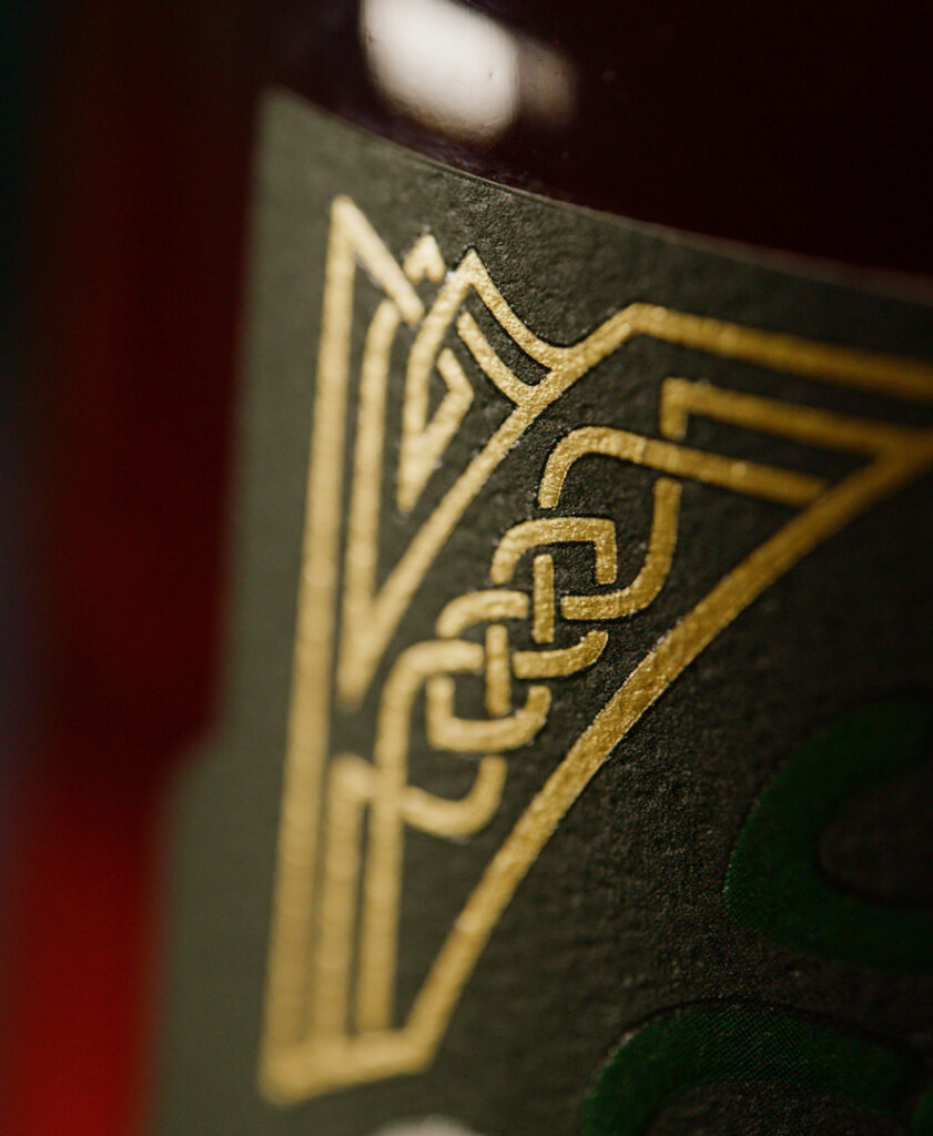
- Aesthetic and Texture Options: Beyond durability, the material of your label affects its aesthetic appeal. Matte, gloss, and satin finishes can dramatically alter the look and feel of your labels. Each finish has its own way of interacting with light and can complement the design of your label to make colors pop or provide a sophisticated understated look.
- Eco-friendly Options: With a growing emphasis on sustainability in the craft beer industry, considering eco-friendly label materials can resonate with your target audience’s values. Materials like recycled paper or biodegradable films can significantly reduce your brand’s environmental footprint while maintaining high-quality aesthetics.
Label Sizes and Shapes
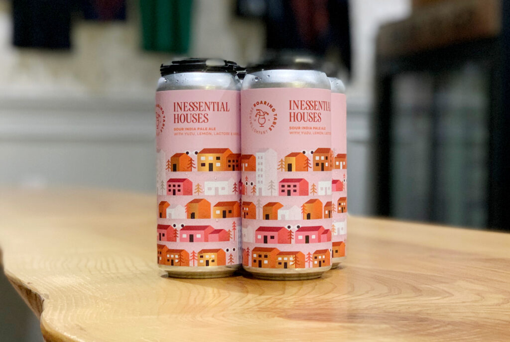
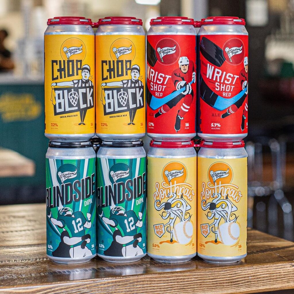
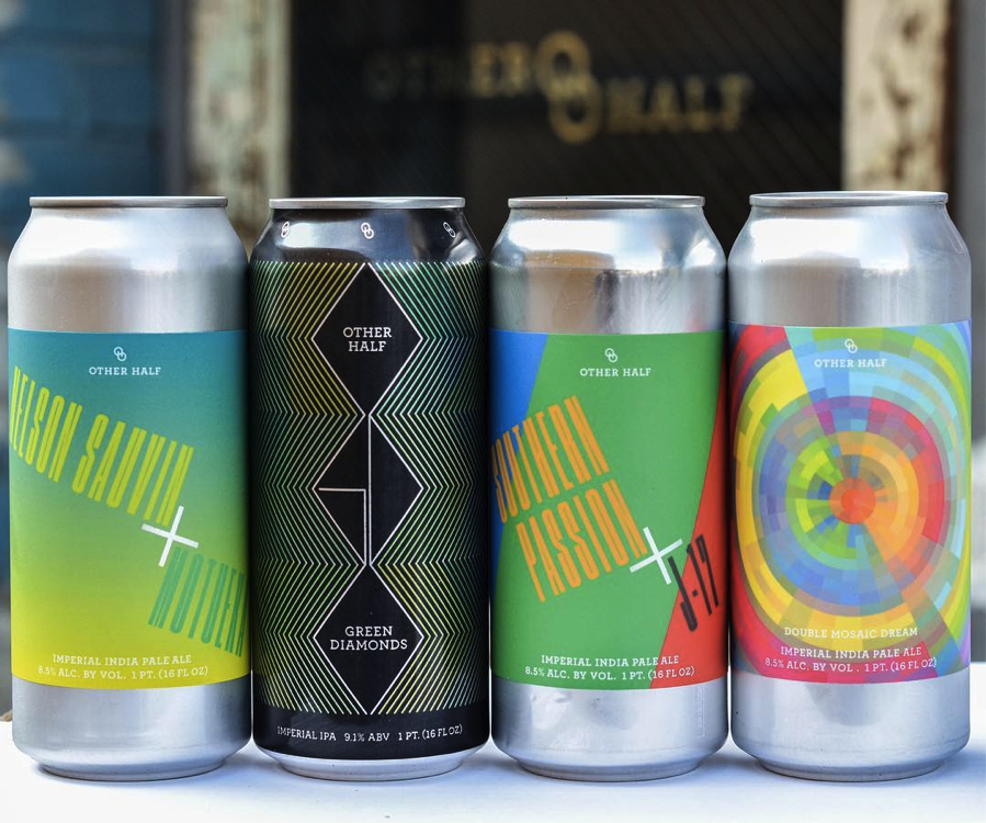
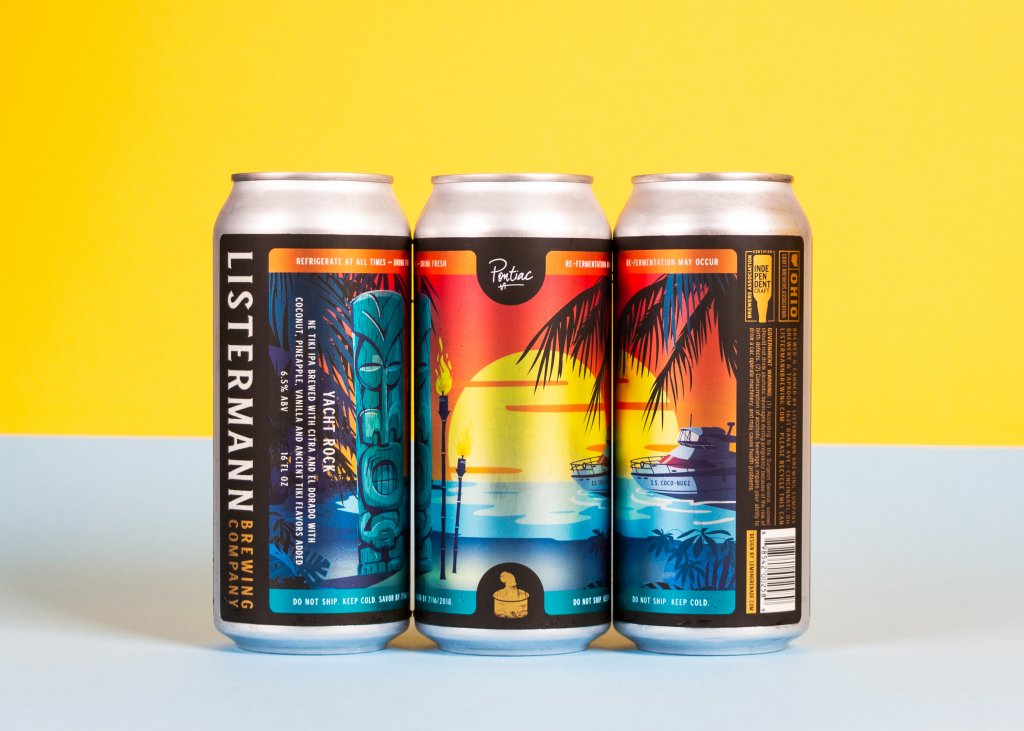
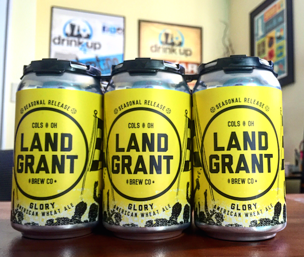
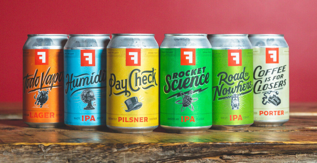
Standard label sizes and shapes have evolved, largely influenced by the industry’s most common container types and sizes. For example, a typical beer bottle label might measure around 3.5 inches wide by 4 inches high, offering ample space for branding, artwork, and necessary information without overwhelming the container. Similarly, can labels often wrap entirely around the vessel, providing a 360-degree canvas for design creativity and brand messaging.
However, the “standard” is not one-size-fits-all. Different bottle and can dimensions, such as slim cans or larger bomber bottles, require tailored label sizes to ensure a perfect fit. The key is understanding the dimensions of your specific containers and how much of that space you want your label to cover.
Going Beyond Standard Options: The Case for Customization
While standard labels serve many brands well, the craft beer industry thrives on uniqueness and personality. Custom labels—those that break the mold in terms of size, shape, and application—are becoming increasingly popular for craft brewers looking to differentiate their offerings.
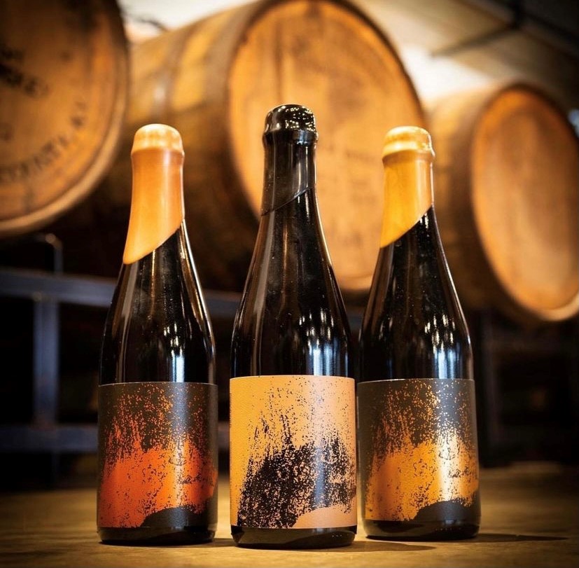
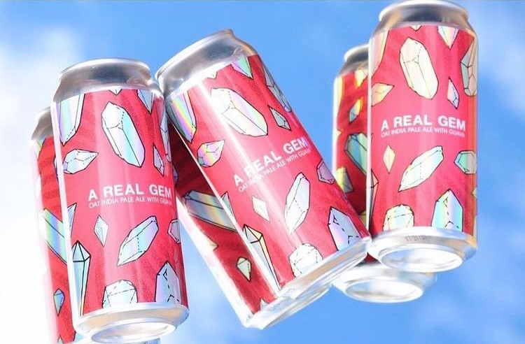
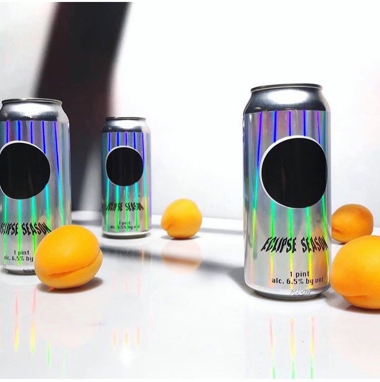
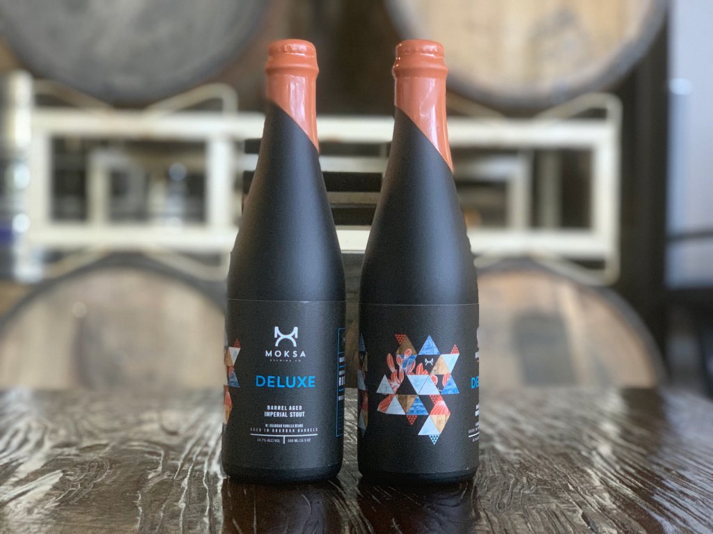
- Embracing Unique Shapes: Custom-shaped labels can mirror the contours of unusual bottle or can designs, create visual interest, and enhance shelf appeal. From sleek, minimalist labels that hint at the contents to intricate, die-cut shapes that tell a story, the possibilities are limited only by imagination.
- Considering Wraparound Labels: For cans, a full wraparound label maximizes the available design space, allowing for bold, engaging visuals that attract attention from every angle. This approach (often called shrink sleeves) can be particularly effective for limited edition releases or flagship brews that deserve extra emphasis.
- Size Matters for Compliance and Clarity: When considering custom sizes and shapes, it’s essential to remember regulatory requirements for labeling alcoholic beverages. Every label must have space for mandatory information, including alcohol content, volume, and manufacturer details, without compromising readability. Balancing creative aspirations with these requirements is key to a successful label design.
Tips for Choosing the Right Label Size and Shape
- Start with Your Container: Measure your bottles or cans carefully, considering curves, necks, and any other features that might influence label adhesion and appearance.
- Reflect on Your Brand’s Personality: Let your label shape and size be an extension of your brand story. Are you bold and avant-garde, or classic and traditional? Your label can reflect this.
- Consult with Design and Printing Experts: Professionals in label design and printing can offer valuable insights into what works well for different types of beers and containers. They can also provide templates or guidelines to help visualize your ideas.
- Experiment with Mockups: Before finalizing your design, use digital or paper mock-ups to see how your label will look on the actual container. This step can help identify potential issues with size, shape, or legibility before you commit to printing.
Cost and Scalability
For breweries and craft beer makers, understanding the costs and scalability options of label printing is critical for both startup ventures and established brands. You’ll want to take into account factors such as minimum order quantities, volume discounts, the flexibility of printing across multiple SKUs, and the efficiency of re-ordering processes.
Understanding Pricing Models
Label printing costs can vary widely depending on several factors, including material choices, print techniques, label size and shape, and the complexity of the design.
Most providers use a pricing model that decreases the unit cost as the order quantity increases, rewarding larger orders with better per-label pricing. However, the starting point and scale of these price breaks can differ between providers, making it important to get detailed quotes for various order sizes.
Minimum Order Quantities and Volume Price Breaks
- Minimum Order Quantities (MOQs): Many label printing companies set MOQs to ensure profitability. For craft breweries, especially those in the startup phase or with a rotating selection of small-batch brews, finding a provider with low MOQs can be crucial. Understanding a provider’s MOQs will help you determine if they’re a good fit for your production scale.
- Volume Price Breaks: Volume discounts are a key consideration when planning your label orders. Providers typically offer price breaks at certain thresholds, which can significantly impact your cost per label. When comparing providers, ask for a detailed breakdown of pricing tiers to understand where these breaks occur and how they align with your anticipated order volumes.
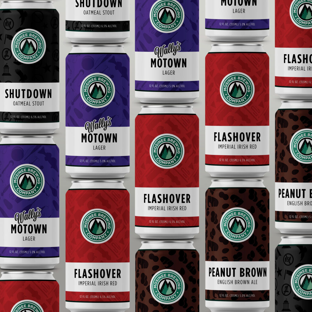
Scalability and Flexibility for Multiple SKUs
Craft breweries often produce a wide range of beers, each requiring its own label design. Some key considerations include:
- Flexibility Across SKUs: Look for providers that offer flexibility in aggregating different label designs to qualify for volume discounts. This can be particularly beneficial for breweries that want to print similar designs for multiple SKUs without the need to place large individual orders for each.
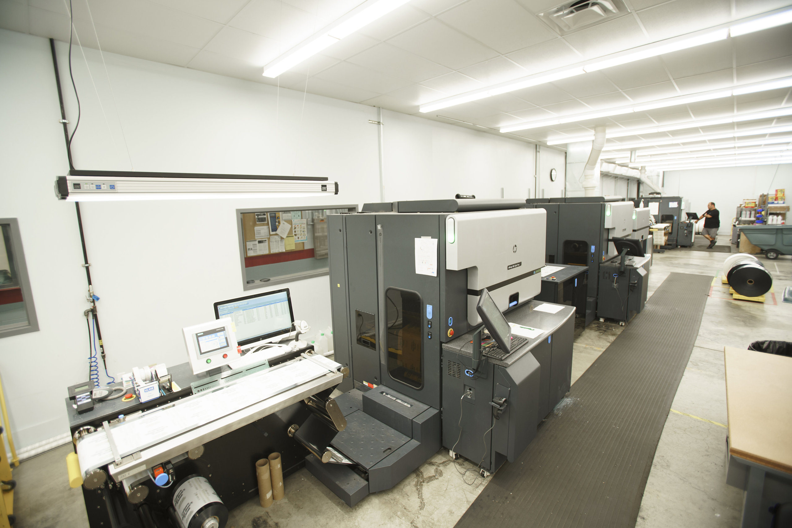
- Digital Printing Advantages: Digital printing technology offers significant advantages in terms of scalability and flexibility. It allows for cost-effective short runs and easy updates to designs without the need for new plates or setup fees, making it an excellent option for breweries with a wide variety of labels.
Ease of Re-Ordering
The ability to quickly and easily reorder labels as needed is essential for maintaining inventory levels and responding to demand fluctuations. Consider providers that offer streamlined re-ordering processes, possibly through online platforms, which can save time and reduce the time to re-order.
Comparing Prices and Making Informed Decisions
When comparing label printing providers, consider the following steps to ensure you’re making an informed decision:
- Request Detailed Quotes: Obtain quotes for various order sizes, including the costs for different materials and print techniques. This information will help you understand the full scope of potential expenses.
- Evaluate Total Cost: Look beyond the sticker price to consider other factors like setup fees, design services, shipping costs, and lead times, which can all affect the total cost.
- Consider Long-Term Needs: Choose a provider that can scale with your brewery. A company that offers competitive pricing for small orders but also has the capacity to handle larger volumes efficiently can be a valuable partner as your business grows.
Turnaround Time and Reliability
For breweries and craft beer makers, timing can be everything. Whether you’re gearing up for a seasonal release, restocking a bestseller, or launching a new brew, the turnaround time for getting your labels can significantly impact your operations. You’ll want to consider everything from artwork approval to set up, printing, and shipping to help you plan effectively and avoid unexpected delays.
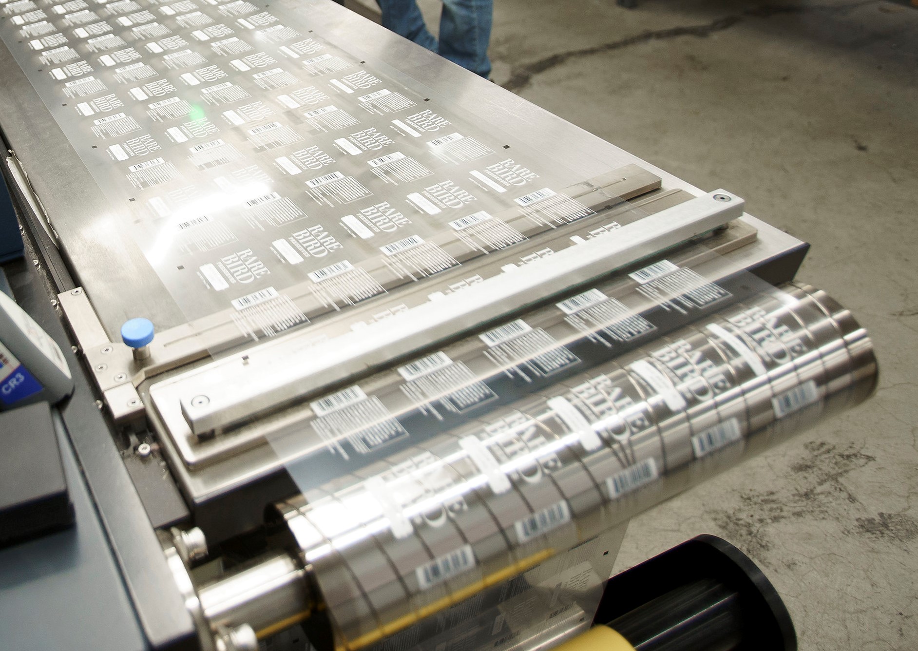
The Components of Turnaround Time
Turnaround time in label printing is influenced by several key stages, each contributing to the total time from placing your order to receiving your labels.
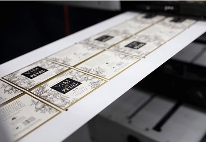
- Artwork Approval: The process begins with your design. Once you submit your artwork, the printing company will review it to ensure it meets technical requirements for printing. This stage includes checking the resolution, color specifications, and any potential issues that could affect print quality. Delays can occur if revisions are needed, so submitting artwork that already adheres to the provider’s guidelines can speed up this phase.
- Pre-Production and Setup: After artwork approval, the project moves into the pre-production stage. For traditional printing methods, this may involve creating plates or screens, which can slow down the process. Digital printing, on the other hand, typically requires less setup time, making it a faster option for smaller or more time-sensitive orders.
- Printing: The actual printing time varies depending on the complexity of your labels, the quantity ordered, and the printing technology used. Digital presses can produce labels relatively quickly, while traditional methods may take longer, especially for large volumes or intricate designs.
- Finishing and Quality Checks: Post-printing, labels undergo finishing processes such as cutting, laminating, and possibly applying adhesive. Quality assurance checks are also conducted to ensure the labels meet the brewery’s and the printer’s standards. This stage is crucial for delivering a high-quality product but can add time to the overall process.
- Shipping and Delivery: Finally, the completed labels are packed and shipped to your brewery. Shipping time depends on the distance between the printer and your location and the shipping method chosen. While expedited shipping options can reduce wait times, planning for standard shipping times in your overall timeline is wise.
Tips for Optimizing Turnaround Time
- Provide Ready-to-Print Artwork: Ensuring your designs meet the printer’s specifications from the start can significantly reduce delays during the artwork approval stage.
- Communicate Your Timeline: Be upfront with your printing provider about your schedule. Some companies can accommodate rush orders, but clear communication is key to aligning expectations.
- Consider Shipping Logistics: Factor in shipping time when planning your label order timeline, especially if you’re located far from the printer or if the labels are being shipped during busy seasons.
Questions to Ask Potential Beer Label Printing Providers
To ensure you partner with a label printer that meets your needs, here are some questions to guide your selection process, informed by insights from our own label experts.
1. What is your experience with craft beer labels?
Understanding the printer’s experience in the craft beer industry can give you insight into their familiarity with common challenges and specific requirements, such as resistance to moisture and cold, adherence to regulatory labeling standards, and the ability to produce high-quality, eye-catching labels.
2. Can you provide samples of your previous work?
Asking for samples allows you to assess the quality of the printer’s work firsthand. Look for clarity, color accuracy, material quality, and the overall finish. Samples can also inspire your own label designs and help you gauge the printer’s capabilities in delivering the visual impact you aim for.
3. What printing technologies do you use?
Inquire about the printing technologies available, such as digital, offset, or flexographic printing. Digital printing offers more flexibility, producing vibrant colors, detailed designs, and cost-effective short runs without the need for expensive setup fees, making it an ideal choice for breweries.
4. How do you ensure label durability and compliance?
Given the conditions beer bottles and cans must endure, from refrigeration to moisture exposure, it’s crucial to ask about the materials and finishes used to ensure label durability. Additionally, confirm that the printer is knowledgeable about the regulatory requirements for beer labeling to ensure compliance with legal standards.
5. What are your minimum order quantities and volume discounts?
This question is vital for budgeting and planning purposes. Understanding the minimum order requirements and how volume discounts are structured can help you optimize your orders for cost efficiency, especially important for smaller breweries or those with a wide variety of products.
6. How do you handle design and artwork preparation?
Some printers offer in-house design services or assistance in preparing your artwork for printing. Asking about these services can be particularly beneficial if you don’t have a dedicated designer on your team or if you need help ensuring your designs are optimized for printing.
7. What is your turnaround time, and how do you handle rush orders?
Knowing the expected turnaround time helps you plan your label ordering process in sync with your production schedule. It’s also wise to ask about the process for rush orders, should you need labels more quickly than anticipated.
8. Can you accommodate special requests or unique label features?
If you’re interested in unique label features, such as foil stamping, embossing, or using eco-friendly materials, ask if the printer can accommodate these requests. Special features can make your labels stand out but may require additional planning and cost.
Finding the Perfect Beer Label Printing Company
Finding the right custom label printing company for your craft beer involves more than just comparing prices and reviewing samples; it requires a deep dive into understanding each provider’s capabilities, technologies, and commitment to meeting your specific needs.
The right partner will offer the flexibility, expertise, and scalability your brewery needs. Make sure you carefully consider the factors we’ve discussed in this article—material options, cost and scalability, turnaround times, and asking the right questions—and you’ll be equipped to make an informed decision.