3 Color Psychology Design Insights to Consider For Your Label
- color psychology
- label design colors
Many people believe that color psychology is a key factor to consider when designing your product’s label. The thought of color experts is that colors have the ability to send messages by influencing consumer’s emotions through a stunning label. When color psychology is applied correctly, businesses competitively position themselves in the visual market, which shows the importance of color in packaging.
Color selection, then, is a vital part in the design process of a custom label. Here are 3 color psychology insights that attract customers for your product’s label design.
Positive Colors Mean Positive Association
According to color experts, colors have the ability to exude different emotions for consumers. When creating a custom label, we want to choose attractive colors to the eye that coincide with what the brand portrays. Below are the five most appealing colors to include in a label as well as the emotions they convey.
- Green: Happiness and relaxation. Green symbolizes nature and the environment. It also has the potential to reduce blood pressure.
- White: Relaxed, complement and clean. White also has the tendency to make people feel secure.
- Black: Stability and wisdom. Black exudes sophistication and class.
- Blue: Creativity and happiness. Shades of blue promote trust and reliability.
- Orange: Vitality, hunger and adventure. Self-confidence is another quality that orange displays.
Use Complementary Colors for Text and Label Design
Choosing a legible text and color combination increases the marketing value and overall success of the brand. Consumers will not be convinced of a product with a label that is displeasing to the eye.
Contrast allows color and text to appeal to customers as well. The combination of using a light background and a dark text is visually appealing to the eye. With this technique, our eyes are not strained, and the name of the company pops.
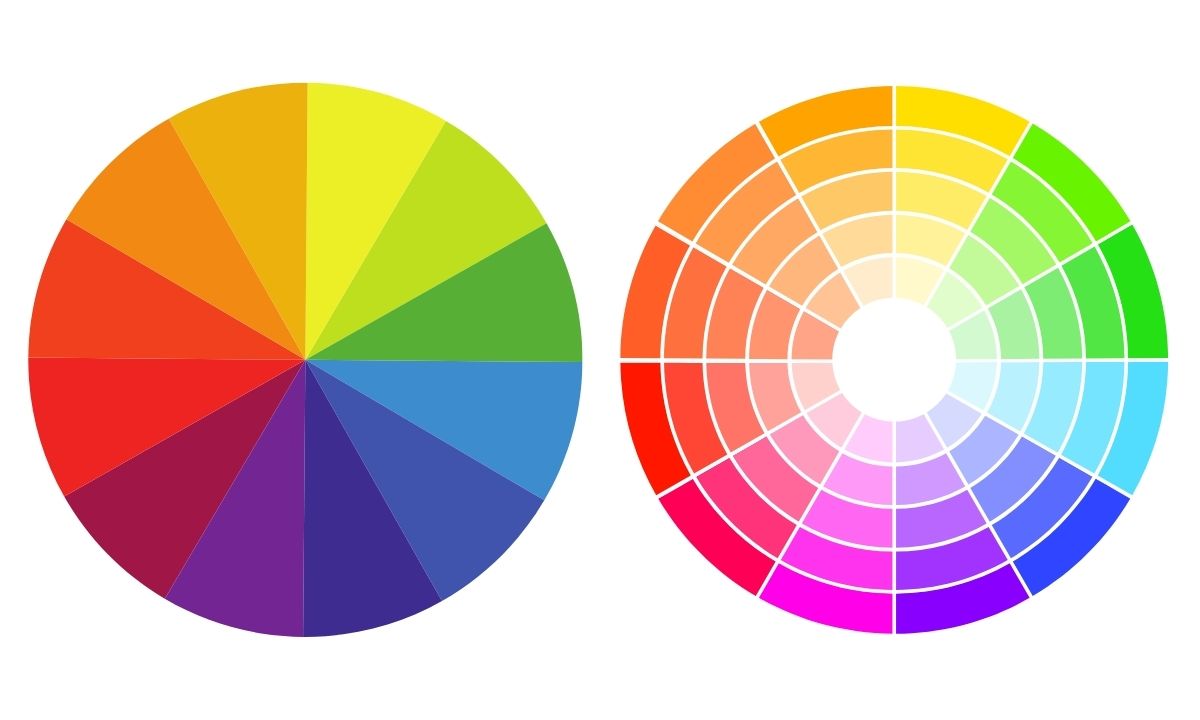
The insights color wheel is the best tool to understand what colors contrast. The idea is to choose colors at the opposite end of the spectrum; for instance, black on white.
Colors To Avoid
While some colors are appealing to our visual stimuli, other colors are instant turn-offs. Some say these colors evoke negative emotions, which do not convince customers to purchase the product. Here are four colors to be cautious of when building your custom label:
- Pink: Triggers the feeling of fatigue and tranquility.
- Red: Exudes danger and failure. However, when combined with the right colors, red also can mean strength and power.
- Bright yellow: Communicates irritability and danger.
- Brown: Displays passivity, relaxation and sometimes depression.
It is significant to note that we are not saying you cannot use these colors. There are many successful brands that incorporate these colors in their label. The key, however, is to combine these colors to the name or image that you are selling.
For instance, pairing pink and red together would not be an ideal combination because these colors send mixed signals. Conversely, Coca-Cola’s label includes red and white. In this label, red exudes more positive emotions because it is paired with white.
Use Online Tools
Want some help finding color combinations that work? Here are two great online resources to aid you in this process:
- COLOURlovers: This site informs the audience of color trends, and it also pairs words with particular colors.
- ColorBlender: ColorBlender is an easy website to use for people who are interested in experimenting with color combination. Without having to register, the online tool allows you to tweak your color palate in an instant.
Ask For Help
Our mission is to help businesses achieve a stunning custom label for their brand. From an initial idea to the final result, we recognize how much work goes into building your product.
In customizing your brand’s label, we understand the importance of creating content that is visually and emotionally appealing. When this is achieved, the value of your business rises.
Color psychology has become a phenomenon. The wrong color palette may hurt your brand, whereas choosing the right colors may give you an advantage in a competitive market. Our mission at Blue Label is help businesses achieve that competitive edge and have the best potential to thrive in the marketplace.
If you are interested in learning more about custom label printing and design, contact us today.