White File Best Practices: The Importance of White Ink for Labels
- art files
- barcodes
- white files
- white ink
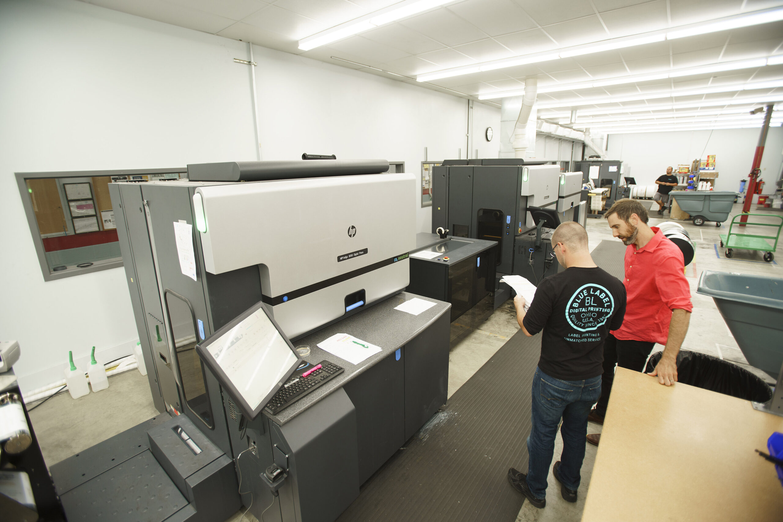
Behind every stunning product label is a well-crafted art file. In this guide, we’re diving into everything you need to know about white files and layered ink printing.
Why White Files Are Critical for Labels
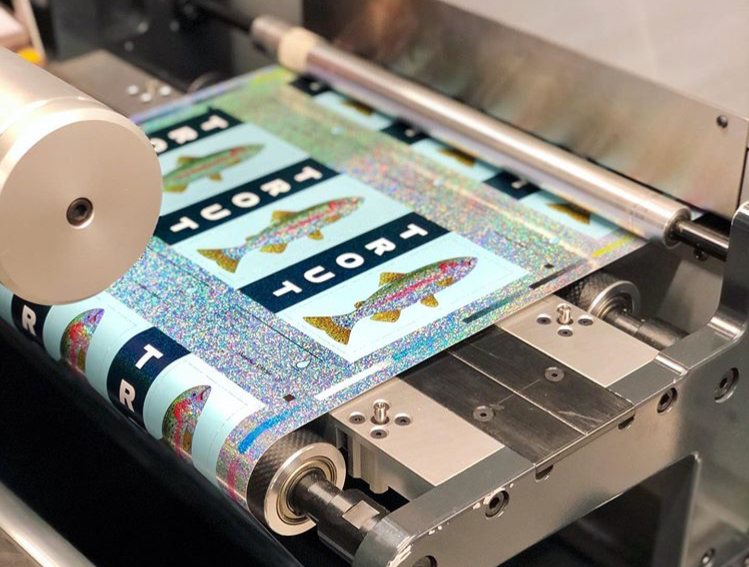
What Is a White File?
A white file is a specific layer in your art file that tells the printing press where to lay down white ink on metallic, clear, holographic, or dark substrates to create opacity. This matters because most label printing companies rely on the CMYK color model, and your white file acts like a primer, ensuring those CMYK colors pop.
Imagine it like this: just as a painter primes a canvas so the colors stand out, your white file primes the substrate. Whether you’re going for a full coat that completely covers the substrate or a partial coat that lets some of the material shine through, the white file is key to getting your desired color effect without interference from the substrate.
Methods for Applying White Ink
There are two main ways to apply white ink, and your choice depends on the look you’re going for:
- Flood Coats: With a flood coat, you cover the entire surface with white ink. It’s a straightforward approach that requires little extra file prep. Sometimes, using a white substrate might even be a more budget-friendly option. (Heads up: Performance can vary based on your substrate and ink formulation. We recommend doing a test run before you go full scale.)
- Spot Applications: Spot applications let you apply white ink only where it’s needed. Your white file tells the prepress team exactly where to add the ink, ensuring that specific design elements stand out—like enhancing a clear label without covering up your container. (Note: Spot applications require precision. Make sure your file settings are dialed in and double-check with your prepress team to ensure everything comes out perfectly.)
Best Practices for White File Creation
File Preparation Techniques
- Use Vector Images When Possible: Both Adobe Illustrator and Photoshop can create art files, but Illustrator’s vector-based approach gives you that extra precision. Vectors keep your layers crisp and reduce the chance of unwanted artifacts like a white fringe.
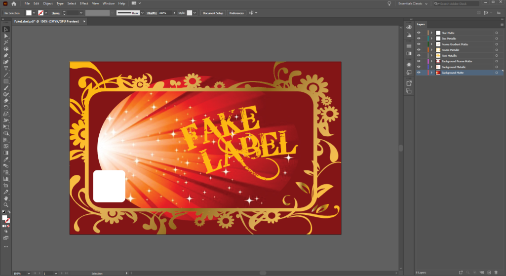
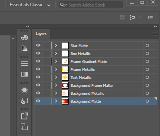
- Layering—Keep White Files Above Your Art Layers: The white ink gets printed first, setting the stage for your CMYK colors. Keeping the white file on top ensures it shows up clearly on proofs and guides the printing process accurately.
(Example: If you’re designing a label with a matte background and a metallic information box, position the white file for the lettering above the box layer. This prevents any overlap issues or lost details. Remember, it’s always a good idea to check your printer’s guidelines since layer handling can differ slightly between machines.) - Clear, Consistent Terminology: Name your layers with specific labels like “white ink” or “50 percent metallic” rather than vague names. This helps cut down on back-and-forth with your prepress team and ensures everyone’s on the same page.
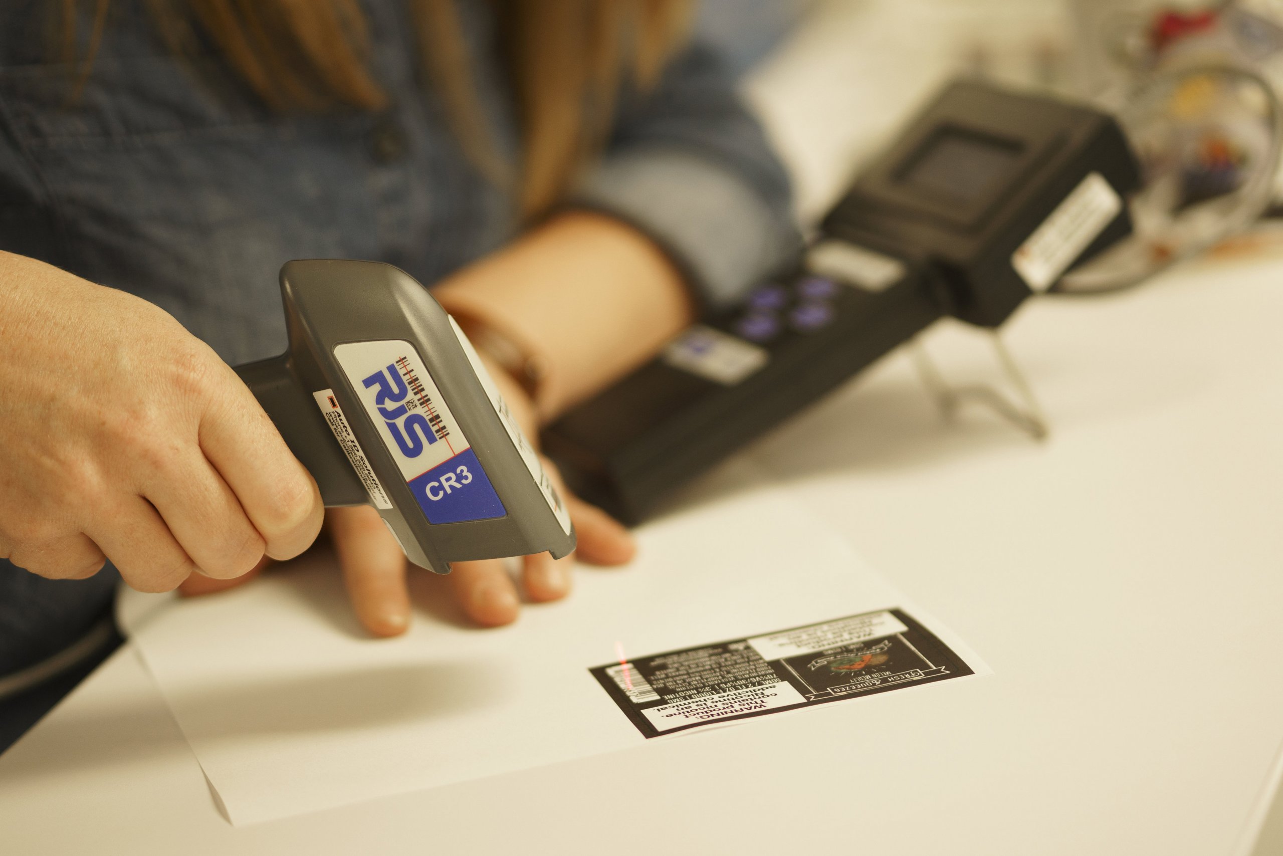
- Simplify Barcodes: While it might be tempting to experiment with creative barcode designs, sticking with a simple approach (black bars on a white background) is usually best for readability and scanner accuracy.
White File Preparation Checklist
Here’s a quick checklist to help you nail your file setup:
- Use vector-based files (e.g., Adobe Illustrator) for clarity.
- Place white file layers above all CMYK layers.
- Name layers with clear, descriptive terms (e.g., “white ink – 100%”).
- Test the file layout with sample proofs before full production.
- Chat with your prepress team to confirm proper layering and settings.
Troubleshooting & Advanced Workflow Techniques
Even with the best practices in place, issues can occur. Here’s our step-by-step process to help you troubleshoot and fine-tune your workflow.
White File Workflow: Step-by-Step Process
- Initial File Setup:
- Create your art file using vector software.
- Define each layer with clear, descriptive names.
- Layer Arrangement:
- Position the white file layer above all CMYK layers.
- Use grouping and locking features to avoid accidental changes.
- Proofing and Testing:
- Request sample proofs to check for consistency.
- Adjust layer settings based on feedback from your prepress team.
- Final Adjustments:
- Make adjustments based on your sample tests.
- Finalize your file settings before sending them to production.
Set Up Your Product Labels for Success
A little extra preparation can make a huge difference in your final labels. If you’re ready to see your labels shine, contact us today for a free consultation, and we’ll show you how our approach can streamline your label production process.