Typography Tips: Text and Font Considerations for Product Label Designs
- fonts
- text
- text outlines
- typography
⚞ The Highlights:
- Good label typography comes down to four things: the right fonts, a clear hierarchy, legible text, and type that holds up in print.
- Limit yourself to two or three fonts that pair well, and let the biggest, boldest text carry the most important information.
- Keep body text large enough to read (generally 6pt and up), with strong contrast against the background. Some elements, like the government warning or nutrition facts, have legal minimum sizes.
- Convert fonts to outlines before sending art to print, and remember that small or thin type behaves differently on textured, kraft, gloss, and foil materials.
Strong label typography is four decisions working together: which fonts you choose, how you rank the information, how legible the text is, and whether that type survives being printed at label size. Handle those and your label reads clearly on a shelf, on a phone screen, and at arm’s length in a cooler. Miss even one and a beautiful design can turn into a blur once it’s printed.
Our graphics studio reviews label artwork every day, so we see where type holds up and where it falls apart between the screen and the printed label. Here’s what we tell people to watch for, including the print details that trip up otherwise great designs.
Start with the right fonts
Your fonts set the tone before anyone reads a word. The goal is a small, coordinated set that matches your brand and stays out of its own way.
Match the font to your brand personality
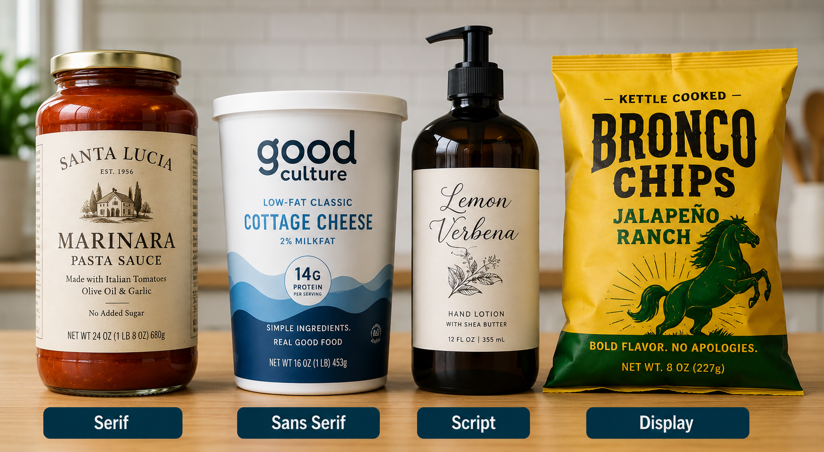
Type carries personality, so pick fonts that match how you want the brand to feel. Serif fonts (the ones with small feet on the letters) read as classic, premium, and trustworthy, which is why so many wine and spirits labels use them. Sans-serif fonts feel clean, modern, and approachable. Script and display fonts add character and craft, but they work best in small doses, like a product name, rather than for body text.
How many fonts should a label use?
Two or three is the sweet spot. One font for the product name, one for supporting text, and maybe one accent for personality. Too many fonts make a label feel busy and amateur. An easy way to stay coordinated is to pull from the same type family (a family often includes light, regular, bold, and italic versions), which gives you variety that still looks intentional.
Serif, sans serif, script, and display: when to use each
- Serif: classic and premium. Great for product names and heritage brands. Watch fine serifs at small sizes.
- Sans serif: clean and legible. A safe choice for body text, ingredients, and details.
- Script: personal and handcrafted. Use for a name or accent, not paragraphs.
- Display: bold and distinctive. Built for headlines and impact, not fine print.
Build a clear visual hierarchy
Visual hierarchy is the order your eye reads the label in. A shopper should catch the most important thing first, then move through the rest without effort.
What should be biggest on the label?
Usually the product name or brand, whatever you most want a shopper to notice and remember. From there, step down in size and weight through the variety or flavor, then the supporting details, then the fine print. If everything is the same size, nothing stands out, and the eye doesn’t know where to land.
Using weight, size, and placement
You build hierarchy with three tools: size (bigger reads first), weight (bold pulls the eye), and placement (top and center get noticed before edges and corners). Combine them intentionally. A large bold product name up top, a medium variety line below it, and small detail text toward the bottom creates a path the eye follows naturally.
Make the text legible and readable
Legibility is whether a single letter or word can be made out. Readability is how easily a block of text flows. A label needs both, and a few factors make or break them.
What is the minimum font size for a label?
As a rule of thumb, keep body text at 6pt or larger for comfortable reading, and treat anything under about 5pt as risky, since it gets hard to read and harder to print cleanly. Small labels tempt designers to shrink type to fit, but text you can’t read does no work. If the content won’t fit legibly, that’s a sign to cut copy or size up the label, not to shrink the font past the point of reading.
Spacing: kerning, tracking, and leading
Spacing is as important as size. Kerning is the space between individual letters, tracking is the overall spacing across a word or line, and leading is the space between lines. Too tight and letters collide into a smudge; too loose and words fall apart. Give text a little room to breathe, and pay special attention to tracking on small caps and all-caps text, which usually needs a bit more.
Color and contrast
Text needs strong contrast with whatever sits behind it. Dark text on a light background (or the reverse) reads easily; text that’s close in tone to its background disappears, especially at a glance on a shelf. Be careful placing type over photos or busy patterns, where contrast changes across the image. If you must, add a solid panel or a subtle shadow behind the text.
Case and alignment
ALL-CAPS works for short, punchy elements like a product name, but a full sentence or paragraph in all caps is harder to read because every word becomes the same rectangular shape. Use sentence case for longer text. Keep alignment consistent too. Left-aligned text is easiest to read for anything more than a line or two.
Want your type to look as sharp in print as it does on screen?
Our graphics studio checks type size, contrast, and print-readiness on every label we run. Send us your design and we’ll flag anything that won’t hold up.
Request a Quote Get a Sample Pack
The legal type sizes you can’t ignore
Beyond design, some label text has legally required minimum sizes, and your typography has to leave room for them. Depending on your product, these can include:
- Net contents: food and beverage labels have minimum type-height rules for the net quantity statement, scaled to package size.
- Nutrition Facts: the FDA sets minimum type sizes for the Nutrition Facts panel (commonly a 6pt floor, larger for key lines).
- Government Warning (alcohol): the TTB requires minimum type sizes for the alcohol warning statement based on container size.
- Allergen and ingredient statements: must be legible and meet size and prominence rules.
These rules change by product and are updated over time, so confirm the current requirement for your category before you finalize the layout. The design point is simple: budget space for the required fine print first, then design the rest of the label around it.
Designing type that survives printing
Type that looks perfect on your monitor can thicken, fill in, or lose definition once it’s printed at label size on real material. This is where a printer’s eye helps, and a little planning keeps it from happening.
Convert fonts to outlines
Before you send artwork to print, convert your fonts to outlines (also called curves). This turns the text into vector shapes so it prints exactly as designed, even if the printer doesn’t have your specific font installed. It’s a small step that prevents a common problem: fonts substituting or reflowing on someone else’s system. Once text is outlined you can’t edit the words, so keep an editable copy for yourself.
Why thin fonts and fine details break at small sizes
Very thin fonts, hairline serifs, and delicate details can lose definition when printed small. On many materials, ink spreads slightly as it’s applied (printers call this dot gain), which thickens thin strokes and can fill in the gaps inside small letters. The finer and smaller the type, the more noticeable this gets. If a font looks delicate on screen at 6pt, it’s worth testing before you commit.
Reverse (knockout) type and how small you can go
Reverse type, light text on a dark background, is a common trouble spot. Because the surrounding ink can spread inward, thin light letters can close up and become unreadable. Reverse type generally needs to be a little larger and a little bolder than the same text would be in dark-on-light. Avoid fine serifs and hairline weights in reverse, especially at small sizes.
How material and finish change your type
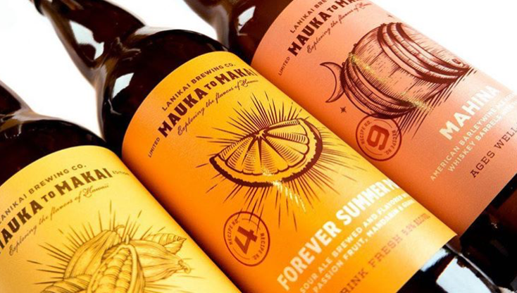
The label material affects what type can do:
- Kraft and uncoated papers absorb more ink, so fine type spreads and softens. Size up and avoid the thinnest weights.
- Textured stocks can break up small type along the texture. Keep detail type on smoother areas.
- Gloss and film hold fine detail well and are friendlier to smaller type.
- Foil and embossing look great on a product name, but fine serifs and small text can lose crispness in these processes. Use them on larger, bolder type.
Type on curved and small containers
On a small bottle or a tightly curved container, type near the edges curves away from the viewer and gets harder to read. Keep critical text toward the flatter center of the label, and give yourself more size and spacing than you’d need on a flat surface. For shrink sleeves, remember the film distorts as it shrinks, so type has to be designed for that distortion.
Pro tip: Print a proof at actual size on your real material before you approve a run. Type that reads fine on a screen (or on plain paper) can behave differently on your chosen stock and finish. Checking it on the real material is the surest way to catch a legibility problem while it’s still free to fix.
Getting your label typography right
Great label type isn’t about finding one perfect font. It’s about a small set of coordinated fonts, a clear hierarchy, legible sizing and spacing, room for the required fine print, and type built to survive printing. Handle those and your label communicates instantly, which is the whole job.
If you want a second set of eyes on your type before it prints, that’s what our graphics studio is for. Request a sample pack to see how type looks on our materials, or get in touch and we’ll review your design for legibility and print-readiness.
Frequently asked questions
How many fonts should I use on a product label?
Two or three is the sweet spot: one font for the product name, one for supporting text, and optionally one accent for personality. More than that makes a label look busy and amateur. Pulling different weights from the same type family gives you variety while keeping the look coordinated.
What is the minimum font size for a product label?
Keep body text at 6pt or larger for comfortable reading, and treat anything under about 5pt as risky because it’s hard to read and hard to print cleanly. Separately, some elements have legal minimum sizes, such as the Nutrition Facts panel, net contents statement, and the alcohol government warning, so confirm the requirements for your product category.
What fonts work best for product labels?
It depends on your brand. Serif fonts read as classic and premium (common on wine and spirits), sans-serif fonts feel clean and modern and are safe for body text, script fonts add a handcrafted feel in small doses, and display fonts suit bold headlines. Choose fonts that match your brand personality and stay legible at label size.
Why do I need to convert fonts to outlines for printing?
Converting fonts to outlines turns your text into vector shapes so it prints exactly as designed, even if the printer doesn’t have your specific font installed. It prevents fonts from substituting or reflowing on another system. Keep an editable copy for yourself, because outlined text can no longer be edited as words.
Why does small text look worse when printed than on screen?
On many materials, ink spreads slightly as it’s applied (dot gain), which thickens thin strokes and can fill in the gaps inside small letters. Thin fonts, hairline serifs, and reverse (light-on-dark) type are most affected. Uncoated and kraft papers spread ink more than gloss or film. Testing small type on your actual material prevents surprises.
How do I keep reverse (light-on-dark) text readable?
Reverse type needs to be a little larger and bolder than the same text in dark-on-light, because surrounding ink can spread inward and close up thin light letters. Avoid fine serifs and hairline weights in reverse, especially at small sizes, and test it on your real material before printing a full run.
Ready to design a label that reads beautifully?
If you want help making sure your type looks as good in print as it does on screen, we’re here for it. Request a sample pack to see type on our materials, or get in touch and our graphics studio will review your design.
More on designing labels that work: