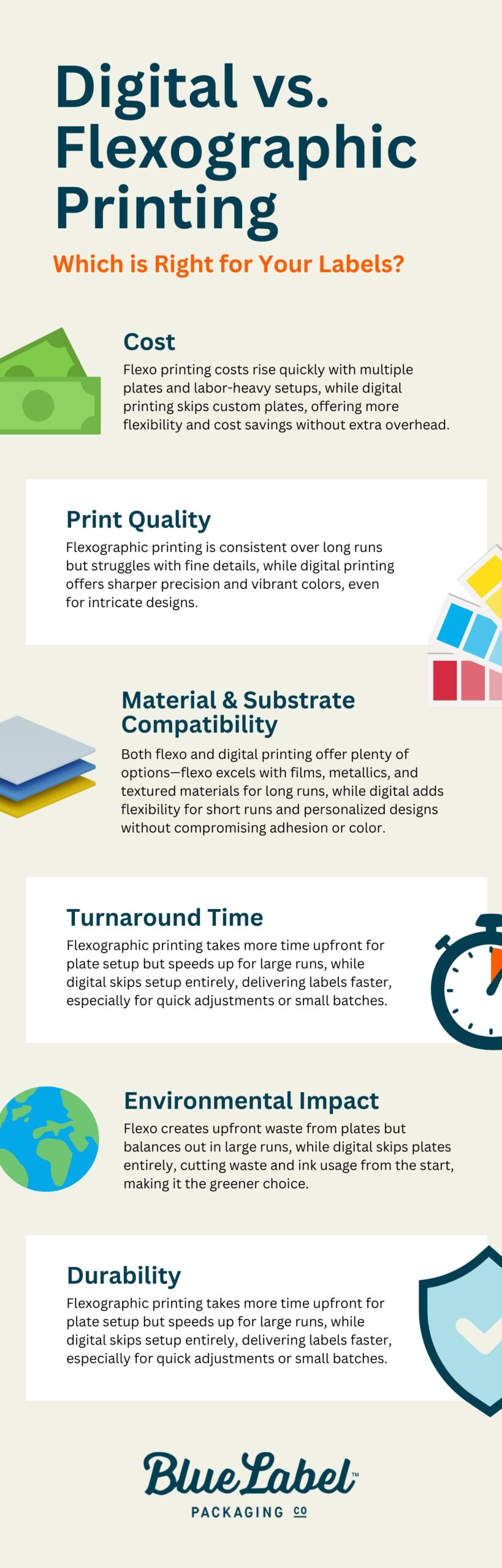
When Is Your Brand Ready for Printed Cans?

Most beverage brands start with labeled cans. Labels are flexible, the minimums are low, and when you’re figuring out your beverage lineup, that flexibility matters. Plenty of brands stay with labels for years because labels are the right fit, and that’s a perfectly good decision.

Printed cans are a different approach. They cost more per unit than labels, so it’s not simply a decision about one or the other. It’s more about which one fits your brand right now.

Here’s how to tell when printed cans are worth a look, and when sticking with labels might make more sense.

When Printed Cans Start to Make Sense

Brands usually start considering printed cans at the following times:

Your category leans toward printed cans. In some categories, printed cans are basically the standard. Walk down the energy drink aisle and nearly every can is printed directly on the aluminum. When a whole category looks one way, a labeled can can read as the less established option, even when the product inside is excellent, and it may get less consideration from buyers and retail accounts who are used to the category norm.

Volume is growing, and labeling is eating into production time. If you’re labeling cans internally, there’s a point where the process becomes a real bottleneck. We see this a lot with breweries doing 1,000+ cans per run. Handing label application off to a label converter is a common approach, but that will add cost too, so this can be a good time to compare both options.

You want one less variable in wet, cold conditions. The right label materials handle coolers, ice, and condensation just fine. A quality BOPP label, applied well, holds up well to moisture and cold environments. If you’re seeing wrinkling or peeling, that’s usually a sign the material or application isn’t matched to the conditions, and it’s often fixable by switching materials or label protection. Printed cans, on the other hand, take the question off the table entirely, because the ink is cured directly onto the aluminum and there’s nothing to lift or peel.

You’re moving into distribution with large retailers. Taproom-only brands have more room for a handmade, personal look, and that look often works in their favor. But when your cans sit next to nationally distributed brands in a cooler at large retailers, small differences get noticed.

None of these on its own means you should switch. Labels are often the right call, especially given the lower cost per unit. But if two or three of these line up, printed cans are worth running the numbers on.

Printed cans

What the Switch Actually Looks Like

Moving to printed cans is simpler than most brands expect. Here’s the basic process:

  1. You send us your artwork. If you already have label designs, they’ll need some adjustments for can printing (different dimensions, different bleed areas, barcode placement). We walk you through what needs to change. If you’re curious about the details, our guide to designing for printed cans covers the technical side.
  2. We produce a pilot can. This is a physical prototype of your design, printed on an actual can, so you can hold it, check the colors, and show it to your team before committing to a full run.
  3. Your team approves the pilot. Once you’re happy with how it looks and feels, we move to production.
  4. Production runs in about 10 business days from pilot approval. Your digitally printed cans arrive ready to fill. No separate label order. No applicator setup. No labeling step on your canning line.

What changes in your workflow: You stop ordering labels and brights separately. You stop scheduling labeling time. Your cans arrive finished.

What stays the same: Your filling process, your canning line, your distribution. The cans just arrive ready to go.

Labels vs. Shrink Sleeves vs. Printed Cans

Each option has a place. The right choice depends on where your brand is right now.

Labels Shrink Sleeves Printed Cans
Best for Early-stage brands, high SKU variety, frequent design changes, lower budgets 360-degree coverage, complex graphics Established SKUs, growing volume, retail shelf presence
Minimum order No minimum order quantity No minimum order quantity ~1,600-2,000 cans per SKU
Lead time 5 business days after artwork approval 5 business days after artwork approval 10 business days (after pilot can approval)
Durability Excellent with the right material like BOPP. Matching the stock to the conditions is what matters. Good moisture resistance Excellent. Ink is bonded to the aluminum.
Shelf presence Strong. A well-made label looks great, with a visible edge up close. Smooth, full coverage Premium. No edges, no seams, no peeling.
Sustainability Adds a label layer to the can Plastic sleeve is typically not recyclable with the can Fully recyclable. No extra materials.


Pro tip: A lot of brands use a mix. Printed cans for their core lineup (the beers or beverages that sell consistently) and labels for seasonal releases, collaborations, or limited editions where they need design flexibility and lower quantities. This isn’t a transition you have to finish. Plenty of brands run both formats for years because each one earns its place.

Printed beer cans

What Printed Cans Can (and Can’t) Do

Printed cans offer finishes that used to be reserved for big national brands with six-figure order minimums. Until recently, most printed can orders required 100,000+ cans per SKU with 12-week lead times. Digital printing has changed that completely.

Available finishes:

  • Matte and gloss 
  • High build (emboss) for a raised, tactile effect
  • Selective metallic, where the bare aluminum shows through your design for a natural metallic look
  • Spot varnish applied to specific design elements

The selective metallic option is worth calling out. Instead of printing a white layer under your entire design, you can leave parts of the aluminum exposed. It creates a metallic effect that’s built into the can itself, not printed on top of it. We see brands use this for logos, accent details, or background textures.

Limitations to know about:

  • Fine text needs to be 7pt or larger for readability
  • Barcodes work best in vertical orientation on cans
  • Your designer will need to think about the can’s curve, especially near the top and bottom edges where the shape changes

Our designing for printed cans guide covers all of these in detail.

How to Test Printed Cans Without Committing

One of the biggest concerns we hear is: “What if I invest in printed cans and they don’t work for us?”

That’s exactly why the pilot can exists. You can:

  • Check the colors against your existing labels or brand guidelines
  • Show it to your sales team and your retail accounts to get feedback before you commit
  • Test consumer response at a taproom, a market, or an event
  • Confirm the design works on a curved surface before running thousands

Worth knowing: Some brands order pilot cans for 2-3 designs at once to compare finishes (matte vs. gloss, metallic knock-outs vs. full coverage) before choosing their production spec.

Ready to See What Your Brand Looks Like on a Printed Can?

If a few of these signs are lining up for your brand, the easiest next step is a pilot can. It’s a low-risk way to see your actual design on an actual can before making any production decisions. And if labels are still the right fit for where you are, that’s a good answer too.

Check out our printed cans page to see what’s possible, or request a quote and we’ll walk you through the options for your specific brand.

Barcode Basics: What to Know About Barcodes and UPCs for Product Labels

⚞ The Highlights:

  • What is a UPC barcode? A UPC (Universal Product Code) is a 12-digit barcode found on retail products. Stores scan it to identify and track items at checkout.
  • UPC vs. EAN vs. QR Code vs. SKU: a UPC is the 12-digit U.S./Canadian barcode standard. An EAN is the 13-digit international equivalent. A QR code is a 2D barcode for marketing or consumer-facing info. A SKU isn’t a barcode at all. It’s an internal product ID set by the retailer or brand.
  • Sizing: a UPC barcode at 100% magnification is 1.469″ wide by 1.02″ tall. You can scale between 80% and 200% of this. Always include at least a 0.25″ quiet zone on each side.
  • To get a UPC: register with GS1 (the global barcode standards organization), get a unique number assigned, and use the resulting barcode on your packaging.
  • The barcode is changing: the industry is moving from the traditional 1D UPC to 2D barcodes (QR-style codes that carry your GTIN). GS1’s Sunrise 2027 push aims to have retail checkouts ready to scan 2D codes by the end of 2027. For now you keep your UPC, and you can start adding a 2D code alongside it.

A barcode and a UPC may not be the most attractive part of your product label, but they’re the part that makes everything else work. A clean, properly sized barcode means the product scans at checkout, gets tracked through the supply chain, and shows up correctly in retail inventory systems. A bad barcode means lost sales, frustrated customers, and chargebacks from retailers. Below is what you need to know to get yours right the first time.

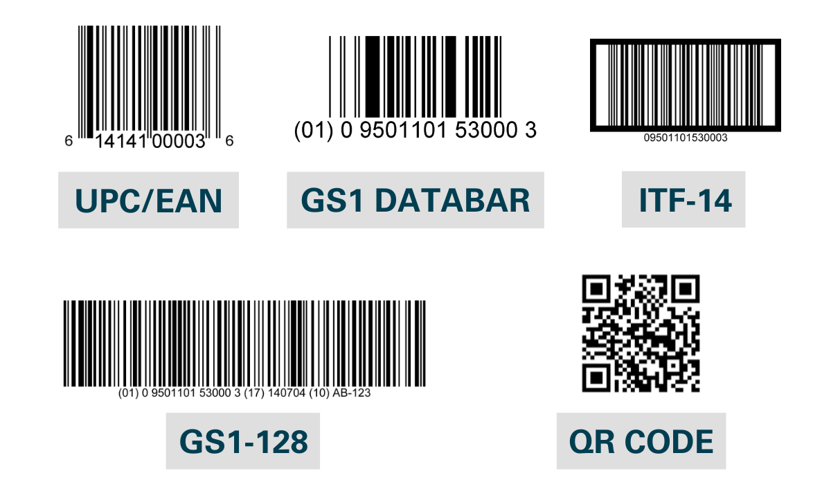
UPC vs. EAN vs. QR Code vs. SKU vs. GS1 DataBar

The terms “barcode,” “UPC,” and “SKU” get used interchangeably, but they’re different things. Here’s how they actually compare.

Type What it is Format Standardized by Common use
UPC 1D linear barcode used at retail in the U.S. and Canada 12 digits GS1 (U.S. / Canada) Retail point-of-sale scanning
EAN 1D linear barcode used at retail internationally 13 digits GS1 (international) Retail point-of-sale scanning outside the U.S.
QR Code 2D barcode that holds more data than a 1D barcode Variable; can encode URLs, text, contact info ISO standard Marketing links, consumer information, traceability
SKU Not a barcode. An internal product identifier set by the retailer or brand Variable, defined by the company using it Each retailer or brand Internal inventory and stock management
GS1 DataBar Compact 1D barcode that holds more data than a UPC Variable GS1 Small items, fresh food, healthcare products where space is limited
2D barcode w/ GS1 Digital Link A QR Code or Data Matrix that carries your GTIN and links to web content. The format retail is moving toward. Variable; encodes a GTIN plus a web link and other data GS1 Checkout scanning and consumer info in one code (the goal for retail by 2027)

The short version: a UPC (or EAN internationally) is what retailers scan at checkout. A SKU is an internal product code. A QR code is a 2D barcode that’s usually supplemental, not a replacement for a UPC. Most retail products need a UPC; only some products need GS1 DataBar or a QR code.

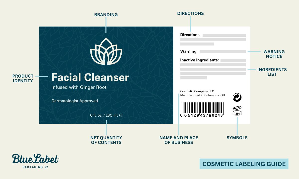
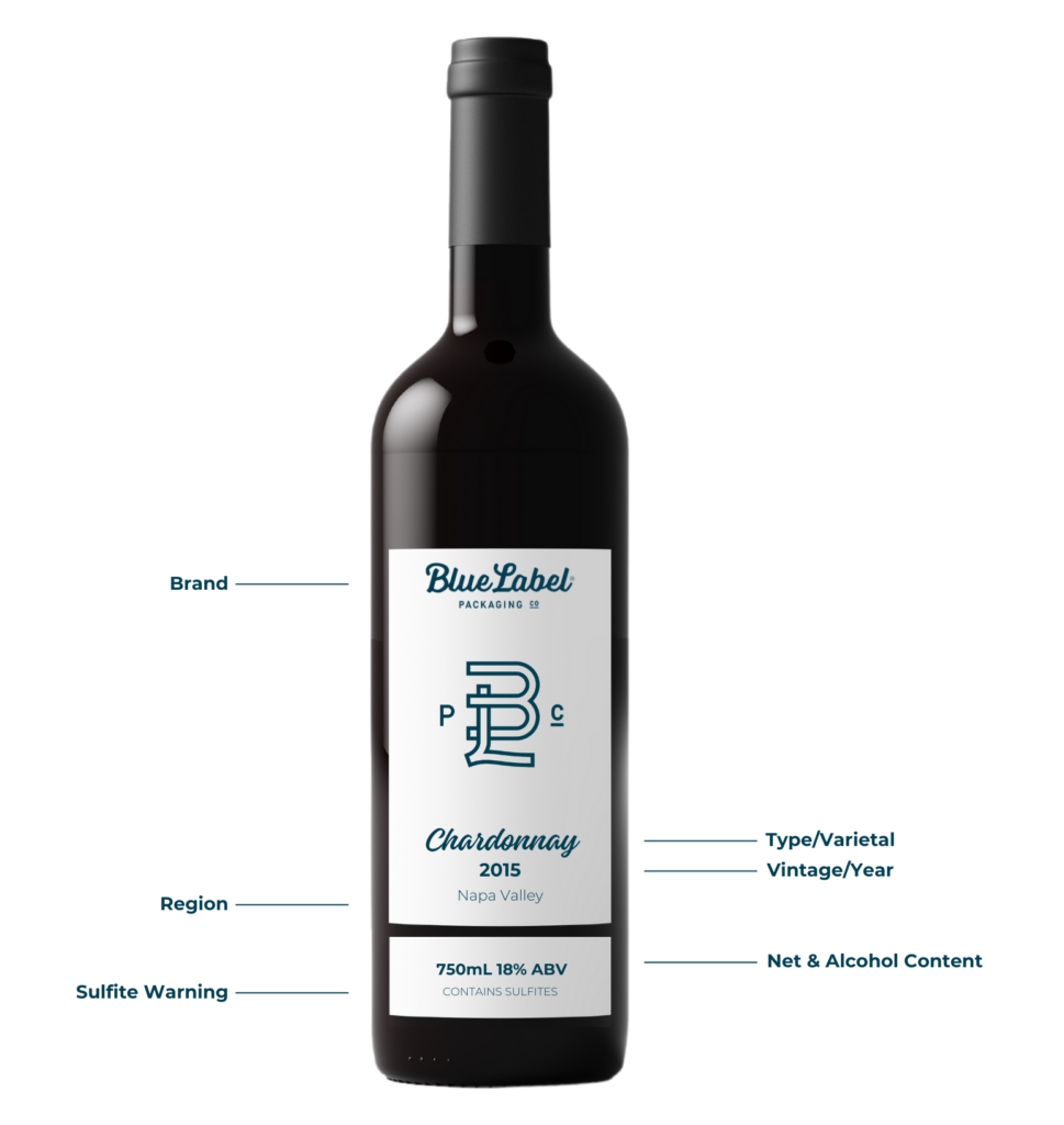
What goes into a barcode and UPC?

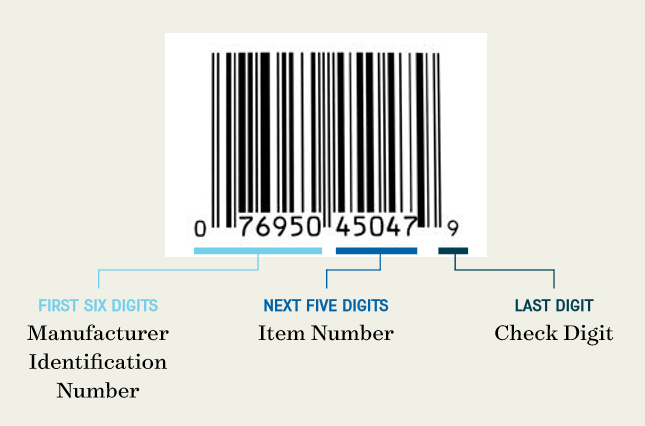
A barcode and a UPC are two parts of the same thing. The UPC (Universal Product Code) is a 12-digit number assigned to a product. The barcode is the machine-readable version of that number. Each part of the 12-digit code does a different job:

  • First six digits. The manufacturer identification number
  • Next five digits. The item number, specific to each product
  • Last digit. The check digit, a single number that confirms the integrity of the barcode

A product label barcode with an example UPC.


Looking for Custom Labels?

We put our all into every custom label we make. No exceptions. And with no minimum order quantities and a 5-day turnaround for digital label printing, we take pride in helping you perfect your first impression.

Request a Quote    Get a Sample Pack


Manufacturers apply for UPCs from GS1 (the Uniform Code Council). After approval, the manufacturer pays an annual fee to participate in the UPC system and receives a unique manufacturer identification number, which is used for all of that company’s barcodes. The item number is specific to each product and is assigned by the manufacturer (avoid duplicating numbers across SKUs). The check digit is calculated from the rest of the number to confirm the barcode hasn’t been corrupted in transmission. You can determine the check digit for any product with GS1’s check digit calculator.

Other types of barcodes

While UPC and EAN barcodes are the most common, GS1 maintains several other barcode types for different business needs:

  1. GS1 DataBar: A family of compact barcodes designed for items that don’t have room for a full UPC. They can carry product identification, batch numbers, and expiration dates, which makes them a fit for fresh foods and healthcare products where space is at a premium but data needs are high.
  2. GS1-128 and ITF-14: GS1-128 is a high-capacity barcode that uses application identifiers to encode multiple data elements in one symbol. Useful for complex supply chain needs. ITF-14 is designed specifically to encode a Global Trade Item Number (GTIN) on corrugated materials, which makes it the standard for tracking trade items in bulk through distribution.
  3. Two-dimensional (2D) barcodes: Think of 2D barcodes as the next-generation form of the typical 1D barcodes you see on most product packaging. The most common 2D barcode is the QR code. 2D barcodes encode data both horizontally and vertically, which lets them hold a lot more information in less space. And they’re about to become a much bigger deal at retail — more on that in the next section.

Different types of product barcodes

Should you use QR codes for product labeling?

QR codes don’t replace a UPC at retail, but they pair well with it. A study published in Sustainability evaluated QR code use on food labels and found:

  • Nearly 39% of respondents wanted QR codes used more broadly in the future
  • 67% of respondents agreed that QR codes make life easier

The study concluded that QR codes “included in product packaging, on labels, and in commercial spaces (shelves, showcases, posters, etc.) are considered particularly effective in providing timely product and brand information given their capacity to reach consumers when and where they are ready to purchase with relevant, targeted, and interactive information.”

The practical use cases we see most: linking to product information pages, ingredient sourcing or sustainability stories, video tutorials, loyalty program signups, and traceability for fresh or regulated products.

The shift from 1D to 2D barcodes (and what Sunrise 2027 means for your labels)

For 50 years, the 1D UPC (those vertical black bars) has been the barcode at retail. That’s starting to change. The industry is moving toward 2D barcodes (the square, QR-style codes) for checkout, and there’s now a date attached to it.

GS1, the same organization that issues your UPC, is leading a global push called Sunrise 2027. The goal: by the end of 2027, retail checkout systems should be able to scan a 2D barcode and pull your product’s GTIN (Global Trade Item Number) the same way they read a UPC today.

Why 2D barcodes

A 1D UPC holds one thing: a 12-digit number. A 2D barcode holds a lot more. A single QR code can carry up to roughly 4,296 characters, more than 50 times what a linear barcode holds. That extra room lets one code do several jobs at once:

  • Identify the product at checkout (the GTIN, same job the UPC does today)
  • Carry batch numbers, lot codes, and expiration dates, which helps with recalls and lets a register stop the sale of an expired item
  • Link to a web page you control with ingredients, sourcing, sustainability info, how-to content, or a loyalty signup

The piece that makes one code do all of this is a GS1 standard called GS1 Digital Link. In plain terms, it’s a way of formatting a QR code so it works as both a scannable retail identifier and a web link. The checkout reads the GTIN; a shopper’s phone opens the page. Same code, two audiences.
If you already put a QR code on your labels, it probably points to a marketing URL and nothing more. A GS1 Digital Link QR code is different. It carries your GTIN inside that link, so the same code a shopper scans for product info can also be read at the register. If you’re refreshing artwork anyway, it’s worth asking your provider to format new QR codes the GS1 Digital Link way so you’re not redoing them in two years.

What this means for your labels right now

Here’s the part that matters most, and the part that’s easy to get wrong: 2027 is not a deadline to remove your UPC. It’s the target for retailers to be able to read 2D codes. For now, the two codes live side by side.

The industry calls this dual marking: your label carries both the traditional 1D barcode and a 2D code during the transition. GS1’s own guidance is that until about 90% of retail point-of-sale scanners can read 2D codes and capture the GTIN, any product using a 2D code at checkout still needs the linear barcode on the pack too. So for the foreseeable future, you keep your UPC. You can add a 2D code next to it.

  • Keep your UPC. It’s still what scans at almost every register today. Nothing about Sunrise 2027 changes that yet.
  • You don’t have to do anything by 2027 to keep selling. If you change nothing, your products still scan. This is an opportunity, not a compliance scramble.
  • If you’re adding a QR code, make it a GS1 Digital Link code. That way the code you print today is the code that works at 2D checkout later.
  • Plan for two codes on the label. A 2D code needs its own space and its own quiet zone, just like a UPC. If you’re tight on real estate (small cans, slim bottles, narrow shrink sleeves), it’s worth working out placement before you commit to a print run.

Whether the move to 2D is on your roadmap this year or a couple of years out, the design rules for the codes themselves haven’t changed. Quiet zones, color, size, placement, and a flat printing surface still decide whether a code scans cleanly. That’s what the next section covers.

How to make sure your barcode and UPC actually work

Barcodes are graded on a scale from A to F. Higher grades scan more reliably across more scanners. The factors that determine the grade are mostly within your control if you set up the barcode correctly from the start.

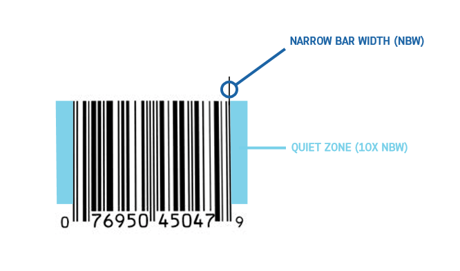
Respect the quiet zone

Every barcode needs a “quiet zone”. A clear margin around the barcode with no text, graphics, or other printed elements. Without a proper quiet zone, a scanner can pick up surrounding artwork and misread the barcode, which causes errors at checkout.

The quiet zone should be the larger of these two measurements:

  • 10 times the width of the narrowest bar in the barcode
  • One-eighth of an inch (0.125″)

An example barcode with the approapriate amount of quiet space.

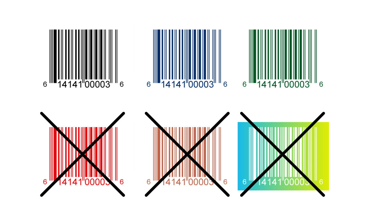
Use the right colors for your barcode

While colorful labels can help your product stand out, the barcode itself needs a simple color scheme to scan reliably:

  • Bars: use a single color, ideally black or another dark color. Avoid warm colors like red or brown. They don’t read well on the red laser scanners most retailers still use.
  • Background: the barcode background is usually unprinted, so it takes on the color of the label or packaging. If the label color is dark or warm, print a light background (typically white) for the barcode area and quiet zone.

Barcode colors for products

Pay attention to barcode size

Barcodes come in custom sizes the same way labels do. Yours needs to be big enough to scan reliably, but not so big that it crowds the rest of the label.

The standard UPC barcode is 1.469″ wide by 1.02″ tall at 100% magnification. You can scale up or down within these limits:

  • Minimum: 1.175″ wide by 0.816″ tall (about 80% of standard)
  • Maximum: 2.938″ wide by 2.04″ tall (about 200% of standard)

A visualization of the minimum and maximum barcode sizes.

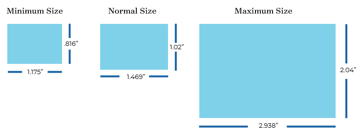
Design the barcode at the size you actually need from the start. Don’t generate a standard-size barcode and then resize it manually. That can cause scanning issues. If you need a different size, generate a fresh barcode at the new dimension.

Place the barcode where scanners can find it

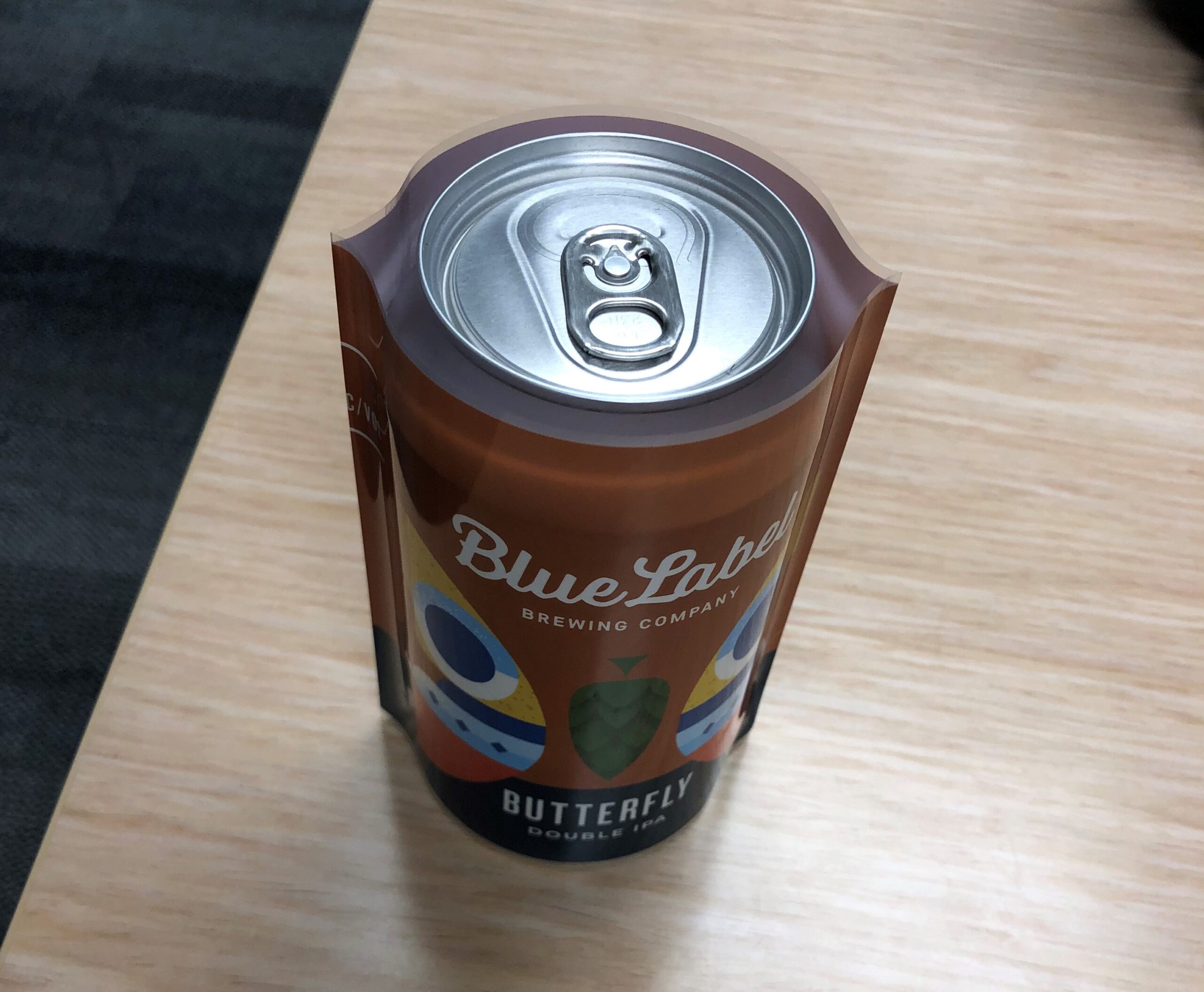
For products that scan at retail checkout, place the barcode in the lower-right corner of the back panel of the package. Keep it away from edges and creases, and leave enough white space around it so the scanner has a clean read.

The printing surface for the barcode also needs to be relatively flat. Bumps, creases, or curved surfaces (like the seam of a shrink sleeve) can cause scan errors. If you’re printing on a curved container, make sure the barcode sits in a flat zone, not where the curve is steepest.

GS1 has published Guidelines for Bar Code Symbol Placement if you want the full reference.

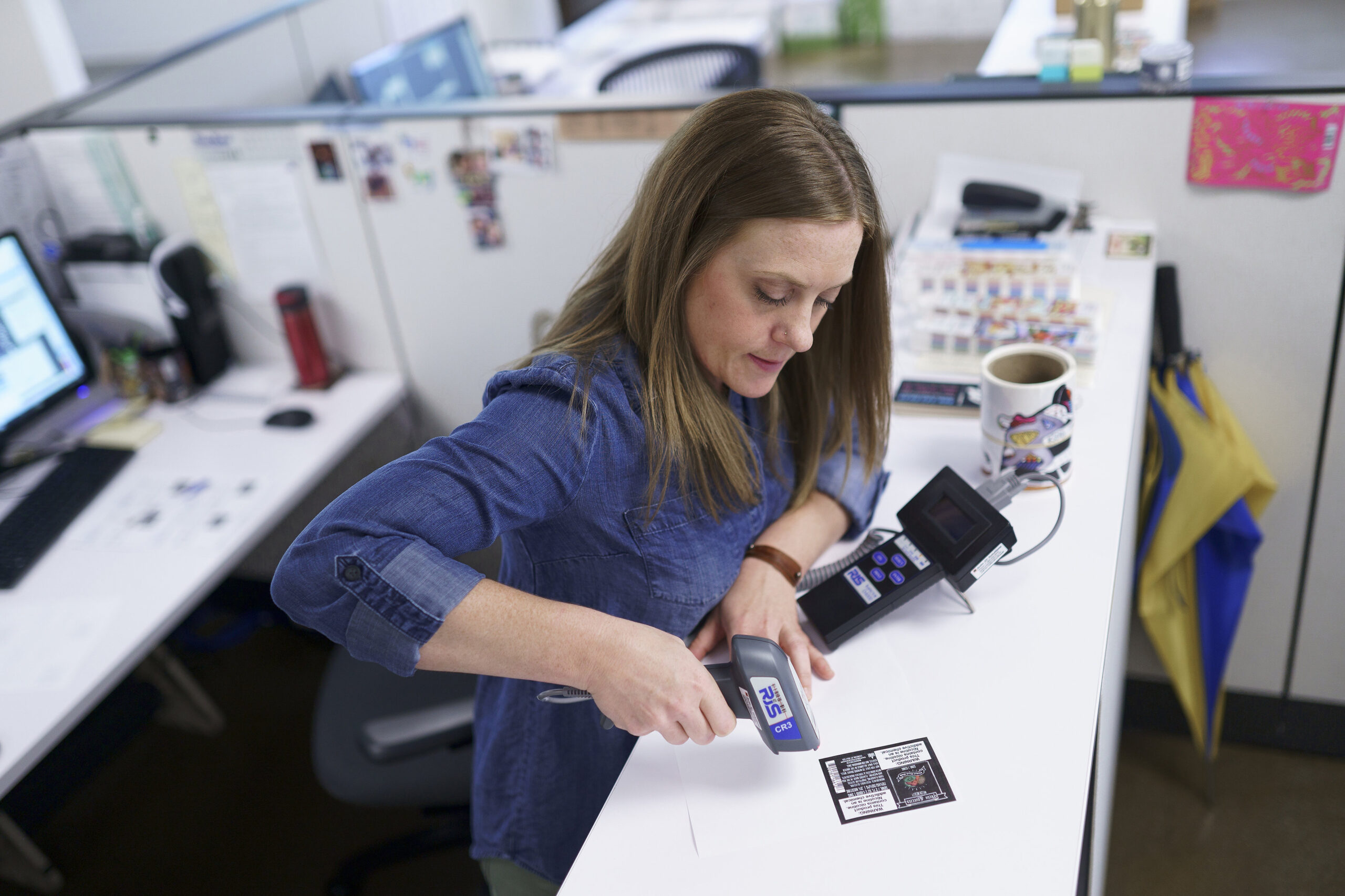
Once you have your UPC ready, request a free sample pack to see exactly how your barcode will scan and sit on our label stock before you commit to a print run.

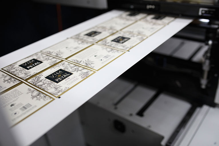
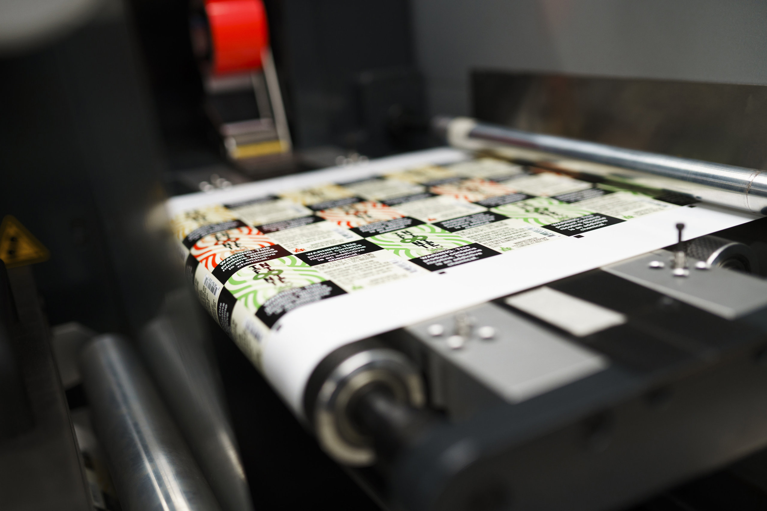
Send your barcodes to the printer in the right format

Once your label design has the barcode in place, you’ll need to send the artwork along with the barcode files to your printer. In addition to the label artwork files, deliver the barcode in one of these forms:

  • An image file of the barcode you received from the provider
  • An Excel document with a list of UPC numbers
  • A PDF or EPS of the barcodes

A label printing expert testing a barcode label.

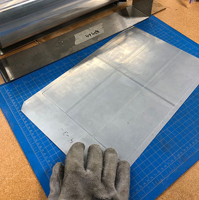
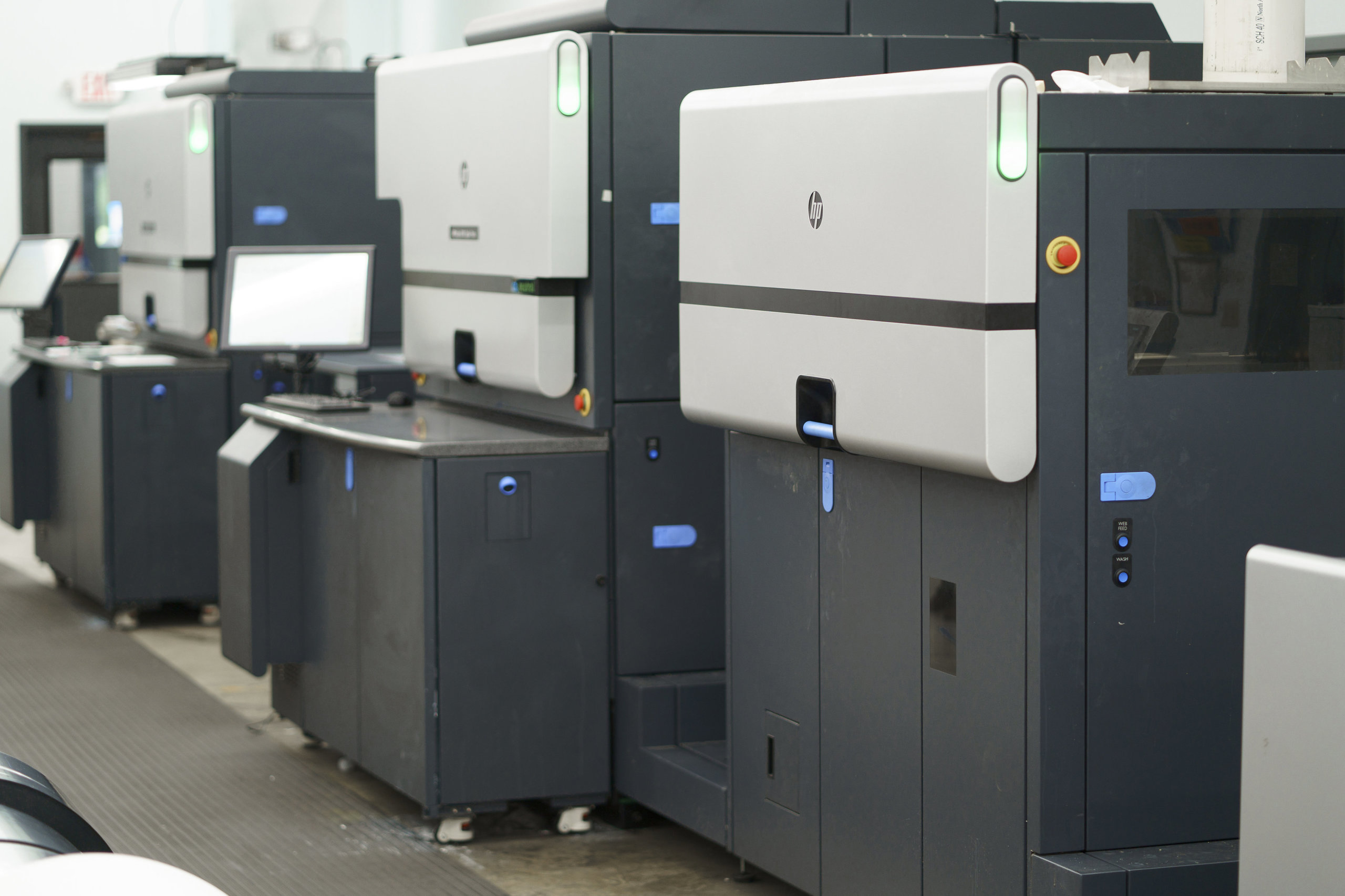
It pays to work with a label printer that has solid barcode-handling capabilities. A barcode that fails to scan can mean lost sales, frustration on both sides of the counter, and chargebacks from retailers if their systems can’t read your products. A good label printer will choose materials and printing techniques that avoid smudges, abrasions, and low-resolution issues that hurt scan quality.

Worth knowing: Thinking of using printable label sheets on a home inkjet or laser printer? Be careful. Home printers often can’t hit the resolution barcodes need, and the paper labels designed for home printers usually aren’t durable enough for most product environments (no water resistance, low tear strength, prone to smudging). Fine for short-run testing; risky for production.

How to get a barcode

If you’re starting from scratch, the place to start is the GS1 website.

In the U.S., you can either get a single barcode (a GS1 US GTIN) or register a block of multiple barcodes (a GS1 Company Prefix). GS1 has a helpful barcode estimator to figure out exactly how many barcodes. And what kind. You’ll need.

The process is straightforward:

  1. Choose either a GS1 US GTIN (single product) or a GS1 Company Prefix (multiple products)
  2. Enter your contact information
  3. Pay (price varies depending on quantity and barcode type)

One thing worth knowing: there are third-party resellers offering “discount” UPCs. Most major retailers (Amazon, Walmart, Target, Kroger) require GS1-issued barcodes specifically. Saving a few dollars on a non-GS1 UPC can disqualify your products from those retailers, so go directly through GS1.

Frequently asked questions

What’s the difference between a UPC and a barcode?

A UPC is the 12-digit Universal Product Code assigned to a product. The barcode is the machine-readable version of that number. The printed pattern of bars and spaces a scanner reads. They’re two parts of the same identification system: the UPC is the number, the barcode is the visual representation.

What’s the difference between a UPC and an EAN?

A UPC is the 12-digit barcode standard used at retail in the U.S. and Canada. An EAN (European Article Number, now called International Article Number) is the 13-digit equivalent used internationally. Most modern retail scanners read both. If you sell in both U.S. and international markets, you may need both, depending on which markets your retailers serve.

What’s the difference between a UPC and a SKU?

A UPC is a globally unique 12-digit barcode standardized by GS1, used at retail point-of-sale and recognized across companies. A SKU (Stock Keeping Unit) is an internal product identifier set by a retailer or brand for their own inventory tracking. SKUs aren’t standardized. Every company defines its own format. A product can have a UPC and one or more SKUs at different retailers.

Do I need a UPC to sell on Amazon?

In most cases, yes. And Amazon specifically requires GS1-issued UPCs (not third-party resellers). Some product categories have GTIN exemptions, but for most retail consumer products, you’ll need a GS1 UPC. Walmart, Target, Kroger, and other major retailers have similar requirements. Going directly through GS1 is the safe path.

How much does it cost to get a UPC?

Cost depends on whether you need a single barcode or a block of barcodes. GS1 offers single GTINs for one-product situations, and GS1 Company Prefixes for businesses needing multiple barcodes. Prices include both an initial fee and an annual renewal fee, and they vary based on the number of barcodes you register. Check the GS1 US site for current pricing.

What size does my barcode need to be?

A standard UPC barcode is 1.469 inches wide by 1.02 inches tall at 100% magnification. You can scale between 80% and 200% of that range. Minimum around 1.175″ x 0.816″, maximum around 2.938″ x 2.04″. Always include a quiet zone of at least 0.25 inch on each side. Generate the barcode at the actual size you need; don’t generate at one size and resize later, which can cause scanning issues.

Where should I place the barcode on my product label?

For most retail products, place the barcode in the lower-right corner of the back panel. Keep it away from edges, creases, and curved or textured surfaces. The barcode should sit on a relatively flat printing surface, with enough white space around it (the quiet zone) for the scanner to get a clean read. GS1 publishes detailed placement guidelines for specific product types and packaging.

Should I use a QR code on my product label?

QR codes don’t replace a UPC, but they pair well with one. They’re useful for linking to product information, ingredient sourcing or sustainability content, video tutorials, loyalty signups, or traceability for regulated products. Research shows nearly 67% of consumers find QR codes make their experience easier. The catch: a QR code takes up label real estate, so you need a clear reason for including it before you commit space to one.

What is GS1 Sunrise 2027 and do I need to switch to 2D barcodes?

Sunrise 2027 is a GS1-led industry initiative to get retail checkout systems ready to scan 2D barcodes (QR-style codes) by the end of 2027, alongside the traditional 1D UPC. It is not a deadline to remove your UPC. During the transition, products use “dual marking,” carrying both the 1D barcode and a 2D code. GS1’s guidance is that until roughly 90% of retail scanners can read 2D codes and capture the GTIN, any product using a 2D code at checkout still needs the linear barcode on the pack. So for now, keep your UPC. If you’re updating artwork anyway, you can start adding a 2D code alongside it.

What is GS1 Digital Link?

GS1 Digital Link is a way of formatting a QR code so it works as both a scannable retail identifier and a web link. It carries your GTIN inside a web URL, so the same code can be read at checkout for the GTIN and opened on a shopper’s phone for product information, sourcing, traceability, or loyalty content. It’s the format the industry is moving toward for the 1D-to-2D transition. If you already use a plain marketing QR code, formatting new ones as GS1 Digital Link keeps them usable when 2D checkout arrives, so you’re not redoing your codes later.

Get your barcode-ready labels right the first time

A barcode and UPC are one of many pieces in a successful product label. Once your design is dialed in, finding the right printer is the next step.

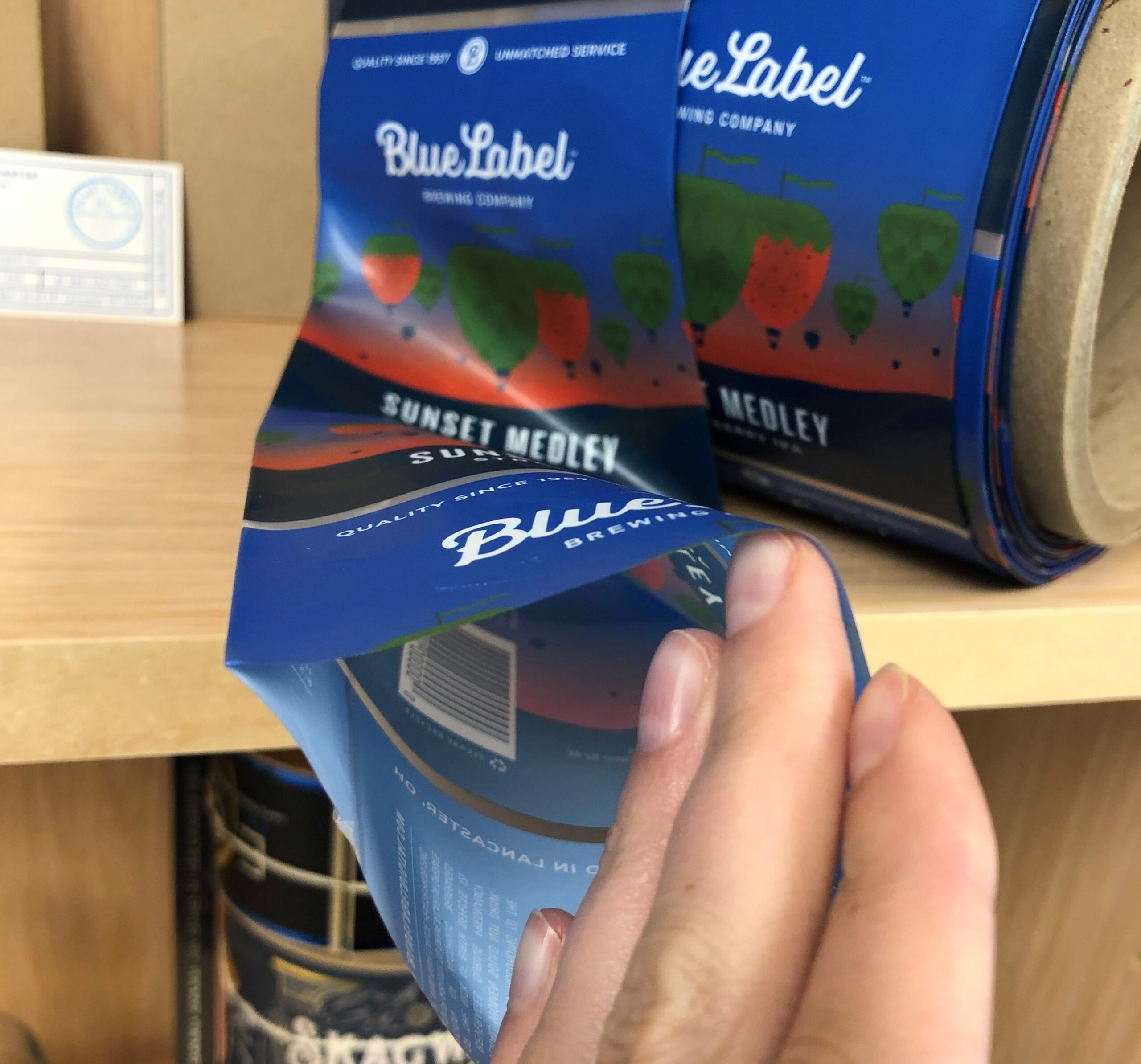
At Blue Label, we test every barcode before a full run. We print example labels, scan them with retail-grade scanners, and grade the result. We confirm that your UPC matches the bars. If anything looks off, we flag it before we print the production run, so you can fix it before it becomes a chargeback.

Ready to put it together? Take a look at our product label options, or request a sample pack to see how your barcode will sit on real label stock. Get in touch when you’re ready to talk through a project.

6 Label Tips for Cosmetics and Beauty Products

⚞ The Highlights:

  • Cosmetics labels in the U.S. must follow FDA rules under the FD&C Act, plus the additional requirements added by MoCRA (Modernization of Cosmetics Regulation Act of 2022).
  • Required elements include the product name, identity statement, net quantity, ingredient list (in descending order), name and place of business, country of origin, and any required warnings.
  • The right adhesive matters as much as the design. Bathroom and shower environments call for high-solvent-resistance adhesives that can handle moisture, alcohol, and humidity.
  • Premium finishes (foil, embossing, soft-touch lamination, spot UV) are how beauty brands signal quality on the shelf without saying a word.

Cosmetic and beauty product labels carry more responsibility than most product labels. They have to meet federal labeling rules, hold up to moisture and frequent handling, and earn a buyer’s eye in a category where the package often sells the product. Below are six things we tell brands to think about when designing or refreshing a cosmetic label, with current FDA framework first and design and material decisions after.

1. Follow the FDA’s cosmetic label guidelines (and the new MoCRA requirements)

A cosmetic label that doesn’t follow federal rules can be considered “misbranded” under the Federal Food, Drug, and Cosmetic Act (FD&C Act) and is subject to FDA enforcement. Two layers of regulation apply:

  • Long-standing FDA cosmetic labeling rules under 21 CFR 701, 740, and 700.25 (covering principal display panel, ingredient declaration, warnings, and tamper-resistant packaging).
  • The Modernization of Cosmetics Regulation Act (MoCRA), signed into law December 29, 2022. The largest update to U.S. cosmetics regulation in decades. MoCRA adds federal requirements around facility registration, product listing, adverse event reporting, safety substantiation, and additional labeling elements (including fragrance allergen disclosure on a phased timeline).

If you’re updating a label in 2026, you need to be current on both layers. The FDA’s cosmetics guidance pages are the authoritative source. Bookmark them.

What counts as a “cosmetic” product?

Under the FD&C Act, cosmetics are products applied to the body for aesthetic purposes that don’t alter the body’s structure or function (soaps that only claim to cleanse are excluded). The category includes skin creams, lotions, perfumes, lipsticks, nail polishes, eye and facial makeup, shampoos, permanent waves, hair colors, toothpastes, deodorants, and any material intended for use as a component of a cosmetic.

Some products serve both cosmetic and therapeutic purposes (fluoride toothpaste, sunscreen, anti-dandruff shampoo, antiperspirant deodorants). Those are regulated as both cosmetics and drugs, which means more stringent requirements including FDA registration and adherence to drug manufacturing practices.

Cosmetic Product Labeling Guide

FDA cosmetic labeling guidelines

The FDA’s cosmetic labeling guide is the document that walks through the specifics. The required label elements:

  • Label statements required by the FD&C Act must be visible on both inside and outside containers or wrappers.
  • Ingredient listing and net quantity statement are required only on the outer container’s principal display panel (per 21 CFR 701 and 740).
  • The principal display panel must show the product name, descriptive nature or use, and accurate net quantity of contents (in weight, measure, or numerical count). Net quantity declaration sits at the bottom in a type size regulated by container size.
  • Solid, semi-solid, or viscous cosmetics are declared in pounds/ounces; liquids in U.S. gallons/quarts/pints/fluid ounces. Quantities greater than one pound or one pint should also state largest whole units, with metric measurements optional.
  • Name and place of business of the firm marketing the product goes on an information panel: street address (unless listed in current directories) plus city, state, and zip code. If you’re not the manufacturer, indicate “Manufactured for…” or “Distributed by…” before the company name.
  • Country of origin must appear on imported articles.

Declaration of ingredients

Cosmetics for retail sale must include an ingredient list. Professional-use products are exempt unless sold to consumers (and MoCRA tightened the labeling required on professional-use products specifically. Verify current rules with FDA before relying on the exemption).

  • The ingredient declaration must be conspicuous and readable at purchase. It can appear on any information panel, or on an affixed tag/tape/card if the package design doesn’t allow it on the container.
  • Letter height: minimum 1/16 inch on most packages; minimum 1/32 inch for packages under 12 square inches.
  • Off-package labeling is allowed in specific cases (for example, cosmetics in compartmented trays without a folding carton).
  • Ingredients listed in descending order of predominance, with two exceptions: color additives and ingredients at 1% or less can be listed in any order. Names must follow regulation-established terms; some can be grouped as “and other ingredients.”
  • For cosmetics also classified as drugs, drug ingredients are labeled first as “active ingredient(s).”

Label warnings

Cosmetics that could be hazardous if misused must carry clear warning labels and directions for safe use under 21 CFR 740. This applies especially to aerosol cosmetics, feminine deodorant sprays, and children’s bubble baths.

Manufacturers aren’t required by the FD&C Act to test products for safety, but the FDA strongly encourages it. If safety hasn’t been substantiated, the label must include a specific warning indicating the product’s safety has not been determined.

Tamper-resistant packaging

Liquid oral hygiene and cosmetic vaginal products sold at retail must be in tamper-resistant packaging, with a distinctive indicator or barrier that signals tampering to the consumer. The package must clearly display a statement about its tamper-resistant feature, which has to remain visible even if the feature is compromised (per 21 CFR 700.25).

Cosmetic packaging and labels

2. Highlight features and benefits that buyers actually look for

The required information is the floor, not the ceiling. The claims you choose to feature on the front of the label often decide whether a buyer picks up your product. The category-specific claims that carry weight in beauty:

  • Organic: signals naturally sourced ingredients to consumers seeking chemical-free options.
  • Vegan: communicates no animal-derived ingredients, which matters to ethical and environmentally conscious shoppers.
  • Cruelty-free / not tested on animals: signals that neither the product nor its ingredients were tested on animals.
  • Alcohol-free: attracts buyers looking for gentle formulations that won’t dry out or irritate sensitive skin.
  • Hypoallergenic: suggests a lower risk of allergic reaction, important for sensitive-skin shoppers.

If any of these claims are truthful and not misleading, they can go on your label. The FDA’s general rule is that claims must be substantiated; some terms (like “organic” or “natural”) have specific definitions tied to USDA or other agency standards, so verify before claiming.

Expiration dates: U.S. law doesn’t currently require expiration dates on cosmetics, but each company is responsible for the safety of its products. If your products have a meaningful shelf life, including the date is good practice, both for customer trust and for liability.

3. Plan label shapes and sizes for every container in your line

Unless you sell a single product, your labels probably aren’t a one-size-fits-all design. Common cosmetic containers include:

  • Airless bottles
  • Pumps
  • Sprayers
  • Jars
  • Tubes
  • Droppers
  • Compacts

Each one calls for a different label shape and size. You can keep your color scheme, font, and visual identity consistent across the full line, but you’ll need to adapt the layout, the required information, and any premium design elements to fit each container’s surface.

Cliff beauty products with custom labels.

4. Choose the right printing techniques and materials

Beauty and cosmetic labels are where premium printing techniques earn their keep. The right finish or technique can make the difference between a product that looks expensive and one that looks generic.

Cosmetic finish comparison

Finish or technique What it does Best for
Lamination (gloss, matte, soft-touch) Adds a clear protective layer over the label. Soft-touch lamination feels velvety; gloss adds shine; matte mutes shine. Premium serums, perfumes, anything that needs a tactile cue of quality. Soft-touch is the most-requested finish in luxury beauty.
UV varnish Coats the label with a thin layer of cured liquid for protection. Available as full-coverage or “spot UV” (selectively applied). Adding a pop of gloss to specific design elements (logo, product name) without coating the whole label.
Hot foil stamping Applies metallic or specialty foil to specific areas. Gold, silver, copper, and holographic options. Logo accents, brand names, or borders. The signature look for premium and luxury beauty.
Embossing / debossing Raises (emboss) or recesses (deboss) parts of the label for a tactile effect. Brand names, logos, monograms. Adds a hand-feel that flat printing can’t match.
Double-sided labels Printed on both sides so the back of the label shows through a clear container. Clear bottles where you want decorative imagery or ingredient information visible from inside.
Waterproof film labels Vinyl or polypropylene labels that hold up to water, humidity, and frequent handling. Anything used in the bathroom, shower, or refrigerator. Standard for most beauty SKUs.
Hang tags Custom tags attached to the product or package, separate from the main label. Extra branding real estate, special promotions, gift packaging, or storytelling that won’t fit on the primary label.

Material recommendations by product type

The product itself often dictates which label material is the right call. A few patterns we see often:

  • Skincare creams and serums (jars): BOPP or polypropylene with soft-touch or matte lamination. Holds up to humidity, fingerprints don’t show as much, and the matte finish reads premium.
  • Perfumes and fragrances (glass bottles): clear polypropylene with hot foil stamping or embossing. The clear material disappears against the bottle so the design feels printed directly on the glass.
  • Shampoos, conditioners, body wash (squeeze bottles): waterproof BOPP with high shear-resistance adhesive. The label sits in a wet, flexed environment and needs to survive both.
  • Lipsticks and small tubes: small-format polypropylene labels, often with a thin UV varnish or lamination. The container is small, so the label has to take the wear of being held, opened, and dropped.
  • Nail polishes (small glass bottles): polypropylene with chemical-resistant adhesive. The cap area is exposed to acetone-based products regularly during use.
  • Bar soaps: uncoated paper for a craft, natural feel; or BOPP if the bar is wrapped in a clear sleeve and the label needs to stay readable through condensation.
  • Cosmetic powders and compacts: small-format film labels with a fine-detail finish (often debossing) for the brand mark, and a separate ingredients label inside the case.

5. Pick the right adhesive for the environment

An elegant cosmetic label is only useful if it stays on the product. Beauty products often live in environments that are hard on labels: humid bathrooms, hot showers, cold refrigerators, frequent handling, and occasional contact with the product itself (oils, alcohols, acetones, fragrance solvents).

Adhesive performance

Cosmetic labels need to hold up against water, alcohol, plasticizers, and other harsh substances without losing adhesion or appearance. The right adhesive doesn’t just keep the label on the package; it keeps the label looking new throughout the product’s life.

High-quality adhesive types

For products that won’t see humidity, a standard all-temperature adhesive works fine. For products that will live in a bathroom, gym bag, or refrigerator:

  • High solvent resistance. Keeps the label adhering through exposure to water, alcohol, and other solvents. Standard for most beauty SKUs that touch water during use.
  • High shear resistance. Keeps the label intact through constant stress without tearing or cracking. Especially important for squeeze bottles and tubes that flex during use.

Match the adhesive to the package

The container’s material affects which adhesive will work best:

  • Soft-touch coated containers need a very aggressive permanent adhesive to bond properly. The velvety surface is harder for standard adhesives to grip.
  • Clear film labels on glass or plastic need ultra-clear permanent adhesives so the label edge stays invisible.
  • Frequently flexed packages (squeeze bottles, tubes) need higher shear resistance to handle the constant deformation.
  • Refrigerated products (some serums, eye creams) need cold-temperature adhesives that don’t get brittle below 40°F.

Glass cosmetic bottles with custom labels

6. Design a label people want to pick up

Walk down any beauty aisle and you’ll see the impact of label design as much as the product itself. Beauty is a visual category. The label is doing the selling. A few design choices that consistently work:

  • Use color psychology deliberately. Color carries emotional cues. Pinks and pastels read soft and feminine; blacks and metallics read luxe; greens and earth tones read natural. Match the palette to what you want the buyer to feel.
  • Build clear typography and visual hierarchy. The buyer should be able to find the product name, type, and size at a glance. Hierarchy matters most when the buyer is comparing similar SKUs in your line.
  • Add tactile or shape variation. Embossing, foil, and unusual label shapes give the package a hand-feel. In a category where people pick up the product before deciding to buy, that physical interaction matters.
  • Tell a story. The label is one of the first places a buyer encounters your brand voice. Even one line of copy that hints at the product’s origin, philosophy, or ritual can make the package feel intentional.
  • Try minimalism if the category is busy. Cleaner labels get noticed in a category where most competitors over-decorate.
  • Color-match the product to the label. A cohesive color story between the package and the product creates a unified visual signature.
  • Test patterns as a differentiator. Abstract patterns or unusual textures can give a product an edge on shelf without losing broad appeal.

Frequently asked questions

What does a cosmetic product label have to include in the U.S.?

Required elements include the product name, identity statement (what the product is), accurate net quantity of contents, ingredient list in descending order of predominance, name and place of business of the firm marketing the product, country of origin (for imports), and any required warnings. The principal display panel and information panel both have specific layout and type-size requirements under 21 CFR 701 and 740.

What is MoCRA and how does it affect cosmetic labels?

MoCRA (the Modernization of Cosmetics Regulation Act of 2022) is the largest update to U.S. cosmetics regulation in decades. Beyond labeling, it adds federal requirements for facility registration, product listing, adverse event recordkeeping, and safety substantiation. On the labeling side, it adds new requirements including fragrance allergen disclosure on a phased timeline. If you’re updating a cosmetic label in 2026, check FDA.gov for the current MoCRA labeling requirements that apply to your product category.

Do I have to list ingredients on my cosmetic label?

Yes, for cosmetics sold at retail. Ingredients must be listed in descending order of predominance, in conspicuous and readable type. Letter height is at least 1/16 inch on most packages, or 1/32 inch on packages under 12 square inches. Color additives and ingredients at 1% or less can be listed in any order. Professional-use products have different rules, which MoCRA tightened. Verify current requirements before relying on the exemption.

What’s the best label finish for cosmetic products?

It depends on the product and the brand positioning. Soft-touch lamination is the most-requested finish in luxury beauty for its velvety hand-feel. Hot foil stamping (gold, silver, holographic) is the standard for premium accents on logos and brand names. Spot UV adds shine to specific design elements without coating the whole label. Matte lamination reads understated and premium; gloss reads bright and approachable. Most beauty brands use a combination, depending on the SKU.

What kind of adhesive should I use for shower or bathroom products?

For products used in moist or humid environments. Shampoos, conditioners, body washes, face cleansers. Use an adhesive with high solvent resistance and high shear resistance. Solvent resistance keeps the label sticking through exposure to water, alcohol, and ingredient interactions. Shear resistance keeps the label intact when the bottle is squeezed or flexed. Standard all-temperature adhesives aren’t enough for these environments.

Do cosmetic labels need expiration dates?

U.S. federal law doesn’t currently require expiration dates on most cosmetic products, but the manufacturer is responsible for product safety. If your product has a meaningful shelf life, including an expiration or “period after opening” (PAO) symbol is good practice for both customer trust and liability. The EU and other jurisdictions have stricter rules, so if you’re selling internationally, check the requirements for each market.

What materials work best for cosmetic labels?

BOPP (biaxially oriented polypropylene) and polypropylene films are the workhorses for most cosmetic labels. They’re waterproof, durable, and accept a wide range of finishes. Clear polypropylene works well on glass perfume bottles where you want the design to look printed directly on the bottle. Uncoated paper fits craft or natural-positioned products. The right pick depends on the package material, the product’s environment, and the brand aesthetic.

Ready to put this to work?

If you’re designing or refreshing a cosmetic label, we can help you sort through the format, materials, finishes, and compliance pieces. Take a look at our cosmetic labels page for an overview of what we offer, or request a sample pack to see finishes and materials in person.

If you’re still looking for a designer, our designer directory can help you find someone who’s worked on beauty packaging before. And when you’re ready, get in touch and we’ll talk through your project.

Anatomy of a Wine Label

⚞ The Highlights:

  • U.S. wine labels are regulated by the Alcohol and Tobacco Tax and Trade Bureau (TTB). Required elements include the brand name, class or type designation, alcohol content, net contents, producer and bottler info, the sulfite warning (if applicable), and the federal government warning.
  • Most required information has flexibility on placement: brand label (front) vs. back label vs. either. The brand name and class/type must be on the brand label; everything else can usually live on the back.
  • Vintage year, appellation, and varietal are technically optional but trigger specific rules when included (75% varietal threshold, 75–85% appellation thresholds, etc.).
  • Material choice (paper, BOPP, soft-touch laminate, foil) sets the visual and tactile tone of the bottle as much as the design itself.

Wine labels carry more rules than most product labels because the TTB regulates them under the Alcohol and Tobacco Tax and Trade Bureau’s labeling requirements. The good news: the rules have been stable for years, and once you know what’s mandatory and what’s flexible, designing a compliant label gets straightforward. Below is what every U.S. wine label needs, where it can go, and what to think about for materials and design.

What goes on the front vs. the back of a wine label?

The TTB doesn’t strictly dictate which side of the bottle gets each piece of information. Some elements must appear on the “brand label” (typically the front), but most can go on either label. Here’s how it usually breaks down.

Element Where it can go Required?
Brand name Brand label (front) Yes
Class or type designation (varietal name, “red wine,” “table wine,” etc.) Brand label (front) Yes
Alcohol by volume (ABV) Either label Yes (some classes deduce it from designation)
Net contents Either label, OR blown/etched into the bottle Yes
Producer / bottler name and address Either label Yes
Sulfite warning Either label Required if >10 ppm SO₂
Government health warning Either label (typically back) Yes
Vintage year Either label Optional (with rules if claimed)
Appellation / region Either label Optional (with grape-source thresholds if claimed)
Pairing notes, flavor profile, story Back label (typical) No

What Information is Included on Wine Labels?

Below is each element in detail, with the rules that apply.What needs to be included on a wine bottle label?


Looking for Custom Wine Labels?

Using high-quality label material, investing in the latest printing technology, continuously improving our processes, and staying on top of industry trends, we make sure wineries around the world are getting the best custom-made wine labels.

Request a Quote    Get a Sample Pack


Brand name

Who made the wine? The winery’s branding usually appears at the top or bottom of the brand label, depending on the design tradition you’re working in (French wines often place the winery prominently at the top; New World wines vary).

Fanciful name

What’s this specific wine called? A fanciful name is a secondary name used to differentiate brands within the same winery. Brengman Brothers’ “Runaway Hen” is one example. Fanciful names are optional, but they don’t replace the need for a class and type designation. When you use one, the TTB requires an additional tax class on the label based on alcohol percentage. For example: “red table wine” or “white table wine” for wines under 14 percent alcohol; “red wine” or “white wine” for wines above 14 percent.

Vintage (year)

When were the grapes harvested? Vintage information isn’t mandatory, but it’s common because it speaks to the quality of the bottle’s contents. Especially if you’re paying attention to year-to-year variation. If you list a vintage, federal rules require that 95% of the wine come from grapes harvested that year (85% for wines from a state or county appellation).

Wine or varietal type

What kind of wine is in the bottle? This is where the grape or varietal type is communicated: Sauvignon Blanc, Pinot Noir, Cabernet Sauvignon, etc. Listing a class or type is required. If you call out a specific varietal name, at least 75 percent of the wine must come from that grape variety. Otherwise, the label needs a generic class designation like “red wine,” “white wine,” or “table wine.”

Appellation (region)

Where was the wine made? Region of origin breaks down differently depending on what you’re claiming:

  • State or county appellation: at least 75 percent of grapes must come from that location (federal rule).
  • American Viticultural Area (AVA, e.g., Napa Valley): at least 85 percent of grapes must come from that AVA.
  • State-specific rules: some states have stricter requirements. California, for example, mandates that 100 percent of grapes come from California if the state name is on the bottle.

Producer and bottler

Where was the wine made and bottled? If the bottling location differs from the winery or vineyard, both names and addresses must appear on the label.

Alcohol content

What’s the percentage of alcohol by volume (ABV)? Required on every label unless it can be deduced from the class designation (table wine implies 14 percent or less). Best practice is to print the ABV explicitly anyway, because consumers and retailers expect to see it.

Net contents

How much wine is in the bottle? Net contents (in milliliters) must appear on every bottle, either printed on the label or blown/etched into the glass.

Sulfite warning

If the wine contains 10 parts per million or more of sulfur dioxide, the label must say “CONTAINS SULFITES” in clear, legible type. Most wines have natural sulfites at levels above 10 ppm, so this warning appears on the vast majority of bottles.

Government warning

Under the Alcoholic Beverage Labeling Act of 1988, every alcoholic beverage label must carry a specific government health warning. The TTB-mandated text reads:

GOVERNMENT WARNING: (1) According to the Surgeon General, women should not drink alcoholic beverages during pregnancy because of the risk of birth defects. (2) Consumption of alcoholic beverages impairs your ability to drive a car or operate machinery, and may cause health problems.

This warning typically lives on the back label. It must be set off from other information and printed in legible type that meets TTB minimum size requirements.

Optional back label content

Beyond the regulatory elements, back labels often include pairing suggestions, flavor notes, and a short story about the winery or vineyard. None of this is required, but it’s the part of the label where consumers actually engage with your brand. Use it.

A TTB compliant wine label featuring necessary legal information.

Wine label materials: choosing the right look and feel

Materials and finishes set the tone of the bottle as much as the design does. Wine is a category where consumers pick up the bottle and feel it before deciding to buy, so the tactile choice matters.

Paper stocks

  • Smooth white paper: clean, modern look. Works for contemporary brands and design-forward labels.
  • Textured papers (felt, cotton, linen): vintage and artisanal feel. Common for premium reds, family wineries, and boutique labels.
  • Estate or rag papers: high-end, hand-feel paper that signals serious craft. Often used for reserve and library wines.
  • Kraft or unbleached paper: earthy, organic, sustainable positioning. Good fit for organic, biodynamic, or natural wines.

Film stocks

  • BOPP / polypropylene: waterproof and durable, works well for wines that will live in damp cellars or ice buckets. Doesn’t have the hand-feel of paper but holds up better.
  • Clear film: makes the design appear printed directly on the bottle. Common for premium and minimalist label designs.

Finishes and special treatments

  • Matte vs. gloss varnish: matte reads understated and premium; gloss reads bright and vibrant. Most premium wines lean matte.
  • Soft-touch laminate: velvety hand-feel that’s increasingly common in luxury wines and spirits.
  • Hot foil stamping: gold, silver, copper, or holographic foil for logos, brand names, or borders. The signature look for premium positioning.
  • Embossing or debossing: raised or recessed elements that add tactile dimension. Often paired with foil for a layered effect.
  • Spot UV varnish: selective glossy coating that highlights specific design elements (logo, illustration) against a matte background.
  • Wet-strength laminate: for wines that will sit in ice buckets or damp cellars, an extra moisture-resistant coating prevents the label from bubbling, peeling, or fading.

The right combination depends on the wine and the brand. Sample packs are the fastest way to feel the difference between paper textures and finishes before committing to a run.

Wine label gallery

Wine bottle design considerations

Wine bottles come in standard shapes (Bordeaux, Burgundy, Champagne, Hock) plus custom or asymmetrical bottles. Each shape needs a label that fits its curve and proportions. Practical design rules:

  • Match the label to the bottle’s flat zone. The label should sit on a section of the bottle that’s relatively flat, not on the steepest part of a shoulder or neck.
  • Mirror or contrast the bottle silhouette. Some labels echo the bottle shape (rectangular labels on Bordeaux); others create deliberate visual tension (a circular label on a rectangular bottle).
  • Plan for the front-back relationship. If the front is minimal, the back can carry more story. If the front is detailed, keep the back focused on regulatory copy and a tight description.
  • Consider the cellar. Wines stored on their sides for years are exposed to humidity and condensation. Choose materials that can survive that environment.

For artwork files, send Adobe Illustrator files or high-resolution PDFs whenever possible. They preserve typography, vectors, and layer structure so we can verify dimensions and produce a clean proof before printing.

Wine bottle shapesFrequently asked questions

What information is required on a wine bottle label?

U.S. wine labels are regulated by the TTB and must include: brand name, class or type designation (varietal name or generic like “red wine”), alcohol by volume, net contents, producer and bottler name and address, the sulfite warning (if SO₂ is over 10 ppm, which most wines are), and the federal government health warning. Vintage year, appellation, and fanciful names are optional but trigger specific rules when included.

What does TTB stand for and what does it regulate?

TTB stands for the Alcohol and Tobacco Tax and Trade Bureau. It’s the federal agency that regulates labeling, advertising, and trade practices for wine, spirits, and beer in the United States. Wine labels must receive a Certificate of Label Approval (COLA) from the TTB before the wine can be sold across state lines.

Does my wine label need a vintage year?

No, vintage year is optional. But if you list one, federal rules require that 95% of the wine come from grapes harvested that year (85% for wines from a state or county appellation). Many premium and varietal wines list a vintage anyway because consumers expect it for that category.

What’s the difference between a varietal wine and a table wine?

A varietal wine names a specific grape (Cabernet Sauvignon, Pinot Noir, Sauvignon Blanc) and must contain at least 75% of that grape variety. A table wine uses a generic designation (“red wine,” “white wine,” “red table wine”) when the wine doesn’t meet the 75% varietal threshold or when the producer chooses not to claim a specific grape. Both need to list a class designation; varietal is just more specific.

What’s an AVA and when do I need to list one?

An AVA (American Viticultural Area) is a federally designated grape-growing region. Napa Valley, Willamette Valley, Russian River Valley are examples. Listing an AVA on a wine label is optional, but if you do, at least 85% of the grapes must come from that AVA. Some states (California, for example) have stricter rules that require 100% of grapes to come from the state if the state name is on the label.

Why do wine labels say “Contains Sulfites”?

If a wine contains 10 parts per million or more of sulfur dioxide (SO₂), the TTB requires the label to display “CONTAINS SULFITES” in clear, legible type. Sulfites occur naturally in wine fermentation and are commonly added as preservatives, so the warning appears on the vast majority of commercially produced wines.

Where does the government warning go on a wine label?

The federal government health warning required by the Alcoholic Beverage Labeling Act of 1988 can go on either the front (brand) label or the back label, but most wineries place it on the back label so it doesn’t crowd the brand-side design. The warning must be set off from other information and printed in legible type that meets TTB minimum size requirements.

Do I need both a front and back label on a wine bottle?

Not strictly. The TTB requires certain mandatory information (brand name, class designation, ABV, net contents, producer/bottler, government warning, sulfite warning) but doesn’t dictate that it be split across two labels. Some wineries use a single wrap-around label that covers both sides. Two-label designs (front + back) are more common because they let the front carry brand and the back carry regulatory copy and storytelling.

Make your wine labels stand out

Once the regulatory pieces are in place, the materials, finishes, and design choices are what set the bottle apart on the shelf. We work with wineries on the full range of label types. Paper to film, matte to soft-touch, foil to embossing. And we’ll help you sort through which combination fits the wine.

If you’re ready to talk through a project, take a look at our wine label printing page for an overview of materials and finishes, or request a sample pack to feel the paper, film, and finish options in person. Our facility offers fast processing. Five business days from artwork approval to ship. With no minimums and an expert review on every project before anything goes to press. Get in touch when you’re ready.

What Does Die Cut Mean?

⚞ The Highlights:

  • Die cut is a fabrication process that uses a specialized metal tool (a “die”) to cut a custom shape out of a material. Like a cookie cutter for label stock.
  • For product labels, die cutting lets you make any shape you want: contour cuts that match the product silhouette, decorative shapes, custom outlines, anything beyond a basic rectangle.
  • Three common die cutting processes: flatbed (low-volume, heavy materials), rotary (high-volume, simple shapes), and semi-rotary (the standard for most label runs because it handles complex shapes efficiently).
  • Die cutting is different from “kiss cutting”. Die cut goes through both the vinyl and the backing; kiss cut goes through the vinyl only.

Die cutting is the process that lets your label come off the press in any shape you design. Not just a standard rectangle. Whether you want a contour cut that matches your product’s silhouette, a decorative shape that adds personality to the package, or a custom outline that no off-the-shelf label can give you, die cutting is the manufacturing step that makes it happen. Below is how the process works, what to think about when designing for it, and what it tends to cost.

Die cut vs. kiss cut vs. standard label

Die cut is one of three common label cutting approaches. The differences come down to how the cut is made and what you end up with.

Format How it’s cut What you get Best for
Die cut Through both the vinyl and the backing Individual labels in your exact custom shape Premium product packaging, decorative cutouts, contour-shaped labels
Kiss cut Through the vinyl only; backing stays intact Custom-shaped sticker on a backing sheet Sticker sheets, promotional packs, multi-design batches
Standard label Cut to a basic rectangular or rounded shape Pre-set stock shapes (rectangle, oval, rounded square) Most cylindrical bottle and jar labels; lowest cost option

For a deeper comparison of die cut vs. kiss cut specifically, see Kiss Cut vs. Die Cut Labels: Understanding the Difference.

What is die cutting in printing?Image of a flexible die used for digital label printing.

Die cutting is a fabrication process that uses specialized machines and tools to convert stock material by cutting, forming, and shearing. In label printing, die cuts are used to create custom shapes for products that need more than a basic rectangle.

It starts with a part called, unsurprisingly, a die. A manufactured die is a specialized piece of metal tooling used to cut a specific shape out of a material. Think of it as a cookie cutter, except instead of a sheet of cookies, it’s a sheet of label material. The die presses or rolls over the material, cuts the label, and the excess material around the cut (called the “matrix”) is removed. The “die line” is the outline of where the die will cut. In artwork proofs, it usually shows up as a thick colored line so the printer can see exactly where the cut will land.

Die cutting comes in several forms, but three processes dominate label production. Below is the practical difference between them.

Flatbed die cutting

Flatbed die cutters use hydraulic presses and lifting systems to press a die down vertically onto a sheet of material. Generally, flatbed cutting is used for low-volume projects or for larger products. Flatbed presses are better suited to heavier materials over 1/8″ thick. Felt, fiber, fabrics, metals. Than to most label stocks.

For most product label work, flatbed isn’t the process you’d use. It tends to come up for specialty pieces, packaging components, or thick-gauge materials.

Rotary and semi-rotary die cutting

Both rotary and semi-rotary die cutting use rollers to pass webs (long, flexible sheets of label material) through a machine, where a rolling die attached to a magnetic cylinder makes cuts as the web moves through.

For label production, semi-rotary tends to be the better fit. The cylindrical die rolls in a single direction, but the press moves the web back and forth as cuts are made. That movement lets a single cylinder make multiple cuts on the same web, which means more complex shapes can be cut faster than they could on a standard rotary setup. After the cuts, the excess material is pulled away, leaving just the labels.

Rotary and semi-rotary machines can use either solid or flexible dies. Solid dies are steel cylinders with the design machined into the body of the die. Durable and precise but expensive to make. Flexible dies are thin steel sheets that wrap around a magnetic cylinder. They’re less expensive than solid dies, which makes them more accessible for small or mid-size brands ordering custom shapes.

Common die cut label shapes

Die cut labels can take any shape you can design, but a few categories show up over and over:

  • Contour cuts. The label outline matches the silhouette of an illustration, logo, or character. Common for premium product labels where the label itself is the brand mark.
  • Decorative shapes. Stars, hearts, banners, badges, ribbons. Common for promotional stickers, holiday packaging, and limited-edition releases.
  • Custom geometric shapes. Hexagons, parallelograms, asymmetrical cuts, rounded corners with notches. Common for modern, design-forward packaging that wants to feel different from off-the-shelf shapes.
  • Wave or organic edges. Softer, hand-drawn-feeling outlines that depart from straight edges. Common for natural, artisan, or wellness-positioned brands.
  • Brand silhouettes. The cut matches the shape of the brand mark or product itself. The label looks like a piece of the brand identity, not a sticker stuck on top.

What to Consider for Die Cut Labels

Image of custom die-cut labels.

The die cut process can vary based on what you’re making. The label design dictates a lot about how the process plays out. Some shapes are simple. Circles, ovals, squares. And we have dies for those readily available. For custom shapes or unusual elements, work with a label printer that knows the ins and outs of die cutting before you finalize the design.

A few practical tips for prepping artwork for die cut labels:

  • Avoid acute angles and sharp corners. They can tear when the matrix is removed after cutting. Round any corner that doesn’t have to be sharp.
  • Mind the spacing around holes or interior cuts. If your design has cutouts inside the label (a window, a hole), leave enough material around them. Thin strips between a hole and the edge tear easily during matrix removal.
  • Add bleed. Extend your design artwork at least 1/16″ past the edge of the label outline. Bleed prevents accidental white edges if the cut lands a hair off-register.
  • Set up the die line correctly in your artwork file. In Adobe Illustrator, mark the die line as a specific spot color and put it on its own layer as a joined line. This is what tells the printer where to cut.
  • Round critical corners with a small radius. Even on shapes that look angular, a 1–2pt corner radius makes peel-and-stick cleaner and reduces edge curling over time.

Seeing die cutting in person tells you more than any mockup. Request a free sample pack and we’ll include examples of our custom die-cut labels cut to real product shapes.

What do die cut labels cost?

There’s no single price for a die cut label. The factors that drive cost:

  • Quantity. Like all printing, per-label cost drops as the run grows. Setup costs amortize across more labels.
  • Material. Vinyl and BOPP are mid-priced; paper is typically lower; specialty films, foils, and eco-friendly materials run higher.
  • Number of colors and finishes. Standard CMYK is the baseline; metallics, spot UV, embossing, and special inks add cost.
  • Shape complexity. Simple shapes (circles, ovals, rounded rectangles) use existing dies and are inexpensive. Custom or intricate shapes may require a new die to be made, which is a one-time cost amortized over the run.
  • Whether a custom die needs to be made. A flexible die for a custom shape costs less than a solid die but still represents an upfront cost. We have over 2,000 dies on hand, so for many shapes there’s nothing to make from scratch.

For a real number, send us your design, run size, and material preference and we’ll quote it.

Frequently asked questions

What does “die cut” mean for product labels?

Die cut means the label has been cut into a custom shape using a specialized metal tool called a die. Instead of a basic rectangular outline, the label comes out of the press in whatever shape your design calls for. A contour matching the product, a decorative shape, or any custom outline.

What’s the difference between die cut and kiss cut?

Die cut goes all the way through both the vinyl and the backing, so each label comes out as an individual piece in its custom shape. Kiss cut goes through the vinyl only, leaving the backing intact, so the labels stay on a backing sheet that can be peeled later. Die cut is the standard for individual product labels; kiss cut is common for sticker sheets and promotional packs.

What’s the difference between die cut and a standard label?

A standard label is cut to a basic stock shape. Usually a rectangle, oval, or rounded square. Using common dies that most printers have available. A die cut label is cut to a custom shape designed for the specific product. Standard labels are cheaper because they don’t require any new tooling; die cut labels cost slightly more but give you a custom outline that fits the brand.

How much do die cut labels cost?

Cost depends on quantity, material, number of colors and finishes, and shape complexity. Simple shapes that use existing dies are about the same cost as standard labels. Custom shapes that require a new die have a one-time die-making cost amortized over the run. Per-label cost drops as the run grows. For a real number, send your design, quantity, and material preference and your printer can quote.

Can you die cut any shape?

Almost any shape, with a few practical limits. Acute angles, sharp corners, and very thin strips between cuts can tear during matrix removal. Highly intricate cutouts may also be at the edge of what flexible dies can handle reliably. For most custom shapes. Contours, decorative outlines, geometric forms. Die cutting works well as long as the artwork is set up correctly.

Do I need to provide a die line in my artwork?

Yes. The die line is the outline that tells the printer where to cut. In Adobe Illustrator, set up the die line as a specific spot color and place it on its own layer as a joined line. The printer uses this line to position the die and to confirm the final shape before production. Send your artwork with the die line clearly marked.

What materials can be die cut?

Most label materials can be die cut: vinyl, BOPP, polypropylene, paper, polyester, and specialty films. The die cutting machine and die type may vary based on the material’s thickness and flexibility. Heavier materials over 1/8″ thick (like felt, fiber, or metal) typically use flatbed dies; standard label stocks use rotary or semi-rotary.

Need a die cut label printer?

If you’re considering custom-shaped labels, work with a label printer that understands die cutting from artwork prep through matrix removal. We have over 2,000 different dies on hand, and if none of those match your shape, we have the capabilities to make a custom die for your brand.

Take a look at our custom die-cut labels page for more on what we offer, or request a sample pack to see real die cuts on actual label stock. If you have specific questions about your design, get in touch and we’ll talk through it.

What is a Shrink Sleeve Label?

⚞ The Highlights:

  • A shrink sleeve is a printed plastic film that slides over a container and shrinks under heat to fit the exact shape, giving you 360-degree coverage.
  • They give you roughly 150% more design space than a standard pressure-sensitive label, plus the option for tamper-evident packaging.
  • They work on any container shape — straight, tapered, hourglass, or unusual — so they’re a fit when a standard label won’t sit right.
  • Most shrink sleeves today are made from PETG film, with PVC and PLA as alternatives. The material choice affects recyclability, cost, and shrink behavior.

A shrink sleeve label is a printed plastic film that wraps fully around a container, then shrinks under heat to fit the exact shape of the bottle or can. The result is a 360-degree label that becomes part of the container’s surface, with no edges, gaps, or front-and-back panels.

Shrink sleeves picked up momentum decades ago when Tylenol started using them to combine eye-catching packaging with tamper-evident sealing. Today they show up across cans, bottles, and oddly shaped containers in beverage, food, beauty, household, and supplement categories. We work with brands on shrink sleeves all the time, and the right call usually comes down to the container, the design, and the volume.

What is a shrink sleeve?

Shrink sleeve labels are full-color, 360-degree printed labels that use heat to conform to the shape of a container. They’re typically printed on plastic film, then converted into a tube that slides over the bottle or can. Once the container moves through a heat or steam tunnel, the sleeve shrinks tightly to every curve and contour.

The result is a label with no front-and-back layout — your design wraps the entire container. It’s why shrink sleeves are common on aluminum cans, glass bottles, and any container with curves or unusual shapes that would be hard to label any other way.

The opening of a shrink sleeve label used for various containers.


Looking for Custom Shrink Sleeves?

Custom shrink sleeve labels allow you to add a “second skin” to your containers. When the film sleeve is placed around your container and heat is applied, it conforms to the shape of the container to create a look like it’s truly part of your product.

Request a Quote    Get a Sample Pack


Benefits of shrink sleeves

The biggest advantage of a shrink sleeve is design real estate. You get roughly 150% more space than a standard pressure-sensitive label, which means more room for brand storytelling, imagery, regulatory information, and ingredient panels. For brands with a lot to say (or a lot they’re required to say), that extra real estate is the whole reason to choose this format.

Shrink sleeves also do more than just label a product. With a perforated shrink cap, they can serve as tamper-evident packaging — the same mechanism Tylenol popularized. They can also bundle multiple containers together for promotions, sample packs, or two-for-one offers, since the film conforms to whatever shape sits inside it.

Durability is another benefit. The film material holds up well in humid or moisture-heavy environments — refrigerators, coolers, showers, ice baths — which is why personal care products and craft beverages so often use them.

If a shrink sleeve looks like the right fit for your product, take a look at our shrink sleeve labels page or request a sample to see the finish on a real container.

How do shrink sleeves work?

Shrink sleeves give you a way to add branding and product information to a container, just like a standard label. The difference is in the application: instead of an adhesive that sticks to a surface, the sleeve is a tube of film that slides over the container, then shrinks under heat or steam to conform to the shape. A few steps lead up to that moment.

Creating the sleeve

Like pressure-sensitive labels (the sticker-style labels you’re used to seeing), shrink sleeves can be printed on flexographic or digital printing presses. The key difference is that the ink is printed on the inside of the film instead of the outside. That way the film itself protects the ink as it shrinks against the container.

Once the sheets are printed, they have to be converted into sleeves. Some printers, including us, do the conversion in-house so the film is handled as little as possible before it ships. Other printers send their printed sheets to outside converters, which adds steps and chances for the film to get scuffed, mishandled, or damaged.

Whoever handles the conversion takes the printed sheet, seams the ends together with a specific glue, and creates a loose cylinder open at the top and bottom. Each seam is inspected to make sure it won’t break open during application. The finished sleeves ship as either rolls or individual cut sleeves depending on how they’ll be applied.

A shrink sleeve slipped over a beer can.

Adjusting the design to the sleeve

One of the big draws of shrink sleeves is that they conform to any container shape: every angle, curve, or unusual contour. The flip side is that your artwork has to be designed for that shrinkage, not for a flat layout.

As the sleeve heats up and conforms to the container, the film shrinks more in some zones than others. Wider parts of the container (the body of a can or bottle) shrink less; narrower or tapered parts (necks, shoulders, hourglass curves) shrink more. If your design isn’t pre-distorted to account for that, the result will look stretched, squashed, or off-center once the sleeve is applied.

A few practical rules our team uses when prepping a shrink sleeve design:

  • Pre-distort the artwork to the container’s shrink profile. Your printer should provide a template based on your specific container shape and the shrink ratio of the film. Don’t design on a flat rectangle and hope it works.
  • Place critical elements where shrink is lowest. Logos, brand names, ABV, and ingredient panels work best on the cylindrical body of the container, not on a tapered neck or shoulder.
  • Avoid hairline elements in high-shrink zones. Thin lines, small text, and detailed illustrations can warp noticeably in areas where the film shrinks more aggressively.
  • Keep barcodes off curves. Barcodes that wrap around a curve can fail to scan after shrinking. Place them on a flat or low-shrink area, and test before a full run.
  • Plan for color shifts at the seam. Where the two ends of the sleeve meet, there’s an overlap. Designs with continuous patterns across that seam need extra attention to look clean.

This is one of the reasons we strongly recommend working with a label designer and a printer who have shrink sleeve experience. Pre-distortion isn’t a guess — it’s calibrated to the specific film, container, and shrink ratio you’re working with.

Applying the sleeve

Once the sleeves are ready, they need to be applied to the containers. If you don’t have applicator equipment in-house, an applicator partner handles this step. Either way, the sleeves are slipped over the containers and run through a heat or steam tunnel where the film shrinks tight to the shape.

Storage and shipping matter more for shrink sleeve film than for most label types. Because the film reacts to heat, it can pre-shrink (slightly tighten before application) if it gets too warm in transit or storage. It can also become brittle if it gets too cold. Either condition can affect the finish or render sleeves unusable, which is why proper temperature-controlled handling matters end to end.

Shrink sleeve materials: PETG, PVC, and PLA

Most shrink sleeves are made from one of three film materials. The choice affects shrink behavior, durability, recyclability, and cost.

PETG

PETG (polyethylene terephthalate glycol-modified) is the most common shrink sleeve film today, especially in food and beverage. It has excellent clarity, holds color well, and shrinks reliably across a wide range of container shapes. PETG is generally considered more recycling-friendly than PVC, and many beverage brands have moved to it specifically for that reason. Higher cost than PVC, but it’s the default for most North American shrink sleeve work.

PVC

PVC (polyvinyl chloride) was the original shrink sleeve material and is still in use, mostly because it’s lower cost and has very high shrink flexibility. The downside is recyclability — PVC contaminates PET recycling streams, which has led some retailers and many sustainability-focused brands to avoid it. It’s also restricted or discouraged in parts of Europe. If recyclability is part of your brand promise, PVC isn’t the right pick.

PLA

PLA (polylactic acid) is a plant-based film made from corn or sugarcane. It’s compostable in industrial composting facilities, which makes it a natural fit for brands that lead with sustainability or circular packaging claims. PLA is more expensive than PETG and PVC, and it isn’t recyclable through curbside streams — it requires industrial composting infrastructure that not every market has. Worth considering for premium eco-positioned brands; not the default for general use.

Worth knowing: Recyclability claims on shrink sleeves get nuanced fast. The sleeve, the container, and the local recycling stream all interact. If sustainability is part of your packaging story, talk it through with your printer before you commit, and consider whether a perforated tear-strip sleeve (which can be removed before recycling) is a better fit than the material change alone.

Shrink sleeves vs. pressure-sensitive labels vs. printed cans

Shrink sleeves aren’t the only way to label a container, and they aren’t always the right call. Here’s how they compare to the two other formats most beverage and CPG brands consider.

Shrink Sleeve Pressure-Sensitive Label Printed Can
Coverage 360° full container Front and back panels 360° on the can body
Container shape flexibility Any shape, including curves and contours Best on cylindrical or flat surfaces Aluminum cans only
Tamper-evident option Yes (with perforated shrink cap) Not typically Not applicable
Application method Heat or steam tunnel Self-adhesive Direct print on the can
Best for Multi-shape containers, full-wrap branding, regulatory-heavy products Standard bottles, cans, jars; smaller runs; quick changes High-volume can production, retail, distribution
Setup cost Higher (sleeve conversion + applicator) Lower Variable; lower with digital direct-to-object printing
Per-unit cost at scale Mid Low to mid Drops as run size grows
Typical minimum order Mid (thousands) Low (hundreds) Around 1,500–2,000 cans per design with digital printing


The short version: shrink sleeves are the right call when the container shape demands full coverage, when you need tamper-evidence, or when you have more brand or regulatory information than a flat label can hold. Pressure-sensitive labels are the most flexible and the easiest to change, which makes them the standard for short runs and frequent design updates. Printed cans are usually the play once your volume justifies a planned run on aluminum.

What do shrink sleeves cost?

There’s no single price for a shrink sleeve. Cost depends on several factors:

  • Container size and shape. Bigger containers use more film, and complex shapes require more careful conversion and heat tuning.
  • Film material. PETG is mid-priced; PVC is the lowest cost; PLA is the highest.
  • Print run quantity. Like all printing, per-unit cost drops as the run gets bigger. Setup costs are amortized across more sleeves.
  • Number of colors and finishes. Standard CMYK runs cheaper than designs with metallics, custom inks, or special effects.
  • Design complexity. Heavy distortion mapping or multi-SKU variant work adds prepress time.
  • Application method. If you’re applying in-house, you’re set. If you need an applicator partner, that’s a separate cost line.

For a real number, the fastest path is a quick conversation about your container, your run size, and your design. We can ballpark quickly and refine as the artwork develops.

How to work with a shrink sleeve label company

Once you’re ready to move forward, the process looks like this:

  • Have your design ready or find a designer who can prep one. If you don’t have a designer in-house, our designer directory is a starting point for finding someone who’s worked on shrink sleeves before.
  • Get your container specs and quantity to the printer. Container shape, neck-to-base dimensions, run size, and timeline drive the quote.
  • Work through pre-distortion together. Your printer will provide a distortion template based on your specific container. Don’t skip this step or trust a generic distortion file.
  • Approve a proof before production. A press proof (or for digital, a sample run) on the actual film and container is the only reliable way to confirm color, fit, and finish before a full run.
  • Plan the application. If you don’t have an applicator, your printer can usually point you to one or coordinate the handoff so the sleeves arrive ready to go.

At Blue Label, we handle shrink sleeve printing and conversion in-house, which means fewer hands on your film and a single point of contact through the project. We’ll also flag practical issues — barcode placement, color match concerns, design elements that won’t survive distortion — before they become reprint problems.

Frequently asked questions

What’s the difference between a shrink sleeve and a pressure-sensitive label?

A pressure-sensitive label is a sticker. It has adhesive on the back and sticks to a flat or cylindrical surface. A shrink sleeve is a printed film that slides over the container as a tube, then shrinks under heat to fit the exact shape. Pressure-sensitive labels typically cover front and back panels; shrink sleeves wrap the whole container.

What materials are shrink sleeves made of?

The three common materials are PETG (most popular today, good clarity, mid-priced, more recycling-friendly than PVC), PVC (lower cost, very high shrink flexibility, but recyclability concerns), and PLA (plant-based, compostable in industrial facilities, premium price). Most beverage and food brands work in PETG.

Are shrink sleeves recyclable?

It depends on the film and the local recycling stream. PETG sleeves are generally easier to recycle than PVC, which can contaminate PET streams. Some brands use perforated tear-strip sleeves so the consumer can remove the sleeve before recycling the container. PLA is compostable but requires industrial composting infrastructure, not curbside pickup. If sustainability is part of your packaging story, walk through the specifics with your printer.

How much do shrink sleeves cost?

Cost varies based on container size, film material, run quantity, number of colors, and design complexity. PETG is the standard mid-priced film; PVC is cheaper; PLA is more expensive. The biggest cost lever is run size — per-unit cost drops noticeably as your quantity grows. For a real number, send your container specs and run size and we can quote.

What’s the minimum order quantity for shrink sleeves?

Shrink sleeve minimums are typically in the low thousands, depending on the printer and the press setup. That’s higher than the few-hundred minimums common with pressure-sensitive labels but lower than traditional offset can printing. If you need a smaller test run, ask — it’s sometimes possible with digital printing.

Can I use a shrink sleeve on any container shape?

Almost any. Shrink sleeves are uniquely good at fitting curves, tapers, hourglass shapes, and other containers that wouldn’t take a flat label. The catch is that more aggressive shapes need more careful artwork pre-distortion. Very tight necks or extreme contours may also be at the edge of what the film can handle without visible distortion in the print.

Why does my artwork need to be “pre-distorted” for shrink sleeves?

Because the film shrinks unevenly. The body of the container shrinks less; the neck and shoulders shrink more. If you design on a flat rectangle, your artwork will look stretched and warped after the sleeve is applied. Pre-distortion takes that shrinkage into account in advance, so the design looks correct on the finished container. Your printer should provide a distortion template based on your specific container.

Are shrink sleeves better than printed cans for craft beer?

Different tools for different jobs. Shrink sleeves are flexible — change the design, swap a SKU, run a small batch — and they don’t require a planned production run on the can itself. Printed cans give you the cleanest aesthetic (no separate label) and lower per-can cost at scale, but they require a larger commitment per design. Many craft breweries use both: shrink sleeves for one-offs and seasonal experiments, printed cans for flagship SKUs that justify a planned run.

Ready to talk shrink sleeves?

If you think a shrink sleeve might be the right call for your product, we’re here to help you sort through it. Take a look at our shrink sleeve labels page for more on what we offer, or request a sample pack to see and feel the materials in person. If you have specific questions about your container or design, get in touch and we’ll talk it through with you.

Want to learn more about shrink sleeves? Check out some of our other posts:

Pressure Sensitive Label Adhesives: A Practical Guide

When you think about labels, you might immediately focus on the design on the front of your product. A striking label design is important, but it won’t do much good if the adhesive on the back can’t keep it on the container.

We’ve seen firsthand how the right adhesive can be the deciding factor between a label that lasts and one that fails under real-world conditions.

(more…)

What Is a Co-Packer and How Do You Find the Right One?

Let’s talk about co-packers, sometimes known as contract packagers or contract manufacturers. A co-packer is a partner who takes your product and dresses it up for market shelves. They specialize in packaging products for other businesses efficiently and creatively.

So why use a contract packaging company? Because they allow you to focus on what you do best—creating fantastic products. They handle the complexities of packaging design, materials selection, assembly line logistics, and more.

If you can relate to this sentiment from Angel Gregorio of the Spice Suite, then looking into a co-packing partner may be beneficial: “I was literally mixing spice blends by hand, bottling them, labeling them, writing on them—It was a very manual, very labor-intensive process.”

If you want your business to grow without getting bogged down by packaging and label logistics, a co-packer can be an important strategic partner.

In this article we’ll explore how contract packaging firms can elevate your brand’s presence in crowded markets—and most importantly—how to find one that aligns perfectly with your products and vision.

Bottles being packaged

Understanding Co-Packers

So what exactly are co-packers? Picture them as your packaging partners. They specialize in assembling and packing products for other businesses. But it’s not just about putting items into boxes; their services span a broad spectrum.

Services Offered by Co-Packers

At the core, they handle basic packaging needs—think bottling sauces, boxing up snack bars, or packaging a private label coffee brand. However, many go beyond this to offer a wide variety of services. This includes:

  • Procurement: They source all necessary materials.
  • Production: Some co-packers will offer contract manufacturing.
  • Packaging: From package and label design to final pack-out.
  • Distribution: Getting your finished product to market.

In short, co-packers can take an idea from raw ingredients right through to a shelf-ready product.

Benefits of Partnering with a Co-Packer

Partnering with a contract packer can certainly help streamline operations, but the benefits go beyond efficiency. A co-packer can lead to enhanced product quality, broader distribution, and a more compelling product.

  • Cost Savings: One might assume doing everything in-house is cheaper, but that’s not always the case. Co-packers often have economies of scale on their side—buying raw materials in bulk at lower prices—which translates to savings for you.
  • Efficiency Boost: Co-packers are experts at streamlining the production process, often translating to faster turnaround times—this can be valuable when responding to market demands or scaling operations quickly without sacrificing quality.
  • Quality Enhancement: Co-packers can help ensure that every item meets both your standards and regulatory requirements.
  • Scalability Made Simple: Whether launching new lines or expanding existing ones, partnering with the right co-packer means scalability isn’t limited by your current facilities’ size or capabilities.

By offloading these tasks, your business can concentrate more on product development, marketing strategies, and exploring new markets—essentially focusing on growth while resting assured that your products are being handled behind scenes.

Why Businesses Need Co-Packers

For the many small to mid-sized businesses we work with—whether they’re in the beverage business, the food business, or producing a product for health or home—we find passionate people that are experts at crafting high-quality products.

Navigating the world of product packaging? Not so much…

The Challenges

Here are some of the challenges we see and how co-packers can help:

  • Sustainability Concerns: Today, consumers are more environmentally conscious than ever. For certain products they’re looking for eco-friendly packaging, which can be a tall order for many companies aiming to stay green without breaking the bank.
  • Cost Management: The balancing act between quality and cost is tricky. High-quality materials often come with higher price tags, making it difficult for businesses to manage expenses while maintaining quality standards.
  • Supply Chain Complexities: From sourcing materials globally to managing inventory levels efficiently—supply chain management is a puzzle that requires expertise and constant attention.
  • Regulatory Compliance: Food safety laws, labeling requirements, international trade regulations—the list goes on. Staying compliant amidst constantly changing legal landscapes can be tough.
  • Innovation Hurdles: In fast-paced markets, continually innovating both products and packaging is important but resource-intensive.

Not Just for Small Businesses

Don’t think that co-packers are just for small businesses and startups—even larger businesses can benefit from a co-packer relationship. An article from Food Technology magazine details how large food companies also benefit from co-packers for testing new products or package changes without the need for significant capital investment.

“For example, the gum industry’s conversion from a focus on individually wrapped pieces of gum within a secondary package to rigid-lidded high-density polyethylene containers, blister packages, and dispensers was managed by using co-packers for the filling, handling, and sealing of these new package formats. Once the packaging acumen was refined, production lines were retooled to accommodate the new package format and were moved to the gum companies.” [How to Pick a Co-Packing Partner, Food Technology magazine]

Packaging boxes

How to Find the Right Co-Packer

Selecting a co-packer is similar to choosing any kind of business partner—you want to find one that understands your industry, your customers, and your needs as a company. Here’s how you can evaluate potential co-packing services partners:

Key Considerations

  • Capacity: Make sure they have the bandwidth to scale up with your demand without compromising quality. Touring co-packing facilities and inquiring about flexibility during peak demand seasons will help you gauge whether a co-packing company can support your needs.
  • Quality Assurance: A top-notch co-packer prioritizes high standards and possesses rigorous quality control processes to back it up. Industry-relevant certifications like ISO 9001 (Quality Management Systems), SQF (Safe Quality Food), GMP (Good Manufacturing Practices) can be indicators of a dedication to quality.
  • Experience: Look for a track record in handling products similar to yours; the right co-packer will bring insights and efficiencies unique to your industry. Certain co-packers specialize in industries like beverage products, food manufacturers, home and health products, and even industrial products.
  • Regulatory Compliance: They must be well-versed in industry-specific regulations, ensuring your product remains compliant at all stages. Check if they have any relevant compliance certifications for your industry (e.g. FDA, GMP, HACCP, ISO, Organic, Non-GMO, etc.).
  • Design and Innovation Support: The ideal co-packer brings more than just execution; they offer creative input that could improve your packaging design or suggest innovative solutions you hadn’t considered yet.
  • Flexibility: Understanding a co-packer’s lead times helps in planning production schedules effectively while discussing flexibility ensures that unexpected demands don’t turn into crises. Also consider a co-packer’s minimum order quantities (MOQ) and make sure they align with your production expectations and scale.

Pricing Structures and Anticipated Costs

Co-packers typically charge based on services rendered—be it per unit, by weight or volume of production. Expect setup fees for new projects. It’s essential you get detailed quotes upfront to avoid surprises later on.

Initiating a Co-Packer Partnership

Finding a Co-Packer

Start online but also tap into industry networks for recommendations.

The Association for Contract Packagers and Manufacturers publishes a Membership Directory that can be a good place to start.

Your industry may also have special interest groups or associations with resource lists for co-packers, or you might find an independent directory like the Specialty Food Co-Packers Directory or BevNET’s Co-Packing Listings.

Evaluating Co-Packers

  1. Vet Potential Partners: Beyond checking references, visit their facilities if possible. Check public reviews, news articles, and as we mentioned above, inquire about any relevant industry certifications of accreditations.
  2. Discuss Your Needs Clearly: From timelines to packaging materials, make sure your needs and business goals align with their co-packing capabilities. Understand their pricing model and ensure that it fits within your budget and pricing strategy.
  3. Start Small: If feasible, begin with a trial run before committing fully. This will help you evaluate their production quality, efficiency, and ability to meet your product specifications.

Managing the Transition and Long-Term Considerations

Transitioning your packaging operations to a co-packer is a significant move. It’s about ensuring continuity, quality, and efficiency—all while keeping an eye on future growth. Here’s how you can navigate this phase smoothly.

Transitioning Packaging Operations

  1. Plan Ahead: Before making the shift, have detailed discussions with your chosen co-packer about timelines, expectations, and any potential roadblocks.
  2. Inventory Management: Coordinate closely to manage existing inventory levels, ensuring there’s enough stock during the transition but avoiding excess that could lead to waste or storage issues.
  3. Pilot Run: If possible, start with a pilot batch. This allows both parties to identify any tweaks needed in processes or communication channels without risking larger production volumes.
  4. Clear Documentation: Ensure all specifications—material types, design files, assembly instructions—are documented clearly. Be sure to sign a co-packing agreement with your partner as well. This reduces chances of misunderstandings and errors.

Maintaining a Successful Partnership

A good relationship with your co-packer isn’t just set-and-forget; it requires ongoing attention.

  • Regular Communication: Keep lines of communication open for both routine updates and more strategic discussions about market trends or new opportunities.
  • Performance Evaluation: Set up periodic reviews not only focusing on what went right but also what could be improved—a balanced approach fosters better collaboration.
  • Flexibility & Adaptability: Market demands evolve; so should your partnership. Be open to revisiting terms if significant shifts in volume or product offerings occur.
  • Feedback Loop: Encourage feedback from both ends. Your co-packer might offer insights into process improvements or cost-saving measures based on their experience across clients.

Next Steps

As you start your search for a co-packer, remember to:

  • Reflect on your specific challenges and opportunities and find a partner that can specialize in these areas.
  • Outline clear goals your partnership should help achieve and share them with potential partners.
  • List non-negotiables reflecting your values and operational needs.

Are you a business in the food, beverage, or consumer goods working with a co-packer? Blue Label Packaging partners with dozens of co-packers to provide high-quality product labels for a wide variety of packaging types and industries.

Whether you’re launching a new product line or revamping an existing one, we’ll guide you through every step of the packaging process.

What You Need to Know About Label Adhesives

The most important part of a label is what is underneath it, the adhesive. Underrated and often forgotten, beverage label adhesives will absolutely make or break your label. Dramatic? Maybe. Wrong? No way. We want to make sure you know exactly what you’re getting into when it comes to customizing your beverage label, and that begins with the all-too-essential sticky stuff.

Comparing label adhesives—permanent, removable, repositionable

There are many types of label adhesives

The first step to nailing down the perfect adhesive is deciding what you will need it to do. You can choose between a permanent, removable or repositionable label adhesive.

Permanent Label Adhesives

Permanent label adhesives are fairly self explanatory. These guys have tattoo status: they can be removed but not without a fight and a little bit of damage. Permanent label adhesives are usually the most cost-efficient and create the strongest bond between label and product. These are a great option if you need your beverage label to withstand any and every condition.

Removeable Adhesives

Next up: removable adhesives, who rock more of a temporary tattoo status. They can be removed without causing harm, but are definitely susceptible to temperature and humidity, so they’re not the best idea for beverages or bottles that will encounter condensation or be stored in extreme cold or heat.

Repositionable Adhesives

Finally, repositionable adhesives are in a class of their own. While they do what their name suggests, and allow you to remove and reapply without leaving a residue, after a certain amount of time, they acquire a level of permanence more on par with our permanent label adhesives.

What are these labels good for? If you’re applying your custom beverage labels manually, repositionable adhesives allow you to correct human error as long as it’s within the allotted amount of time; before permanent adhesion. (That’s right, no more crooked labels!)

In order to make sure these adhesives do their job it is very important that you consider all of the environments that your labels will be exposed to throughout their life.

  • Where will they be stored prior to application? This is important because low temperatures and high humidity can affect adhesive performance (if you are storing them in a warehouse that isn’t climate controlled, for instance).
  • What is the environment at the point of application—high speed bottling line, semi automatic, or by hand?
  • Are the bottles being filled with a hot or cold liquid? This can affect the bond the label makes with the container.
  • Is there heavy condensation or overspill where the label is being applied?
  • How is your product going to be stored after it is labeled? On a store shelf, in a freezer, an ice bucket, in a shower, outside in the UV rays for an extended period of time, in an industrial atmosphere with various solvents and chemicals?

All of these questions factor into selecting the perfect adhesive for your project.

Label adhesives are either acrylic or rubber-based

Narrowing down the sea of options for you is the chemistry of your label adhesive.

Acrylic Adhesives

Acrylic adhesives are synthetic and are created to stick to a wide spectrum of surfaces, including glass and metal. These adhesives are great for surfaces that will encounter wet, rigid and/or uncertain conditions, as they hold up well under a myriad of circumstances.

Rubber-based Adhesives

Rubber-based adhesives are a little less versatile. They are the most cost-effective of the two options, but if your product label encounters humidity or extreme temperatures, this adhesive will break down over time.

Label adhesives perform in three ways

Regardless of the type of label adhesive you choose, whether its acrylic or rubber-based, all options have to answer to the three following factors:

  1. Tack: the stickiness to the container without any outside help.
  2. Adhesion: the strength of the bond after help from external pressure.
  3. Shear: the label’s staying power, in essence, as expressed through time.

Hey, you wouldn’t buy a diamond without checking out the cut, color and clarity, would you? To test the level of adhesion, tools like a loop tack tester or peel tester can be used.

A loop tack tester measures the adhesive’s initial “stickiness” by applying the label and gauging the force required to remove it instantly.

A peel tester, on the other hand, measures how much force is needed to peel the label off after it has adhered over time.

PS Range in label adhesives

As you investigate various label adhesives, you might come across the term “PS Range,” or pressure-sensitive range. PS range adhesives stick with just a little pressure—no heat or water needed. It’s used for the different types of labels we’ve introduced in this post, like permanent, removable, and repositionable.

Label adhesion to different containers and packaging

Label adhesives perform differently depending on the surface material and the conditions of the container or packaging. For example, adhesion on glass is typically strong, but labels may struggle on rough surfaces, cold surfaces, or uneven surfaces.

To assist with long-term adhesion, it’s important to match the adhesive to the specific container material. Here are some key considerations:

• Adhesion on surfaces like glass is usually reliable.

Rough surfaces may require stronger adhesives.

Cold surfaces can affect the adhesive’s ability to bond.

Uneven surfaces may need more flexible adhesives for proper adhesion.

We do custom label adhesives right

The authority in knowledge and execution, Blue Label Packaging Company will make sure your custom beverage labels are perfect. That means the highest quality labels, turned around quicker than you’d believe, at the most cost effective option for your brand.  Oh, and we don’t stop until you’re satisfied. Guaranteed. Call us or shoot us an email. Let’s grab a beer and talk labels.

Digital vs. Flexographic Printing: Which is Right for Your Labels?

⚞ The Highlights:

  • Digital printing is great for short runs, quick design changes, or multiple SKUs because it doesn’t require plates and can handle variable data easily
  • Flexo printing can be more cost-effective for large orders, but it comes with higher setup costs and a longer lead time
  • Your choice depends on how many labels you need, how complex your design is, and how fast you need them

Quality labels play a pivotal role in any product. However, there’s more than one way to manufacture your custom labels.

Digital and flexographic label printing are both viable ways to make product labels, but it’s not always obvious why one would be better than another for your business. Let’s break down the differences between the two printing processes (and how you don’t always have to decide between the two).

A digital printing press used for digital vs. flexo printing.

Flexographic Printing vs. Digital Printing: How They Work

The differences between flexographic and digital label printing largely boil down to how the two processes work. Each method aims to accomplish the same task – print product labels. However, the way they go about this task is very different.

The flexographic label printing process

Flexo label printing is the old-school approach where ink is physically pressed onto either film or paper. This process uses custom rubber printing plates to stamp your design onto the label material. These plates are attached to cylinders so that the flexographic printing press can make multiple imprints on a roll of labels. Larger projects will sometimes avoid the rubber plates and engrave the label design directly on metal cylinders instead to accommodate massive quantities.

The digital label printing process

Digital printing eliminates the need for plates in favor of using technology. Digital label printing presses read art files that lay out your design and call out specific Pantone colors and other key instructions. The printer then uses an electrophotographic process to transfer images onto a material. HP Indigo printers use heated blankets to blend electronically charged particles into a smooth film. This process creates a defined image on the blanket, which in turn is transferred onto the label substrate.

Comparing Costs

The short version: Flexo printing costs can stack up fast with multiple plates and labor-intensive setups, while digital printing spares us from custom plates—making it a more nimble and cost-effective choice when we need label printing flexibility without the extra overhead.

Costs of Flexographic Printing

One challenge with flexographic printing is that its various costs can add up rather quickly. Every color will need its own plate for your design, which means you’ll need multiple custom plates for every design.

That number increases dramatically if you have multiple SKUs. Let’s say you need labels for four different SKUs and each of them needs four different colors. That’s 16 total plates that you’ll need to pay for if you go with flexographic printing.

There are additional costs associated with this flexographic printing. Time and labor is a factor as well. Flexographic printers need to align each plate to create a perfect imprint on each piece. This process isn’t short—some jobs can take days to set up properly. Testing these setups also requires a lot of waste material. It’s not uncommon that 15 percent or more of your material costs go toward waste accrued during flexographic setup.

So why would businesses turn to flexographic label printing if there are so many initial costs and delays? This method is well-suited to handle large-scale label printing projects. Larger quantities help amortize initial costs over a long print run of labels, which is why massive businesses, like Budweiser, use flexographic printing for millions of labels. However, that same scale is less likely to be realistic for small to mid-size businesses.

Costs of Digital Printing

Because of the lack of custom plates and lengthy setups, the digital printing process offers businesses a lot more flexibility and cost-saving capabilities. Because of how they’re made, flexographic presses will use a lot of spot colors. Digital presses do CMYK blending to achieve full color label printing without the need to source different inks for every hue.

Comparing Print Quality

The short version: Flexographic printing provides solid consistency over long runs but can run into issues on fine details and sharpness, while digital printing consistently delivers sharper precision and vibrant colors, even with intricate designs.

Print Quality of Flexographic Printing

When it comes to flexographic printing, you’ll get solid color consistency over long runs. However, it does come with some limitations—especially with finer details and high-resolution images. While flexographic printing does a great job with simple designs and bold colors, it can sometimes struggle with the sharpness and precision of more intricate artwork.

There are some occasions, though, when the flexographic printing technique is necessary for certain printing techniques. For example, plates are needed to apply flood or spot coats onto labels. Digital printing technology hasn’t quite come far enough to accommodate more than a few select metallic, fluorescent, and pastel inks. Until those specialty inks are developed, you’ll likely need some form of flexographic process to enjoy those capabilities.

One final aspect we should mention—flexographic printing uses rollers for ink transfers. When those rollers become worn or improperly calibrated, this can lead to uneven ink distribution or pressure, potentially resulting in blurred designs and inconsistent color quality.

Print Quality of Digital Printing

With a high-quality digital printing press like our HP Indigo, you’ll get a high-level of print precision. The resolution is razor-sharp, capturing every tiny detail and gradient accurately. Thanks to advanced color management and CMYK blending, colors are highly accurate.

Comparing Material & Substrate Compatibility

The short version: It’s good news here—both flexo and digital printing give us plenty of options. Flexo handles films, metallics, and textured materials like a pro, making it perfect for long runs and durable finishes, while digital lets us do all that with the added bonus of flexibility for short runs and personalized designs without compromising on label adhesion or color.

Materials & Substrates Compatible with Flexographic Printing

Flexographic printing shines when it comes to material versatility. It can accommodate films like BOPP, metallics, textured substrates, or flexible films. This flexibility makes it ideal for durable, high-end applications like cosmetics or even industrial products. Flexographic printing is an especially useful approach for long runs of labels that need to be waterproof, heat-resistant, or stand out with unique finishes.

Materials & Substrates Compatible with Digital Printing

Digital printing is also versatile in its own right, working with a wide range of substrates, from films and metallics to textured materials. Whether you need waterproof labels for cosmetics or eye-catching metallic finishes for luxury products, a high-quality digital printing press can handle it with ease. Plus, digital’s flexibility makes it perfect for short runs and personalized designs while maintaining excellent adhesion and color accuracy on different surfaces.

Comparing Turnaround Time

The short version: Flexographic printing takes more time upfront for plate setup, but once it’s rolling, it’s fast for large runs, while digital skips the setup entirely, letting us get our labels quicker, especially when we need fast adjustments or smaller batches.

Turnaround Time of Flexographic Printing

Flexographic printing requires a bit of patience at the start—setting up plates can take some time, especially for complex designs. But once everything’s aligned and ready to go, flexo can produce large volumes quickly and efficiently. (We should note, modern flexo presses are starting to incorporate more automation, helping to reduce setup time and labor intensity, and making them more efficient for future operations)

Turnaround Time of Digital Printing

Digital label printing tends to be a much more scalable option. By cutting out tooling and setup costs, digital printing can help accommodate your label needs with quicker turnaround times. That time savings means that you’ll get your labels sooner than you would if you had to wait for new plates any time you adjust your order.

Comparing Environmental Impact

The short version: Flexo may leave us with some upfront waste due to plates, but it tends to balance out on larger runs, while digital printing skips the plates entirely, reducing waste and ink usage from the start—making it the eco-friendlier option.

Environmental Impact of Flexographic Printing

Flexographic printing isn’t exactly a green dream—plates and setup waste can add up, especially for short runs. But for larger print runs, flexo can become more efficient, minimizing waste per label. So, while the upfront impact isn’t ideal, the efficiency on long runs helps balance things out if you’re looking for scalability with a lighter environmental footprint over time.

Environmental Impact of Digital Printing

Digital printing cuts out the need for plates, so we’re able to save materials and energy with every label printed. Digital presses also only use the exact amount of ink needed, so it minimizes excess while providing the flexibility and speed needed for print runs of all sizes.

Comparing Durability

The short version: For the toughest of environments (like moisture and heat), flexo is our go-to, but digital holds its own for everyday wear and tear.

Durability of Flexographic Printing

Flexographic printing delivers labels, especially when they need to withstand tough conditions—think moisture, heat, and abrasion. Flexo labels tend to be built to last, especially for industrial or outdoor applications.

Durability of Digital Printing

Digital printing holds its own when it comes to durability, especially with the right materials and finishes. From waterproof labels for bath and body products or scratch-resistant labels, digital labels can withstand everyday wear and tear. Just keep in mind that extreme conditions might require flexographic printing techniques for extra durability.

Infographic comparing digital label printing and flexographic label printing—covering cost, print quality, materials, turnaround time, environmental impact, and durability

Combine Digital and Flexographic Label Printing for the Best of Both Worlds

While both digital and flexographic label printing offer certain advantages, you don’t necessarily have to settle for one or the other. Digital label printing is adaptable enough to include flexographic into its finishing processes so that you can enjoy the benefits of both.

During the digital label printing process, printed labels go through a finishing machine to put on final touches such as decorative treatments or print protection. However, some digital label printing companies have flexographic stations incorporated into the finishing process to address specific needs like flood coats or fluorescent inks.

As with traditional flexographic printing, these added finishing processes will still require plates for any custom designs. However, the costs and time associated with tooling and setup are drastically reduced since you’re only making a single plate. Flood coats of white ink or label varnishes won’t require any plates either, as they require a solid stamp that’s already available in-house.

Hybrid digital flexo presses, showcased at Labelexpo, combine the speed and efficiency of flexo with the flexibility of digital printing, allowing for seamless production transitions and enhanced features like inline embellishments in a single setup, making them ideal for short runs and customized labels.

A digital label printer utilizing flexo label printing techniques for finishing.

Find the Right Label Printing Partner for Your Company

Both digital and flexographic label printing have their advantages, but it’s important to find the right solutions for your product labels. At Blue Label, our digital label printing technology and flexographic finishing stations allow you to invest in the best, most cost-effective labels for your company.

We strive to do more than simply print labels. Our experts work with you throughout the ordering process to enhance your designs and identify potential issues before they become a problem. Thanks to our flexibility, we can deliver stunning labels that cut out costly tooling costs and lengthy turnaround times. Contact us today to have Blue Label get to work on your next label project.