Minimalist Design Trends for Product Labels
- aesthetic
- bottle labels
- color consistency
- design
- design trends
- label design
- labeling
- Labels
- minimalism
- Packaging
The minimalist movement is making its way into label design as more brands are forgoing flashy and opting for simple. You’ve surely heard the phrase, “less is more,” which can be especially true when it comes to the design of your product and bottle labels.
A minimalist’s mantra is to remove the unnecessary. In an era of information overload, brands are realizing that customers appreciate minimal labeling. It’s an effective trend that works because of its simplicity.
Although simple, minimalism can evoke a variety of tones, from clean and earthy, to elegant and chic. For this reason, minimalism designs can work great for labels in many industries:
We’ve rounded up some top designs and minimalist packaging trends that will help give your packaging a minimalist look. See how you can apply these minimalist product design techniques to your next label.
Choose Your Words (and Typography) Carefully
Abandon lengthy descriptions and use fewer words on your labels to achieve a minimalist look. Your label could simply state your brand’s name or shorten it down to its initials, like E.L.F. cosmetics, or EOS lip balms. Smaller brands may want to add a little more explanation, such as a catchy slogan or a brief product description that can be summarized in one sentence.
Think about your typography. Sans serif fonts are easier to read and add simplicity to a label design. These fonts display the text in the simplest way possible without any added embellishments and are slightly more modern than serif fonts.
A great example is Plain Foot File’s packaging. The mint green box has the brand name “plain” in big bold letters on the right and a short message, “Say goodbye to hard, thick and stubborn skin on your feet & heels” on the left. Flip the package over, and you’ll see the outline of a foot file. It’s simple, to the point, and easy to digest.
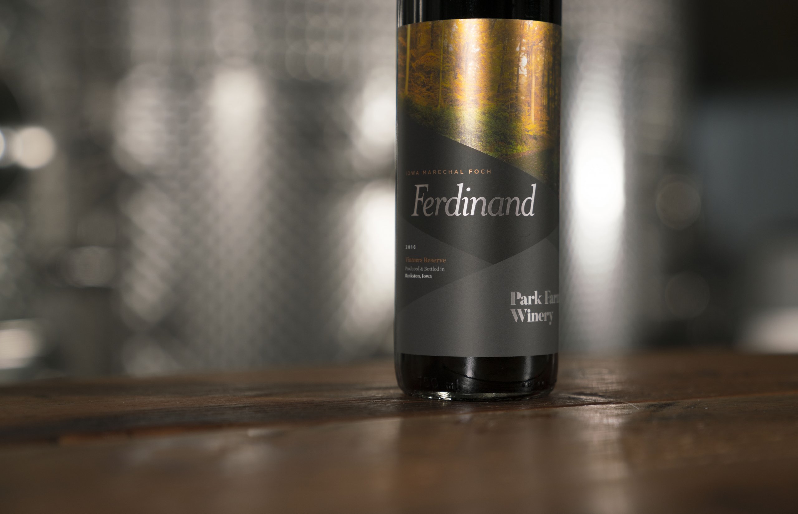
Play with Colors and Utilize White Space
Don’t be afraid to use white space or bold colors on your label. Blank space is important because it can improve the readability of your label and makes it easier to focus on your brand first, foremost, and only.
For example, Svedka Vodka doesn’t rely on images of fruit to convey the flavor. Instead, the color of the bottle matches a color associated with the flavor. Rather than reading label after label to find a lime-flavored vodka instead of lemon, the consumer can quickly identify which is which by the yellow and green colors of the bottles. Since the brand name and flavor are in a small text, Svedka relies on color (and lots of it) to tell the story.
Be Obvious, but Don’t State the Obvious
The Gestalt Principle says it’s human nature to fill in the blanks and look for patterns. While you don’t want to create patterns on your label, you do want to tap into the instinctive nature of the consumer wanting to fill in the blanks themselves. With the right label, certain details can be obvious to the consumer what the product is without having to state what it is. That means that you don’t have to write that your product is a sauce on your label if all the other elements can lead the consumer to come to the conclusion that it’s a sauce on their own.
A great minimalism trend is to take a “what you see is what you get” approach. Consider Wagg dog food. Their newly designed packaging clearly states on the front what’s in the dog food and what kind of dog it’s best suited for, but never actually says that it’s dog food.
At the same time, minimalism shouldn’t be so ambiguous that customers don’t know what the product is. Make good use of imagery and try to summarize or get your point across with as few words as possible, like the Wagg dog food.
Stay Consistent with Your Brand
Your label should reflect your brand, which is why many all-natural products and sustainable clothing brands opt for a minimalist label. Fewer words and images can translate into minimal ingredients and a healthier, more conscious product.
Consistency also means implementing similar designs across your different products. This will allow consumers to easily recognize and differentiate your brand from others.
Brand consistency like O’Care, a skincare company, felt it was important to have packaging that reflected a bright, clean look much like the goal of their product. Using bright shapes against a white background, O’Care chose a different color and shape for each of its products. These designs helped maintain a consistent brand theme while still differentiating its products.
Make a Statement and Break the Rules
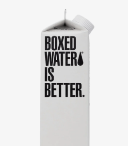
Make the most out of a minimalist design by letting the label make eye-catching, bold claims. After all, minimalism is all about being edgy, and taking a minimalist approach allows some room to play. Boxed Water, for example, put this practice to the test by stating “Boxed Water Is Better” in big, bold text on the package.
When you remove elements that consumers have come to expect, you have some room to play with the rules. You’re able to consider things like eliminating basic product information, making bold claims (like Boxed Water), getting creative with typography (like the natural prepared foods brand Evol), or changing the spelling of words (Surup Cafe). Minimalism doesn’t have to be boring.
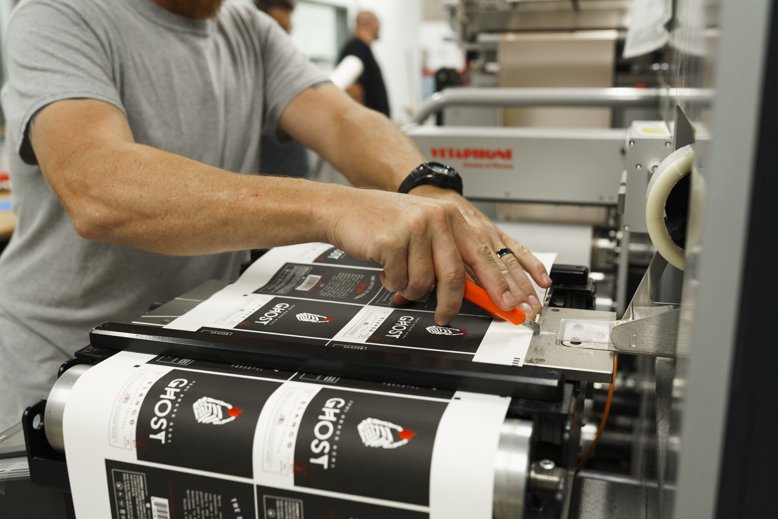
A Simple Way to Get Product Labels
Once you have a minimalist design in place, you still need to find a company that can execute your eye-catching label vision. Blue Label Packaging Company can work with you to determine the best material options and label trends that do justice to your label design. Contact us today to talk to one of our experts.