Choosing the Right Imagery for Your Product Labels: Tips for Effective Design

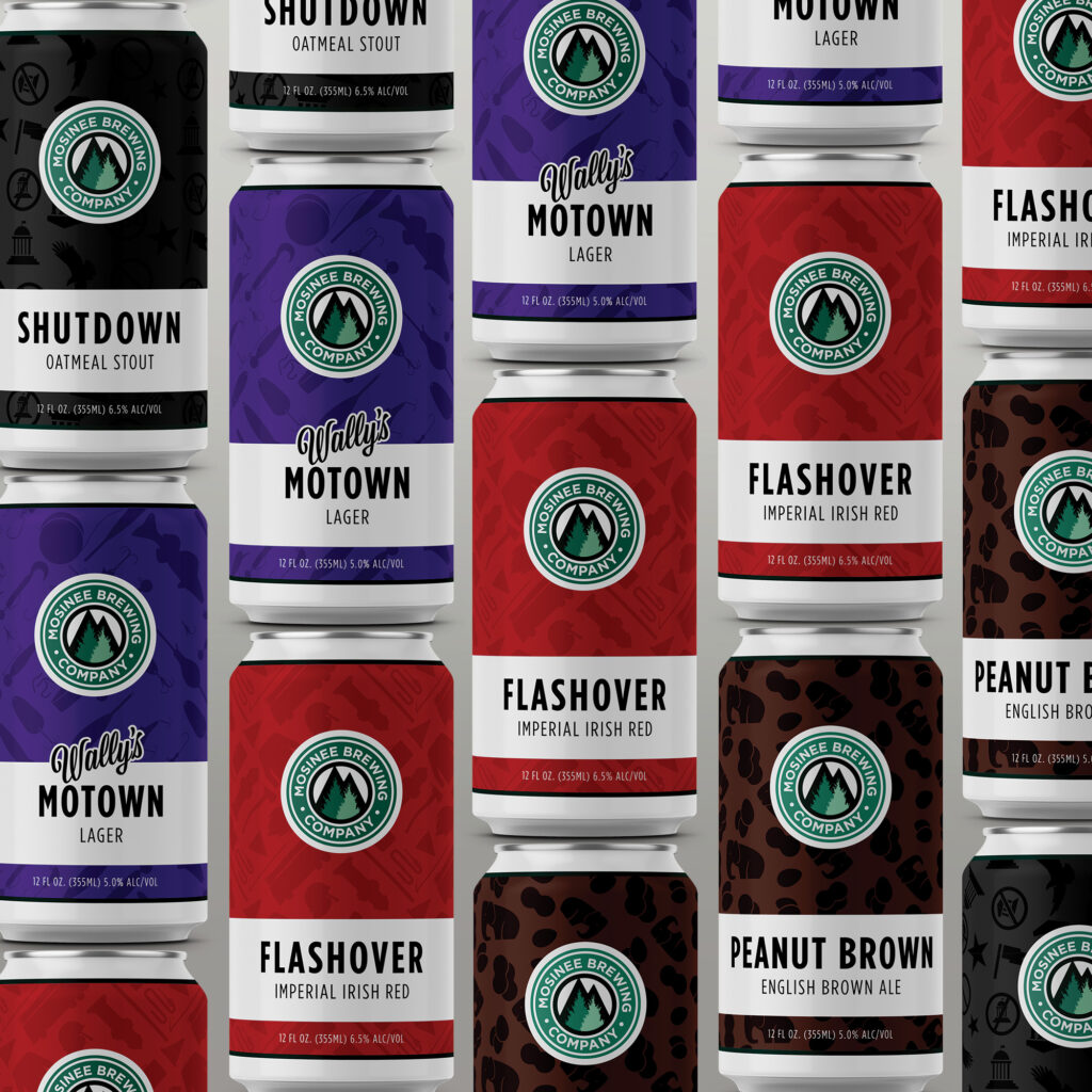
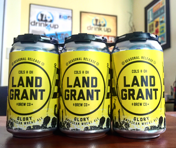
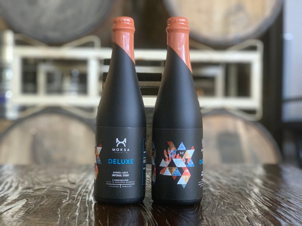
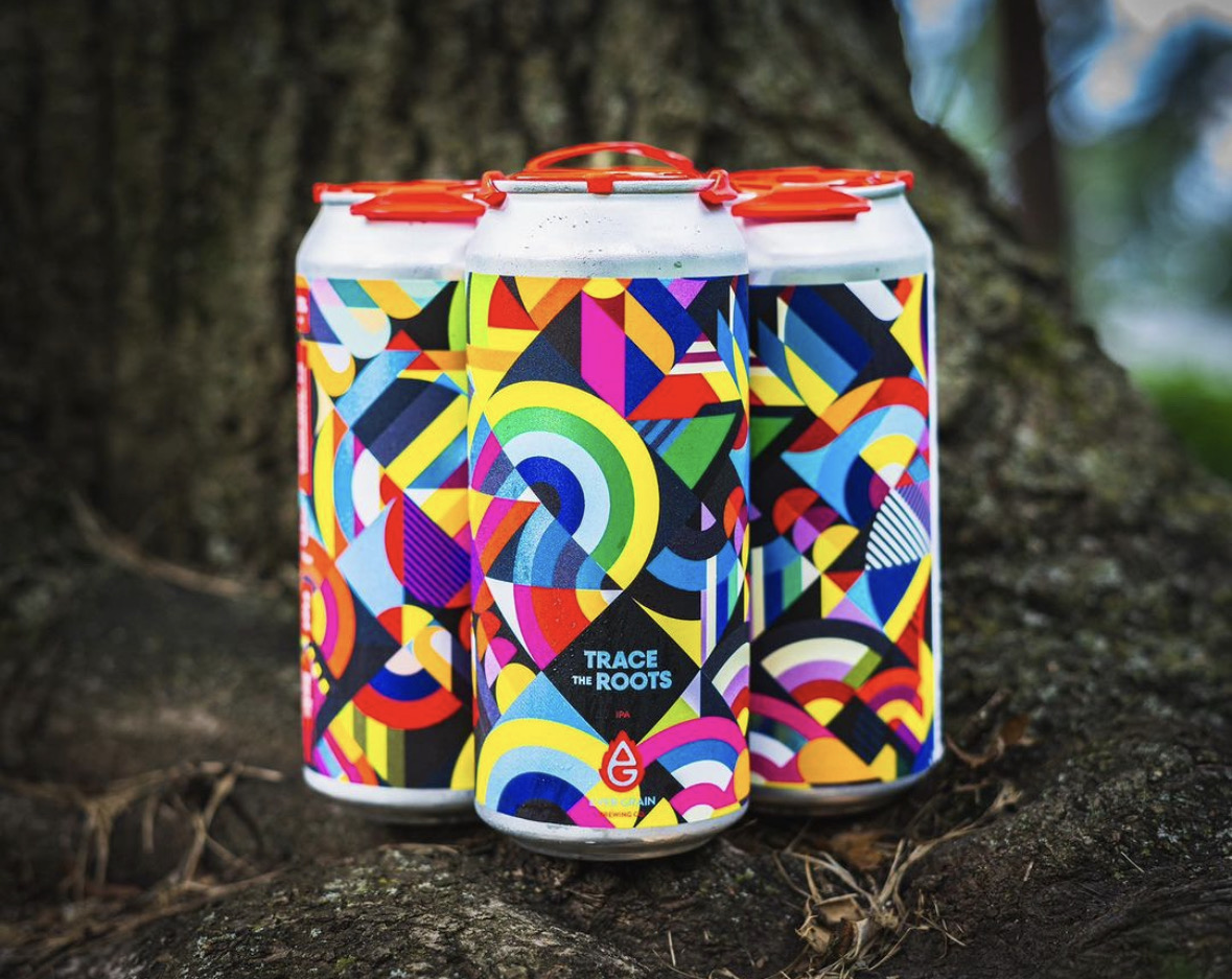
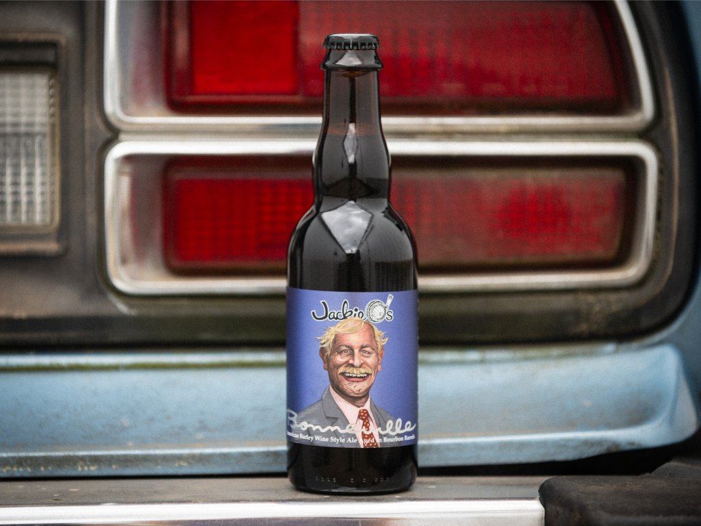
Apple visionary Steve Jobs once said, “Packaging can be theatre. It can create a story.” Imagery examples, such as minimal and bold like those on an Apple product, locally themed and intricate on a craft beer bottle label, or timeless and luxe like the embossed and foiled label on Godiva chocolates, serve as the lead narrator of your brand’s story.

How all-powerful is product label design? How can you level up your existing label with imagery and accents matching your mission and target customer? Let’s explore four key concepts for creating impactful brand imagery.

Beer Cans with Labels

1. The Value of Design and Imagery in Product Labels and Packaging

First Impressions Are Crucial

A product that is new to your customer will only get one shot at grabbing their attention. When your product sits on a physical shelf, the imagery on your label is your brand’s last expression and our customer’s first impression. Studies estimate that 60% of consumers decide in the first 30 seconds! How does imagery help your consumer decide?

Evoke Emotions

Imagery evokes emotions — one of the key catalysts for buying behavior. They influence our buying decisions, preferences, and attitudes toward your brand. According to the Harvard Business Review, “emotional motivators” give a better insight into a customer’s future value than any other metric (including brand awareness and customer satisfaction), making them a key driver of growth and profitability.

For example, Nike’s imagery of athletes pushing the limit can spark inspiration and motivation, while depictions of happy people can lend themselves to joy and nostalgia.

Your Label as Brand Narrator

Labels and the imagery you choose to create a visual narrative about your company will shape how your business is perceived. It is your brand’s story and intention in a nutshell, and it should align with your brand identity by bringing photography, illustration, or both together.

You Get One Shot — or 313 Milliseconds — at a First Impression

Your label should provide clarity and relevance. It should act as a key building block to trust building. A visually striking package can capture attention quickly, making it more likely that people will pick up your product out of curiosity and interest. That initial spark of attraction — which one study says can happen in as little as 313 milliseconds — is often the first step toward a purchase decision.

Catch the Attention of New Adaptors

Strong imagery allows your label to attract new customers unfamiliar with your brand. Impactful visuals allow your product to project itself on a shelf amongst a sea of competing items. This gets the attention of new adaptors, who will then go on to evaluate whether this product solves a problem or fulfills a want or need.

2. Eye-Catching Appeal: How to Use Imagery in Label and Packaging Design

Beer can with photography

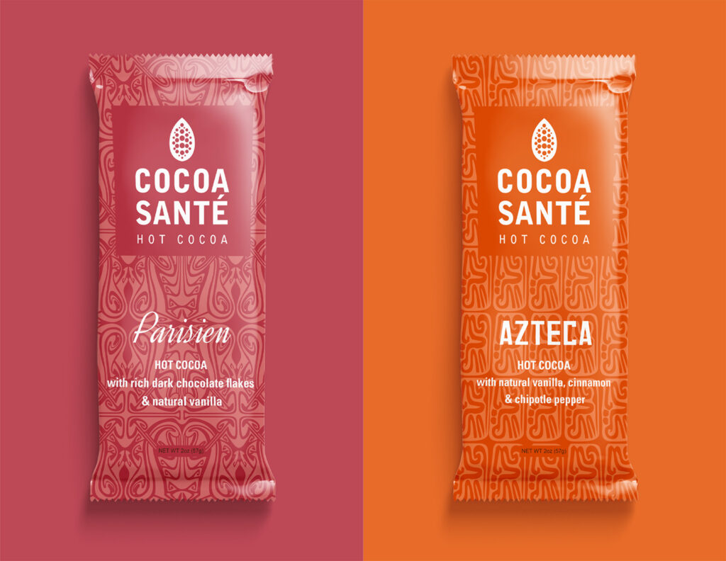
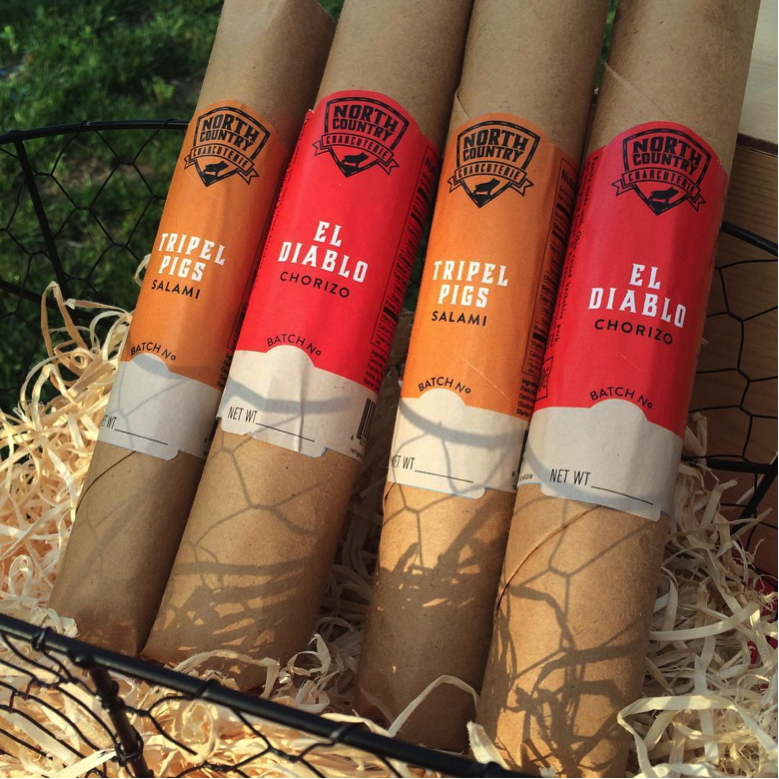
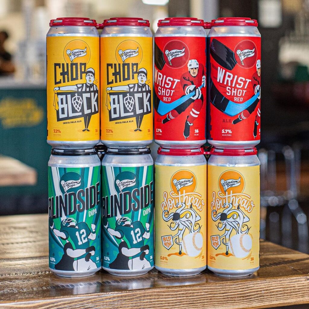
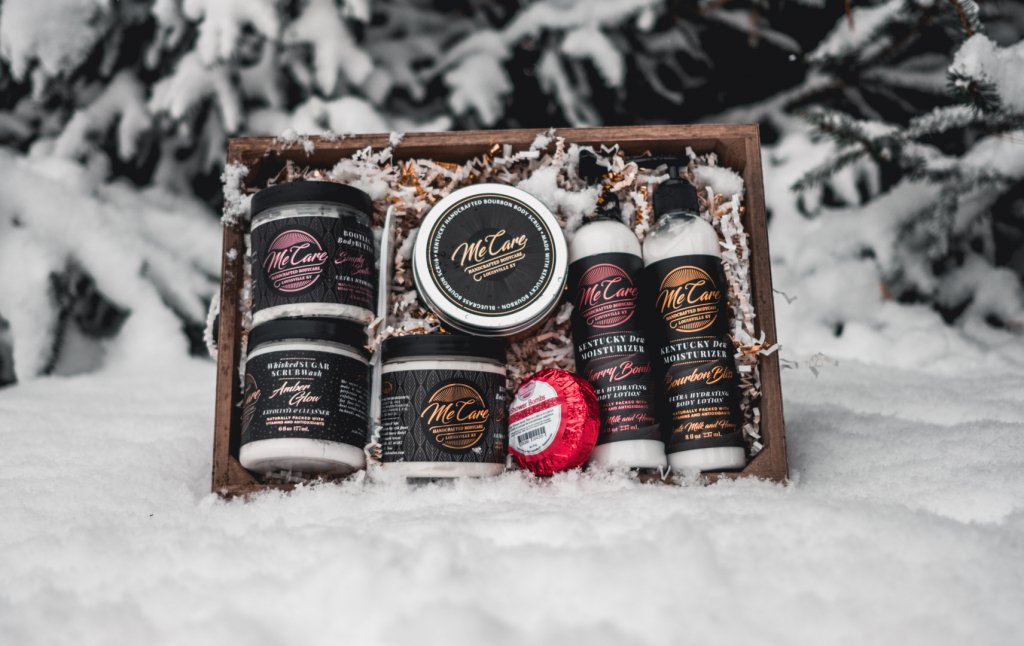
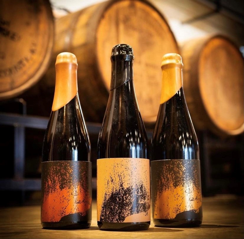
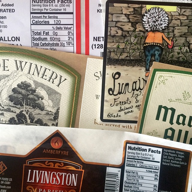
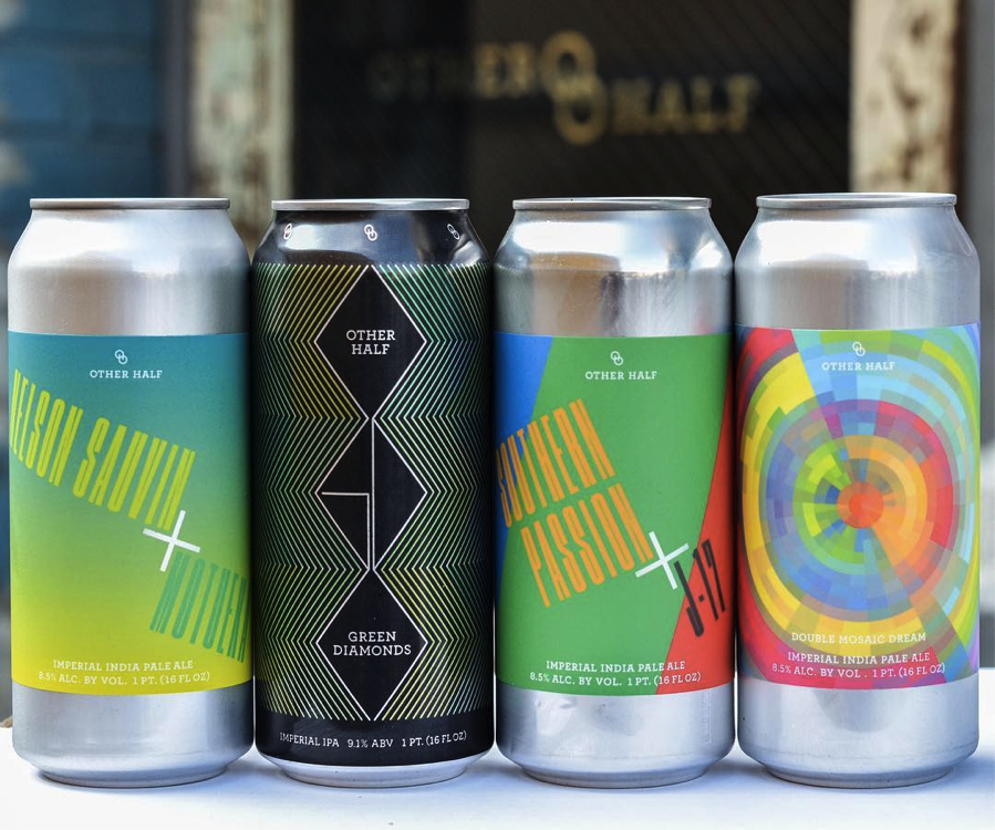
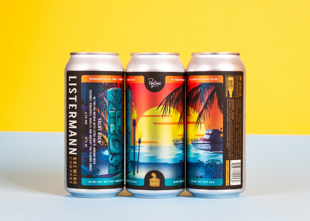
Photography vs. Illustration

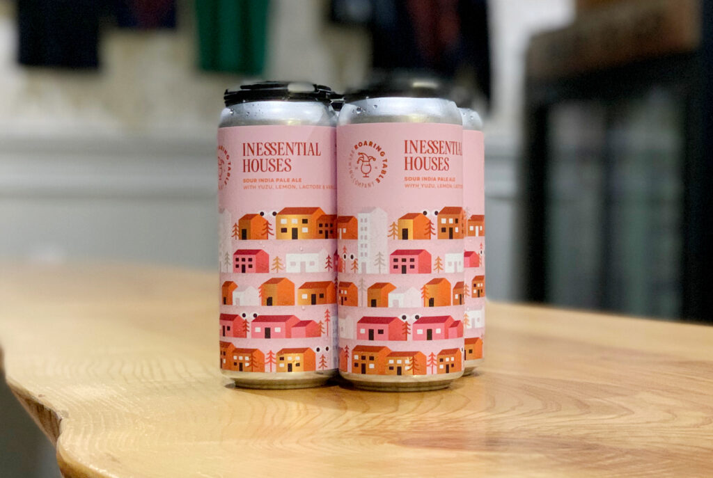
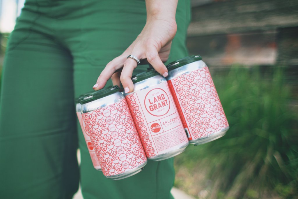
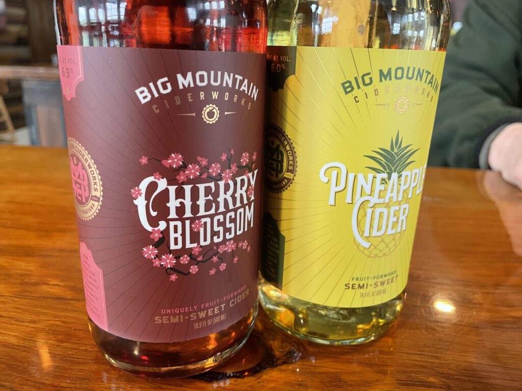
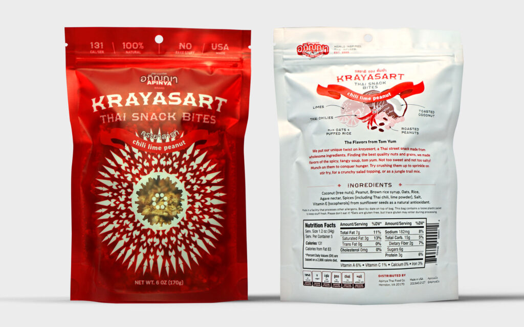
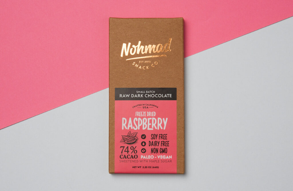
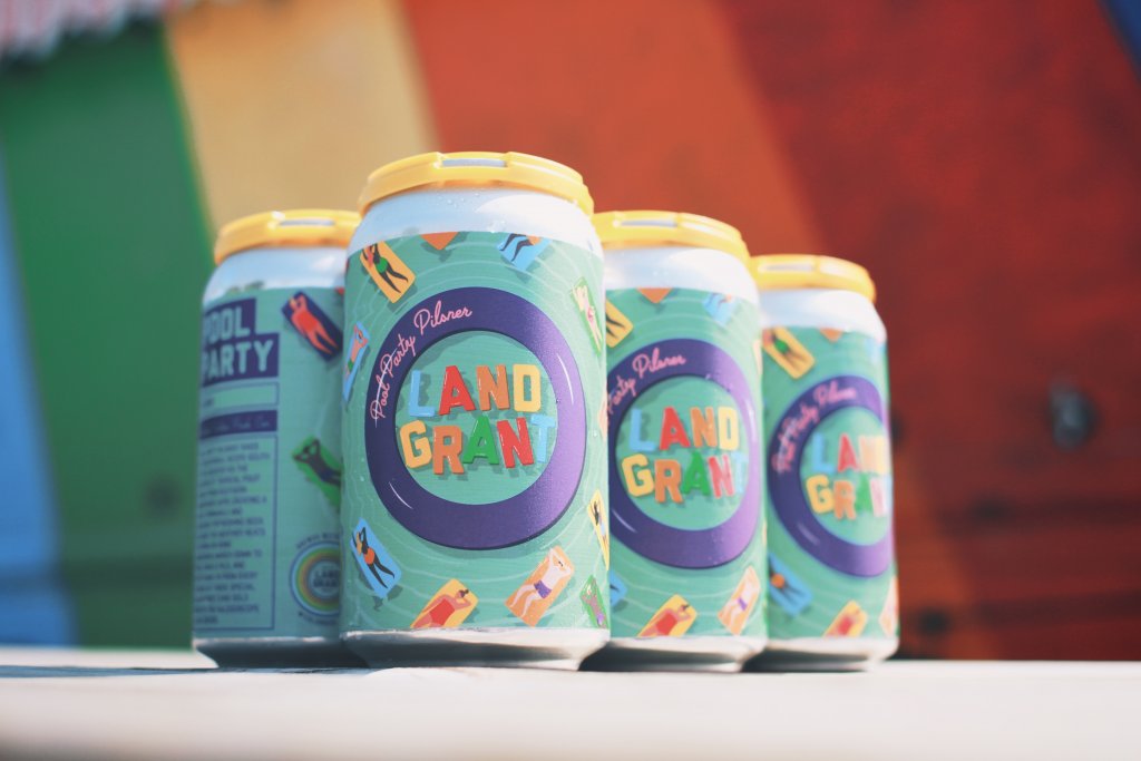
When should you use photography over illustration? Can you use both in a label design for your product? Real product photography works best for food, beverage, and beauty products where trust and authenticity are important. Illustrations are ideal for abstract or complex concepts — the kind of label where the consumer could look several times and still see different details. Adding illustrations to photography can help fill the gaps for any information the photo doesn’t project.

Beer can with typography

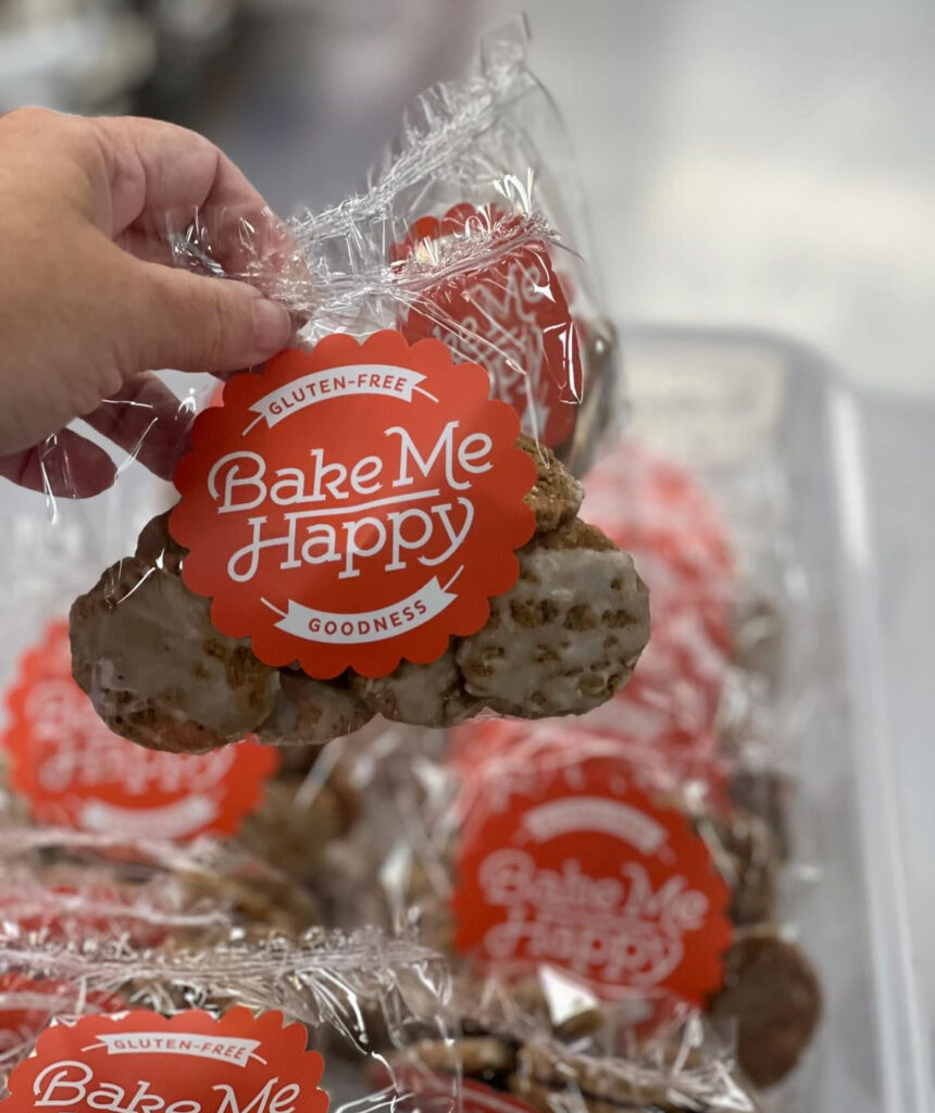
Typography as Imagery

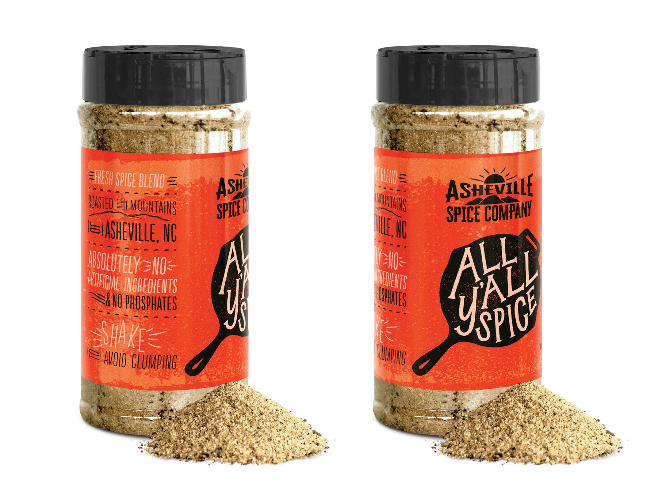
Fonts and text placement are the unsung heroes of label design. Bold, creative fonts can become as much a part of the main visual as photography and illustration. Delicate fonts can message sophistication and elegance or become a decorative element. Fonts are also functional, guiding the customer’s eye to important information.

Visual Hierarchy

As we mentioned above, you may have less than a second to talk to a prospective customer. Organizing the label so that imagery, text, and key product information like features and benefits are easily scannable is key to getting your message across quickly and concisely.

beer cans with pattern on label

Textures and Patterns

Your label may be one-dimensional, but your design doesn’t have to be. Textures can convey a message with just as much impact as imagery. Adding a tactile touch through raised UV coating used in screen printing or embossing can give a luxurious feel.

Visual patterns in your design through debossing or foiling can complement imagery, enhance appeal, and create a sensory connection.

Complimentary colors on labels

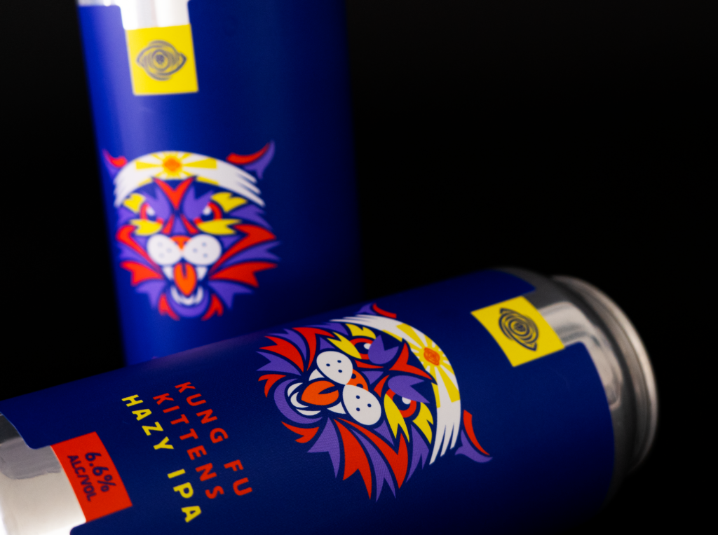
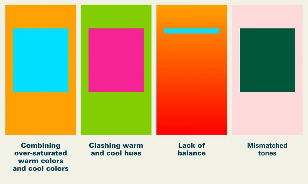
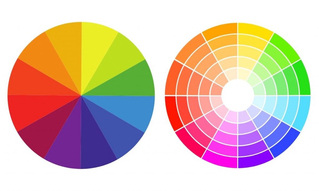
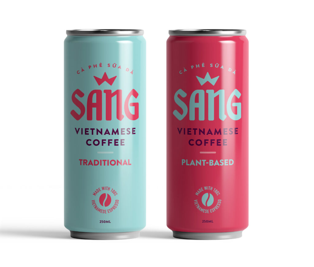
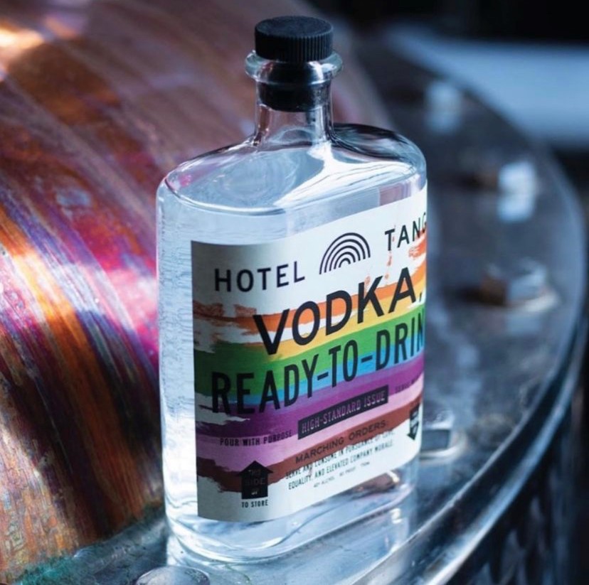
Complementary Use of Color

Colors have a psychological impact on our buying. This feeling can trigger the emotions we touched on above. Color experts recommend these colors to enhance the impact of your imagery.

  • Green is associated with joy, tranquility, and nature.
  • White is calming and conveys a sense of cleanliness. It tends to make individuals feel safe.
  • Black is linked to stability and intelligence, sophistication and elegance.
  • Blue inspires creativity and joy; different shades encourage trust and dependability.
  • Orange signifies energy, appetite, and a sense of adventure.

3. Building Trust & Authenticity

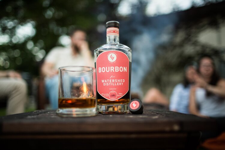
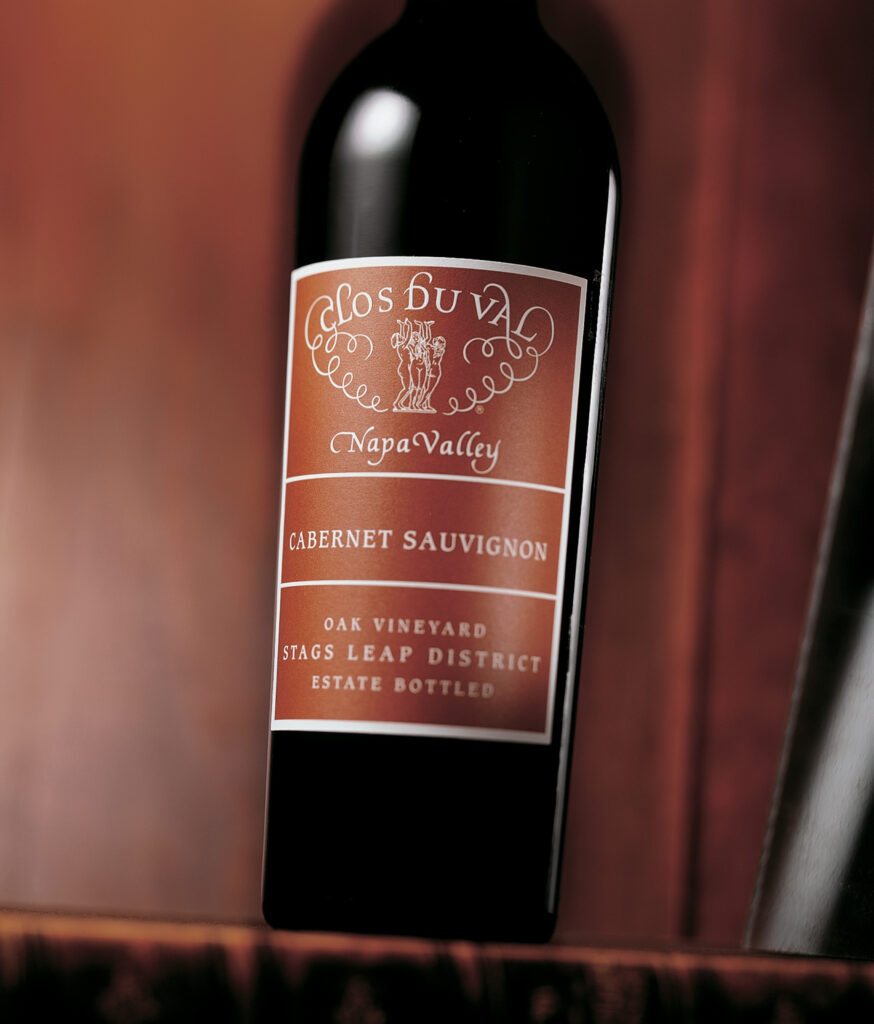
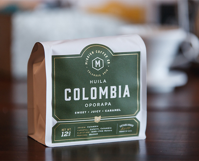
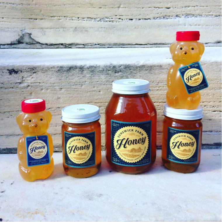
Real Product Photography

The first step in gaining consumer trust? Using real product photography, especially in industries like food and beauty, where authenticity is critical. Customers are more consumer savvy than ever and can spot shortcuts, which can build distrust.

Authentic Representation

Building on using real product photos, you can ensure authentic representation by using photographic or illustrated imagery that realistically reflects what’s inside the package. Fool them once, and well — there might not be another time.

Honey storage container with custom lables

Transparency in Packaging

Discerning customers want to know where their money is going, and a window directly into the product can help! Consider transparent or partially clear packaging to show the actual product and establish trust through honest representation.

4. How Material Choices and Embellishments Can Make Imagery Stand Out

Give your customers a full sensory experience. Materials like the wide range offered by Blue Label Packaging are as important as the images on them. Glossy, matte, or textured labels give different qualities to the appearance of imagery, user experience, and overall impact.

Rye Whiskey bottle with custom label

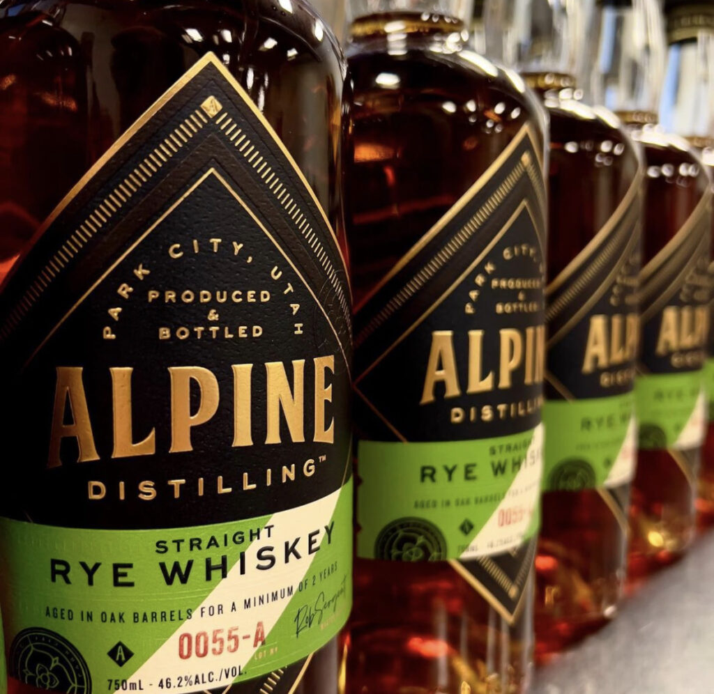
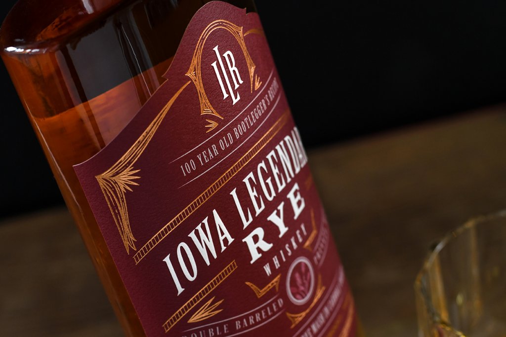
Embossing, Debossing, and Foil Stamping

These are all excellent accent techniques to add to any product packaging design. They help draw attention to certain priority areas of a label, like the brand name and logo. Features like embossing and debossing can also add depth to the design. Shiny and reflective foil stamping enhances visual appeal by highlighting specific features, such as logos, text, images, and borders.

Let Blue Label Packaging Bring Your Imagery to Life

Well-thought imagery plays a big role in attracting new customers and significantly impacting profitability. What is the key to selecting the right imagery? It truly lies in understanding both your product and the style that aligns with your brand’s identity and also resonates with your target audience.

Remember — it’s not just about aesthetics and what’s trendy. Quite the opposite, it’s about standing apart from the rest and crafting a memorable visual narrative that resonates with your audience.

Blue Label Packaging can help you curate the perfect custom label that will best suit your imagery and user experience. Check out our designer directory, get a sample pack, or request a quote today!

These Color Combos Could Be Hurting Your Labels—Here’s What to Know

In the aisles of supermarkets and product listings online, label design plays an important role in catching the consumer’s eye. For businesses in food, beverage, and consumer goods industries, a well-designed label can elevate your product from shelf space to a memorable brand.

Enter color psychology—the science that taps into how colors affect our perceptions and behaviors. Specific hues can trigger an appetite, convey freshness, or even create a sense of trust. This psychological interplay between color and emotion is important for brands trying to resonate with their audience on a deeper level.

With this understanding comes great responsibility—especially when selecting color combinations for packaging design. This guide aims to help you consider color combinations that may not communicate your message effectively so that your labels resonate with consumers and create a lasting impression.

Understanding Color Theory and Color Psychology in Packaging

The Basics of Color Theory

At its heart, color theory is the study of hues, saturation, and brightness—elements that form the foundation of every color we see. Hues give us the rainbow; think reds, blues, greens. Saturation refers to how intense or muted these colors appear, while brightness dictates how light or dark they are.

Color Psychology

Color psychology takes this understanding one step further by exploring how specific colors influence our emotions and behaviors. It’s a powerful tool for packaging design as it taps directly into consumer perceptions. For instance:

  • Red often evokes excitement and appetite—a reason why it’s prevalent in food industries.
  • Blue conveys trustworthiness and reliability making it favored by technology brands.
  • Green is synonymous with health and sustainability appealing to eco-conscious consumers.

Color Combinations to Use with Caution

When it comes to label design, certain color combinations may pose challenges in visibility or readability. Understanding how colors interact and the psychological impact they have on consumers is worth understanding. Below are a few pairings to approach thoughtfully.

Neon Green and Bright Pink

Neon Green and Bright Pink

While each of these colors might be striking individually, together they can create an intense visual experience. This combination often feels highly saturated and may overwhelm the viewer, making it harder to focus on product details.

Consideration:. If you are not looking to be perceived as more bold or “loud”, consider ways to balance these vibrant tones by adding in neutral accents or contrasts. 

Red and Green

Red and Green (Without Careful Contrast)

Red and green can be a powerful combination, but it’s important to consider contrast. These colors can be challenging for individuals with red-green color blindness and might evoke strong seasonal associations, which could affect year-round appeal.

Consideration: Consider using strong contrast between these two hues to enhance accessibility and clarity for all consumers.

Dark Blue on Black

Dark Blue on Black

Both dark blue and black are often associated with elegance and professionalism. However, when paired together without sufficient contrast, the result can be difficult to read—especially in retail environments where consumers see a product for a few short seconds.

Consideration: Using contrast between text and background can improve readability, allowing your label and its messaging to be more effectively communicated.

Bright Yellow on White

Bright Yellow on White

This combination can suffer from low contrast, which may make text and details hard to discern, especially under certain lighting conditions.

Accessibility Considerations:

Accessibility Consideration: Approximately 1 in 12 men and 1 in 200 women experience some form of color blindness. Choosing color combinations with sufficient contrast ensures that all customers can read and engage with your product effectively.

Common Mistakes and How to Avoid Them

Color Schemes

Overcomplicating Color Schemes

A complex palette with too many colors can dilute your message, making it harder for consumers to understand your brand identity.

Tip: Sticking to a core set of three to four hues makes your label clear and reinforces your brand without overwhelming the customer.

Ignoring Market Research

Cultural and industry-specific preferences can influence how colors are perceived by different audiences. What works in one market may not translate well in another.

Tip: Conduct market research to tailor your label designs to your target demographic. This will help your color choices align with consumer expectations and cultural nuances.

Forgetting About Compliance Regulations

Certain industries, such as food and beverage, have strict guidelines regarding labeling. These guidelines often extend to readability, contrast, and visibility.

Tip: Familiarize yourself with relevant industry standards early in the design process. This helps you balance regulatory requirements with aesthetic goals.

Chasing Trends at Expense Timelessness

Trends can be enticing, but they also may fade quickly. Balancing timeless design elements with subtle trend influences can keep your packaging fresh without risking it becoming dated.

Tip: Incorporate classic design elements like minimalist layouts, complemented by trendy accents that can be updated over time.

Strategies for Choosing the Right Color Combinations

Navigating the color spectrum effectively can transform a good label design into an unforgettable one. Here’s how to ensure your selections resonate well with consumers and amplify your product’s appeal.

Color Wheel

Harnessing the Color Wheel

The color wheel isn’t just an artist’s tool; it’s a fundamental guide for selecting colors that work in harmony.

  • Complementary Colors: Located directly opposite each other on the wheel, these combinations stand out due to their high contrast while maintaining balance.
  • Analogous Colors: These are colors next to each other on the wheel, sharing similar hues which create a serene and comfortable design.

Tip: Use complementary colors for elements you wish to highlight (like logos or call-to-actions) and analogous schemes for background or less prominent features.

Navigating the Challenges of Sustainability and Color Selection

The intersection between color selection for packaging and its impact on recycling and eco-friendliness presents unique challenges but also opens opportunities for innovation.

The Impact of Colors on Sustainability

Color selection can influence the recyclability of inner packaging. For example, certain bright or dark dyes used in plastics may interfere with sorting mechanisms in recycling facilities, reducing the material’s overall recyclability. 

Strategies for Eco-Friendly Choices for Inner Packaging

  • Opting for Lighter Shades: Lighter colors for plastics and inner packaging are often easier to process in recycling plants and typically require less dye, which may contribute to more sustainable packaging.
  • Choosing Natural Dyes: Where possible, using natural plant-based dyes can provide vibrant hues without the environmental impact of synthetic dyes.
  • Material Matters: Beyond the colors themselves, it’s important to consider the materials being used. Biodegradable and compostable materials should be prioritized to ensure that the entire packaging aligns with eco-friendly initiatives, from the ink to the substrate.

Next Steps

We’ve explored how certain color combinations can present challenges in terms of readability and consumer opinion. These considerations aren’t just about avoiding specific combinations, but about improving your product’s appeal through accessible and visually effective design.

At Blue Label Packaging, our expert team understands the nuances of color and how to help you create labels that resonate with your audience.

Browse through our portfolio to discover a world of possibilities for your product labels.

Red Labels That Inspire: A Gallery of Designs for Red Product Labels

Red is the color of passion, power, and unshakable confidence—and when it’s used on a label, it has the ability to make products pop off the shelves. The color red can make a product feel bold and fiery or rich and refined. In this post, we’re diving into some inspiring examples of red labels that demand attention, connect with customers, and leave a lasting impression.

Cocoa Santé Hot Cocoa

The deep red on the Cocoa Santé Parisien label grabs your attention instantly—it’s bold, luxurious, and exudes warmth and indulgence. It’s the kind of color that makes you feel like you’re about to unwrap something truly special, setting the perfect tone for a Parisian-inspired cocoa experience.

Bake Me Happy Baked Goods

The bright, cheerful red of the Bake Me Happy label is impossible to miss—it’s fun, welcoming, and gives off a sense of homemade joy. Paired with the playful scalloped edge and friendly typography, it’s like the packaging is saying, “Yes, it’s gluten-free, but it’s also packed with pure happiness!”

Baked cookies with custom labels

Iowa Legendary Rye Whiskey

The deep, rich red of the Iowa Legendary Rye label is sophisticated, and gives nod to its storied 100-year history, drawing you into the bootlegger’s era. With its bold typography and intricate golden accents, the design evokes craftsmanship and legacy.

Rye Whiskey Label

Mosinee Brewing Company’s Flashover Imperial Irish Red

The fiery red design of Mosinee Brewing Company’s Flashover Imperial Irish Red cans gives off intensity and energy, echoing the bold, full-bodied flavor inside. The subtle textured pattern adds depth and character, making this can unforgettable.

Roaring Table Brewing’s Inessential Houses IPA

The playful pink palette and charming illustrations on Roaring Table Brewing’s Inessential Houses can make it feel like you’re strolling through a vibrant, whimsical neighborhood. The design is as refreshing and unexpected as the Sour IPA inside.

Land Grant’s Splendid Berry Brut

The bright, playful red and intricate patterns on Land Grant’s Jeni’s Splendid cans mirrors the creativity and sweetness of its collaboration with Jeni’s Splendid Ice Creams. The design feels like a joyful celebration in a can—inviting, fun, and as delightful as the treat-inspired beer inside.

Watershed Distillery Bourbon

The bold red label on Watershed Distillery’s bourbon strikes the perfect balance between modern simplicity and timeless warmth, drawing attention to its refined craftsmanship. It’s a design that feels right at home at any gathering—inviting, approachable, and as smooth as the bourbon it represents.

North Country Charcuterie

The fiery red labels for North Country Charcuterie’s El Diablo Chorizo demand attention with their bold and spicy energy, channeling the heat-packed flavor inside. The clean typography and rustic packaging create an artisanal charm.

Custom food label for North Country

Stadium Pizza Write Shot Red

The bold red labels for Stadium Pizza’s Wrist Shot Red amber ale hit the mark with their energetic hockey-inspired design. The striking colors and dynamic illustration make this brew feel like a power play for your taste buds, perfect for game day or any day.

Cà Phê Sữa Đá Sang Vietnamese Coffee

The vibrant red label on Sang Vietnamese Coffee’s plant-based can is bold, modern, and full of energy. Paired with the minty green/blue typography, it’s a fresh twist on tradition that grabs your attention and promises a creamy, plant-powered coffee experience.

Clos du Val Cabernet Sauvignon

The rich, earthy tones of the Clos du Val Cabernet Sauvignon label evoke elegance and timeless sophistication, capturing the essence of Napa Valley’s craftsmanship. With its delicate script and balanced design, the label feels as refined and complex as the wine itself.

Wine bottle with red label

Big Mountain Ciderworks Cherry Blossom Cider

The Big Mountain Ciderworks Cherry Blossom label features a rich cherry-red background adorned with delicate floral accents that evoke freshness and sophistication. The interplay of bold typography and soft blossom imagery creates a perfect harmony, much like the semi-sweet cider inside.

bottle with custom cider labels

Krayasart Thai snack bites

The vibrant red packaging of Krayasart Thai Snack Bites demands attention with its intricate, mandala-inspired design that radiates energy and cultural authenticity. Perfectly complementing the bold chili-lime peanut flavor, this packaging promises a snack experience that’s as dynamic and exciting as its appearance suggests.

Specialty food packages with custom labels

Nomad Snack Company’s Raw Dark Chocolate Bars

The Nomad Snack Company raw dark chocolate bar packaging is a perfect blend of rustic charm and modern flair. With its kraft paper base and vibrant pink accent, it feels natural and handcrafted, while the copper foil logo adds a luxurious touch.

chocolate box with custom label

Asheville Spice Company All Y’All Spice

The bold orange/red label for Asheville Spice Company’s All Y’All Spice is as vibrant and flavorful as the blend itself, capturing the warmth of southern charm and the zest of its mountain-roasted ingredients. With its playful skillet graphic and hand-drawn typography, this packaging promises an authentic and lively seasoning experience.

Spice Seasoning Jars with Labels

4 Ways Labels Improve Consumer Perception of Product Quality

It’s no surprise that the typical consumer is looking to high quality products. The problem is that you don’t have a lot of time to make an impression. Customers take an average of 13 seconds to make a purchase decision, so it’s essential to make sure your goods stand out compared to competing products.

Fortunately, a good product label makes a direct impact on how potential customers view your products. Here are four ways that your labels can improve the perceived quality of your products.

Mind the Materials

Think of your label material as your product’s coat – an attractive topcoat is going to exude more class and luxury than a basic windbreaker. Your choice of label material makes a direct impact in how consumers perceive your product. If you’re aiming to convey the quality of your product, you’ll want to match your product with the right material.

Of course, the right type of “quality” material depends greatly on your product. Some product need to look expensive to present themselves as quality goods, which is why textured and matte-coated paper stocks are excellent choices for wine labels and other products that need to radiate elegance. Meanwhile, a shrink sleeve can create a very professional, 360-degree look that appears very official and clean.

Simply put, your material needs to both look good and match the vibe of your product. By combining those factors, your labels will be set up for a great introduction for customers seeking quality products.

A slection of Me Care products with quality labels.

Color Them Impressed

The right color can help sway consumers to your side. More than 90% of buying decisions are impacted by visual factors. What’s more is that different color choices impact how people perceive your products. By utilizing certain colors in your label design, you can present your product in the right light.

Of course, there are always exceptions based on your particular product and your intended audience. Different genders have varying color preferences, so purple packaging tends to be more effective for women, while men gravitate toward striking black labels. You’ll want to tailor your color choices to your brand, market, and audience, but the right combinations can help you communicate quality before people ever touch your product.

Elevate Your Packaging Through Decoration

A little decoration goes a long way toward people’s perception of product quality. Remember that coat analogy earlier? Decorations are the little touches that enhance your look – tailoring, embroidering, etc. Decorative additions can completely overhaul how people view your product, which is why the following capabilities can help showcase product quality.

Each of these processes allow you to add new, intriguing elements to the look and feel of your label. An embossed pattern or soft touch varnish give customers a different tactile experience. Stamping metallic, holographic, and other foils add a new dimension that takes your packaging to a new level. Adding these extra details takes your packaging beyond that of a simple, boring label. That extra attention to detail isn’t lost on customers.

Eliminate Label Damage and Application Issues

Even the best labels can be derailed by a simple defect. It’s hard to convey quality you’re your label is damaged or has visible application issues. It’s like that proverbial coat we keep mentioning – a visible tear is going to overshadow even the snazziest jacket.

There are a few measures that companies can take to prevent label damage and defects. Print protection plays a pivotal part in proactively protecting product labels. No matter what type of product you sell, any form of friction could damage your design. Add in potential threats like water, oil, and other substances make print protection essential for defending your product labels.

As for application issues like air bubbles, wrinkles, and more, it’s important to work with your label printing and applicating partners to identify potential issues ahead of time. There are plenty of potential reasons for label application defects, so you’ll want to address the following factors.

  • The container – Your container’s dimensions and surface can lead to issues. For example, you may need to properly taper your label or use a specific adhesive for different types of containers.
  • The applicating environment – Factors like temperature, moisture, and potential contamination can all dictate which materials and adhesives will best help you avoid application issues.
  • Liner issues – Different applicators are built for paper or clear liners, so you’ll need to identify which is best suited for your process.
  • Improper storage – It’s best to store labels in a temperature controlled environment based on your specific label. This is especially true for shrink sleeves, as they are more susceptible to potential damage prior to application.

A trio of stunning bottle labels that convery the perception of product quality.

Showcase the Quality of Your Products with Stunning Labels

The right label makes a direct impact on driving consumer behavior, but it takes a good printing partner to turn your designs into a reality. Blue Label combines state-of-the-art digital printing technology with unmatched customer service to enhance your labels and showcase the quality customers want to see in their products.

Want to elevate your product packaging? Contact us today to get the stunning labels and unmatched customer service your products deserve.

5 Product Label Design Tips to Elevate Your Packaging

Coming up with the perfect label design is a challenge in itself. When it comes to designing a product label, there are things to consider that, perhaps, not just any designer can do. Let’s break down a five notable design tips that can help you take your packaging to the next level.

Product Label Design Should Be Honest

A colorful product label design for Hotel Tango vodka.

Any designer might default to trying to depict a product in its most desirable and flawless state, but an experienced product label designer knows that it’s essential to honestly represent a product. Your design is supposed to tell your product’s story, not fabricate a misleading fable.

The imagery and messaging on your label should be, to the best of your ability, an accurate representation of what consumers will find inside of the packaging. This need for honesty is especially true when design food labels or any other products people will consume or use for their body. You know your product best, so make sure your design properly represents what you sell and how it should make customers feel.

If you still think this a little deception is fine, just consider what can happen. Even if your label gets someone to buy your product once, that individual will quickly snuff out that your packaging design wasn’t quite so honest about its contents. That one-and-done customer won’t be giving you any more money. What’s worse is that a slighted consumer may tell others that your product is misleading.

That scenario represents quite an unfortunate spiral thanks to a misleading packaging label design. That’s why we suggest being as transparent with your packaging design – and we’re talking about more than just clear labels. You make a good product, so make sure your packaging properly represents your work.

Product Label Design Must Take Legalities into Account

It’s okay to push boundaries with your design, but your label must follow any applicable federal or state regulations. Several products are regulated by various government entities, so there’s a good chance some organization will have a say in what you include in your design.

For example, the Alcoholic Beverage Labeling Act requires that alcoholic beverages carry a government warning, among other things, telling pregnant women of the effects of drinking, and regular consumers of the health risks. The penalties for violating this act can be a fine in the tens of thousands of dollars. As such, you’ll want you brush up on your Alcohol and Tobacco Tax and Trade Bureau (TTB) regulations to make sure your design is up to date with legal standards.

Beer is far from the only product that needs to incorporate legal guidelines into its packaging label design. Wine labels, spirit labels, food labels, health and beauty labels, and so many more all carry some sort of legal requirement to communicate ingredients, warnings, or risks with consumers.

Your Product’s Design Has to Fly Off Shelves

There’s always competition. Regardless of which product is being designed for, it must exist on a shelf, in an online store, or somewhere else with all of its rivals. That’s no small task while still staying true to the product, the brand, and labeling regulations. Still there are ways that your design can keep a unique quality that differentiates it from its shelf-neighbors.

  • Use different font types to evoke specific emotions and quickly portray your product and brand’s personality.
  • 90 percent of information transmitted to the brain is visual, so incorporate imagery to your product label design can help it get noticed.
  • Utilize color psychology and contrasts to develop a striking color palette that evokes certain moods and feelings and competitively positions your product in a visual market.
  • Enhance your design in cool, creative ways with embossing, hot foil stamping, and other label decorations that turn your product into a visual spectacle.
  • Build in white space to embrace minimalism or space out certain aspects of your design to make them more legible.

Those are just some of the ways that you can amp up your label design, and there are so many opportunities to outshine your competitors. Need some inspiration? Check out some of our favorite examples of outstanding labels here.

Product Packaging Should be Extensible

A good product label design shouldn’t focus on the present alone. It’s important to keep your label design open to variation for future product extensions as well. No matter your industry, your design should be flexible enough to accommodate expansion into several subsets if that’s a possibility in the future.

One way to prepare for multiple SKUs is to create a templated design. This approach will help you maintain an instantly recognizable identity while giving you to adapt specific details for individual products. You’ll also need to account for one of the least flashy elements of a label – the barcode. Barcodes and UPCs are important for any product, but you’ll need to keep track of each UPC to avoid duplication of numbers for different SKUs.

Product Label Design Must Speak to Digital Printing Machinery

Digital label printing equipment for printing product label designs.

A great custom label design is just the first step toward stellar packaging. Somebody needs to take that design and turn it into a real, eye-catching product label. That’s where the right label printing company comes into play.

At Blue Label, we use state-of-the-art digital printing technology to make the most out of your design. We can combine the quality, scalability, and cost-savings of digital printing with flexographic finishing capabilities to help you enhance your product label design so that you can attract attention. Our experts work directly with you to identify new opportunities and address potential issues throughout the process so that you invest in the best, most cost-effective labels for your company.

Ready for a design and printing process that can’t be beat? No matter the size or budget of your project, we can make the process work for you. Browse our directory of Blue Label Approved Label Designers to find the perfect professional designer for you. Already have a design ready? Contact us when it’s time to work on your next label project.

How to Use Color Effectively in Beer Label Design: 5 Key Factors

When you only have a few seconds to catch a consumer’s eye, it’s imperative that your beer label is on point. Creative, compelling color choices can make your beers stand out among the competition. However, those same colors can pose problems if you’re not careful. Here are five ways that you can use colors to get the most out of your beer labels.

Create the Right Impression

Your color choices play a vital role in beer label design. The colors you use not only allow you to create a recognizable brand for all your different brews, but also influence consumers’ emotions through positive association.

You’ll want to identify what type of feeling you want to convey with each product label. For example, you may utilize soothing blues for a smooth lager that’s perfect for a nice, relaxing time on the porch. Meanwhile a dark grey or black can create an air of elegance and class for a high-end imperial stout. Your label is an opportunity to show your beer’s character, and a good color scheme will do just that.

A trio of cans with colorful beer labels.

Don’t Drown Out Your Brand

Whether you want to establish your products as playful, classy, or something else, it’s important to make sure that your color scheme works with your brand. Exciting color combinations are fun, but consumers should be able to identify your brand with each container. Because of this, you’ll want to practice some caution when designing labels for each product.

A big part of beer branding is your logo. You’ll need to decide whether you want your logo to stay the same for every product or modify it to match different color choices. If you choose the former, it’s good practice to make sure your beer can branding and logo won’t clash with your preferred product pigments. If it’s the latter, you’ll just want to ensure that people can still instantly recognize your brand, even if your logo changes colors or versions. Remember, you want your product to stand out, but you don’t want to hide who you are.

Mix and Match Colors Appropriately

Identifying the right colors is a delicate balancing act. Picking and choosing an array of colors that make sense for your various beers without having them clash, create legibility concerns, or cause other brand issues are just a few of the balls you juggle..

There are a couple of different routes you can go with color selection. One method is to focus on contrasts to help emphasize various label elements. This can help make your label visually “pop” to consumers, especially if you use it to highlight a certain aspect of your label. A color wheel can help you identify opposite colors that still work with each other. A second option is to stick with analogous colors that easily flow together. These colors line up next to each other in the color wheel and create a more relaxed feel for your label.

Regardless of which route you choose – or if you opt for a hybrid of the two – it’s important to make sure that people can read your labels. Certain colors may look great together, but dark-on-dark or light-on-light combinations can cause legibility concerns. Try and use some form of contrasting colors for backgrounds and text to make sure the words on your label don’t go to waste.

Beer can label designs using contrasting colors.

Consider the Container

Your beer label plays a critical role in product packaging, but it’s only one piece of the puzzle. Your container can have a major impact in the overall look of your product. For example, one label design may work wonderfully on a clear glass bottle, but could clash with a brown one.

Certain colors schemes may work better for some containers than others, so make sure you consider how your design plays with your cans or bottles. Depending on your container, you may simply opt for a shrink sleeve for complete coverage or a clear label that uses splashes of colors to accentuate your packaging. When done well, your container can even complement your label colors, making your beers look more appealing than before.

Maximize Your Materials

Ink isn’t the only way to create colorful combinations. There are a variety of paper and film label materials that can add a new dimension to your desired color scheme. A black vellum label would be a stunning way to create an elegant background for a high-end beer. Clear labels can help you emphasize your container (or even what’s inside your container). Meanwhile, a holographic film can create a fun contrast to add some glitz and glam to a beer can.

A beer bottle label with a colorful design.

Color Your Customers Impressed with Stunning Beer Labels

In such a competitive market, pristine packaging can put your products on a pedestal. Stunning beer labels start with a stellar design, but it takes the right printing company to turn your vision into a reality.

When you need quality, cost-effective beer labels, Blue Label Packaging can help. Our team has the expertise and state-of-the-art equipment to help you enhance your designs. Contact us today to talk about your beer labels.

From Screen to Product Packaging: How to Make Sure a Label Design will Work in Print

A great label design may look great on a screen, but it won’t mean much if it doesn’t look good in print. Fortunately, there are some steps that you can take to make sure that your design translates to print. Here are some important product packaging design considerations to keep in mind when creating a design for a product label.
(more…)

Designing Beer Labels: Colors and Special Printing Capabilities

The right splash of color or an eye-catching feature can be the key to a successful beer label. Of course, the challenge for a designer is to try and figure out which colors or features make the most sense for the product. Whether you’re trying to decide on the right colors or a special printing capability, here’s what you need to consider.
(more…)

3 Color Psychology Design Insights to Consider For Your Label

Many people believe that color psychology is a key factor to consider when designing your product’s label. The thought of color experts is that colors have the ability to send messages by influencing consumer’s emotions through a stunning label. When color psychology is applied correctly, businesses competitively position themselves in the visual market, which shows the importance of color in packaging.

Color selection, then, is a vital part in the design process of a custom label. Here are 3 color psychology insights that attract customers for your product’s label design.

(more…)