From Screen to Product Packaging: How to Make Sure a Label Design will Work in Print
- aesthetic
- color consistency
- color psychology
- designers
- label design
Consider the Size and Shape of Your Packaging
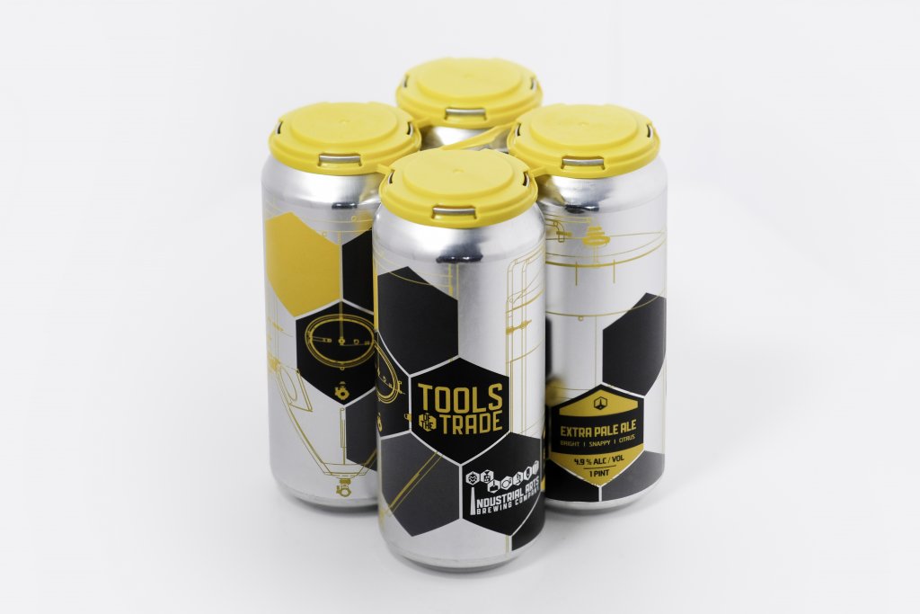
Products come in all shapes and sizes. As a result, you need to take those shapes and sizes into consideration when you design a label for those products.
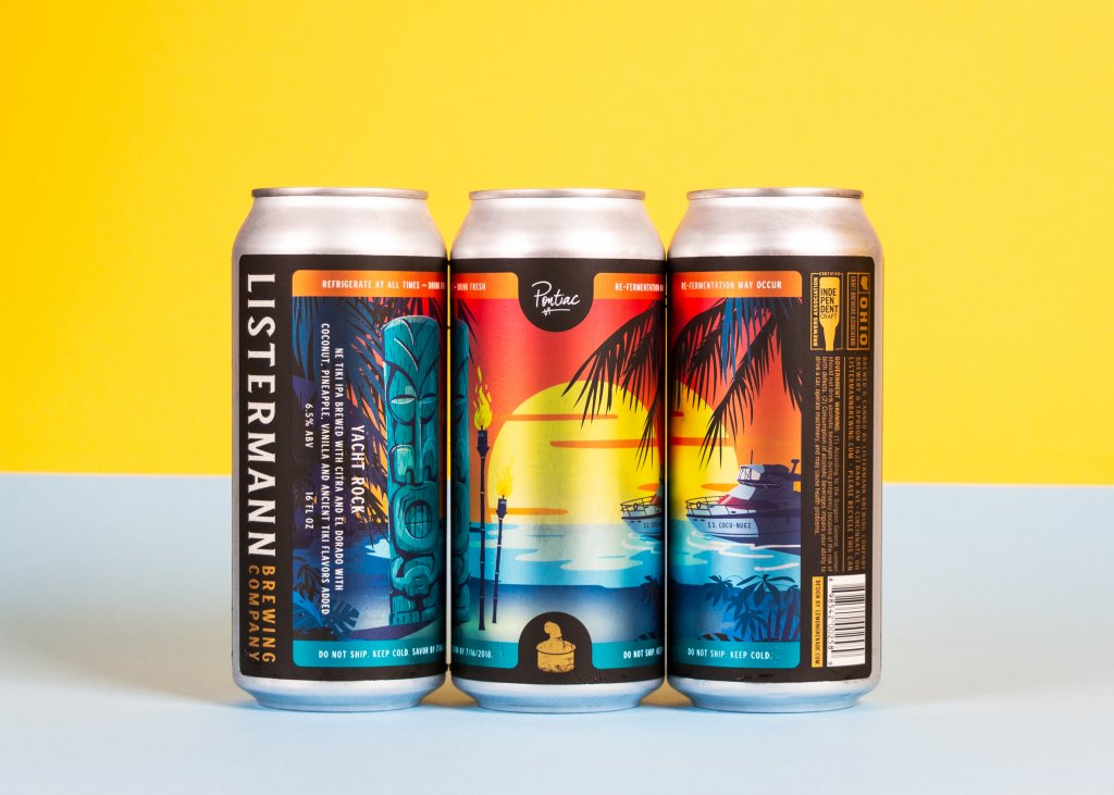
The size of a product container can have a big impact on your design. Not only can the container dictate about how big your label design needs to be, it also places some restrictions on how much you can try to include in your design. For example, labels for vape juice bottles are typically tiny, which leaves some hard decisions involving what’s the best use of that limited space.
The shape of a container can also affect the look of your design. Not every box, bottle, or bag is going to be a normal shape. This means that you should consider which label shapes or dimensions would look best for your product labels. These containers may also impact how your label is seen by consumers, such as how a rounded label will leave parts of the label obscured at certain angles. If you can, get a hold of one of the containers (or the dimensions for them) so that you can see how they can impact how the finished labels will look.
Make Sure the Text is Legible in Print
What’s readable on a computer monitor isn’t necessarily going to be legible on a physical copy. The text on a label needs to be legible from a good distance, whether it’s a brand name, tag line, or some other form of written information. This can call for careful consideration of both font sizes and font colors.
Font size can be a balancing act of sorts. You don’t want to go so small that a label can’t be read by a passing customer in an aisle, but not so large that it overwhelms the rest of your design. In this case, it’s best to try out different sizes and hold them from a distance to get a true sense of what’s the right size for label readability.
Color can also play a key role in text legibility. It’s best to try and contrast the font and background colors to make the text easier to read. A dark-on-dark or light-on-light combination can be difficult to read, especially for fine print on a product.
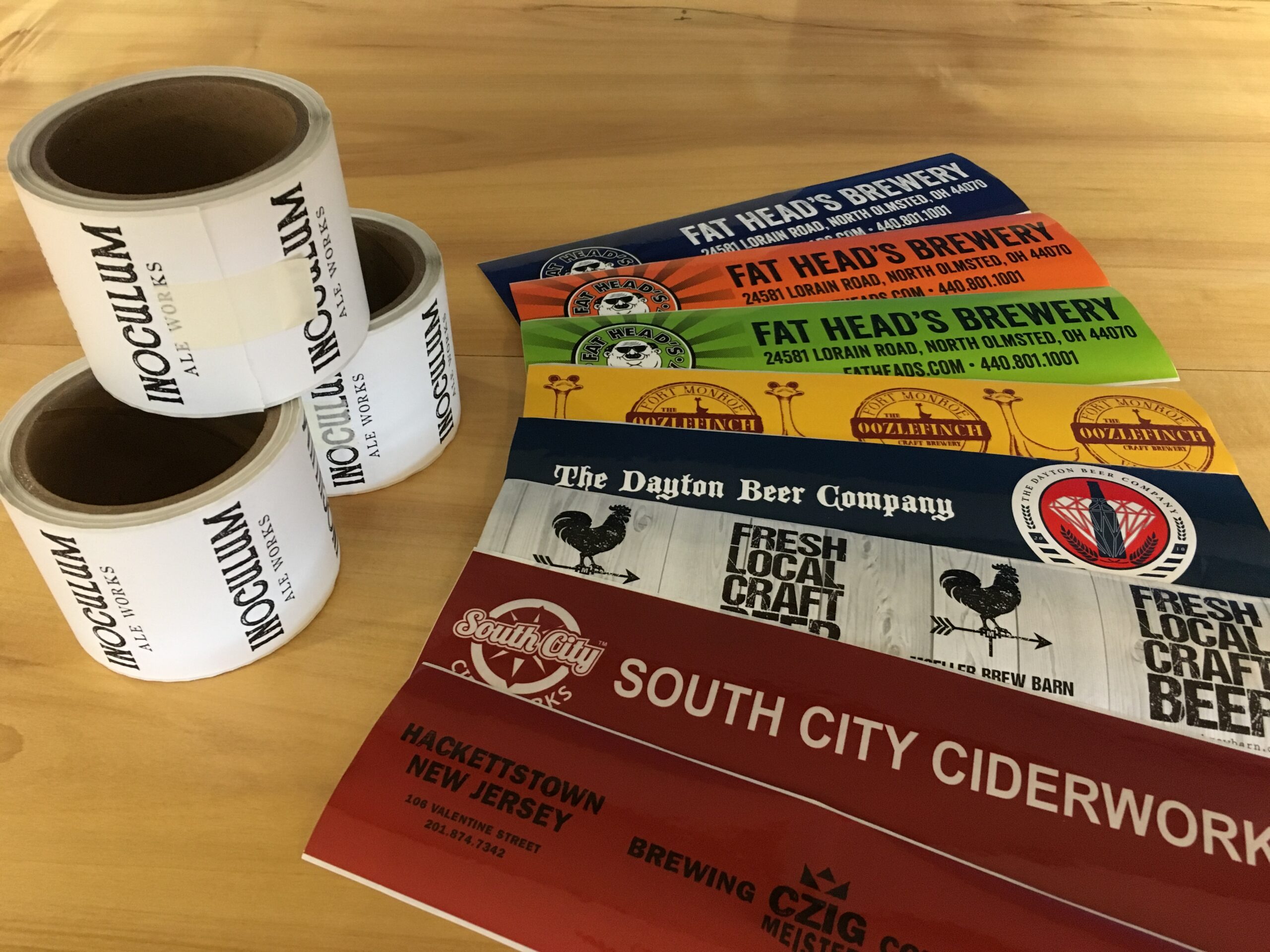
Use Label Materials and Techniques to Enhance Design Elements
The physical aspect of product labels can be a game changer when it comes to upgrading your design. Different label materials and printing techniques can add an extra dimension to finished labels, whether it’s to change the whole look of your design or highlight specific aspects of it.
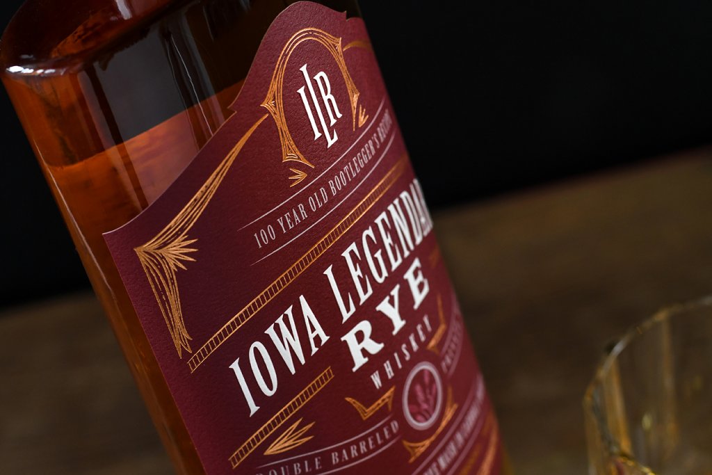
The right label material choice is a part of packaging psychology and is a great way to enhance your design. For example, a textured or matte-coated paper stock can exude a sense of quality and class, which can make for a perfect pairing if your label design matches that style. Other materials, such as a see-through film stock, can open your design up to new possibilities like two-sided labels that showcase your design in a whole new way.
Special printing techniques are also a useful option for adding a special twist to your design. Embossing presses patterns into a label, which means that you can raise certain parts of your design or across the whole label. This gives your design a three-dimensional look and feel and adds a level of complexity to your design that can add an air of class and sophistication if that’s what you desire.
Hot foil stamping allows you to press different foils to the surface of a label in a way that enhances your design. This lets you play with metallic, gloss, matte, holographic, and other finishes that you couldn’t through normal means, giving you additional freedom when it comes to achieving a certain look with your design.
Color Considerations
When you design a product label, you need to consider color in a couple of ways. When 90 percent of snap judgments about products are based on color, the psychology of color plays a huge part in your design choices. Of course, the color or colors you should use heavily depends on the personality the product should convey. For a breakdown on matching colors to personality, check out our post on design tips for beer labels.
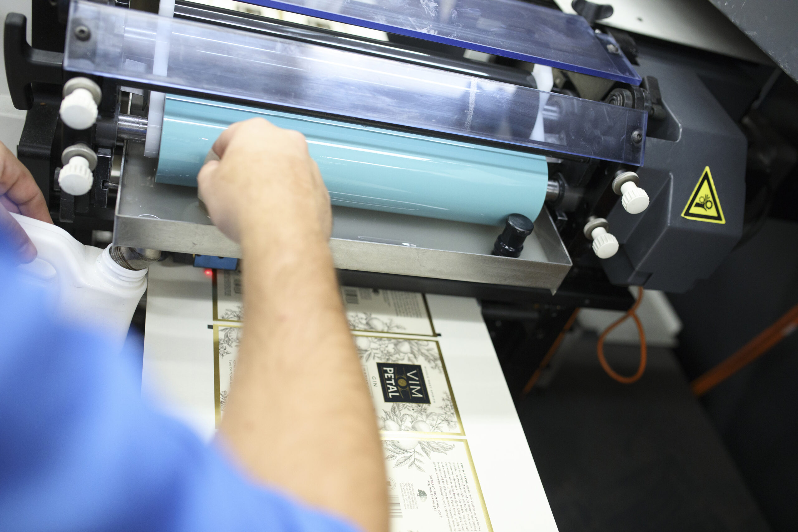
Another huge color tip is to make sure that you use the right color model. While the RGB model may be great when you create a design on a monitor, the colors won’t translate well to print, which is a big issue when that perfect shade of blue ends up being teal. When you design a label, it’s best to use CMYK and the Pantone Matching System (PMS), as they are both meant for use with ink. This will help to ensure that every color you use prints the way it should. If you and your client need some physical evidence of this, some digital printing companies can provide low-cost proofs so you can check how your design looks when it’s printed before you commit to a long run of labels.
Work with A Printing Company That Brings Your Packaging Design to Life
One of the most important parts of getting your brand packaging design to translate to print is to work with the right digital printing company. At Blue Label, we can work with you to let you know your printing options and ensure that your design translates well to print. Contact us today to talk to us about how we can help you with your next label project.