How to Translate Your Brand Identity into Packaging and Labels: A Step-by-Step Guide

⚞ The Highlights:

  • Your brand identity is your visual and verbal signature: name, logo, colors, typography, imagery, and voice. Packaging and labels are where customers meet it.
  • Branding, packaging, and labeling are related but distinct: branding is the identity, packaging is the physical container and its design, labeling is the applied label and its information.
  • Translate your identity by carrying your color palette, typography, logo, and voice consistently onto the label, guided by a brand guide.
  • The catch most brands miss: screen colors don’t print exactly, and material and finish change how your brand reads. Plan for the jump from digital to printed.
  • Consistency across your whole product line is what turns a nice label into brand recognition on a shelf.

Translating your brand identity into packaging means carrying the same colors, typography, logo, imagery, and voice that define your brand onto the physical product, so a shopper recognizes you at a glance. Your label is often the first and most frequent place a customer meets your brand, so it has to look and feel like the rest of your identity, not like a separate thing.

We help brands make that jump from a brand guide to a printed label every day, so we see where it goes smoothly and where it breaks down. Below, we walk through how the pieces fit together, how to translate your identity onto a label, and the print realities that catch brands off guard.

Branding, packaging, and labeling: what’s the difference?

These three terms get used together so often they blur, but they’re distinct pieces that work as a system. Understanding the difference makes every choice that follows easier.

Branding Packaging Labeling
What it is Your identity: name, logo, colors, voice The physical container and its design The label applied to the product and its info
Job Define who you are and how you feel Protect the product and present the brand Identify the product and carry required info
Example Logo, color palette, brand voice The bottle, can, box, or pouch The printed label with name, ingredients, barcode

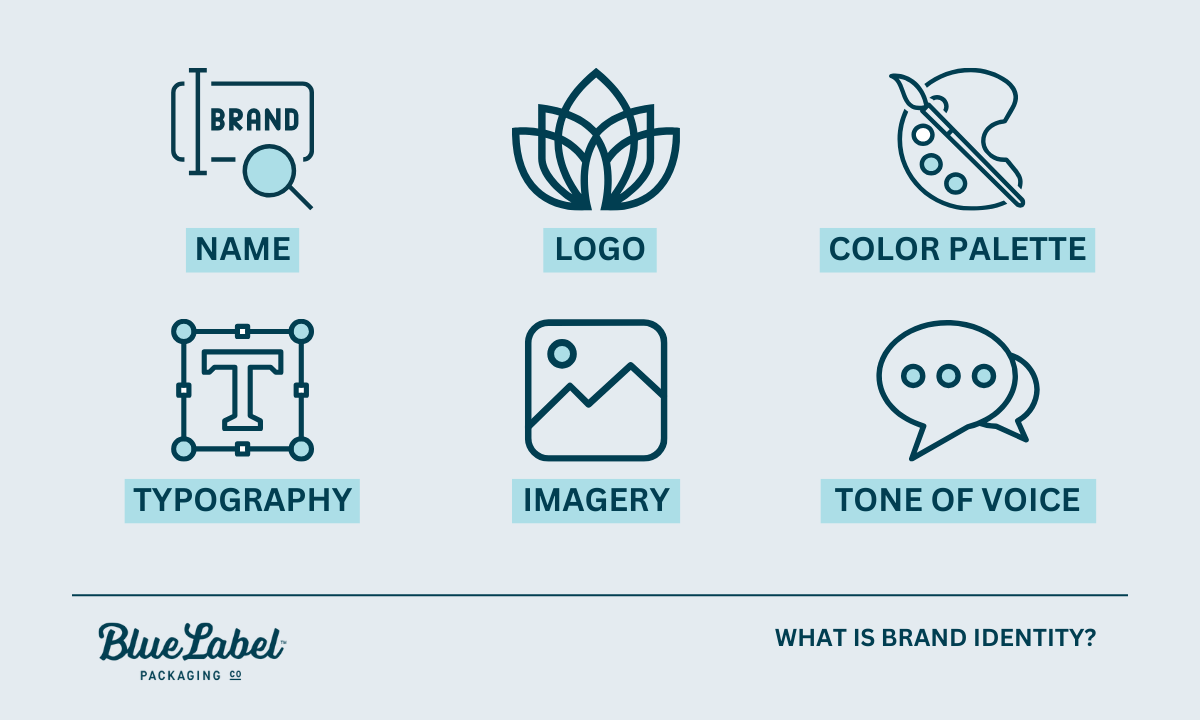
What is brand identity? Infographic

What is branding?

Branding is your identity: the name, logo, colors, typography, imagery, and voice that make your product recognizably yours. It’s the feeling and promise a customer associates with you, expressed through a consistent look and voice.

What is packaging?

Packaging is the physical container and how it’s designed: the bottle, can, box, or pouch that holds and protects your product and presents it on a shelf. Packaging serves a functional job (protection) and a brand job (presentation) at the same time.

What is labeling?

Labeling is the label applied to the product and the information on it. That includes your brand design plus the required details: product name, ingredients, net contents, barcodes, and any regulatory information. The label is usually where your brand identity and the practical, legal requirements meet.

How they work together

Branding sets the identity, packaging gives it a physical form, and labeling carries both the brand and the required information to the customer. When all three align, a shopper sees a coherent product. When they don’t, the product feels off, even if each piece looks fine on its own.

What is brand identity, and why does packaging carry it?

Brand identity is the collection of visual and verbal elements that represent your brand and set it apart. On a shelf, your packaging is the version of that identity a customer actually touches.

The visual elements of brand identity

  • Logo: the primary mark customers recognize.
  • Color palette: the colors that trigger instant recognition.
  • Typography: the fonts that carry your personality.
  • Imagery and graphics: the photo, illustration, or pattern style you use.
  • Voice and tone: how your copy sounds, from playful to refined.

Why packaging is your most-seen brand asset

For a physical product, the package is often the first brand touchpoint and the one a customer sees most: on the shelf, in their cart, at home, in a photo they share. That makes it one of the best places to express your identity. A lot of purchase decisions happen fast and visually at the shelf, so a package that instantly reads as yours helps in the moment someone is choosing.

How packaging shapes what shoppers think

Design choices like color, shape, material, and typography shape how a shopper feels about your product before they read a word. Muted tones and uncoated paper read as natural or premium. Bright colors and glossy finishes read as fun and energetic. None of it is neutral, so every choice should map back to the brand you’re building.

Designing for your target customer

Design for the people you want to buy the product, not for your own taste. Research who they are and what catches their eye, then make choices that fit them. A supplement aimed at serious athletes and one aimed at wellness-focused parents call for very different looks, even in the same category. The clearer your customer, the easier every design decision gets.

How to translate your brand identity onto a label

Here’s how to move from brand identity to a finished label, step by step.

Start with your brand guide

A brand guide is the reference that keeps everything consistent: your logo files and usage rules, exact colors, fonts, imagery style, and voice. If you have one, it’s the source of truth for your label. If you don’t, building even a simple one before you design pays off immediately, and it’s the single most useful thing to hand a designer or printer.

Color

Color is the fastest way people recognize you. Carry your exact brand colors onto the label, and specify them precisely (more on why exact matters in the print section below). Color also carries meaning, so make sure your palette fits the feeling you want, whether that’s calm, bold, natural, or premium.

Typography

Use the fonts from your brand identity, and keep them legible at label size. Your type should feel like the same brand across your website, your ads, and your package. For more on making type work on a label specifically, see our typography tips for product labels.

Logo and imagery

Apply your logo consistently, at a size and clear space that keep it recognizable, and use the same imagery style (photography, illustration, pattern) you use elsewhere. Consistency here is what makes a lineup of products read as one family.

Materials and finish

The material and finish are part of your brand, not just a spec. Uncoated or kraft stock feels natural and honest. Soft-touch matte reads premium and modern. High gloss looks bright and fun, while foil or embossing says luxury. Choose the material that reinforces your identity, not just the cheapest option.

Voice and copy

The words on your label should sound like your brand too. A playful brand can be playful in its product description; a refined brand keeps its copy spare. Voice is easy to forget on a label, but it’s part of the identity you’re translating.


Ready to put your brand on a label?

Send us your brand guide and we’ll help translate it into a print-ready label, matching your colors, choosing the right material, and making sure it looks like you.
Request a Quote Get a Sample Pack


Where brand identity meets the printed label

This is the step brands underestimate, and it’s where we spend the most time with customers. Your brand assets were almost certainly built for a screen, and a label is a physical, printed object. A few things change in that jump, and planning for them keeps your brand looking like itself.

Screen colors vs. printed colors

Screens show color in RGB (light), while labels print in CMYK inks, often with specific Pantone (spot) colors for brand hues. The two don’t map perfectly, so a color that glows on your website can print duller or slightly shifted if it isn’t managed. The fix is to define your brand colors as Pantone or CMYK values, not just a screen hex code, and to check them on a printed proof. For the full picture, see our guide to RGB vs. CMYK color formats.

How material and finish change brand perception

The same design reads differently on different materials. A logo color looks richer on gloss than on uncoated kraft, which absorbs ink and mutes it. A matte finish softens everything; a metallic film adds shine your artwork didn’t have on screen. Because material affects both color and feel, it’s worth choosing it as part of the brand decision and seeing your design on that actual stock before you commit.

What to hand your printer

  • Your brand guide, including logo files and color specs.
  • Vector artwork with fonts converted to outlines (so your type prints exactly, even if the printer doesn’t have your font).
  • Pantone or CMYK values for your brand colors, not just hex codes.
  • Your material and finish preference, or a request for guidance on it.
  • The container details, so the label is sized and shaped correctly.

Hand a printer those, and the translation from brand identity to finished label goes smoothly. Leave them out, and you risk a label that doesn’t quite look like your brand.

Keeping your brand consistent across products

Consistency across your whole product line is what turns individual labels into brand recognition. Use your brand guide to keep the core identity steady across every SKU: logo placement, color system, and typography. Allow thoughtful variation, like a different accent color per flavor, as long as the lineup still reads as one family. When you expand into a new product or market, adapt carefully rather than reinventing, so customers still recognize you. Our post on 8 steps to great label design is a useful companion here.

Frequently asked questions

What is the difference between branding, packaging, and labeling?

Branding is your identity: the name, logo, colors, typography, and voice that make a product recognizably yours. Packaging is the physical container and its design, the bottle, can, box, or pouch that protects the product and presents the brand. Labeling is the label applied to the product and the information on it, including brand design plus required details like ingredients, net contents, and barcodes. Branding sets the identity, packaging gives it physical form, and labeling carries both to the customer.

What is brand identity in packaging?

Brand identity in packaging is how your visual and verbal signature shows up on the physical product: your logo, color palette, typography, imagery, and voice. Because packaging is often the first and most frequent place a customer meets your brand, it’s one of the best places to express your identity consistently.

How do you translate a brand into a label design?

Start from your brand guide, then carry your exact colors, typography, logo, imagery style, and voice onto the label, keeping everything legible at label size. Choose a material and finish that reinforce the brand’s feel. Then account for print realities: define colors in Pantone or CMYK (not just screen hex codes) and check them on a printed proof, since screen color doesn’t map perfectly to printed ink.

Why do my brand colors look different when printed?

Screens display color in RGB (light) while labels print in CMYK inks, often with Pantone spot colors for brand hues, and the two don’t map perfectly. A color that glows on screen can print duller or slightly shifted if it isn’t managed. Define your brand colors as Pantone or CMYK values and confirm them on a printed proof on your actual material.

Why does brand consistency across products matter?

Consistency is what turns individual labels into recognition. When logo placement, color system, and typography stay steady across every product, a lineup reads as one family and customers recognize you at a glance. Thoughtful variation (like a different accent color per flavor) is fine as long as the core identity stays consistent.

Ready to bring your brand to the shelf?

If you’re ready to turn your brand identity into a label that looks like you, we’re glad to help. Request a sample pack to see materials and finishes, or get in touch with your brand guide and we’ll help translate it into print.

More on designing a label that reflects your brand:
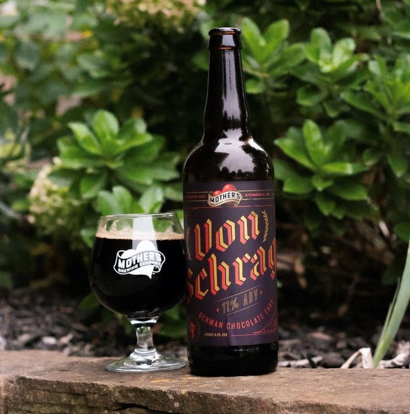
Craft Brewery Branding: 6 Ways to Build Trust Through Beer Labels

In a crowded market, beer drinkers want to feel confident that they’ve made the right choice. The problem is that without any nearby samples, the average consumer has to judge a book by its cover.

Fortunately, that cover can do a lot to build confidence in your craft brewery’s brand. There are multiple factors that play a role in beer selection. Your beer label is the perfect tool to make a first impression and tell interested consumers what your product is all about. Here are six ways that your beer labels can help you build trust with your customers.

A craft beer bottle with custom craft brewery branding.

Brewed on and Best By Dates

No craft beer lover wants to drink something that’s past its prime. While you can print date codes on the neck of your bottle, adding more details on your label is one way to engender trust with consumers. Including a brewed by date or a best by date will help potential buyers feel confident that your beers are still fresh.

Serving Facts and Ingredient Information

While beer labels are exempt from listing ingredients and nutritional information that doesn’t mean you can’t add them anyway. There’s a reason why massive beer industry brands like Bud Light chose to add serving facts labels in 2019 – it makes them look good.

Simply put, consumers like having as much information as possible. Including your ingredients, serving facts, or other nutritional information is just another way to add transparency about what’s in your beer. Even something as simple as tasting notes will give customers more details to digest before deciding if your beer is right for them.

Local Pride

A little local pride can go a long way toward attracting new customers. Brewery location is one of the top factors consumers consider when choosing craft beer according to Craft Brewing Business – and your labels are a perfect opportunity to play up that local connection.

Just how much does amplifying your local roots boost confidence for regional buyers? Craft Brewing Business learned that “locally brewed” was the most attractive claim to Americans in a survey of craft beer drinkers. Fortunately, your label is the perfect place to proclaim your local pride. There are multiple ways to do this – emblazon your labels with “brewed in [blank],” adjust your design to highlight local ties, etc. – and each can be the extra edge you need to attract new customers.

Craft Beer Sustainability

One major purchasing trend in recent years is the push to support green businesses. That trend is no stranger to craft beer branding. According to a Purdue University study, roughly “75 percent of beer consumers are willing to pay premiums for beer brewed using environmentally sustainable practices.” These practices include:

  • Water conservation
  • Energy use reduction
  • Landfill diversion

Your label is the perfect place to showcase your sustainability initiatives and create consumer confidence in your products. There are a few ways that you can communicate your sustainability efforts. The Environmental Protection Agency allows businesses to add ecolabel seals to their packaging if they meet certain environmental performance criteria.

You could also take sustainability to the next level with certain label materials. Utilizing paper materials made with post-consumer waste, including those certified by the Forest Stewardship Council (FSC). By marking your products with an FSC label, you can show your consumers that your labels came from responsibly managed forests and that your company is doing its part to take care of the world’s forests.

Your Craft Brewery’s Personality

Remember when we said that brewery location was one of the top factors people consider when buying craft beer? It turns out that the brewery itself is another major consideration for potential patrons.

People naturally like to have a connection with the brands they support. Using your label to tell your brewery’s story is one way to get people to grow closer to your brand. Don’t be afraid to showcase your personality through your label – that identity is a big part of what makes your brewery different than the competition. In turn, people can feel confident that they’re supporting a one-of-a-kind business instead of just another brewery.

Multiple cans with custom craft beer branding.

Consistent Quality

According to a survey from C+R Research, 76 percent of people who enjoy alcohol say that price doesn’t influence their decision to buy craft beer. Instead, the top two factors driving people toward craft beer are taste and quality. Simply put, craft beer drinkers don’t want to waste their time on a substandard product – they simply want a great beer.

Fortunately, your beer labels play a pivotal role in conveying the quality of your product. A quality, eye-catching label sends a clear message to consumers that you take your products seriously. Of course, your design is just one part of an attractive beer label. It takes a good label printing company to help your beers dress for success.

At Blue Label, we have the experts and technology to help you get the most out of your beer labels. Our team works with you throughout the printing process to not only enhance your design, but also protect your packaging from unsightly scratches and water damage. We also offer a variety of resources like our designer directory to help you find the right graphic designer to help you capture your brewery’s brand identity.

Ready to make the best first impression? Contact us today about quality, cost-effective beer labels for your brewery.

Identifying the Best Design Approach for Your Seltzer Labels

With the burgeoning success of the hard seltzer market, it’s a good time to be in the carbonated water business. Of course, this increase in seltzer sales doesn’t mean your seltzers are guaranteed to make money without proper packaging.

There are many routes you can take when it comes to seltzer labels. Each labeling approach has its benefits, so it’s important to identify what method makes sense for your product labels.

What Do Your Seltzer Labels Need to Do?

Before you can identify the right approach to your seltzer label designs, it’s important to take a step back and consider what you’re trying to accomplish with your labels. There are some objectives that are largely the same for every company – tell people who made your seltzer and include any information required by the TTB or FDA – but there are some other important goals you should consider as well.

A good product label is more than a place to provide basic information. A good label can help you establish a specific brand voice and make your product more than just another can or bottle of seltzer. Your design choices also make a huge different in increasing your visibility on shelves, advertising, and anywhere else consumers will see your goods. With those goals in mind, it’s time for you and your team to figure out the best way to make your brand known.

Different Approaches Toward Creating a Standout Seltzer Label

There is no perfect answer for every brand, but there are are different approaches that may makes sense for your brand. Here are a variety of approaches you can take to make sure your seltzer labels do their job.

Create an instantly recognizable identity through a templated design

Do you have several different flavors and want to create a series of labels that differentiate all your SKUs without creating too much additional design work? A templated approach can help you create a system that allows you to adapt specific details while maintaining a very specific look for your brand.

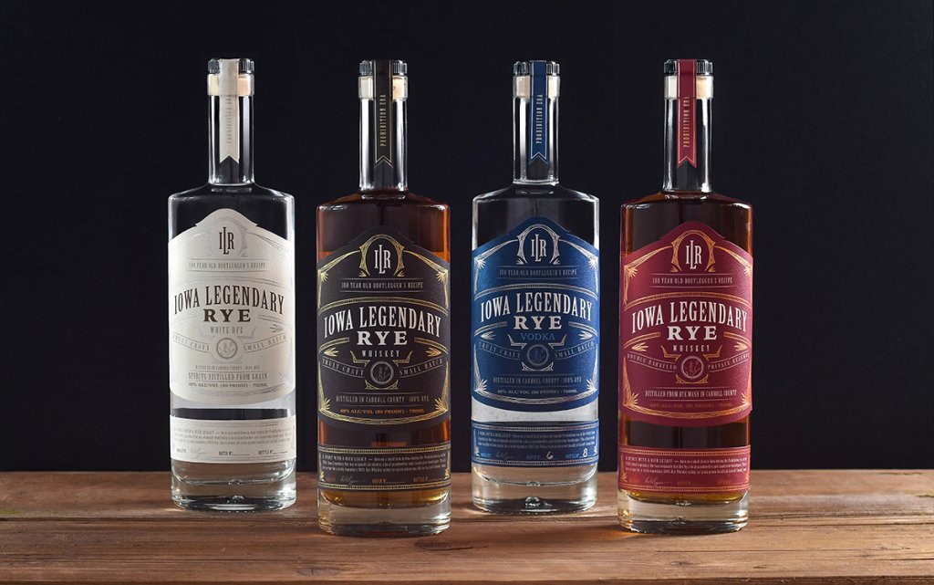
Iowa Legendary Rye bottles showing off product labels made with a templated design.

Take the the Iowa Legendary Rye labels pictured above for example. The design uses consistent shapes and hot foil stamped borders to create a specific look for their overall brand while changing colors, product names, and descriptions to differentiate individual products. This approach allows them to dominate their specific spot on a store shelf with a cohesive identity that people can remember the next time they look for the Iowa Legendary brand. This approach also means you can utilize variable data printing to use a single design version to print labels for multiple SKUs in a single run.

Promote personality for each product

Depending on your business and customers, you may want to avoid a neat templated style in favor of being big, bold, and different. Each label is a canvas and there are no rules saying you can’t create distinct designs for each product. Whether you want to play up different personalities for each flavor or utilize different imagery for your various SKUs, you can make each one of your products grab attention by being a bit different.

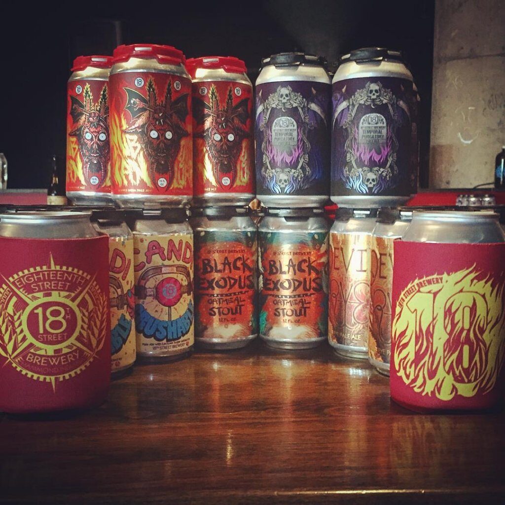
A group of 18th Street Brewery beer cans with custom-designed can labels.

18th Street Brewery embraced this approach for their labels. Each can has its own special design that’s completely original and visually irresistible. They can’t help but grab people’s attention. Not only can this approach give each product it’s own personality, it can lead your consumers to look out for new products to see what else your labels have in store for them.

Focus on an angle

Sometimes you need to focus on what makes your products special. In a growing seltzer market, what makes your seltzers worth trying? This approach can take many forms, whether you’re trying to appeal to someone’s health, wallet, or adventurous flavor palate. Once you identify that angle, you can use your labels to promote your seltzer to everyone within eyesight and help people understand the why behind your brand.

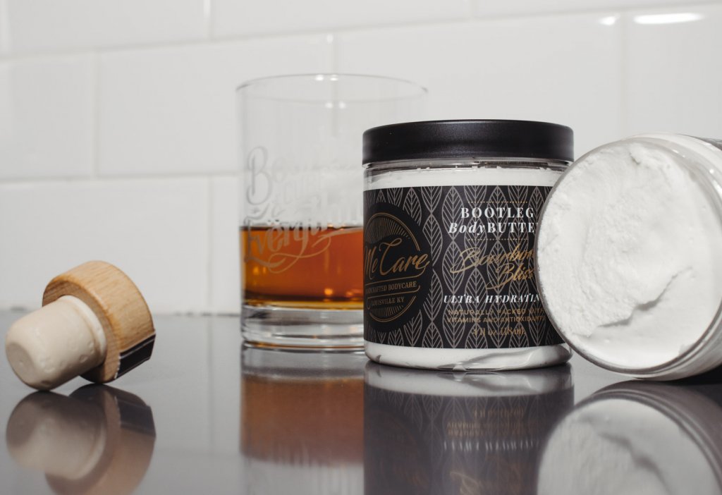
A Me Care body butter with a professional product label.

For example, Me Care used its product labels to highlight its own specific angle: Quality body products that create an authentic Kentucky bourbon experience. Not too many people would think to connect products like handcrafted body scrubs and moisturizers with booze. That specific angle gives Me Care’s labels an edge to help to sell its products to an intrigued audience while still telling a story about their brand.

Choose an Approach That Suits Your Seltzer Labels

There are a variety of approaches you can take in terms of label design, but the right answer depends on you and your product. A templatized approach may make sense for a company with a simple and stated brand of seltzers. Others may prefer turning each product’s label into its own piece of art for a more unique aesthetic. In fact, you can always combine a few approaches to find a blend that suits your product’s style. Who says you can’t have a custom illustration for each seltzer flavor on a partially templated label?

No matter which route you go, it’s important to make sure that you work with a label printing company that can do your designs justice. At Blue Label, we can work with you to balance both your label’s performance and design needs. Need the right material and adhesive for coolers? We got you. Want to add some extra flair to your design. We have the label printing capabilities to help you turn heads.

We’re here to help you get the most out of your seltzer labels. Contact us today about your next labeling project.

5 Hot Foil Label Designs We Love

One of the things we love most about our job is that we work directly with some of America’s best packaging designers. The most successful projects are a collaborative effort between the brand owners, designers, and packaging vendors to make products that capture the customer’s interest and imagination. These projects use a variety of decoration techniques like embossing, spot varnishes, and screen printing to achieve a high level of complexity and depth.

Of all the decoration techniques, hot foil stamping stands out as the most effective. At a relatively low cost per piece, gold, silver, and other types of foils can be used to create outstanding, multifaceted compositions very economically. We’ve compiled five hot foil label projects that we had a lot of fun working on to demonstrate the versatility of foil stamping, especially when used in combination with digital printing.

(more…)

8 Steps to Great Label Design: Part 1

Blue Label is lucky enough to work with great clients, as well as talented designers during the process of collaboratively producing great labels. One of those designers, Madison McMullen has agreed to provide her insight into label design. Here are her 8 Steps to Great Label Design:

(more…)