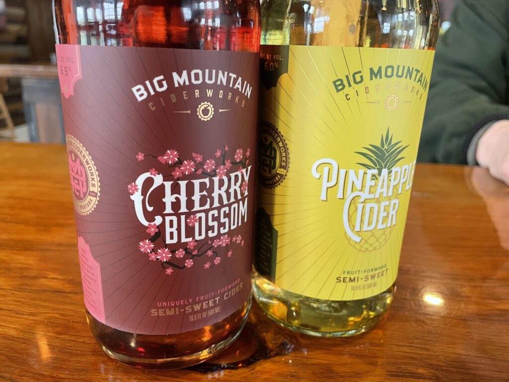
Wine labels carry more rules than most product labels because the TTB regulates them under the Alcohol and Tobacco Tax and Trade Bureau’s labeling requirements. The good news: the rules have been stable for years, and once you know what’s mandatory and what’s flexible, designing a compliant label gets straightforward. Below is what every U.S. wine label needs, where it can go, and what to think about for materials and design.
What goes on the front vs. the back of a wine label?
The TTB doesn’t strictly dictate which side of the bottle gets each piece of information. Some elements must appear on the “brand label” (typically the front), but most can go on either label. Here’s how it usually breaks down.
| Element |
Where it can go |
Required? |
| Brand name |
Brand label (front) |
Yes |
| Class or type designation (varietal name, “red wine,” “table wine,” etc.) |
Brand label (front) |
Yes |
| Alcohol by volume (ABV) |
Either label |
Yes (some classes deduce it from designation) |
| Net contents |
Either label, OR blown/etched into the bottle |
Yes |
| Producer / bottler name and address |
Either label |
Yes |
| Sulfite warning |
Either label |
Required if >10 ppm SO₂ |
| Government health warning |
Either label (typically back) |
Yes |
| Vintage year |
Either label |
Optional (with rules if claimed) |
| Appellation / region |
Either label |
Optional (with grape-source thresholds if claimed) |
| Pairing notes, flavor profile, story |
Back label (typical) |
No |
What Information is Included on Wine Labels?
Below is each element in detail, with the rules that apply.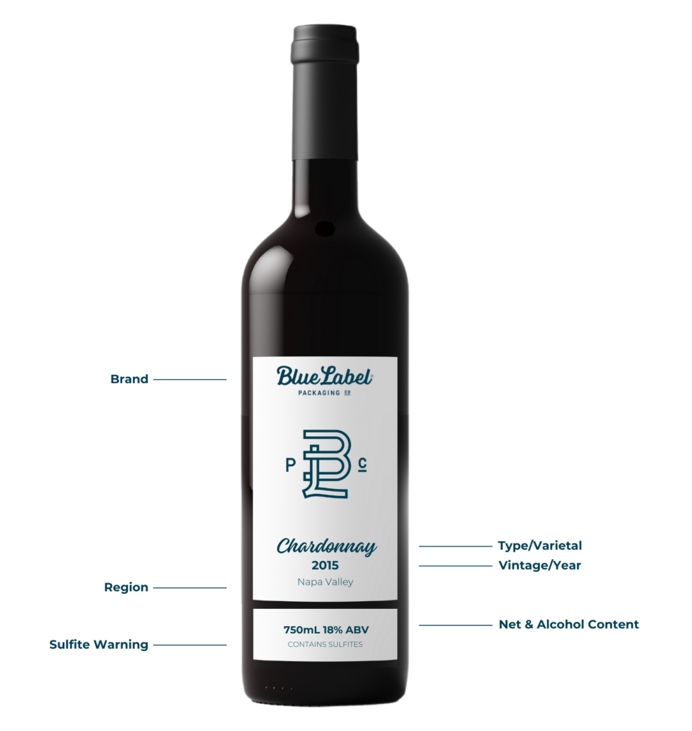
Looking for Custom Wine Labels?
Using high-quality label material, investing in the latest printing technology, continuously improving our processes, and staying on top of industry trends, we make sure wineries around the world are getting the best custom-made wine labels.
Request a Quote Get a Sample Pack
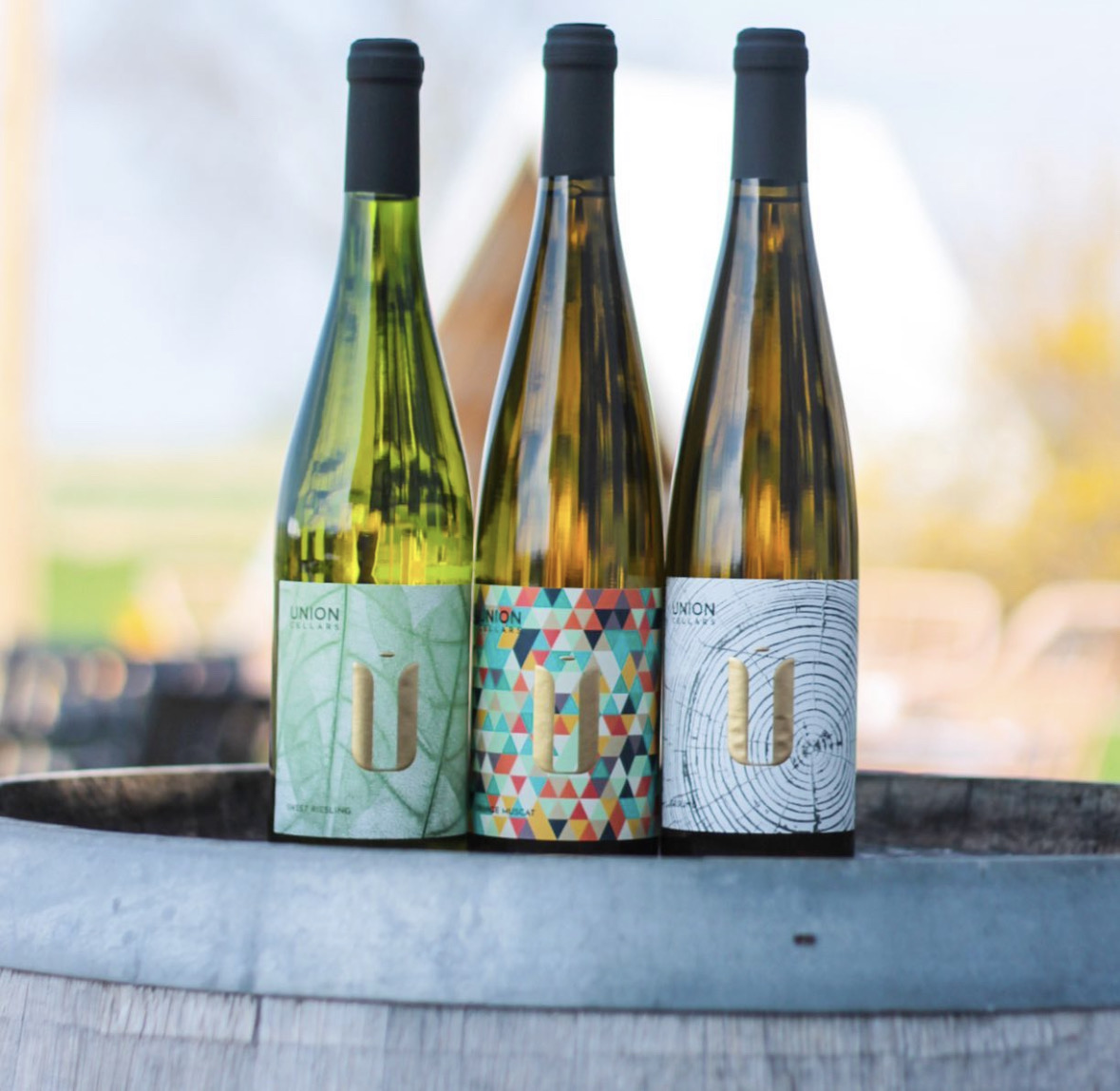
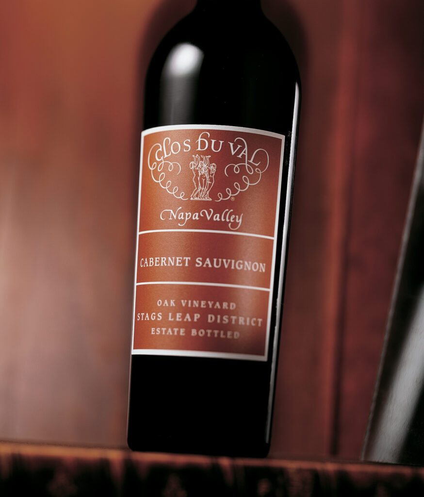
Brand name
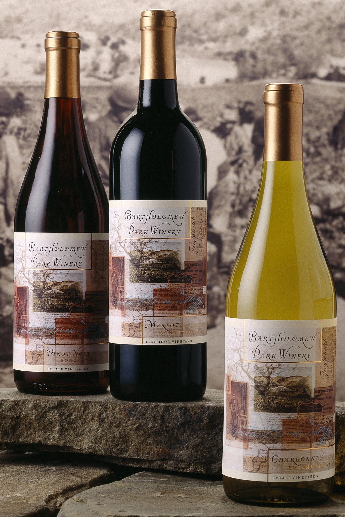
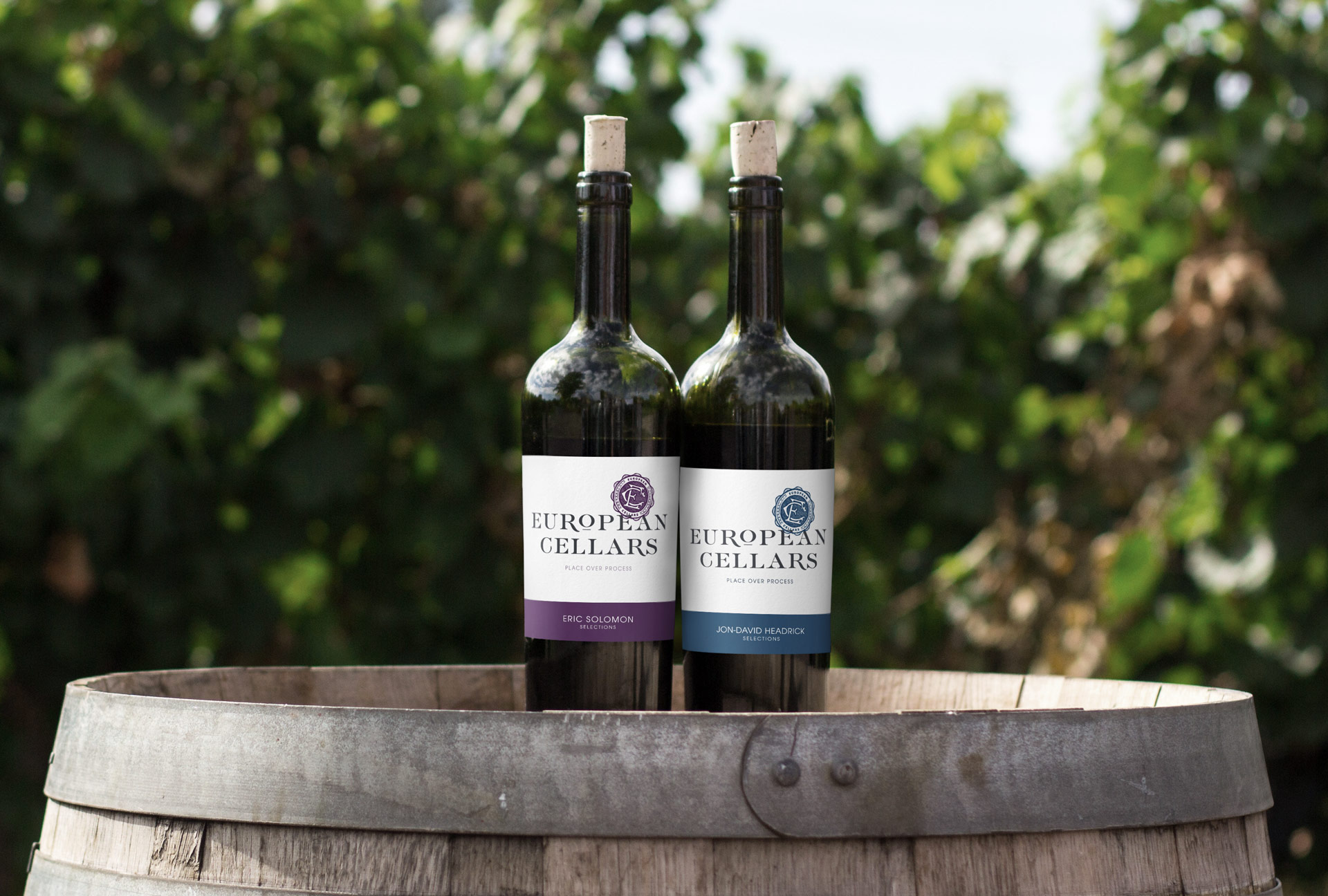
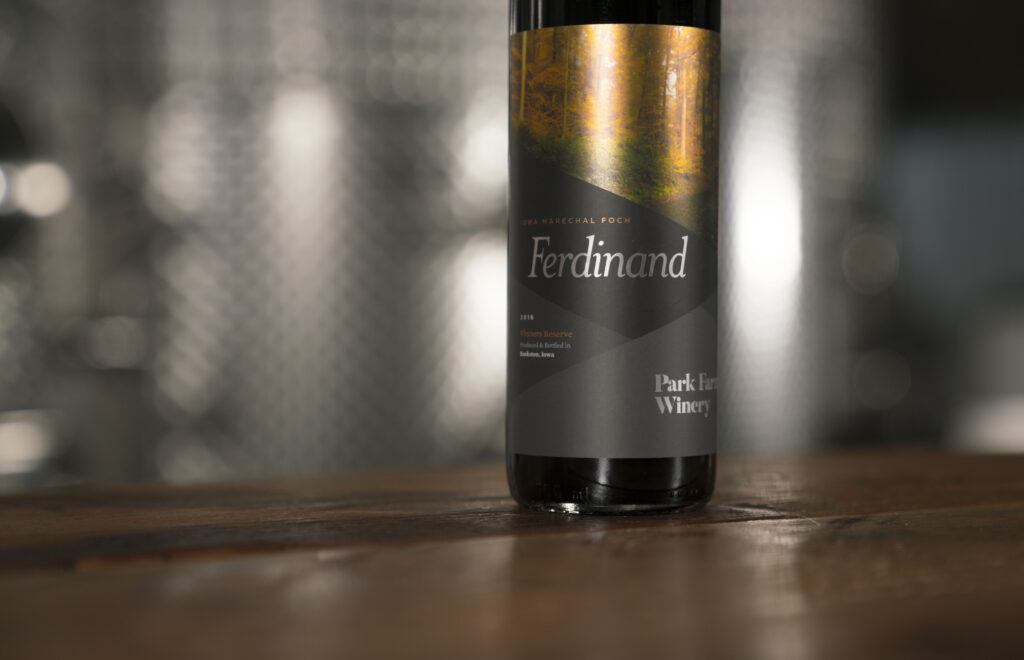
Who made the wine? The winery’s branding usually appears at the top or bottom of the brand label, depending on the design tradition you’re working in (French wines often place the winery prominently at the top; New World wines vary).
Fanciful name
What’s this specific wine called? A fanciful name is a secondary name used to differentiate brands within the same winery. Brengman Brothers’ “Runaway Hen” is one example. Fanciful names are optional, but they don’t replace the need for a class and type designation. When you use one, the TTB requires an additional tax class on the label based on alcohol percentage. For example: “red table wine” or “white table wine” for wines under 14 percent alcohol; “red wine” or “white wine” for wines above 14 percent.
Vintage (year)
When were the grapes harvested? Vintage information isn’t mandatory, but it’s common because it speaks to the quality of the bottle’s contents. Especially if you’re paying attention to year-to-year variation. If you list a vintage, federal rules require that 95% of the wine come from grapes harvested that year (85% for wines from a state or county appellation).
Wine or varietal type
What kind of wine is in the bottle? This is where the grape or varietal type is communicated: Sauvignon Blanc, Pinot Noir, Cabernet Sauvignon, etc. Listing a class or type is required. If you call out a specific varietal name, at least 75 percent of the wine must come from that grape variety. Otherwise, the label needs a generic class designation like “red wine,” “white wine,” or “table wine.”
Appellation (region)
Where was the wine made? Region of origin breaks down differently depending on what you’re claiming:
- State or county appellation: at least 75 percent of grapes must come from that location (federal rule).
- American Viticultural Area (AVA, e.g., Napa Valley): at least 85 percent of grapes must come from that AVA.
- State-specific rules: some states have stricter requirements. California, for example, mandates that 100 percent of grapes come from California if the state name is on the bottle.
Producer and bottler
Where was the wine made and bottled? If the bottling location differs from the winery or vineyard, both names and addresses must appear on the label.
Alcohol content
What’s the percentage of alcohol by volume (ABV)? Required on every label unless it can be deduced from the class designation (table wine implies 14 percent or less). Best practice is to print the ABV explicitly anyway, because consumers and retailers expect to see it.
Net contents
How much wine is in the bottle? Net contents (in milliliters) must appear on every bottle, either printed on the label or blown/etched into the glass.
Sulfite warning
If the wine contains 10 parts per million or more of sulfur dioxide, the label must say “CONTAINS SULFITES” in clear, legible type. Most wines have natural sulfites at levels above 10 ppm, so this warning appears on the vast majority of bottles.
Government warning
Under the Alcoholic Beverage Labeling Act of 1988, every alcoholic beverage label must carry a specific government health warning. The TTB-mandated text reads:
GOVERNMENT WARNING: (1) According to the Surgeon General, women should not drink alcoholic beverages during pregnancy because of the risk of birth defects. (2) Consumption of alcoholic beverages impairs your ability to drive a car or operate machinery, and may cause health problems.
This warning typically lives on the back label. It must be set off from other information and printed in legible type that meets TTB minimum size requirements.
Optional back label content
Beyond the regulatory elements, back labels often include pairing suggestions, flavor notes, and a short story about the winery or vineyard. None of this is required, but it’s the part of the label where consumers actually engage with your brand. Use it.
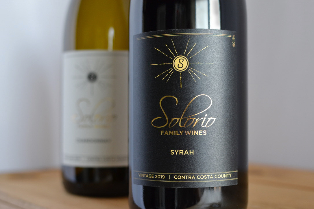
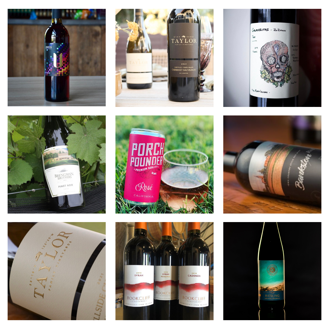
Wine label materials: choosing the right look and feel
Materials and finishes set the tone of the bottle as much as the design does. Wine is a category where consumers pick up the bottle and feel it before deciding to buy, so the tactile choice matters.
Paper stocks
- Smooth white paper: clean, modern look. Works for contemporary brands and design-forward labels.
- Textured papers (felt, cotton, linen): vintage and artisanal feel. Common for premium reds, family wineries, and boutique labels.
- Estate or rag papers: high-end, hand-feel paper that signals serious craft. Often used for reserve and library wines.
- Kraft or unbleached paper: earthy, organic, sustainable positioning. Good fit for organic, biodynamic, or natural wines.
Film stocks
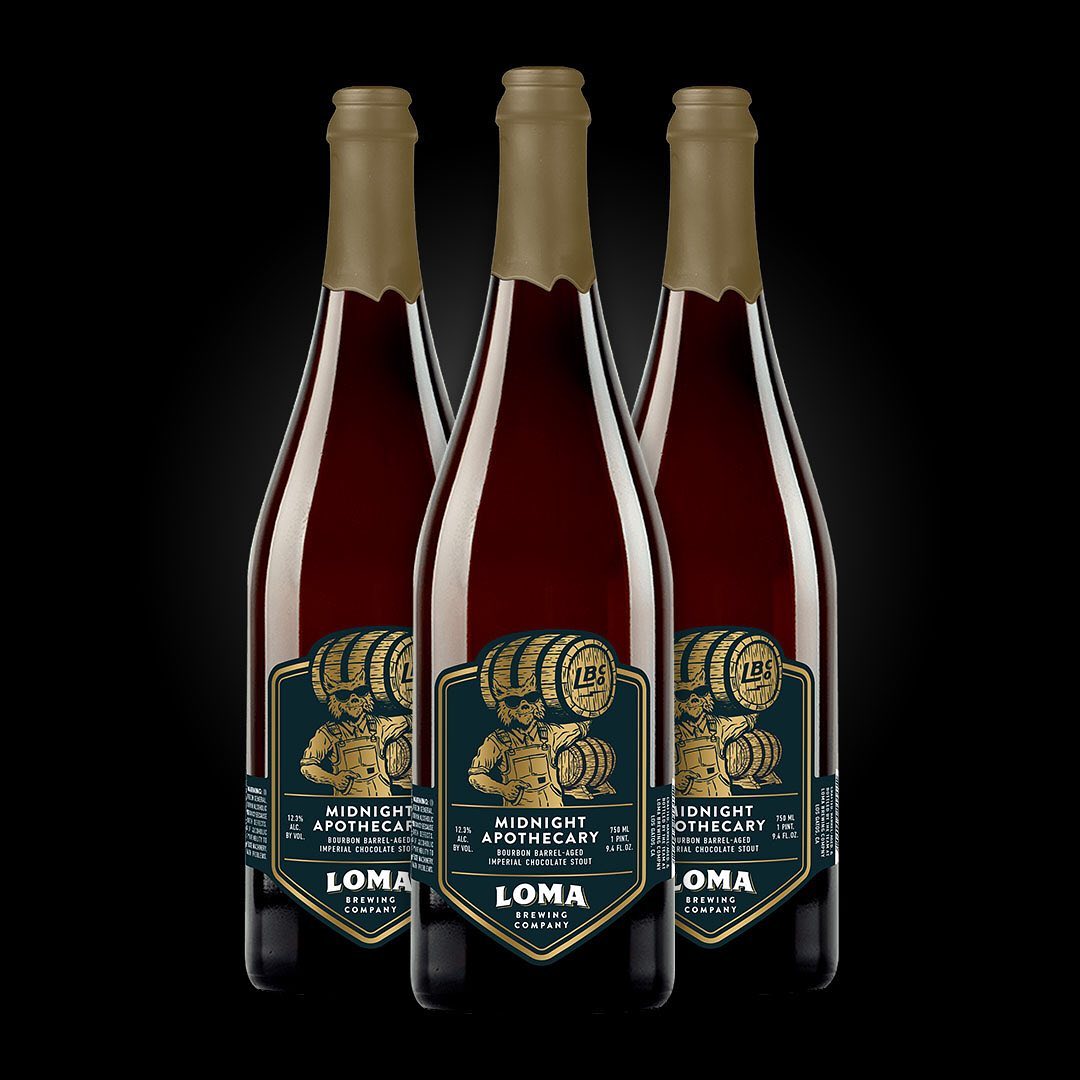
- BOPP / polypropylene: waterproof and durable, works well for wines that will live in damp cellars or ice buckets. Doesn’t have the hand-feel of paper but holds up better.
- Clear film: makes the design appear printed directly on the bottle. Common for premium and minimalist label designs.
Finishes and special treatments
- Matte vs. gloss varnish: matte reads understated and premium; gloss reads bright and vibrant. Most premium wines lean matte.
- Soft-touch laminate: velvety hand-feel that’s increasingly common in luxury wines and spirits.
- Hot foil stamping: gold, silver, copper, or holographic foil for logos, brand names, or borders. The signature look for premium positioning.
- Embossing or debossing: raised or recessed elements that add tactile dimension. Often paired with foil for a layered effect.
- Spot UV varnish: selective glossy coating that highlights specific design elements (logo, illustration) against a matte background.
- Wet-strength laminate: for wines that will sit in ice buckets or damp cellars, an extra moisture-resistant coating prevents the label from bubbling, peeling, or fading.
The right combination depends on the wine and the brand. Sample packs are the fastest way to feel the difference between paper textures and finishes before committing to a run.
Wine bottle design considerations
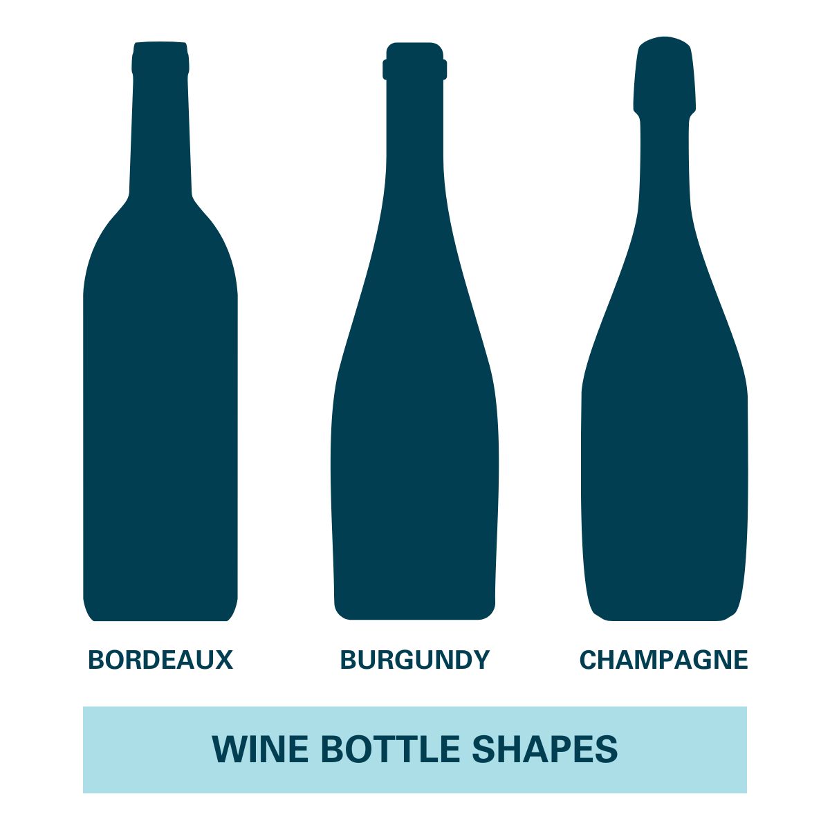
Wine bottles come in standard shapes (Bordeaux, Burgundy, Champagne, Hock) plus custom or asymmetrical bottles. Each shape needs a label that fits its curve and proportions. Practical design rules:
- Match the label to the bottle’s flat zone. The label should sit on a section of the bottle that’s relatively flat, not on the steepest part of a shoulder or neck.
- Mirror or contrast the bottle silhouette. Some labels echo the bottle shape (rectangular labels on Bordeaux); others create deliberate visual tension (a circular label on a rectangular bottle).
- Plan for the front-back relationship. If the front is minimal, the back can carry more story. If the front is detailed, keep the back focused on regulatory copy and a tight description.
- Consider the cellar. Wines stored on their sides for years are exposed to humidity and condensation. Choose materials that can survive that environment.
For artwork files, send Adobe Illustrator files or high-resolution PDFs whenever possible. They preserve typography, vectors, and layer structure so we can verify dimensions and produce a clean proof before printing.
 Frequently asked questions
What information is required on a wine bottle label?
U.S. wine labels are regulated by the TTB and must include: brand name, class or type designation (varietal name or generic like “red wine”), alcohol by volume, net contents, producer and bottler name and address, the sulfite warning (if SO₂ is over 10 ppm, which most wines are), and the federal government health warning. Vintage year, appellation, and fanciful names are optional but trigger specific rules when included.
What does TTB stand for and what does it regulate?
TTB stands for the Alcohol and Tobacco Tax and Trade Bureau. It’s the federal agency that regulates labeling, advertising, and trade practices for wine, spirits, and beer in the United States. Wine labels must receive a Certificate of Label Approval (COLA) from the TTB before the wine can be sold across state lines.
Does my wine label need a vintage year?
No, vintage year is optional. But if you list one, federal rules require that 95% of the wine come from grapes harvested that year (85% for wines from a state or county appellation). Many premium and varietal wines list a vintage anyway because consumers expect it for that category.
What’s the difference between a varietal wine and a table wine?
A varietal wine names a specific grape (Cabernet Sauvignon, Pinot Noir, Sauvignon Blanc) and must contain at least 75% of that grape variety. A table wine uses a generic designation (“red wine,” “white wine,” “red table wine”) when the wine doesn’t meet the 75% varietal threshold or when the producer chooses not to claim a specific grape. Both need to list a class designation; varietal is just more specific.
What’s an AVA and when do I need to list one?
An AVA (American Viticultural Area) is a federally designated grape-growing region. Napa Valley, Willamette Valley, Russian River Valley are examples. Listing an AVA on a wine label is optional, but if you do, at least 85% of the grapes must come from that AVA. Some states (California, for example) have stricter rules that require 100% of grapes to come from the state if the state name is on the label.
Why do wine labels say “Contains Sulfites”?
If a wine contains 10 parts per million or more of sulfur dioxide (SO₂), the TTB requires the label to display “CONTAINS SULFITES” in clear, legible type. Sulfites occur naturally in wine fermentation and are commonly added as preservatives, so the warning appears on the vast majority of commercially produced wines.
Where does the government warning go on a wine label?
The federal government health warning required by the Alcoholic Beverage Labeling Act of 1988 can go on either the front (brand) label or the back label, but most wineries place it on the back label so it doesn’t crowd the brand-side design. The warning must be set off from other information and printed in legible type that meets TTB minimum size requirements.
Do I need both a front and back label on a wine bottle?
Not strictly. The TTB requires certain mandatory information (brand name, class designation, ABV, net contents, producer/bottler, government warning, sulfite warning) but doesn’t dictate that it be split across two labels. Some wineries use a single wrap-around label that covers both sides. Two-label designs (front + back) are more common because they let the front carry brand and the back carry regulatory copy and storytelling.
Make your wine labels stand out
Once the regulatory pieces are in place, the materials, finishes, and design choices are what set the bottle apart on the shelf. We work with wineries on the full range of label types. Paper to film, matte to soft-touch, foil to embossing. And we’ll help you sort through which combination fits the wine.
If you’re ready to talk through a project, take a look at our wine label printing page for an overview of materials and finishes, or request a sample pack to feel the paper, film, and finish options in person. Our facility offers fast processing. Five business days from artwork approval to ship. With no minimums and an expert review on every project before anything goes to press. Get in touch when you’re ready.