5 Hot Foil Label Designs We Love
- alcohol labels
- Hot foil stamping
- label design
- spirits
Of all the decoration techniques, hot foil stamping stands out as the most effective. At a relatively low cost per piece, gold, silver, and other types of foils can be used to create outstanding, multifaceted compositions very economically. We’ve compiled five hot foil label projects that we had a lot of fun working on to demonstrate the versatility of foil stamping, especially when used in combination with digital printing.
Foil Label No. 1: St. Petersburg Distillery – American Royal Mead
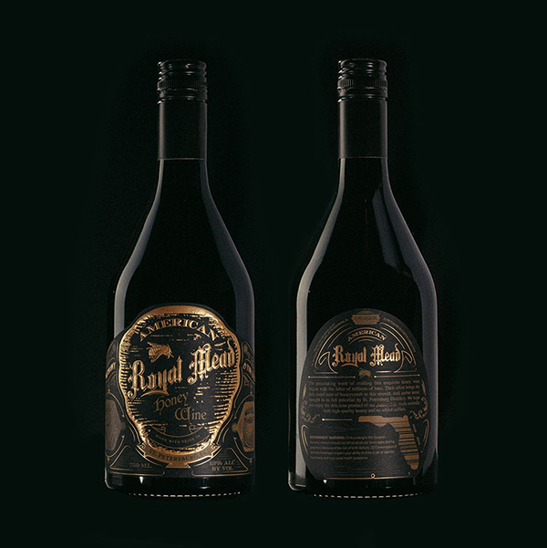
How do you position your product as ‘royal’ without overdoing it and creating something gaudy? That was Dunn&Co’s dilemma when they set out to design a label for St. Petersburg Distillery’s premium mead product, American Royal Mead.
In early discussions we discussed a product that looked like it came straight out of Game of Thrones. This type of look was achieved by using gold hot foil (a lot of it) contrasted with a muted, flat gold ink, all set on a black vellum material. This design created a sense of depth while still using only two colors, gold and black. By using two different golds, a ‘flat’ gold and a ‘shining’ gold, the designer was able to create a palette to work with, while delivering a monochromatic, custom-printed gold foil label. American Royal Mead shows that foil works very well as the whole subject of the label. It’s opacity and sheen let it stand out even against a jet-black background, so it’s more than capable of standing alone in a label design.
Foil Label No. 2: Seventh Son Brewery – Bourbon Barrel Aged Oubliette
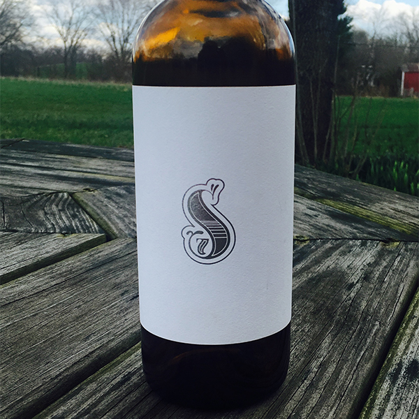
Minimalism has been an ongoing theme in packaging design over the last few years, and for good reason. If you have a great product, and a strong brand identity, why not design products to match? With its Bourbon Barrel Aged Oubliette, Seventh Son Brewery wanted a label that spoke to the high quality of the beer, but also their commitment to quality and craft.
We worked with their design to make a simple silver ‘S’ (their logo) on a white wine stock. It was simultaneously stark and complex. The shining silver on the textured background created a silver foil label that was immediately eye catching. Much like the American Royal Mead Label, the Bourbon Barrel Aged Oubliette just goes to show that foil can speak for itself, not needing much else.
Foil Label No. 3: Devil’s Head Distillery – Vodka, Gin, & Aquavit
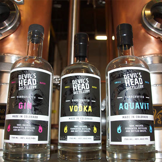
Hot foil doesn’t just come in golds and silvers. It can be holographic, completely clear, or even black. Ryan White, the owner of Devil’s Head Distillery in Englewood, Colorado, wanted his iconic ‘devil’s head’ logo to stand out from the rest of logo.
We originally discussed a spot varnish, but realized we needed something more dramatic after further consideration. We ended up using a gloss black foil to stand out from the otherwise matte wine stock material. The design also utilized bright text that stood in contrast to the gloss black image in the background. The Devil’s Head Distillery labels demonstrate what a versatile tool foil can be. Simply looking at it as a way to add gold or silver to a label overlooks a whole range of possibilities.
Hot Foil Label No. 4: Mission Coffee – Packaged Coffee
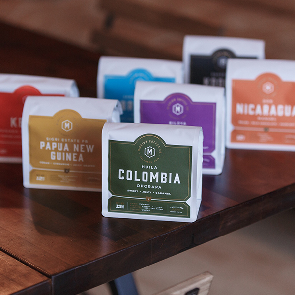
When Mission Coffee increased distribution of their premium coffee, they needed packaging that communicated what their brand was about. After going over a variety of hot foil stamping options, their design team came up with a series vibrant, bold colored labels for each variety of coffee. They were all pulled together by a consistent foil design with a detail of Columbus, Ohio, in the middle. This creates a consistent look across the whole brand, and demonstrates the high quality and craftsmanship of the product inside.
Foil Label No. 5: Middle West Spirits – OYO Oloroso Wheat Whiskey
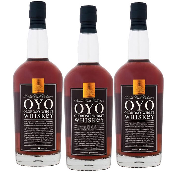
Foil doesn’t always have to be incorporated into the label; sometimes it can act as an actual ‘stamp’ or quality seal. In the case of Middle West Spirits’ OYO Olorosa Wheat Whiskey, it is used as more of a quality mark than to accentuate a specific part of the design. The foil is stamped on and die cut out, but looks like it’s applied on top of the actual label. This references many older quality seals that were actual separate labels applied over-top of the traditional label.
Use Foil Labels to Make Your Products Stand Out
These are just a few of the hundreds of hot foil stamped labels we’ve done. Hopefully they give you some ideas for your product labels. For a relatively small investment, foil can add a great deal of depth and complexity to your labels. If you’re interested in seeing more examples or understanding the process, contact us today and we’ll be happy to talk about it.