Blue Label Packaging
Case Studies
Case Study
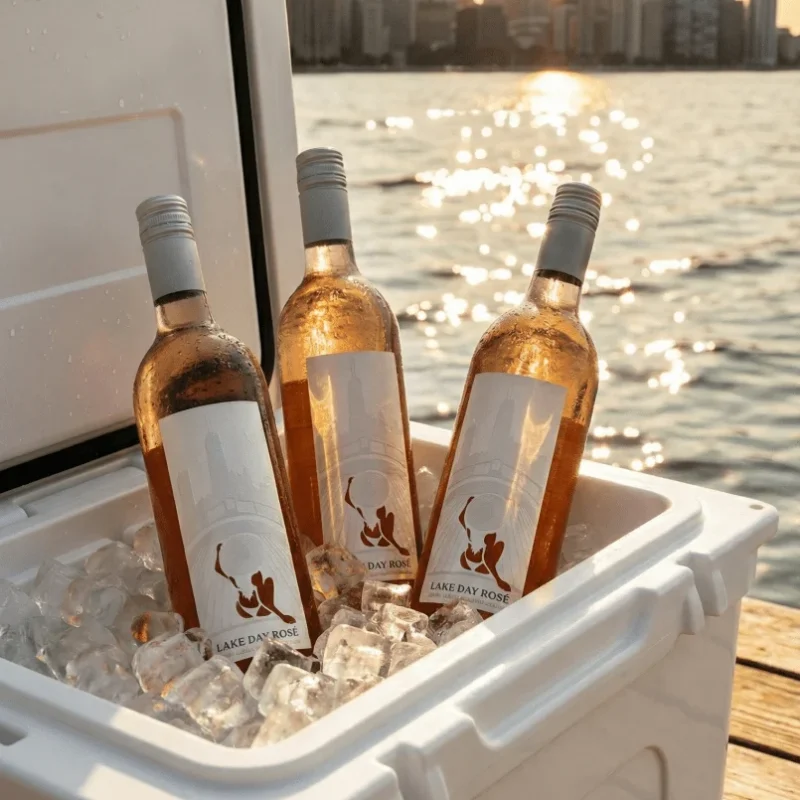
How Urban Coast Wines Saved Their Labels
Case Study
How Urban Coast Wines Saved Their Labels
When Urban Coast Wines approached us with a highly detailed label design for a new product launch, they had already experienced setbacks after another printer’s laser die-cutting process damaged the material.
The design featured delicate internal die cuts and thin line embossing, and it needed an alternative production approach that would preserve both the design intent and the label’s functionality.
Case Study
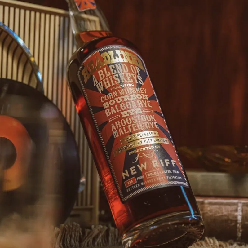
Timeless Vintage Labels for New Riff Distilling
Case Study
Timeless Vintage Labels for New Riff Distilling
When New Riff Distilling set out to create a vintage-inspired label, they had a clear vision but needed guidance on selecting the right materials and embellishments to achieve the desired look.
The team at Blue Label worked closely with them throughout the process, holding multiple consultations to review options, discuss constraints, and help translate creative ideas into a manufacturable design.
Case Study
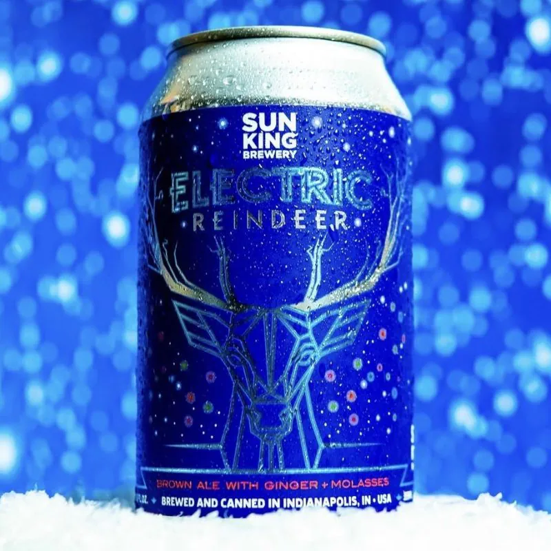
The Art of Metallic Enhancement for Sun King Brewery
Case Study
The Art of Metallic Enhancement for Sun King Brewery
For years, we’ve partnered with Sun King to elevate their can labels through strategic metallic embellishments. What began as a simple recommendation evolved into a trusted creative partnership.
As new label designs were developed, our team reviewed each piece of artwork to identify opportunities where metallic accents could enhance key details without overwhelming the overall design. Over time, Sun King came to rely on our expertise, allowing us to proactively recommend and select these enhancements as part of the proofing process.
Case Study
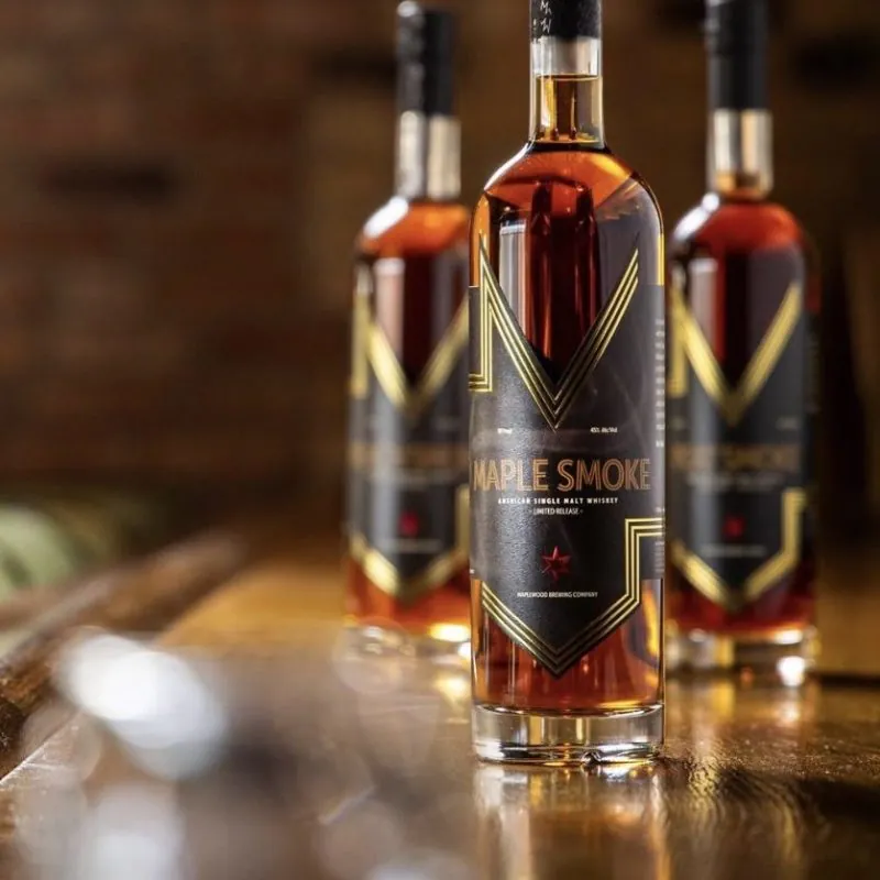
A High-End Brand Refresh for Maplewood
Case Study
A High-End Brand Refresh for Maplewood
Maplewood’s vision for their spirits brand refresh was simple: create a high-end label worthy of a premium spirits experience.
As part of the redesign, a new bottle was selected to provide a larger canvas for showcasing the brand’s craftsmanship and attention to detail. With a new bottle shape and larger label panel, the project required both creative problem-solving and careful consideration of how the label would fit and perform.