Case Study
A High-End Brand Refresh for Maplewood
The Background
Maplewood’s vision for their spirits brand refresh was simple: create a high-end label worthy of a premium spirits experience.
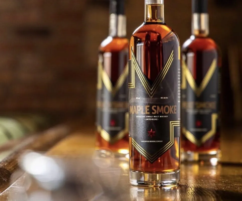
As part of the redesign, a new bottle was selected to provide a larger canvas for showcasing the brand’s craftsmanship and attention to detail. With a new bottle shape and larger label panel, the project required both creative problem-solving and careful consideration of how the label would fit and perform.
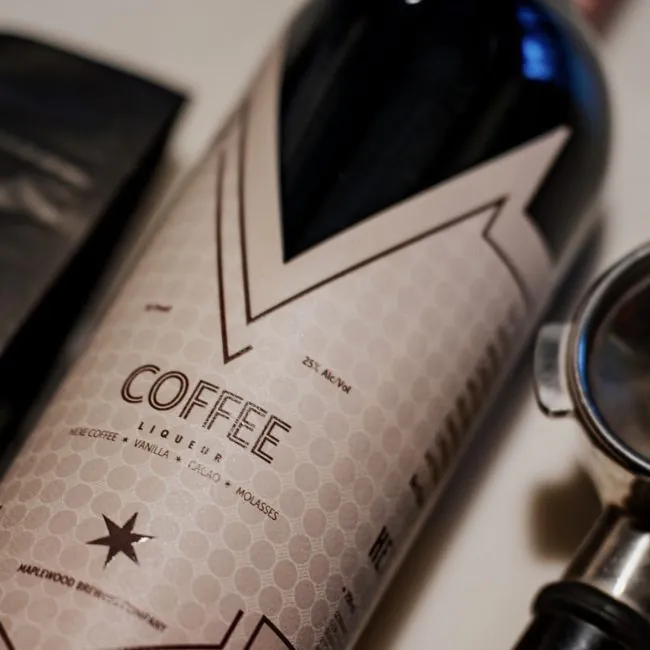
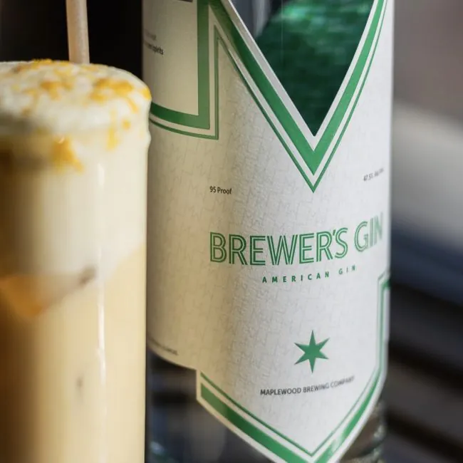
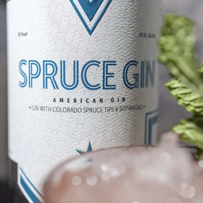
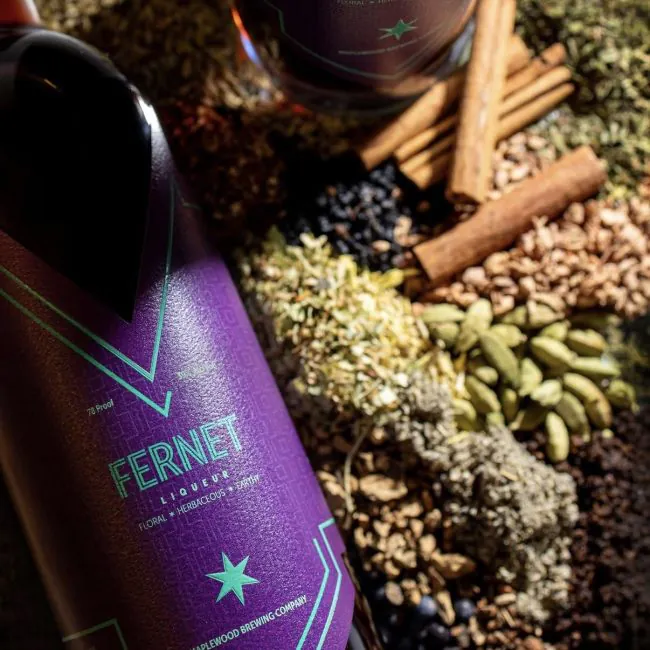
Working closely with the Maplewood team, we developed a sophisticated label featuring bright white felt stock for added texture, dual foil applications, embossing, and a double-sided label design that allows the Maplewood logo to be viewed through the back of the bottle. Together, these elements created a refined, multi-dimensional presentation that elevates the brand from every angle.
The finished product surpassed expectations and continues to support Maplewood’s growing lineup of award-winning spirits.
Details:
- Bright white felt material for the rigid texture
- Two passes of foil so that different foil areas could be highlighted with multiple colors
- Embossing to have that foil pop off of the bottle
- Double sided label setup so that you could see the Maplewood logo through the back of the bottle