RGB and CMYK: A Color Format Guide for Label Printing
⚞ The Highlights:
- What’s the difference between RGB and CMYK? RGB uses red, green, and blue light for digital displays, while CMYK uses cyan, magenta, yellow, and black inks for printing.
- When designing product labels, it’s important to create artwork in CMYK so the printed colors match your intended design, rather than relying on RGB, which is meant for screens.
- Because a label can look different on-screen than in print, it’s important to use a color management system for accurate RGB-to-CMYK conversions and to check a physical proof before finalizing the design.
Color plays a crucial role in your product’s look and brand identity. But if you’re planning to print labels, it’s not enough to pick colors you like on screen and hope they’ll print the same way. We want to help you understand how RGB and CMYK impact your final labels so you can maintain brand consistency and avoid costly reprints.
Below, we’ll break down the basics of RGB and CMYK, show you how different substrates and printing methods can affect your colors, and give you practical tips on proofing.

Which Color Format Is Right for Your Labels?
The most important question is: Will this design live on a screen or as a physical print?
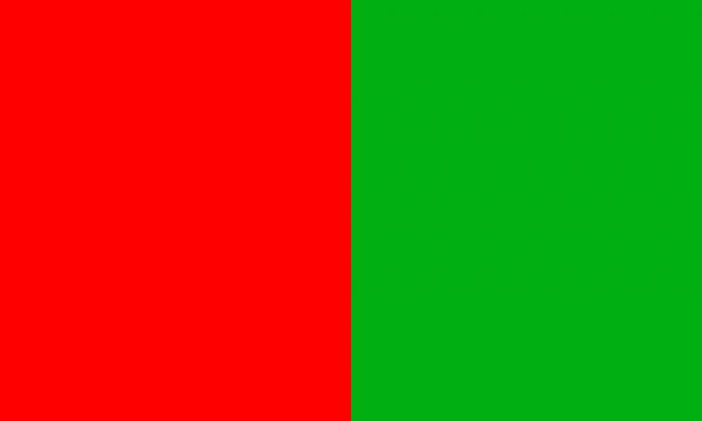
If you’re creating designs for phones, computer monitors, or TV, you’ll use RGB (Red, Green, Blue).
But if you need to print product labels, brochures, or other physical materials, you’ll want to use CMYK (Cyan, Magenta, Yellow, Black).
Using the wrong format can lead to inaccurate color. We’ve seen it happen: you settle on the perfect color in RGB, then it looks dull or washed out when converted to CMYK for print. That mismatch could lead to you paying for multiple reprints if you’re not careful.
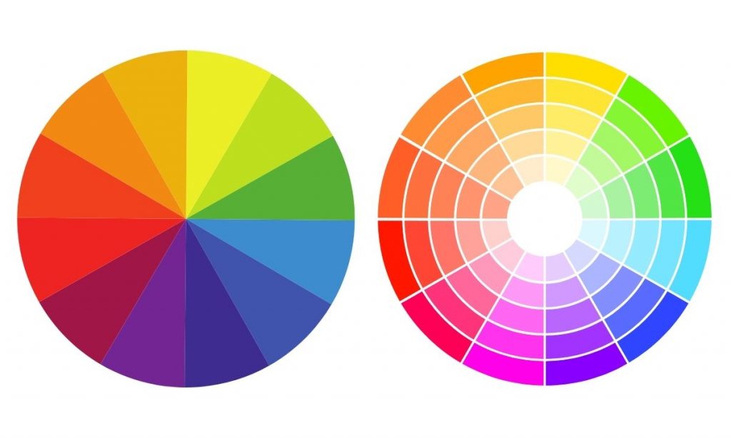
A Quick Look at RGB vs. CMYK
What is RBG?
RGB is an additive color system that builds colors by adding together different intensities of red, green, and blue light on a black backdrop. If you set each color channel to its highest intensity, you’ll get white light on a screen. It’s great for web graphics and other digital media because it produces a wide range of vibrant colors.
What is CMYK?
CMYK, on the other hand, uses subtractive mixing. Here, you’re printing overlapping layers of cyan, magenta, yellow, and black ink onto a surface. That surface is typically white paper (though it could be clear or metallic, which complicates things a bit). As you add more ink, you subtract the amount of white space that’s showing through—leading to a final color. Equal amounts of CMYK ideally produce a rich black.

Why the Right Color Mode Matters for Your Labels
Avoiding Costly Reprints
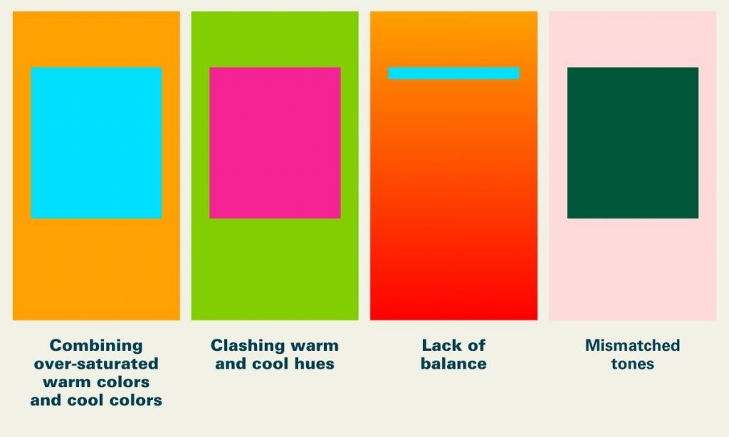
Over the years, we’ve worked with multiple brands who have sent us RGB files for labels. The problem is, this often triggers an automatic conversion to CMYK, which can dull or shift colors.
Sometimes printers can’t match specific RGB hues at all. When you’re ordering thousands of labels, those surprises can mean wasted time, extra expenses, and possible reprints.
If you’re working with a designer, ask them to set your file in CMYK from the start if you’re printing labels. Double-check your color profiles, too. We recommend requesting a proof (physical, if possible) so you can see exactly how the colors will turn out before printing a large run.
According to the Smithers report, “The Future of Digital Print for Packaging to 2026,” 41% of brand owners rate color consistency as their top challenge when adopting new or short-run printing technologies.
This really shows why it’s so crucial to set things up in CMYK from the start.
Materials and Finishes Affect Color
Another key factor is the substrate you’re printing on.
White paper will show off color differently than a metallic or clear film. A glossy laminate can make colors pop, whereas a matte finish can soften them.
According to industry experts—like the team at Labels & Labeling—metallic materials can shift your colors by around 10–15% compared to white stock because of the way they reflect light. (This figure can vary based on ink type, printer calibration, and the specific substrate brand.)
This is why it’s a good idea to test or request samples if you’re not sure.
Ensuring Brand Consistency Across SKUs
If you have multiple products, consistency is everything. Maybe you have a seasonal craft beer, a flagship IPA, and a limited-edition stout, all featuring the same shade of teal on their labels. When you’re managing multiple SKUs, it’s easy for slight color variations to pop up if you’re not careful—especially if you’re switching printers or label materials.
Here’s what we’ve found works best:
- Maintaining a master color profile for your brand. (This is your “source of truth,” usually an ICC profile or Pantone reference that you share with designers and printers so everyone has the same baseline for color accuracy.)
- Printers can use color management systems to ensure consistent brand colors across SKUs and print jobs by calibrating equipment, applying ICC profiles, and measuring color accuracy, preventing variations across materials, lighting conditions, and production runs.
Common Mistakes to Avoid
- Forgetting to Convert Color Mode: Always switch to CMYK if you plan to print. Relying on last-minute conversions by your printer could lead to dull or inaccurate results.
- Skipping Physical Proofs: Colors on your monitor aren’t always reliable. A physical proof or press check reveals how inks interact with your chosen substrate. (A press check is typically an in-person review where you or your representative watch the job run on press, confirming final color matches your expectations.)
- Not Accounting for Substrate Color: Metallic, clear, or even kraft paper labels can shift your final color more than you’d think. Test them out!
- Ignoring Brand Consistency Over Time: If you have multiple product lines, confirm that each run matches your brand guidelines—especially if you switch printers or label stocks.
Work with a Printing Company That Understands Color
If you’re ready to print labels that truly pop, we’d love to help. Our team at Blue Label works with you to guide you through the entire printing process—from choosing the right materials and color profiles to providing recommendations that fit your budget. We’ll hop on a quick call to learn about your label project, talk through your design and substrate ideas, and figure out how to nail the colors. After that, we’ll send you a proof so you know exactly what to expect before going to print.