How to Use Color Effectively in Beer Label Design: 5 Key Factors
- branding
- color psychology
- color theory
- contrast
- craft beer
When you only have a few seconds to catch a consumer’s eye, it’s imperative that your beer label is on point. Creative, compelling color choices can make your beers stand out among the competition. However, those same colors can pose problems if you’re not careful. Here are five ways that you can use colors to get the most out of your beer labels.
Create the Right Impression
Your color choices play a vital role in beer label design. The colors you use not only allow you to create a recognizable brand for all your different brews, but also influence consumers’ emotions through positive association.
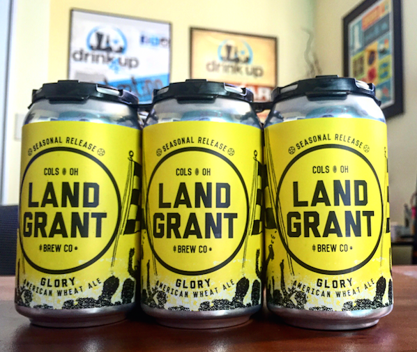
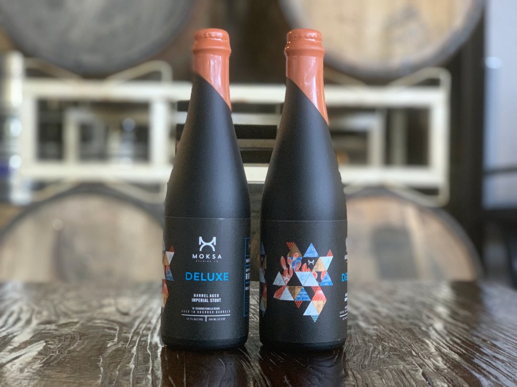
You’ll want to identify what type of feeling you want to convey with each product label. For example, you may utilize soothing blues for a smooth lager that’s perfect for a nice, relaxing time on the porch. Meanwhile a dark grey or black can create an air of elegance and class for a high-end imperial stout. Your label is an opportunity to show your beer’s character, and a good color scheme will do just that.
Don’t Drown Out Your Brand
Whether you want to establish your products as playful, classy, or something else, it’s important to make sure that your color scheme works with your brand. Exciting color combinations are fun, but consumers should be able to identify your brand with each container. Because of this, you’ll want to practice some caution when designing labels for each product.
A big part of beer branding is your logo. You’ll need to decide whether you want your logo to stay the same for every product or modify it to match different color choices. If you choose the former, it’s good practice to make sure your beer can branding and logo won’t clash with your preferred product pigments. If it’s the latter, you’ll just want to ensure that people can still instantly recognize your brand, even if your logo changes colors or versions. Remember, you want your product to stand out, but you don’t want to hide who you are.
Mix and Match Colors Appropriately
Identifying the right colors is a delicate balancing act. Picking and choosing an array of colors that make sense for your various beers without having them clash, create legibility concerns, or cause other brand issues are just a few of the balls you juggle..
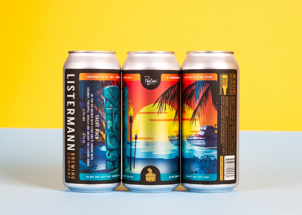
There are a couple of different routes you can go with color selection. One method is to focus on contrasts to help emphasize various label elements. This can help make your label visually “pop” to consumers, especially if you use it to highlight a certain aspect of your label. A color wheel can help you identify opposite colors that still work with each other. A second option is to stick with analogous colors that easily flow together. These colors line up next to each other in the color wheel and create a more relaxed feel for your label.
Regardless of which route you choose – or if you opt for a hybrid of the two – it’s important to make sure that people can read your labels. Certain colors may look great together, but dark-on-dark or light-on-light combinations can cause legibility concerns. Try and use some form of contrasting colors for backgrounds and text to make sure the words on your label don’t go to waste.
Consider the Container
Your beer label plays a critical role in product packaging, but it’s only one piece of the puzzle. Your container can have a major impact in the overall look of your product. For example, one label design may work wonderfully on a clear glass bottle, but could clash with a brown one.
Certain colors schemes may work better for some containers than others, so make sure you consider how your design plays with your cans or bottles. Depending on your container, you may simply opt for a shrink sleeve for complete coverage or a clear label that uses splashes of colors to accentuate your packaging. When done well, your container can even complement your label colors, making your beers look more appealing than before.
Maximize Your Materials
Ink isn’t the only way to create colorful combinations. There are a variety of paper and film label materials that can add a new dimension to your desired color scheme. A black vellum label would be a stunning way to create an elegant background for a high-end beer. Clear labels can help you emphasize your container (or even what’s inside your container). Meanwhile, a holographic film can create a fun contrast to add some glitz and glam to a beer can.
Color Your Customers Impressed with Stunning Beer Labels
In such a competitive market, pristine packaging can put your products on a pedestal. Stunning beer labels start with a stellar design, but it takes the right printing company to turn your vision into a reality.
When you need quality, cost-effective beer labels, Blue Label Packaging can help. Our team has the expertise and state-of-the-art equipment to help you enhance your designs. Contact us today to talk about your beer labels.