Common Label Mistakes to Avoid: Art File Issues

Before a label is made, it starts off as art file. Label printing companies need these files to turn your design into a physical product, so it’s important to have everything in place to set your label project up for success.

An art file contains much more than just your design. Each file needs to include important details and meet certain guidelines so your finished labels look just like your design. As a result, one overlooked file standard can lead to potential problems with your label. Here’s a rundown of the most common issues that can affect your art files.

It’s in the Wrong File Format

Before you get too far, make sure that you’re using the right file format for your printer. Print companies have preferred file formats so that they can take your file and turn it into labels. At Blue Label, we require Adobe Illustrator files or High-resolution PDFs from Photoshop, so make sure to ask your label printer what files they need (if they haven’t told you already). Companies can often accept PDFs made through other software, but it’s best to ask questions or send over art files beforehand to make sure they are compatible with the commercial printing presses used to produce your packaging.

The Images are Blurry

Blurry images are the bane of a good design’s existence. When possible, use vector images in your art file so that they can be resized without worry. Vector-based artwork uses mathematical calculations to create lines and shapes that allow these graphic to look the same even if you zoom in on the file. You can make vector images in Illustrator
If this isn’t an option, you should be fine with pixel-based images if they’re a high enough resolution. Whether you use vector or pixel-based images, they should be a minimum of 300 DPI, although 600 DPI or more is preferable if possible.

A digital printing expert reviewing an art file for a product label.

The File is Too Big

Art files tend to get rather big if you’re not careful. Large file sizes can make it difficult to transfer the file to the printing press. That means it’s best to try and manage file size before yours becomes too big.

Images are the main reason for a hefty art file. Pixel-based images, such as .jpg, .gif, and .png files, are larger than vector-based images in terms of file size, so too much pixel-based artwork will bog down your file. You should also embed or link pixel-based images in your file. Embedded images are kept in the art file, which can contribute more to the overall file size. Linked images are saved outside the file and can save space if you also share the original image files with your printer.

There are some other tricks to reduce image and file size in Illustrator, including playing with raster effects and file cleanup resources. You can learn more about these methods and the processes for linking and embedding images in our guide on managing file size.

The Colors are Wrong

It’s imperative that your art file uses the right color format. Digital printing requires CMYK, which is comprised of four colors – Cyan, Magenta, Yellow, and Black (Key) – with additional hues that allow best-in-class printing presses to attain up to 98 percent of the Pantone spectrum. The RGB color model is designed for use on electronic displays like computer monitors and phone screens, but not for print. This means that you’ll want to use the CMYK model to make sure that your colors come through the way they should on your labels.

If you have a specific color in mind, it’s important to call it out using the Pantone Matching System. This will allow the printer to look up the exact color code and match the exact shade your brand requires. To learn more about using the Pantone Matching System and different color profiles, check out our digital printing color guide.

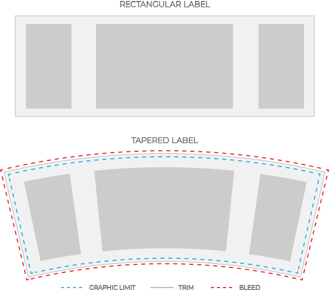
The Dieline Doesn’t Incorporate Bleed or a Safe Zone

Your art file not only needs to include your design, it also needs a dieline. As much as printing companies try to make exact cuts for every single label, there is a chance of some slight variation. The dieline should consist of three separate lines to prepare for this potential variation:

  • A main dieline that maps out the intended cut of the final design
  • A bleed area to ensure that there are no accidental white spaces
  • A safe zone to protect design elements

The purpose of the main dieline is simple: to show exactly where a die is supposed to cut a label. The bleed space is an extension of the background of the design to eliminate any off-putting white spaces if the cut isn’t exact. This bleed area should be at least 1/8” around all sides of your design.

The safe zone is also designed to provide wiggle room, this time creating a space in your design so that any essential elements – type, logos, etc. – aren’t too close to the dieline. The safe zone should allow for 1/16” of space between the dieline and any elements. You can see an example of a complete dieline with all three components below.

A sample dieline for a product label.

The Text isn’t Outlined

A good design is more than just images – even a minimalist label design is bound to include a few words. To ensure that these words print correctly, it’s important that you have the font outlined in your art file before you send it over to a printing company.

Outlining fonts is critical because it takes each letter and turns it into an image. This practice eliminates the need for font software and files. It also offers a few key benefits, such as making it easier to create custom type tailoring, adding color treatments to parts of characters, and making type heavier for production purposes. For guidance on how to convert font to outlines, check out our font preparation guide.

Find a Label Printing Company That Works with You

A good art file plays a big role in the production of your product labels, but it’s not always easy to figure out exactly what to do to make sure your art file is ready for its close-up. At Blue Label, we do more than just print your labels; we work with your company to guide you through the printing process and assist you from start to finish. Whether you have art file questions, need to identify the right label materials, or want to know more about our printing capabilities for your products, we put in the time to understand your needs and help along the way.

Ready to turn your design into the perfect labels for your products? Contact Blue Label today to talk to one of our experts about your project.

How to Taper a Label for Your Products

Are you wondering how to put a label on a curved surface and how to apply them straight? Designing for a flat surface is pretty straightforward. A straight edge will still be straight, a square will still be a square, etc. Curved or inclined surfaces are more difficult. Depending on the shape of your container, especially if it’s tapered, this can be trickier than you expect.

A container is tapered when it isn’t perfectly cylindrical and gradually changes in width. An easy way to tell if your container has a tapered shape is tapered is to compare it to something that’s completely flat or straight, whether it’s something like a rectangular box or a ruler. If you stand both items next to each other and the side of your container isn’t flush against something flat, it has some degree of tapering to it.

Why Can’t You Use Rectangular Labels on Tapered Containers?

Tapered labels can create some problems for even the most basic of label shapes. Straight lines appear uneven when placed on tapered containers, even if the change in width is very slight. This can lead to crooked label placement or noticeable creases or bulges that result in an unprofessional overall packaging design.

While it may seem easy to simply switch to a non-tapered container, these labeling challenges shouldn’t scare you away from utilizing uniquely-shaped packaging that stands out to your consumers. Even standard beer bottles feature a tapered neck, so you may not be able to avoid some form of tapering depending on your container.

You also may not want to change your container. Tapered shapes can attract eyes and create an exclusive silhouette for your brand. Instead of settling for standard containers, you can create a curved dieline that will allow your custom product labels to account for the gradual tapering of your container.

Labels that were tapered for custom-shaped bottles.


Looking for Custom Labels?

We put our all into every custom label we make. No exceptions. And with no minimum order quantities and a 5-day turnaround for digital label printing, we take pride in helping you perfect your first impression.

Request a Quote    Get a Sample Pack


How to Adjust Your Label to Fit a Tapered Container

One option is to downsize your label so that the effect of the tapering isn’t as noticeable. However, this limits the amount of label space you have to showcase your brand, describe your product, and include any necessary regulatory information.

The other option is to tailor your label to better suit the shape of your container or tapered bottle. If you still want your label to look rectangular, you’ll need to create a curved dieline. You’ll need to do some math to figure out the right shape, but the process may not be as tricky as you think.

Step 1: Decide where your label should go

Before you can solve anything, you’ll need to acquire some information. First, figure out exactly where you want your label to stick to your container. Since the width of your container gradually changes, it’s important to measure exactly where a label needs to go or else your measurements could be wrong. This also means you should have an idea of whether you want a partial or full wrap for your label as that will greatly impact the width. Once you’re set, use a pen, pencil, tape, or some other item to mark where the top, bottom, and sides of your label should go.

Step 2: Measure your dimensions

Once you have your container marked, you’ll want to measure the following:

  • Width of the top of your label
  • Width of the bottom of your label
  • Height of your label

Regular rulers won’t be too helpful in this stage since you’ll need something that can curl around your container and measure the top and bottom parts of your label. If you don’t have a loose tape measure, contact your Blue Label representative and request a custom flexible ruler or you can download and print a paper ruler. Another is to wrap string around your container and mark or cut it to fit the right lengths.

Please note that if you measure completely around your container, those measurements will make for a full wrap label dieline. If you don’t want a full wrap label, you’ll want to factor in your desired gap into the measurements. Once you’re all set, you can use your measurements to create a curved shape in Adobe Illustrator.

Step 3: Use Adobe Illustrator to create a curved dieline

In order to turn your measurements into an actual curved shape, you’ll need to do some geometry. Fortunately, there’s a convenient online cone calculator that will do the hard work for you. All you need to do is plug in the height and widths from your container to generate the following measurements.

  • Arc angle
  • Radius 1
  • Radius 2

A cone with measurements used to taper product labels.

These numbers will allow you to create your exact custom container label shape in Illustrator. First, take each radius and create a pair of circles that share a common center (also known as concentric circles). Now you can use the drawing and transform tools to create a triangle that shares an apex point with the center of the two circles. The triangle should use the arc angle generated by the calculator and extend past the larger of the two circles. In the end, the two circles and triangle will intersect to create a curved dieline for your container.

Example dielines for rectangular and tapered labels.

Step 4: Identify an ideal rectangular shape

Even though you have a curved dieline, you still need to figure out how to warp your design to fit your container. To start, you’ll want to convert your curved dieline into an ideal rectangular shape.

Before you find your shape, make sure to add a bleed area that extends your design artwork at least 1/16” past the edges of your curved label dieline. This will add some extra insurance that your labels don’t have any accidental white spaces once they’re cut. It’s also important to add this now because you’ll need to measure the top and bottom chords of your label to identify your ideal rectangular shape. A chord is the straight line between two corners of a curved dieline.

Once you use Illustrator to find these measurements, you’ll then need to average the top and bottom length together. You can now build out your ideal rectangular shape with the measurements for the average chord length and your original height and use the Illustrator warp tool to curve your artwork.

Make Sure Your Labels Stay Ahead of the Curve

Preparing a label for a tapered container may seem like a lot of work, but it doesn’t mean you have to settle for something you don’t want. At Blue Label Packaging Company, our experts work directly with you to ensure that your tapered labels are catered to your needs. That way, you don’t have to sacrifice your container or other important aspects of your packaging. If you need a professional designer to help you create a specific look for your products, we can even point you toward our approved designer directory.

Ready to wow your customers with tapered product labels by using our custom label printing? Contact us today to talk to one of our experts about your label design and project.