What is a Color Management System and Why it Matters for Product Labels
- Color Management System
- Labels
- materials
You know how important your brand’s colors and image are—they’re the first things your customers notice. Making sure that color looks the same everywhere can be a real challenge. That’s where it helps to work with a label printing partner that uses color management to reproduce your brand’s colors accurately on every label.
We’ll walk you through what a color management system is and how it’s beneficial to work with a printer that uses one.
 What a Color Management System Can Do
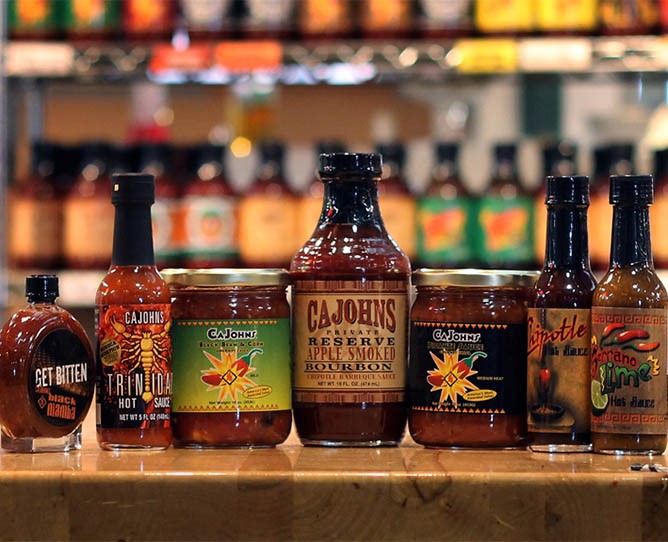
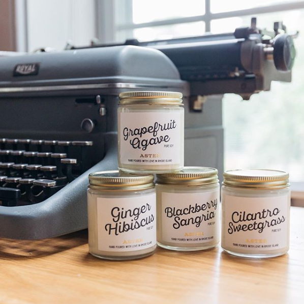
- Ensures that colors remain consistent across label runs and that each label matches your brand colors.
- Reduces the need for reprints due to color errors by calibrating and profiling devices for accurate color display and printing.
- Helps you achieve consistent colors across materials like matte and glossy paper, vinyl, and soft-touch labels.
Understanding Color Management Systems
It’s frustrating when labels from different print runs don’t match up. A color management system tackles this problem by calibrating equipment—such as monitors, presses, and proofing devices—so that each device “speaks the same language” of color. Here’s how it works:
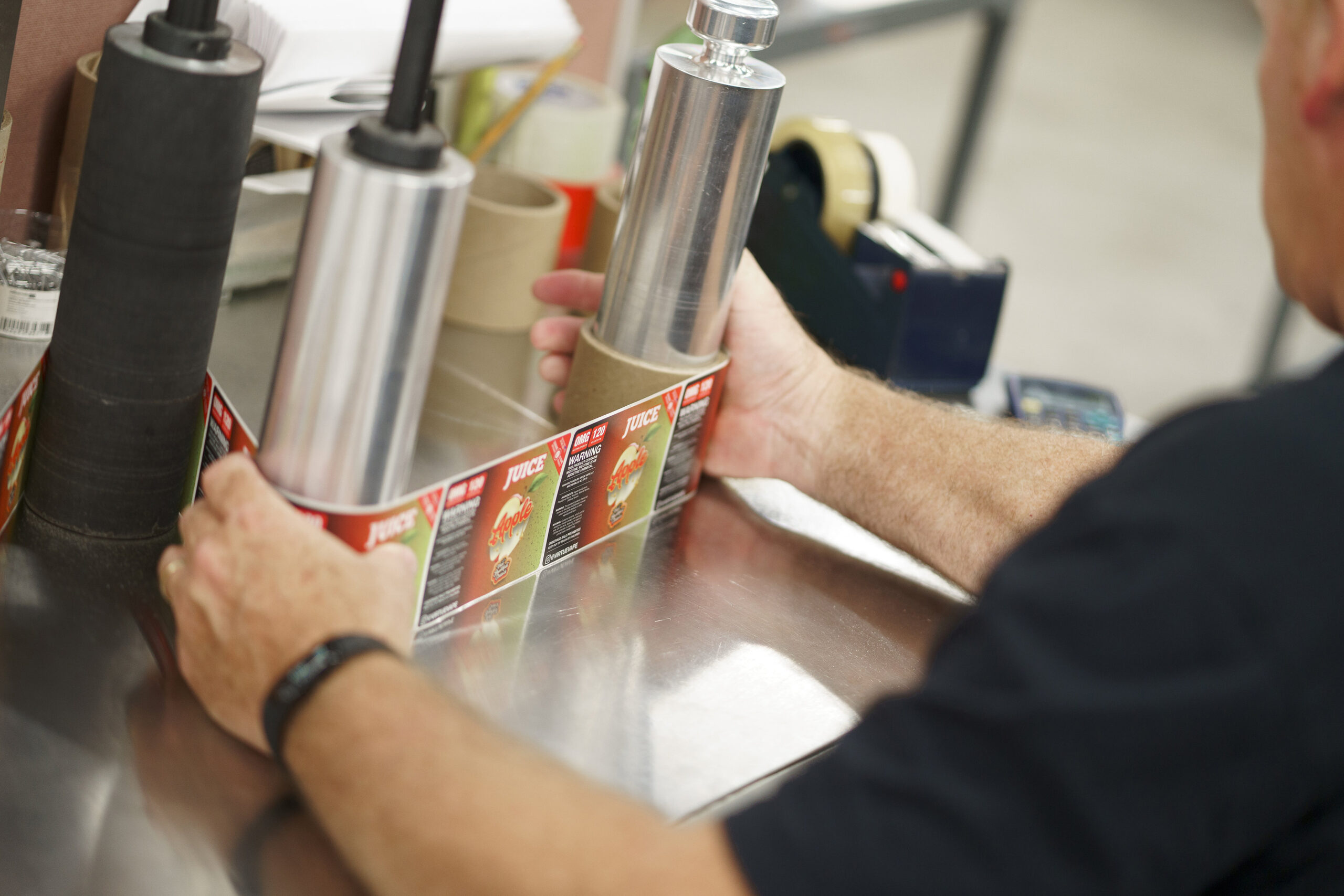
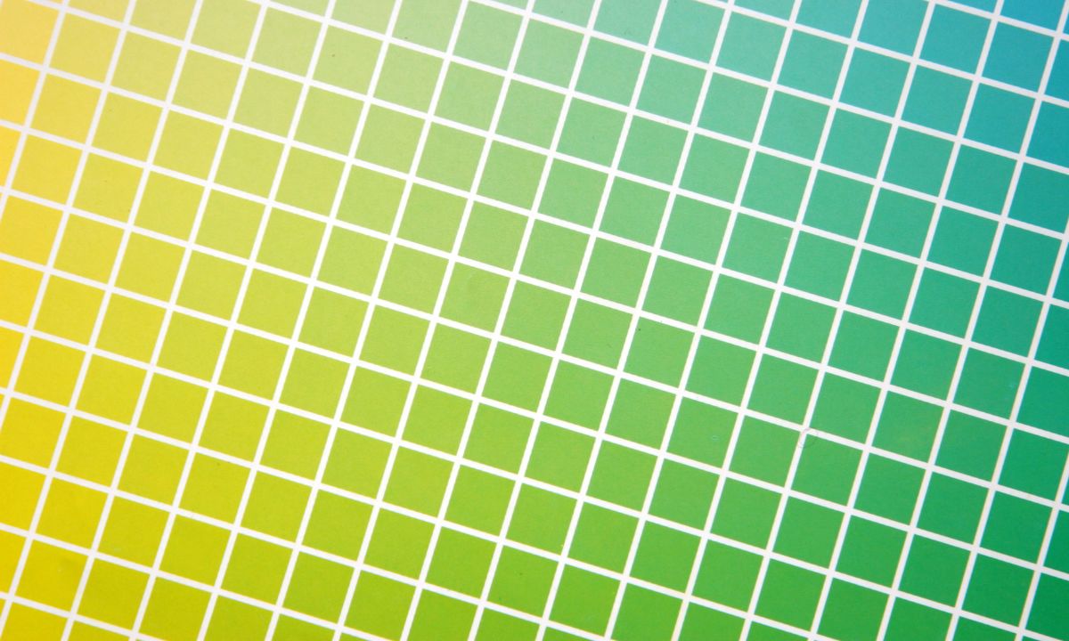
- Measuring and Calibrating: Instruments are used to measure what color looks like on every material and every press type that your printer may use. Press operators use highly calibrated proofers and spectrophotometers to check every product prior to printing. This ensures that the press output matches your brand color.
- Unifying Different Color Spaces: Conversion formulas are created that will take into account the materials and finishes being used for the label so that the associated CMYK value looks the same at the end of the process, regardless of the press, material, or finishes.
Think of it like a universal translator. With fine-tuned profiles and regular calibration, a printing partner should deliver labels that match your brand’s colors, no matter the material or printing method.

The Impact of Lighting on Color
Different lighting conditions can make the same color appear drastically different. For example:
- Bright Fluorescent Lighting (ex: in a grocery store): Colors may look cooler and more intense, making some shades seem more vibrant than intended.
- Soft, Warm Lighting (ex: at home): Colors often appear warmer, giving reds and yellows a richer tone while muting cooler hues.
- Dim Lighting (ex: in a bar or restaurant): Colors can seem darker or less saturated, making it harder for customers to recognize your brand at a glance.
Benefits of Color Consistency
Imagine your customers recognizing your product from across the aisle without a second glance—that’s the power of consistent, spot-on color in your labels.
- Faster Brand Recognition: When every label print run aligns with your established brand colors, customers can spot your products quickly—no matter where they’re shopping.
- Brand Integrity: By maintaining consistent color standards, you show that you’re serious about quality and brand integrity. This level of detail signals that your product is well-crafted and dependable.
- Increased Customer Loyalty and Repeat Purchases: Consistent color schemes create a familiar visual cue that keeps your brand top-of-mind. When shoppers know your product at a glance, they’re more inclined to buy again, driving long-term customer loyalty.
Work With an Expert Printer For Better Consistency
Color management will help you ensure uniformity across your labels and packaging. It’ll make your brand look professional and recognizable, and build your customers’ trust.
With strict color management processes, we make sure that each print is perfect down to the last detail.
Experienced printers like Blue Label have the industry expertise and tools to calibrate colors to deliver reliable results.If you’re ready to print quality labels that leave a lasting impression, we can help. Call us today to request a quote for your next label run.