How Wine Label Packaging is Changing
- alcohol labels
- augmented reality
- digital label trends
- watermarking
Modern Designs
Toy with Texture
Some wines have gone as far as to dedicate most of their label space to textured materials that entice consumers to see how they feel. For example, Limnos Wines’ Krama features texturized black and blue stripes that refer to the vineyards. Not only is this an eye-catching play on the vineyards, it also entices consumers to run their fingers across raised lines.
Texture can also allow you to play some visual tricks on consumers. The Dieline highlights Lanzerac Wine’s use of a textured paper stock, embossing, and some strategically-placed shadows give their labels a three-dimensional style that just begs for a closer look.
Avoid Clichés
Like any product, you can spot several motifs and clichés on wine shelves. Gothic and Germanic-style fonts make wines appear older and distinguished. Images of chateaux are everywhere, even for wines that don’t hail from the Bordeaux region of France. These go-to design ideas can make a wine look more distinguished, but it can also make it seems like just another bottle among the bunch.
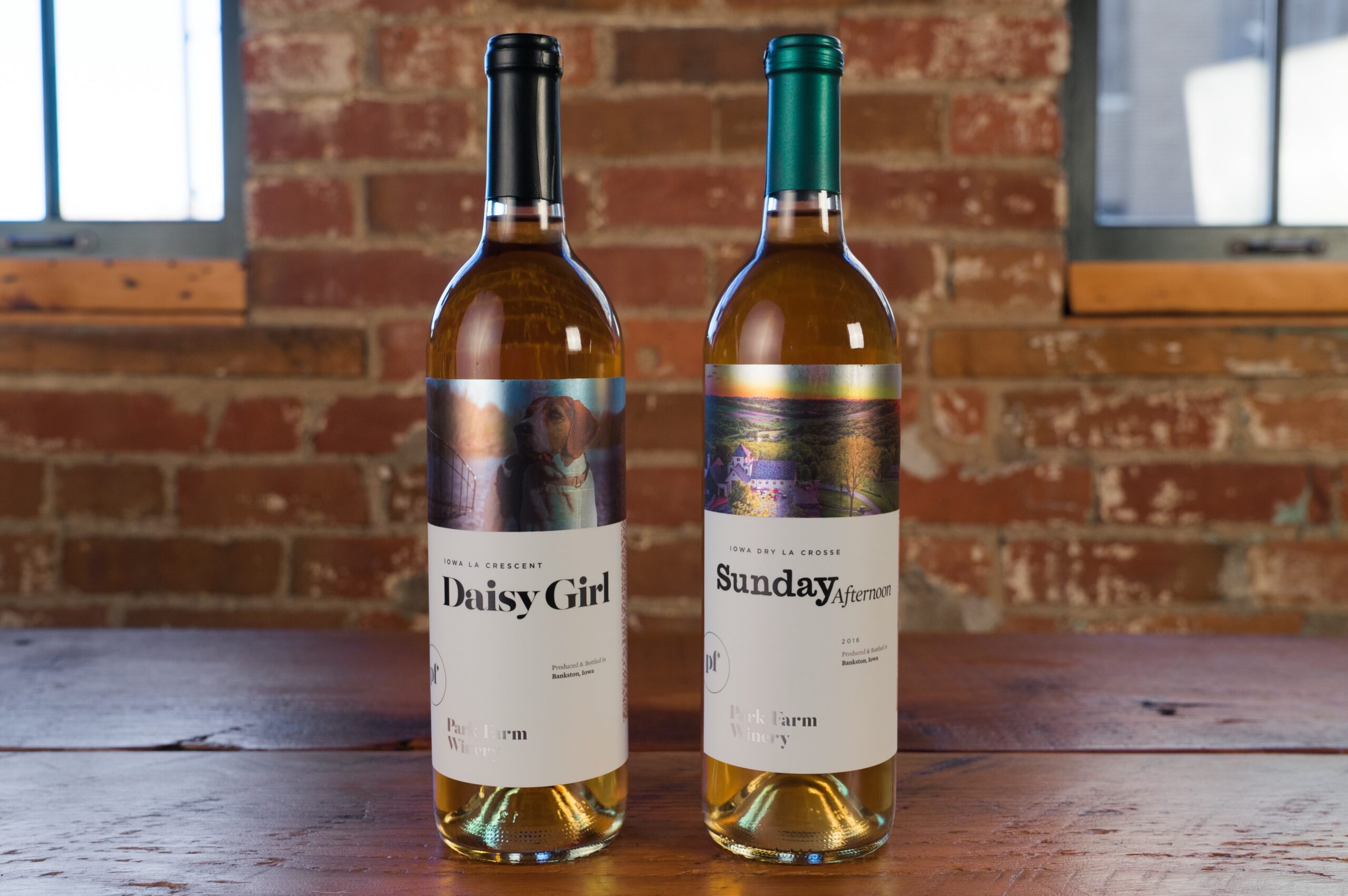
Instead of reusing the same coat of arms or classic script, modern wine label designers are starting new trends that tell the story of their products. For example, Forbes reports that traditional Bordeaux winemakers are experimenting with more contemporary designs. The same idea applies to designers in the U.S. as well. Park Farm Winery decided to eschew traditional illustrations for vivid photography of scenes found at their property. Not only did going against the grain help Park Farm connect to potential buyers, it also stands out in comparison to other labels on the shelf.
Test out Non-Traditional Colors
Certain color schemes are natural pairs for different types of wine. For example, you can quickly scan through a shelf and spot the red wines by looking for red and black labels. The same goes for cream and other off-white colors for white wines. The problem is that when every other wine uses those same colors, one bottle is just going to blend in with the crowd.
While these trends may dominate more traditional wine labels, more wineries are embracing a shift to designs that favor style over the status quo. This means that more designers avoid common color motifs for big, simple, and bold bottle labels that take advantage of color psychology to tell the story of their wine, make it relate to their intended audience, and have their product stick out in a wall of similar-looking bottles.
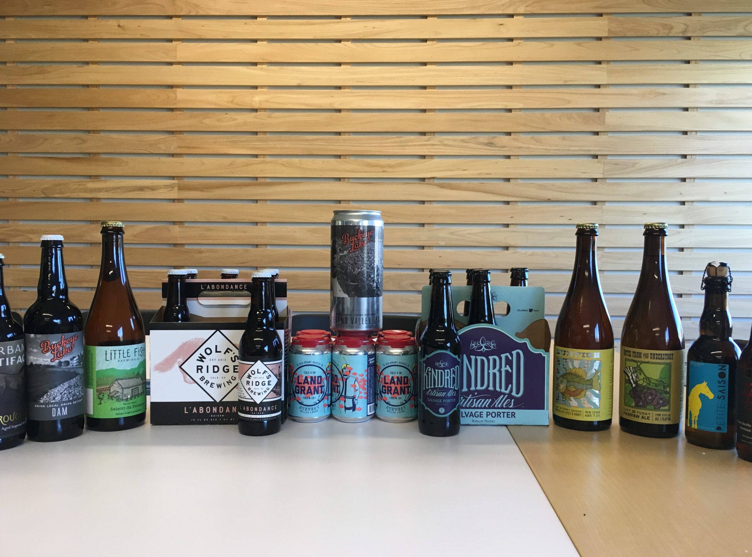
Canned Wine
Glass isn’t a necessity. Canned wine is becoming more popular for a variety of reasons, such as its portability, affordability, and convenience. The trend also has big business potential, as year-over-year sales of canned wine is up 43 percent in the U.S. according to the Drinks Business. Of course, this trend also means that wine label designers need to rethink a few things.
As always, you need to make sure that your wine packaging fits your vessel of choice. Wine cans come in various sizes that are smaller than the usual 750ml bottle, which can limit the amount of space you have to fit everything you need. As with any container, measure the dimensions so you know how much real estate you’re working with for your cans. The style of label is also important. If you used a front and back panel to label glass bottles, you may want to consider a full-wrap label that offers 360-degree coverage for your branding and compliance needs.
The overall aesthetic of the wine labels may also call for some extra attention. While some wineries focus on tradition as a main selling point, canned wine packaging is an opportunity to appeal to a new generation of wine drinkers who value convenient containers that chill quickly, won’t shatter, and travel easily. This means that your design may want to focus less on sprawling vineyards and more on vivid imagery that’s both sophisticated and approachable.
Augmented Reality
While you can’t bring your bottles to life, augmented reality (AR) is the next best option. This technology allows businesses to animate parts of packaging to engage with consumers. To do this, wineries need to design an AR-capable label design and a corresponding app, or work with a company that can do it for them. Australian wine brand 19 Crimes is one of the most noteworthy examples of AR technology. Each of 19 Crimes bottles depicts different real-life 18th century British criminals who were sent to Australia, which was a penal colony at the time. If consumers download a free app, they can hold up their smartphones to a 19 Crimes label and see an animated version of the criminal tell his or her tale.
Response to this AR campaign was extremely positive, as the 19 Crimes saw sales grow by 60 percent in volume and 70 percent in value according to Forbes. Even better, improving technology has made AR a potential option for wineries interested in telling their stories in a new, engaging way. Digital printing companies can help make AR wine labels possible though means like embedded watermarks or unique images that can be scanned with the Living Wine Labels app, Facebook cameras, or another AR-reading technology.
Work with a Digital Printer that Can Change with the Times
It’s hard to modernize your wine labels if your printing company is stuck in the past. Blue Label is a fully digital printing company that invests in high-quality equipment and digital technology that allows us to modernize your wine labels without the need for a massive budget. Contact us today to talk to us about your wine label printing project, whether you’re interested in AR technology, can labels, or other exciting packaging needs.