How to Translate Your Brand Identity into Packaging and Labels: A Step-by-Step Guide
- design
- designers
- label design
⚞ The Highlights:
- Your brand identity is your visual and verbal signature: name, logo, colors, typography, imagery, and voice. Packaging and labels are where customers meet it.
- Branding, packaging, and labeling are related but distinct: branding is the identity, packaging is the physical container and its design, labeling is the applied label and its information.
- Translate your identity by carrying your color palette, typography, logo, and voice consistently onto the label, guided by a brand guide.
- The catch most brands miss: screen colors don’t print exactly, and material and finish change how your brand reads. Plan for the jump from digital to printed.
- Consistency across your whole product line is what turns a nice label into brand recognition on a shelf.
Translating your brand identity into packaging means carrying the same colors, typography, logo, imagery, and voice that define your brand onto the physical product, so a shopper recognizes you at a glance. Your label is often the first and most frequent place a customer meets your brand, so it has to look and feel like the rest of your identity, not like a separate thing.
We help brands make that jump from a brand guide to a printed label every day, so we see where it goes smoothly and where it breaks down. Below, we walk through how the pieces fit together, how to translate your identity onto a label, and the print realities that catch brands off guard.
Branding, packaging, and labeling: what’s the difference?
These three terms get used together so often they blur, but they’re distinct pieces that work as a system. Understanding the difference makes every choice that follows easier.
| Branding | Packaging | Labeling | |
|---|---|---|---|
| What it is | Your identity: name, logo, colors, voice | The physical container and its design | The label applied to the product and its info |
| Job | Define who you are and how you feel | Protect the product and present the brand | Identify the product and carry required info |
| Example | Logo, color palette, brand voice | The bottle, can, box, or pouch | The printed label with name, ingredients, barcode |
What is branding?
Branding is your identity: the name, logo, colors, typography, imagery, and voice that make your product recognizably yours. It’s the feeling and promise a customer associates with you, expressed through a consistent look and voice.
What is packaging?
Packaging is the physical container and how it’s designed: the bottle, can, box, or pouch that holds and protects your product and presents it on a shelf. Packaging serves a functional job (protection) and a brand job (presentation) at the same time.
What is labeling?
Labeling is the label applied to the product and the information on it. That includes your brand design plus the required details: product name, ingredients, net contents, barcodes, and any regulatory information. The label is usually where your brand identity and the practical, legal requirements meet.
How they work together
Branding sets the identity, packaging gives it a physical form, and labeling carries both the brand and the required information to the customer. When all three align, a shopper sees a coherent product. When they don’t, the product feels off, even if each piece looks fine on its own.
What is brand identity, and why does packaging carry it?
Brand identity is the collection of visual and verbal elements that represent your brand and set it apart. On a shelf, your packaging is the version of that identity a customer actually touches.
The visual elements of brand identity
- Logo: the primary mark customers recognize.
- Color palette: the colors that trigger instant recognition.
- Typography: the fonts that carry your personality.
- Imagery and graphics: the photo, illustration, or pattern style you use.
- Voice and tone: how your copy sounds, from playful to refined.
Why packaging is your most-seen brand asset
For a physical product, the package is often the first brand touchpoint and the one a customer sees most: on the shelf, in their cart, at home, in a photo they share. That makes it one of the best places to express your identity. A lot of purchase decisions happen fast and visually at the shelf, so a package that instantly reads as yours helps in the moment someone is choosing.
How packaging shapes what shoppers think
Design choices like color, shape, material, and typography shape how a shopper feels about your product before they read a word. Muted tones and uncoated paper read as natural or premium. Bright colors and glossy finishes read as fun and energetic. None of it is neutral, so every choice should map back to the brand you’re building.
Designing for your target customer
Design for the people you want to buy the product, not for your own taste. Research who they are and what catches their eye, then make choices that fit them. A supplement aimed at serious athletes and one aimed at wellness-focused parents call for very different looks, even in the same category. The clearer your customer, the easier every design decision gets.
How to translate your brand identity onto a label
Here’s how to move from brand identity to a finished label, step by step.
Start with your brand guide
A brand guide is the reference that keeps everything consistent: your logo files and usage rules, exact colors, fonts, imagery style, and voice. If you have one, it’s the source of truth for your label. If you don’t, building even a simple one before you design pays off immediately, and it’s the single most useful thing to hand a designer or printer.
Color
Color is the fastest way people recognize you. Carry your exact brand colors onto the label, and specify them precisely (more on why exact matters in the print section below). Color also carries meaning, so make sure your palette fits the feeling you want, whether that’s calm, bold, natural, or premium.
Typography
Use the fonts from your brand identity, and keep them legible at label size. Your type should feel like the same brand across your website, your ads, and your package. For more on making type work on a label specifically, see our typography tips for product labels.
Logo and imagery
Apply your logo consistently, at a size and clear space that keep it recognizable, and use the same imagery style (photography, illustration, pattern) you use elsewhere. Consistency here is what makes a lineup of products read as one family.
Materials and finish
The material and finish are part of your brand, not just a spec. Uncoated or kraft stock feels natural and honest. Soft-touch matte reads premium and modern. High gloss looks bright and fun, while foil or embossing says luxury. Choose the material that reinforces your identity, not just the cheapest option.
Voice and copy
The words on your label should sound like your brand too. A playful brand can be playful in its product description; a refined brand keeps its copy spare. Voice is easy to forget on a label, but it’s part of the identity you’re translating.
Ready to put your brand on a label?
Send us your brand guide and we’ll help translate it into a print-ready label, matching your colors, choosing the right material, and making sure it looks like you.
Request a Quote Get a Sample Pack
Where brand identity meets the printed label
This is the step brands underestimate, and it’s where we spend the most time with customers. Your brand assets were almost certainly built for a screen, and a label is a physical, printed object. A few things change in that jump, and planning for them keeps your brand looking like itself.
Screen colors vs. printed colors
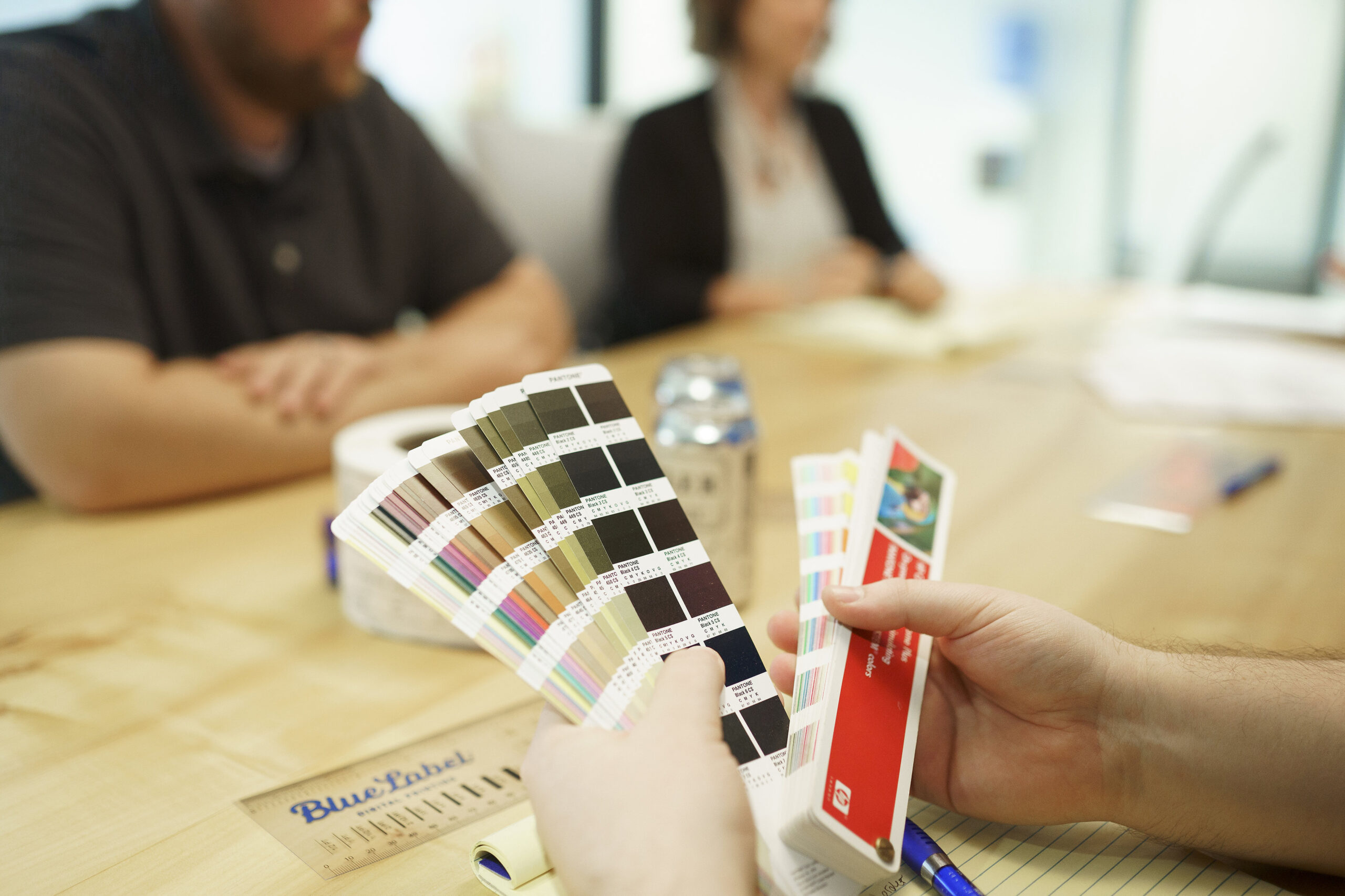
Screens show color in RGB (light), while labels print in CMYK inks, often with specific Pantone (spot) colors for brand hues. The two don’t map perfectly, so a color that glows on your website can print duller or slightly shifted if it isn’t managed. The fix is to define your brand colors as Pantone or CMYK values, not just a screen hex code, and to check them on a printed proof. For the full picture, see our guide to RGB vs. CMYK color formats.
How material and finish change brand perception
The same design reads differently on different materials. A logo color looks richer on gloss than on uncoated kraft, which absorbs ink and mutes it. A matte finish softens everything; a metallic film adds shine your artwork didn’t have on screen. Because material affects both color and feel, it’s worth choosing it as part of the brand decision and seeing your design on that actual stock before you commit.
What to hand your printer
- Your brand guide, including logo files and color specs.
- Vector artwork with fonts converted to outlines (so your type prints exactly, even if the printer doesn’t have your font).
- Pantone or CMYK values for your brand colors, not just hex codes.
- Your material and finish preference, or a request for guidance on it.
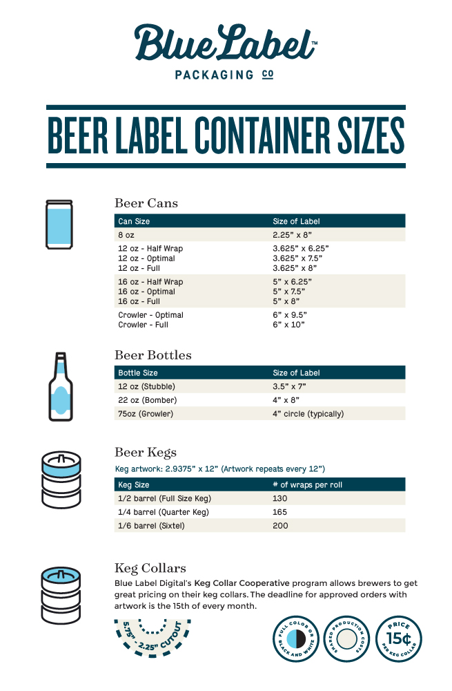
- The container details, so the label is sized and shaped correctly.
Hand a printer those, and the translation from brand identity to finished label goes smoothly. Leave them out, and you risk a label that doesn’t quite look like your brand.
Keeping your brand consistent across products
Consistency across your whole product line is what turns individual labels into brand recognition. Use your brand guide to keep the core identity steady across every SKU: logo placement, color system, and typography. Allow thoughtful variation, like a different accent color per flavor, as long as the lineup still reads as one family. When you expand into a new product or market, adapt carefully rather than reinventing, so customers still recognize you. Our post on 8 steps to great label design is a useful companion here.
Frequently asked questions
What is the difference between branding, packaging, and labeling?
Branding is your identity: the name, logo, colors, typography, and voice that make a product recognizably yours. Packaging is the physical container and its design, the bottle, can, box, or pouch that protects the product and presents the brand. Labeling is the label applied to the product and the information on it, including brand design plus required details like ingredients, net contents, and barcodes. Branding sets the identity, packaging gives it physical form, and labeling carries both to the customer.
What is brand identity in packaging?
Brand identity in packaging is how your visual and verbal signature shows up on the physical product: your logo, color palette, typography, imagery, and voice. Because packaging is often the first and most frequent place a customer meets your brand, it’s one of the best places to express your identity consistently.
How do you translate a brand into a label design?
Start from your brand guide, then carry your exact colors, typography, logo, imagery style, and voice onto the label, keeping everything legible at label size. Choose a material and finish that reinforce the brand’s feel. Then account for print realities: define colors in Pantone or CMYK (not just screen hex codes) and check them on a printed proof, since screen color doesn’t map perfectly to printed ink.
Why do my brand colors look different when printed?
Screens display color in RGB (light) while labels print in CMYK inks, often with Pantone spot colors for brand hues, and the two don’t map perfectly. A color that glows on screen can print duller or slightly shifted if it isn’t managed. Define your brand colors as Pantone or CMYK values and confirm them on a printed proof on your actual material.
Why does brand consistency across products matter?
Consistency is what turns individual labels into recognition. When logo placement, color system, and typography stay steady across every product, a lineup reads as one family and customers recognize you at a glance. Thoughtful variation (like a different accent color per flavor) is fine as long as the core identity stays consistent.
Ready to bring your brand to the shelf?
If you’re ready to turn your brand identity into a label that looks like you, we’re glad to help. Request a sample pack to see materials and finishes, or get in touch with your brand guide and we’ll help translate it into print.
More on designing a label that reflects your brand:
- 8 Steps to Great Label Design
- 3 Color Psychology Tips to Consider for Your Label
- RGB vs. CMYK: A Quick Guide to Color Formats