Using AI for Label Design: A Practical Guide
We’re seeing more brands using AI to design or assist with the design of their labels. Brands get a great-looking mockup and send it over to print, only to find out that the artwork isn’t prepared properly for actual production.
Is using AI to assist with design bad? Not at all. In fact, AI can be an incredibly useful tool for brainstorming concepts, exploring creative directions, and generating early-stage label ideas. Where it often falls short is creating the final, print-ready files needed for production.
As AI becomes a bigger part of the design process, we want to help you understand where these tools excel, where they can create challenges, and how to bridge the gap between an AI-generated concept and artwork that is ready for press. We’ll also share ways to guide AI tools toward more production-friendly results, helping you save time and avoid common pitfalls.
What “Print-Ready” Actually Means
Before we talk about AI specifically, it helps to know what a printer is looking for. These are the same standards that have always applied to artwork, AI or not.
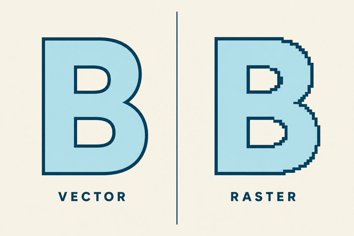
Vector vs. raster. Raster files are built out of pixels, like a photo. When you scale a raster image up much past its original size, the pixels start to show and the image gets blurry. Vector files work differently. They use paths and points, so the artwork stays sharp at any size. AI tools output raster files, which is one of the main reasons their artwork has to be rebuilt before it can go to press.
CMYK vs. RGB. Screens use RGB (red, green, blue). Presses use CMYK (cyan, magenta, yellow, black). Colors do not translate one-to-one between them. Bright neons, deep blacks, and rich greens are the ones that drift the most when a file gets converted. AI tools generate in RGB by default.
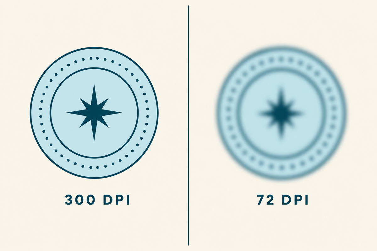
Resolution. Print files need to be at least 300 DPI at the final printed size. A label that prints two inches wide needs about 600 pixels of real detail across that two inches. AI tools usually generate at lower effective resolution than that, even when the canvas looks big.
Bleed. The artwork has to extend past the cut line by 1/8″ on every side. That extra bit gets trimmed off after printing. Without bleed, a slightly off-center cut leaves a white edge on your label. AI does not know about bleed unless you tell it.
Safe zone. The safe zone is the inside version of bleed. Nothing important (text, logo, key visual) should sit within 1/16″ of the cut line, because cuts are precise but not always perfect. The safe zone gives you a buffer around the elements you cannot afford to have trimmed.

Label template. Designers and printers call this a “dieline.” It is the outline of the actual label shape, sized at 100%, sitting on its own layer in the file. The label template tells the press where to cut.
Outlined fonts. Every piece of type in the final file needs to be converted from a font into a shape. Otherwise the press needs that font installed, and missing fonts are one of the most common reasons a job stalls in prepress.
Live barcodes. A barcode in a label file has to be a real generated code, not a picture of one. Pictures of barcodes do not scan. We get a lot of these from AI files.
Ink coverage. A label with heavy, saturated ink coverage across most of its surface can be hard on a press. Ink does not dry as fast, registration can drift, and the label can feel wet at takeoff. There are ways to handle this, but it has to be planned for.
Worth knowing: we go deeper on file specifications in our post on common art file mistakes. This guide focuses on what AI specifically does and does not do well in this context.
What Our Graphics Team Sees in AI-Generated Files
Our graphics team handles these files every day. Here is what they are seeing from AI right now:
“Mainly we are seeing AI-generated artwork arrive not truly print-ready for packaging and labels. Issues include low-res raster files instead of vectors, RGB color that shifts badly when converted to CMYK, and no consideration for spot colors or white ink. Text and barcodes are arriving rasterized or distorted, causing legibility and scan issues at small sizes. Files also rarely account for die lines, bleed, or finishing tolerances, and heavy ink coverage can create press stability problems.”
A few patterns come up over and over:
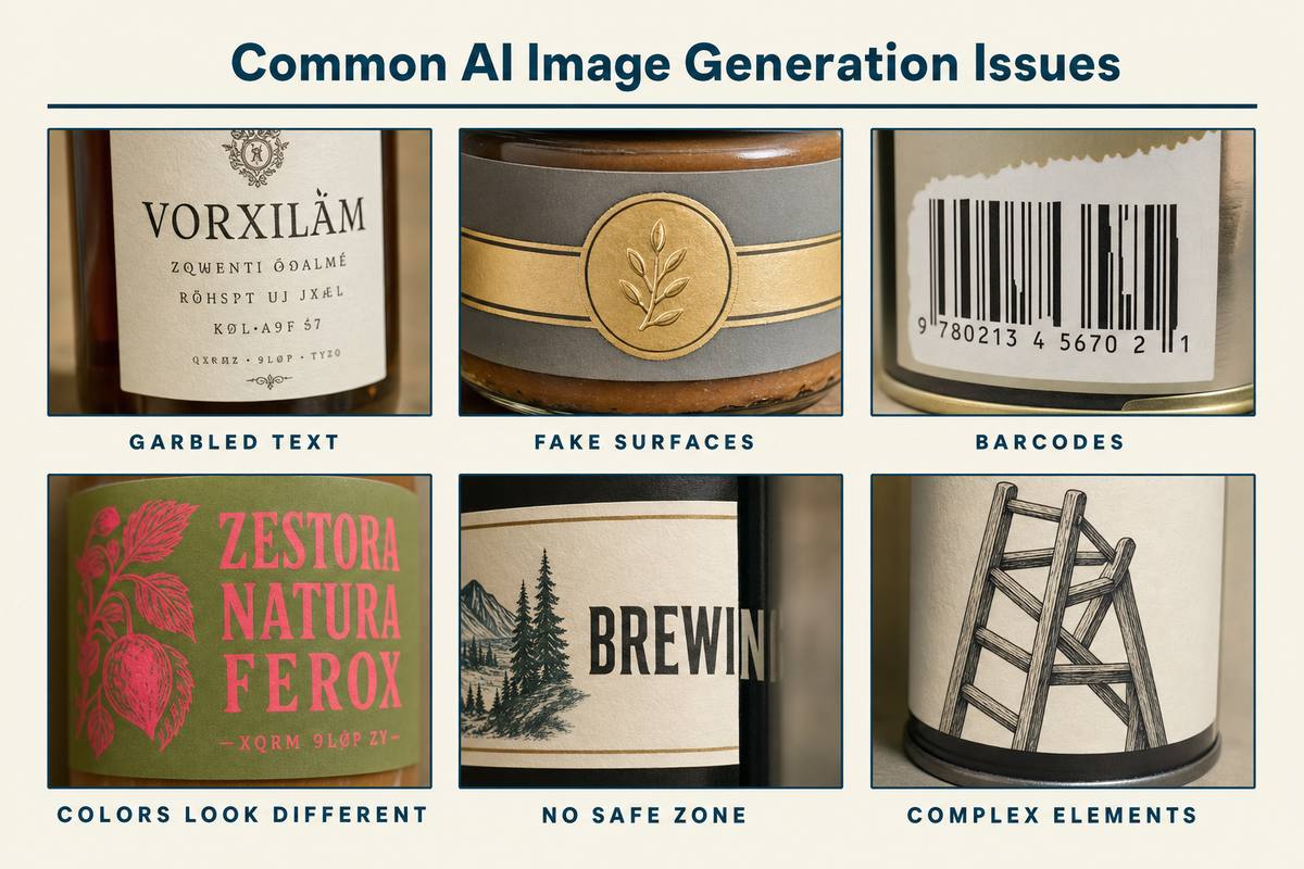
- The text comes out wrong. AI image tools invent letters, misspell brand names, drop characters, and warp type. Even when the type looks fine in a render, it is baked into the pixels. It can’t be edited, kerned, or outlined cleanly later.
- Fake foil, fake gloss, fake holographic. AI loves rendering surfaces that look metallic or shimmery on screen. None of that translates to a press. Foil is a physical material, applied after printing. Gloss is a finish, not an image. When AI bakes a shimmer into the artwork, you get a flat image of a shimmer on the label, not the actual finish.
- Barcodes that do not scan. AI renders barcodes the same way it renders any other visual: as a decorative imitation. The bars are not encoded, and the spacing is not accurate. Even when they look perfect, scanners cannot read them.
- Colors look different on the proof. This is the most common surprise. The mockup looks vivid and saturated on screen, the printed label comes back duller and slightly off. That is the RGB-to-CMYK shift in action, and it is more pronounced with bright colors. It’s also worth noting that there are some blend modes and transparency effects that are only usable on screen and in the RGB color space. If possible, include a note about CMYK or printable colors in your AI prompts.
- No bleed, no safe zone. AI generates inside the canvas you specify and treats the edges as edges. There is no margin for trim, and important elements often sit right at the boundary.
This is not really a knock on AI. These tools were built to produce images that look good on a screen, and they do that well. Print-ready is a different problem from the one they were designed to solve.
How the Major AI Tools Differ for Label Work
The tools are not the same, and the differences matter when you are using them for label work. Knowing how each one behaves helps you pick the right one for the part of the process you are in.
| Tool | What it is good at | Where it drifts | What it cannot do |
| ChatGPT image generation (DALL-E / GPT image models) | Takes detailed instructions well. Will respect explicit constraints. Good for first-pass concepts with specific requirements. | Drifts toward illustrative or photoreal mockups if not constrained. Can over-render textures. | True vector, true spot color, working barcodes, accurate Pantone matches. |
| Midjourney | Aesthetic richness. Strong on mood, texture, lighting, and visual style. Best output if you are exploring a look. | Least responsive to technical constraints. Loves rendering fake foil, fake gloss, fake metallics. Type is consistently weak. | True vector, true spot color, working barcodes, editable layered output. |
| Adobe Firefly | Closest path to a real production workflow. Outputs can be brought into Illustrator with less friction. Trained on commercially-safe data, which matters for brand use. | Still raster at generation. Aesthetic range narrower than Midjourney. | True vector at generation, true spot color, working barcodes. |
| Microsoft Copilot / Designer | Convenient inside Microsoft 365. Quick concept passes without leaving the tools you already use. | Uses similar underlying models to ChatGPT for many outputs. Same drift patterns. | Same limits as ChatGPT and the others. |
| Claude | Strong for creative direction, prompt writing, label copy, dieline-aware planning, critique, and translating brand strategy into design instructions. Can help structure production notes and identify print risks before artwork goes to a designer. | Not a native image-generation tool for photos or illustrations. Better as a design director than a design generator. Can over-specify concepts that still need to be executed elsewhere. | Direct generation of finished label artwork, true vector, true spot color, working barcodes, accurate Pantone matches, editable layered print files. |
| Google Gemini | Good for quick concept exploration, image generation/editing, visual variation, and multimodal feedback. Strong when you want to iterate from written direction plus reference imagery. | Can still drift toward polished mockups rather than production artwork. Type, small regulatory copy, exact layout discipline, and material/finish realism need careful checking. | True vector at generation, true spot color, working barcodes, accurate Pantone matches, reliable print-ready typography, editable layered production files. |
The takeaway across all four is similar. They are useful for the brainstorming and concepting side of label design, and they are limited for the production side. Pick the one that fits how you already work, and plan on bringing in a designer or your printer to take the concept to a file the press can run.
A Better Approach to Prompting AI for Label Design
No matter which AI platform you choose, you want to train it before you can rely on it to deliver what you want or don’t want. Build your prompts out of reusable blocks that you can mix, match, and iterate on one piece at a time.
There are four blocks we recommend keeping separate.
Block 1: The Persona Block
The persona block tells the AI what role it is playing, which sets the defaults for everything else. If you just ask for “a label design,” the output tends to be generic. If you set up the AI as if you were briefing a working production designer, the output usually tightens up.
A starter persona block:
“You are a print production designer creating artwork for a small commercial beverage brand. Your output will be evaluated against professional prepress standards. You design for a real press, not a screen.”
You can adjust this. A persona for a CPG hot sauce brand might emphasize shelf appeal. A persona for a winery might emphasize elegance and craft. The point is to give the model a role with specific defaults.
Block 2: The Technical Block
The technical block is where you spell out the print specifications. It is the part that feels tedious, and it is the block we would suggest locking in and reusing across every prompt so the specs stay consistent.
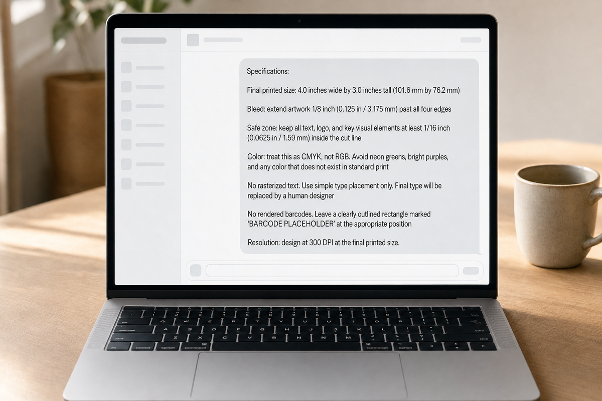
A technical block based on our own artwork file standards:
Specifications:
- Final printed size: 4.0 inches wide by 3.0 inches tall (101.6 mm by 76.2 mm)
- Bleed: extend artwork 1/8 inch (0.125 in / 3.175 mm) past all four edges
- Safe zone: keep all text, logo, and key visual elements at least 1/16 inch (0.0625 in / 1.59 mm) inside the cut line
- Color: treat this as CMYK, not RGB. Avoid any color that does not exist in standard print
- No rasterized text. Use simple type placement only. Final type will be replaced by a human designer
- No rendered barcodes. Leave a clearly outlined rectangle marked ‘BARCODE PLACEHOLDER’ at the appropriate position
- Resolution: design at 300 DPI at the final printed size
Once you have a version of this block dialed in for a given product, the only thing you tend to change between prompts is the dimensions.
Block 3: The Visual Direction Block
This is where you describe the actual look you want, which is the creative side of the prompt. It is also where most prompts go off the rails, because people pack technical specs and visual direction into one paragraph and the AI gets confused about what it is being asked to do.
A visual direction block might look like:
Visual direction:
- Mood: warm, modern, slightly nostalgic
- Palette: deep navy, cream, a single accent of warm orange. Avoid neons and pastels
- Typography style: sans-serif with a small handwritten brand mark.
- Imagery: a stylized illustration of a sun or sunrise over a curved horizon line. Linework-led, not photoreal
- Finish: Do NOT render fake foil, fake gloss, fake holographic, fake embossing, or any simulated metallic shimmer. The actual finish will be applied by the printer
Block 4: The Negative Constraints Block
The last block tells the AI what NOT to do. Negative constraints are surprisingly effective with these models.
Do not include:
- Fake foil shimmer or metallic gradients
- Fake glossy reflections or wet-look highlights
- Decorative imitation barcodes or QR codes
- Warped, stretched, or curved text
- Off-brand colors or unexpected color shifts
- Stretched, rotated, or modified logos
- Visual artifacts (extra fingers, garbled letterforms, melted edges)
- Heavy texture overlays that simulate paper, foil, or holographic surfaces
Stitching the Blocks Together
A complete prompt for a small-batch hot sauce label would be the four blocks stacked together in order: persona first, technical second, visual third, negative constraints last. That order gives the model the role, then the rules, then the look, then the things to avoid. Each block stands on its own, so you can rewrite one without having to redo the others.
What Still Needs a Human Designer After AI
This is the part of the process AI cannot do on its own (currently). A few things still need a designer or your printer:
- Rebuilding the file as a true vector. A raster AI render gets rebuilt in Illustrator (or equivalent) before it goes to a press. This is where the logo gets cleaned up, the type gets set in real fonts, and the shapes get drawn as paths.
- Real spot color and Pantone matches. If your brand has specific Pantones, those have to be specified as spot colors in the file, not approximated in CMYK.
- White ink layers. For clear or metallic label stocks, white ink underlays the design where you want opacity. AI does not model this. It has to be added.
- Working barcodes. The label needs a real scannable code. AI typically does not produce this well.
- The label template. Your printer provides the dieline at your exact label dimensions. The artwork gets placed inside it.
- Bleed, safe zone, and outlined fonts. All of these get enforced in the production file, not in the AI output.
- Ink coverage and finish decisions. Foil, emboss, spot UV, soft-touch laminate, matte versus gloss. They can’t just be “rendered in.”
In Blue Label’s Expert Review, we check these things on every project before anything goes to press. If you want a closer look at the production side, we wrote about how a label goes from artwork to a finished product.
A Quick Pre-Press Checklist for AI Artwork
Before you send an AI-generated concept to a printer, run through this:
- File format: PDF or AI file (we recommend high-resolution PDF, and we accept Illustrator files)
- Resolution: at least 300 DPI at the final printed size
- Bleed: 1/8″ past the cut line on all sides
- Safe zone: 1/16″ inside the cut line
- Type: the type should be built (or rebuilt) in real fonts (don’t rely on AI text)
- Barcode: a real generated code, not a rendered imitation
- Color: marked CMYK, or clearly labeled as RGB that needs conversion
- Finishes: not baked into the artwork as fake textures
- Pantones: any spot colors called out explicitly
You can also download our artwork templates for common label sizes, which already have the bleed and safe zones built in. They are a fast way to get your artwork into a real production layout before sending it over.
Working With Blue Label on AI Concepts
AI is part of how a lot of brands work now. What we will do is look at your file, tell you what works, tell you what needs to be rebuilt for press, and give you a clear path to a finished label.
If you want to send us an early concept, even a rough one, we are happy to take a look. We can tell you what to expect, what we will need, and what your options are for finishes and materials.
Send us your file or request a quote when you are ready. We are here if you have questions.