When Is Your Brand Ready for Printed Cans?
Most beverage brands start with labeled cans. Labels are flexible, the minimums are low, and when you’re figuring out your beverage lineup, that flexibility matters. Plenty of brands stay with labels for years because labels are the right fit, and that’s a perfectly good decision.
Printed cans are a different approach. They cost more per unit than labels, so it’s not simply a decision about one or the other. It’s more about which one fits your brand right now.
Here’s how to tell when printed cans are worth a look, and when sticking with labels might make more sense.
When Printed Cans Start to Make Sense
Brands usually start considering printed cans at the following times:
Your category leans toward printed cans. In some categories, printed cans are basically the standard. Walk down the energy drink aisle and nearly every can is printed directly on the aluminum. When a whole category looks one way, a labeled can can read as the less established option, even when the product inside is excellent, and it may get less consideration from buyers and retail accounts who are used to the category norm.
Volume is growing, and labeling is eating into production time. If you’re labeling cans internally, there’s a point where the process becomes a real bottleneck. We see this a lot with breweries doing 1,000+ cans per run. Handing label application off to a label converter is a common approach, but that will add cost too, so this can be a good time to compare both options.
You want one less variable in wet, cold conditions. The right label materials handle coolers, ice, and condensation just fine. A quality BOPP label, applied well, holds up well to moisture and cold environments. If you’re seeing wrinkling or peeling, that’s usually a sign the material or application isn’t matched to the conditions, and it’s often fixable by switching materials or label protection. Printed cans, on the other hand, take the question off the table entirely, because the ink is cured directly onto the aluminum and there’s nothing to lift or peel.
You’re moving into distribution with large retailers. Taproom-only brands have more room for a handmade, personal look, and that look often works in their favor. But when your cans sit next to nationally distributed brands in a cooler at large retailers, small differences get noticed.
None of these on its own means you should switch. Labels are often the right call, especially given the lower cost per unit. But if two or three of these line up, printed cans are worth running the numbers on.
What the Switch Actually Looks Like
Moving to printed cans is simpler than most brands expect. Here’s the basic process:
- You send us your artwork. If you already have label designs, they’ll need some adjustments for can printing (different dimensions, different bleed areas, barcode placement). We walk you through what needs to change. If you’re curious about the details, our guide to designing for printed cans covers the technical side.
- We produce a pilot can. This is a physical prototype of your design, printed on an actual can, so you can hold it, check the colors, and show it to your team before committing to a full run.
- Your team approves the pilot. Once you’re happy with how it looks and feels, we move to production.
- Production runs in about 10 business days from pilot approval. Your digitally printed cans arrive ready to fill. No separate label order. No applicator setup. No labeling step on your canning line.
What changes in your workflow: You stop ordering labels and brights separately. You stop scheduling labeling time. Your cans arrive finished.
What stays the same: Your filling process, your canning line, your distribution. The cans just arrive ready to go.
Labels vs. Shrink Sleeves vs. Printed Cans
Each option has a place. The right choice depends on where your brand is right now.
| Labels | Shrink Sleeves | Printed Cans | |
| Best for | Early-stage brands, high SKU variety, frequent design changes, lower budgets | 360-degree coverage, complex graphics | Established SKUs, growing volume, retail shelf presence |
| Minimum order | No minimum order quantity | No minimum order quantity | ~1,600-2,000 cans per SKU |
| Lead time | 5 business days after artwork approval | 5 business days after artwork approval | 10 business days (after pilot can approval) |
| Durability | Excellent with the right material like BOPP. Matching the stock to the conditions is what matters. | Good moisture resistance | Excellent. Ink is bonded to the aluminum. |
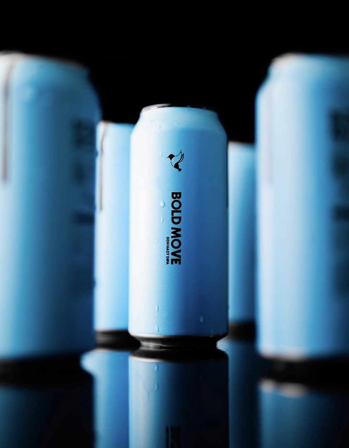
| Shelf presence | Strong. A well-made label looks great, with a visible edge up close. | Smooth, full coverage | Premium. No edges, no seams, no peeling. |
| Sustainability | Adds a label layer to the can | Plastic sleeve is typically not recyclable with the can | Fully recyclable. No extra materials. |
Pro tip: A lot of brands use a mix. Printed cans for their core lineup (the beers or beverages that sell consistently) and labels for seasonal releases, collaborations, or limited editions where they need design flexibility and lower quantities. This isn’t a transition you have to finish. Plenty of brands run both formats for years because each one earns its place.
What Printed Cans Can (and Can’t) Do
Printed cans offer finishes that used to be reserved for big national brands with six-figure order minimums. Until recently, most printed can orders required 100,000+ cans per SKU with 12-week lead times. Digital printing has changed that completely.
Available finishes:
- Matte and gloss
- High build (emboss) for a raised, tactile effect
- Selective metallic, where the bare aluminum shows through your design for a natural metallic look
- Spot varnish applied to specific design elements
The selective metallic option is worth calling out. Instead of printing a white layer under your entire design, you can leave parts of the aluminum exposed. It creates a metallic effect that’s built into the can itself, not printed on top of it. We see brands use this for logos, accent details, or background textures.
Limitations to know about:
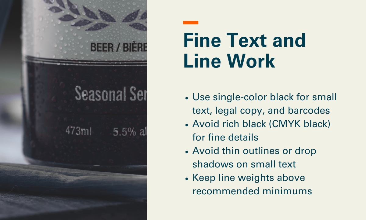
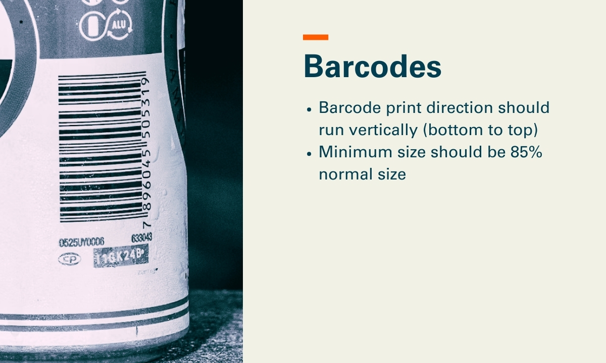
- Fine text needs to be 7pt or larger for readability
- Barcodes work best in vertical orientation on cans
- Your designer will need to think about the can’s curve, especially near the top and bottom edges where the shape changes
Our designing for printed cans guide covers all of these in detail.
How to Test Printed Cans Without Committing
One of the biggest concerns we hear is: “What if I invest in printed cans and they don’t work for us?”
That’s exactly why the pilot can exists. You can:
- Check the colors against your existing labels or brand guidelines
- Show it to your sales team and your retail accounts to get feedback before you commit
- Test consumer response at a taproom, a market, or an event
- Confirm the design works on a curved surface before running thousands
Worth knowing: Some brands order pilot cans for 2-3 designs at once to compare finishes (matte vs. gloss, metallic knock-outs vs. full coverage) before choosing their production spec.
Ready to See What Your Brand Looks Like on a Printed Can?
If a few of these signs are lining up for your brand, the easiest next step is a pilot can. It’s a low-risk way to see your actual design on an actual can before making any production decisions. And if labels are still the right fit for where you are, that’s a good answer too.
Check out our printed cans page to see what’s possible, or request a quote and we’ll walk you through the options for your specific brand.