Common Label Mistakes to Avoid: Art File Issues
An art file contains much more than just your design. Each file needs to include important details and meet certain guidelines so your finished labels look just like your design. As a result, one overlooked file standard can lead to potential problems with your label. Here’s a rundown of the most common issues that can affect your art files.
It’s in the Wrong File Format
Before you get too far, make sure that you’re using the right file format for your printer. Print companies have preferred file formats so that they can take your file and turn it into labels. At Blue Label, we require Adobe Illustrator files or High-resolution PDFs from Photoshop, so make sure to ask your label printer what files they need (if they haven’t told you already). Companies can often accept PDFs made through other software, but it’s best to ask questions or send over art files beforehand to make sure they are compatible with the commercial printing presses used to produce your packaging.
The Images are Blurry
Blurry images are the bane of a good design’s existence. When possible, use vector images in your art file so that they can be resized without worry. Vector-based artwork uses mathematical calculations to create lines and shapes that allow these graphic to look the same even if you zoom in on the file. You can make vector images in Illustrator
If this isn’t an option, you should be fine with pixel-based images if they’re a high enough resolution. Whether you use vector or pixel-based images, they should be a minimum of 300 DPI, although 600 DPI or more is preferable if possible.

The File is Too Big
Art files tend to get rather big if you’re not careful. Large file sizes can make it difficult to transfer the file to the printing press. That means it’s best to try and manage file size before yours becomes too big.
Images are the main reason for a hefty art file. Pixel-based images, such as .jpg, .gif, and .png files, are larger than vector-based images in terms of file size, so too much pixel-based artwork will bog down your file. You should also embed or link pixel-based images in your file. Embedded images are kept in the art file, which can contribute more to the overall file size. Linked images are saved outside the file and can save space if you also share the original image files with your printer.
There are some other tricks to reduce image and file size in Illustrator, including playing with raster effects and file cleanup resources. You can learn more about these methods and the processes for linking and embedding images in our guide on managing file size.
The Colors are Wrong
It’s imperative that your art file uses the right color format. Digital printing requires CMYK, which is comprised of four colors – Cyan, Magenta, Yellow, and Black (Key) – with additional hues that allow best-in-class printing presses to attain up to 98 percent of the Pantone spectrum. The RGB color model is designed for use on electronic displays like computer monitors and phone screens, but not for print. This means that you’ll want to use the CMYK model to make sure that your colors come through the way they should on your labels.
If you have a specific color in mind, it’s important to call it out using the Pantone Matching System. This will allow the printer to look up the exact color code and match the exact shade your brand requires. To learn more about using the Pantone Matching System and different color profiles, check out our digital printing color guide.
The Dieline Doesn’t Incorporate Bleed or a Safe Zone
Your art file not only needs to include your design, it also needs a dieline. As much as printing companies try to make exact cuts for every single label, there is a chance of some slight variation. The dieline should consist of three separate lines to prepare for this potential variation:
- A main dieline that maps out the intended cut of the final design
- A bleed area to ensure that there are no accidental white spaces
- A safe zone to protect design elements
The purpose of the main dieline is simple: to show exactly where a die is supposed to cut a label. The bleed space is an extension of the background of the design to eliminate any off-putting white spaces if the cut isn’t exact. This bleed area should be at least 1/8” around all sides of your design.
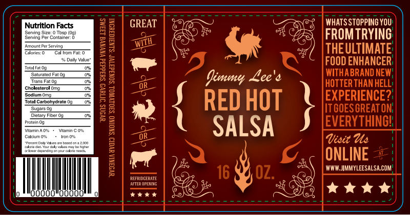
The safe zone is also designed to provide wiggle room, this time creating a space in your design so that any essential elements – type, logos, etc. – aren’t too close to the dieline. The safe zone should allow for 1/16” of space between the dieline and any elements. You can see an example of a complete dieline with all three components below.

The Text isn’t Outlined
A good design is more than just images – even a minimalist label design is bound to include a few words. To ensure that these words print correctly, it’s important that you have the font outlined in your art file before you send it over to a printing company.
Outlining fonts is critical because it takes each letter and turns it into an image. This practice eliminates the need for font software and files. It also offers a few key benefits, such as making it easier to create custom type tailoring, adding color treatments to parts of characters, and making type heavier for production purposes. For guidance on how to convert font to outlines, check out our font preparation guide.
Find a Label Printing Company That Works with You
A good art file plays a big role in the production of your product labels, but it’s not always easy to figure out exactly what to do to make sure your art file is ready for its close-up. At Blue Label, we do more than just print your labels; we work with your company to guide you through the printing process and assist you from start to finish. Whether you have art file questions, need to identify the right label materials, or want to know more about our printing capabilities for your products, we put in the time to understand your needs and help along the way.
Ready to turn your design into the perfect labels for your products? Contact Blue Label today to talk to one of our experts about your project.