Designing for Printed Cans: What You Need to Know
- Custom Designs
- Printed Cans
If this is your first time switching from labels to printed cans, the goal isn’t to redesign everything, it’s to understand how can printing is different from labels or sleeves and how to brief your designer so the final result looks exactly the way you expect.
The biggest difference:
Artwork is printed directly onto the can using high-speed digital inkjet technology with the can rotating while ink is applied. That process changes how fine details, text, color layering, and registration behave compared to pressure-sensitive labels or shrink sleeves.
We’ll walk through the adjustments you need to make to get great looking printed cans without any surprises.
Core Design Differences Your Designer Needs to Know
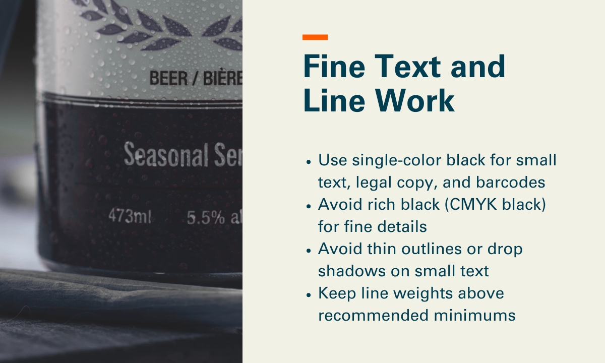
1. Fine Text and Line Work
Printed can technology uses multiple print heads and layered color separations, and the resolution is lower than what designers are used to with pressure-sensitive labels or shrink sleeves. That means very small text or thin lines can look less crisp than expected.
Our recommendations:
- Use single-color black for small text, legal copy, and barcodes
- Avoid rich black (CMYK black) for fine details
- Avoid thin outlines or drop shadows on small text
- Keep line weights above recommended minimums (0.1pt for lines; avoid ultra‑fine hairlines), and keep small text above minimums (7pt and up for single‑color text, larger if reversed out or multi‑color)
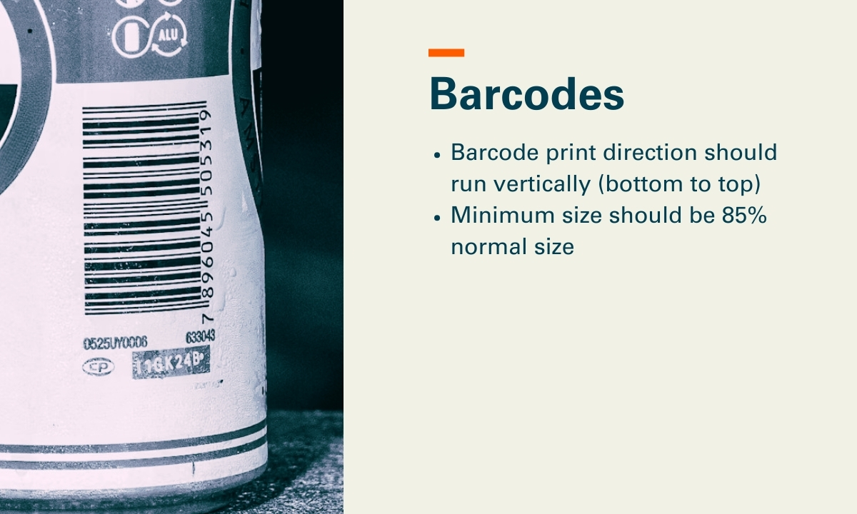
2. Barcodes
Barcode orientation and color matters more on printed cans than it does on labels.
Our recommendations:
- Barcode print direction should run vertically (bottom to top)
- Minimum size should be 85% normal size. Some customers do choose to use a reduced barcode size, however, the Bar Code Council and ANSI scanning requirements advise that the code bars should not be truncated (shortened) or reduced, but in full size.
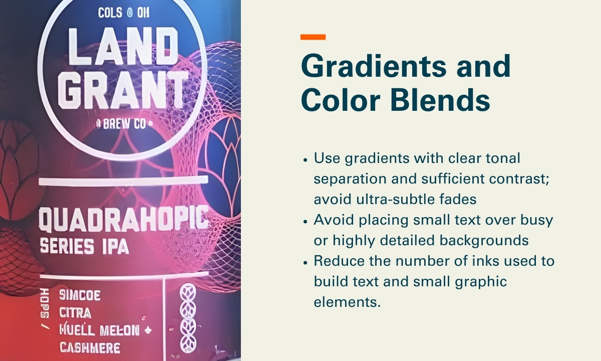
3. Gradients and Color Blends
Printed cans handle large color fields and imagery very well. Issues tend to appear when gradients are extremely subtle, when many colors are stacked into small areas, or when fine text sits on top of complex blends.
Our recommendations:
- Use gradients with clear tonal separation and sufficient contrast; avoid ultra‑subtle fades (for example, 1–2% tint steps) and very long, low‑contrast blends that can band or break up at ~900 DPI on a rotating can
- Avoid placing small text over busy or highly detailed backgrounds
- Reduce the number of inks used to build text and small graphic elements. Specifically, avoid CMYK or multi‑color builds for typography; use single‑ink colors where possible, and limit text to one color (or two at most) to reduce registration risk across multiple print heads.
Designing for the Can’s Shape
Neck (Top) and Chime (Bottom) Live Areas
With cans, the neck and chime curves matter from a design standpoint.
- The very top and bottom of the can curve more, which can cause distortion, softening, or loss of clarity in small text and fine details as ink is applied over tighter radii
- Text and fine details should stay within designated safe zones, typically keeping critical text and thin line work at least 15mm away from the very top flange and bottom of the can, where curvature increases and print clarity is more likely to degrade
- Many successful designs transition to solid color or simple patterns near the top
We can provide templates, and it also helps to tell designers early that the top and bottom of the can are not ideal places for critical text.
Using the Aluminum Can as a Design Feature
One advantage that often gets overlooked is the metallic nature of the can itself.
Designers can let the natural aluminum show through, use selective white ink to control where metallic effects appear, and create shimmer or depth without foils or specialty materials.
Common ways designers and brands use the aluminum itself as a design feature include:
- Metallic highlights: Leaving aluminum exposed behind logos, illustrations, or key accents to create natural shine without foil or specialty coatings.
- Patterned metallic fields: Using repeating patterns or textures with selective white ink to create contrast between matte inked areas and reflective metal.
- Depth and layering effects: Letting metallic areas sit behind translucent or lightly inked colors to create visual depth and dimensionality.
- Premium negative space: Intentionally unprinted areas that give the design space.
Embellishments You Can Use Digitally
Digitally printed cans support several embellishments without plates or added materials. Everything is applied inline during printing.
| Embellishment | What It Does | When to Use It |
| Matte finish | Reduces glare and softens the look | Premium, modern brands |
| Gloss finish | Adds shine and contrast | Bold graphics and shelf impact |
| Gloss finish | Adds extra sheen and depth | Highlight areas and logos |
| High Build/Emboss | Creates tactile texture | Logos, typography, focal elements |
File Preparation
Here are some baseline expectations to communicate with your graphic designer:
- Fonts outlined (no live fonts in final files)
- Images embedded, not linked (no external file dependencies)
- Files must be CMYK (no RGB)
- Raster images supplied at 300 DPI at final print size; avoid upscaling low‑resolution assets
- Spot colors used only when explicitly specified and approved for the digital can workflow
- Create separate layers for selective white/metallic printing or selective varnish
Proofing and Prototyping Options
There are several ways to proof and validate artwork before moving into full production. Depending on the project, proofing options could include:
- Digital proofs: Used to review layout, copy, color intent, and overall composition before anything is printed.
- Pilot cans: Physically printed cans that show real color on aluminum, text clarity, embellishment effects, and how the design behaves under lighting, moisture, and handling.
Pre-Flight Checklist: 10 Things to Check
Before finalizing artwork, make sure you can confidently check the following:
- Small text is single-color where possible, and meets minimum size guidelines (generally 7pt or larger)
- Line weights meet minimum thresholds (generally 0.1pt or heavier)
- Barcodes are oriented vertically
- Gradients use sufficient contrast and avoid ultra-subtle tint steps
- Fine outlines, drop shadows, and multi-color text builds are minimized
- Critical text and details stay within top and bottom safe zones (15mm from the neck and chime)
- Use of exposed aluminum or metallic effects is planned (if desired)
- Embellishments (matte, gloss, high-gloss top coat, raised ink) are clearly defined
- Artwork has been reviewed at 100% scale with digital-can resolution expectations in mind (~900 DPI)
- A proofing plan is in place
Next Steps
When you (and your designer) understand how the printed can process works, it becomes much easier to provide artwork with confidence and avoid surprises once cans are on the line.
If you’re exploring printed cans and want to learn more, we’re always happy to talk through what’s possible, answer design or production questions, or help you get a quote for your project.