Labels Without Borders
Borders frame the image, add an air of decoration to the composition, and are traditionally an important part of design. Basically every great work of art has a border (a frame) that accentuates the work, so why wouldn’t you give the same treatment to your label? Well, there is one very important reason.
Why borders don’t work.
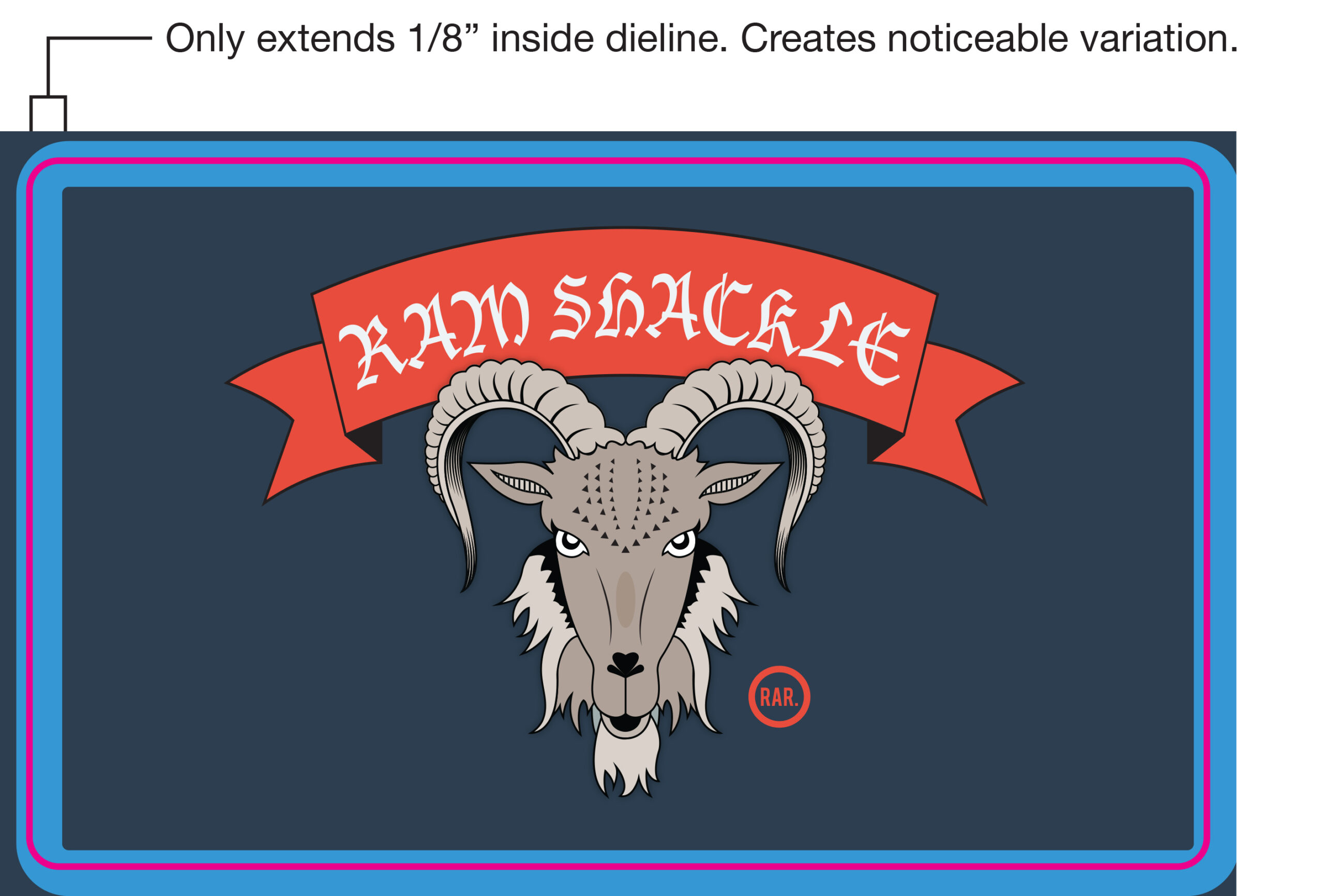
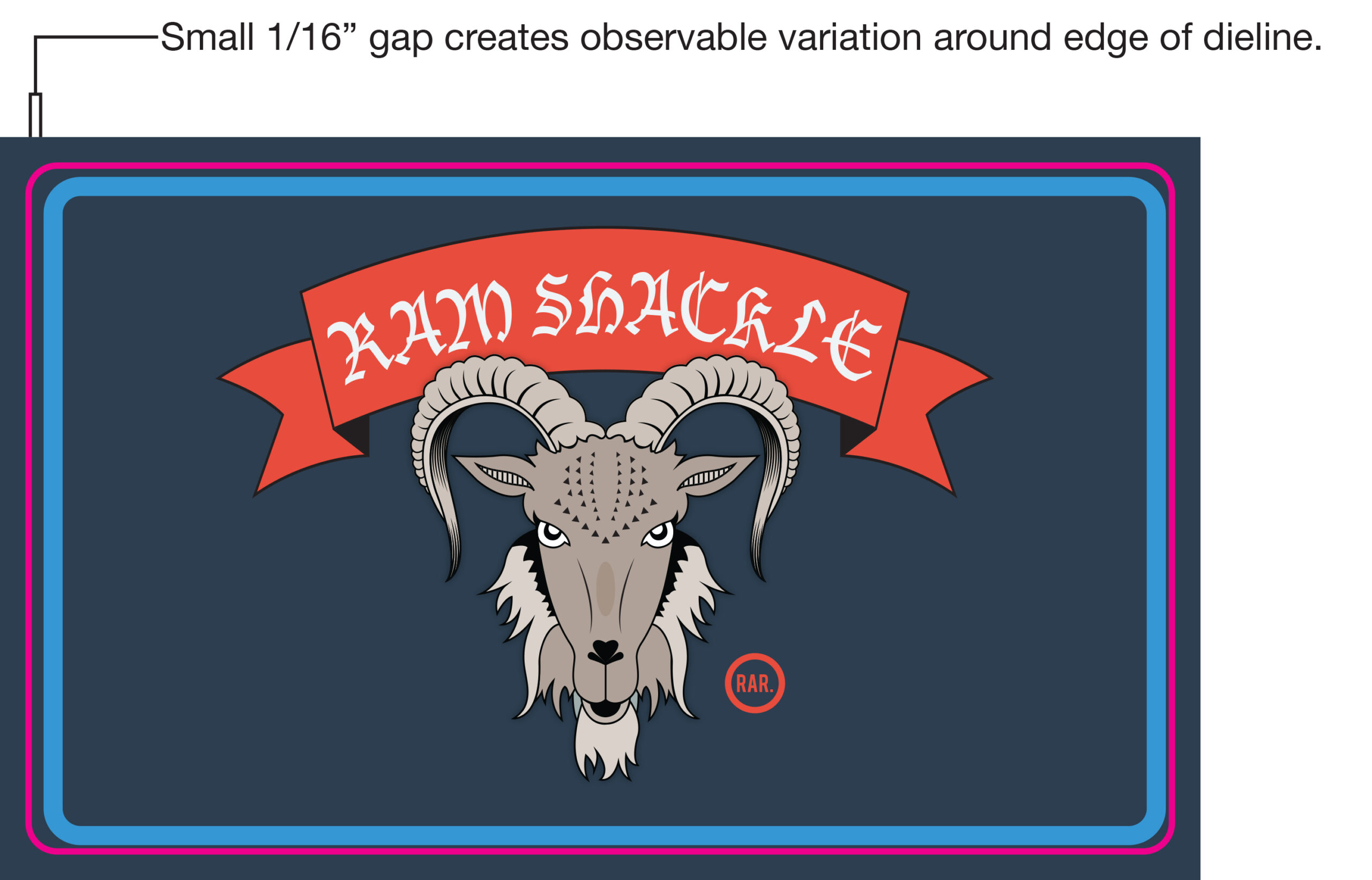
The human eye can pick up very small variation, especially when it comes to symmetry. When we say small variation, we are talking about differences as small as 1/64 of an inch. Borders are normally designed to be uniform from all sides, or at least symmetrically uniform. This piece of information becomes very important when combined with another fact. There is variation in virtually every label.
When a label is finished, it is die cut from a roll of paper (think of a cookie cutter used on a sheet of cookie dough). This die cut is very precise, but even the best cutting equipment will vary up to 1/32 of an inch. That means that where the image is falling within the die cut area will differ from label to label. When there are uniform areas around the edges, this isn’t an issue. The problem arises when there are thin lines around the edges, which draw attention to the small differences. For a comparison, see the images below.
How to use borders safely.
Are we advocating that you totally abstain from borders? No, of course not. There are ways to use them without damaging the overall appearance of the label. Here are the two best ways:
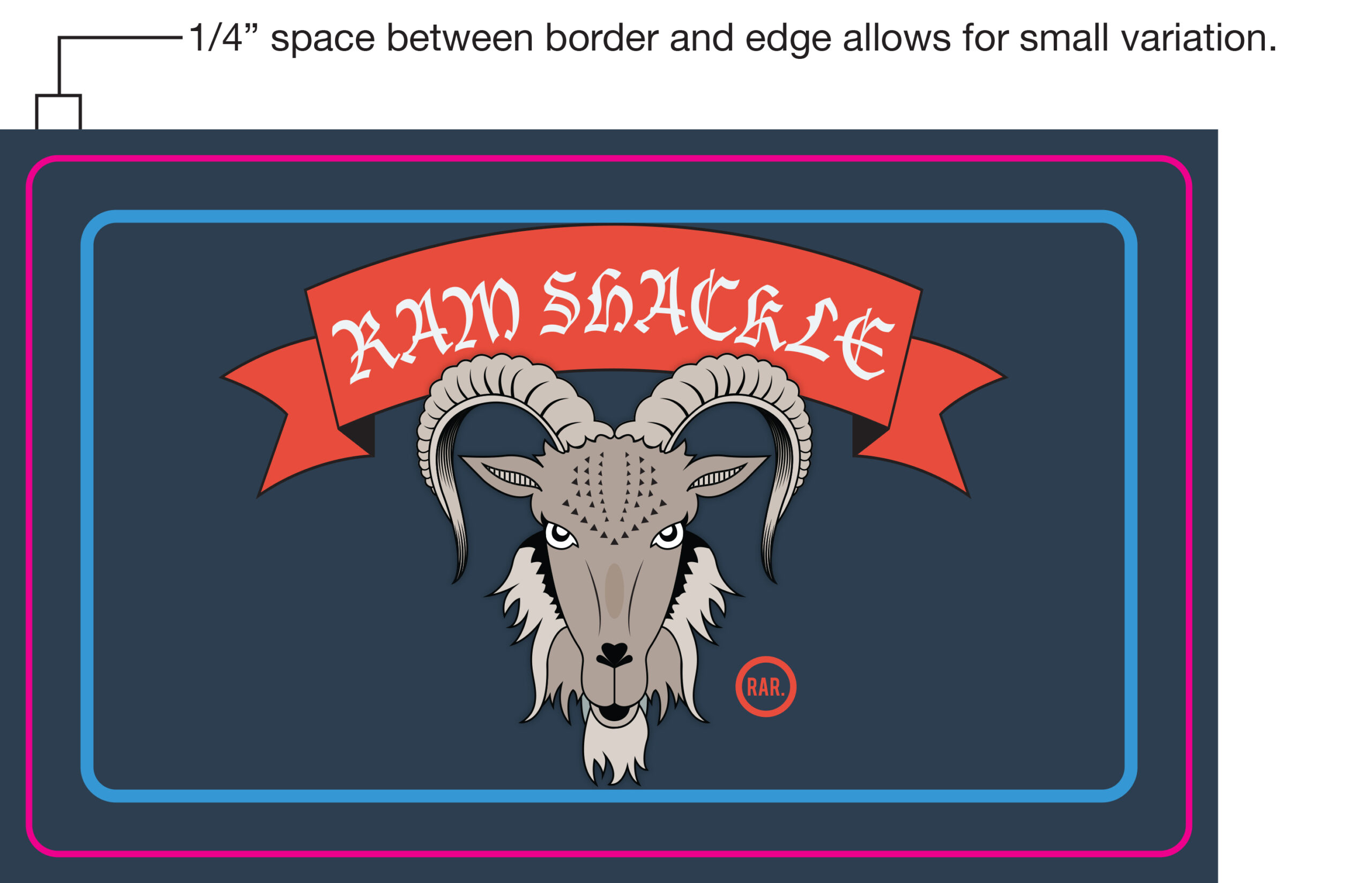
Leave a big gap. You’re going to want to leave no less than ¼ of an inch of non-decorated space around the edges of your design. If there is a border inside this ¼ inch, it will be successful as the eye won’t be able to pick up the variation. Below is an image of a label file with a sufficient border.
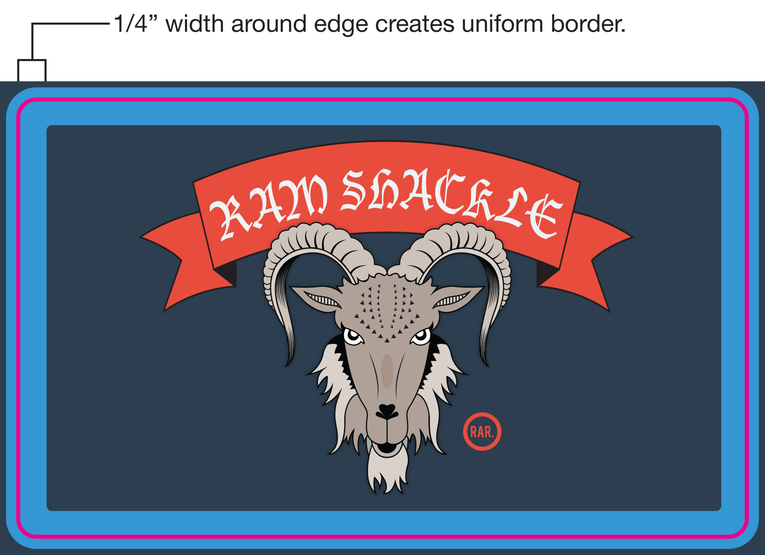
Bleed your label. By that we mean that the border continues off the label by at least 1/16 of an inch in all directions. The result is that the border runs to the edge of your label in all directions. One important caveat, it is important to have a thick border to achieve this. If you have a thin border that continues off the edge, you’ll have varying thicknesses in your border. Below is an image that demonstrates a successfully bled border.
Borders are important to design; we know that as well as anyone. And there are a lot of circumstances where borders that don’t adhere to the above guidelines still look great. This blog is a warning about what you might expect to see when you design a label with thin or tight borders. Don’t be discouraged by the fact that borders can create problems, we have a team of solutions and art experts that can work with you to create a successful label that doesn’t sacrifice the design you’ve worked so hard to hard to perfect.