4 Tips to Elevate Your Whiskey Bottle Label Design
- whiskey labels
People aren’t supposed to judge a book by it’s cover, but that doesn’t stop them from judging a whiskey by it’s label. According to a Harris Poll study, a whopping 85 percent of shoppers said that product packaging impacted their purchase decisions. That visual edge is why intriguing packaging is crucial whether you sell your craft spirits in liquor stores, online retailers, and anywhere else people can procure your whiskies.
Simply put, an eye-catching whiskey bottle label is essential for everything from bourbons to wheaters. Let’s break down a few ways that you can elevate your custom whiskey label design so that your spirit catches consumers’ attention.
Material Selection
Paper is a classic choice for a reason. Paper is incredibly versatile and allows you to play with a variety of textures to capture your desired aesthetic. These options include:
- Linen
- Eggshell
- Felt/velvet
- Estate
- Metalized
- Cobblestone
- Ever-opaque
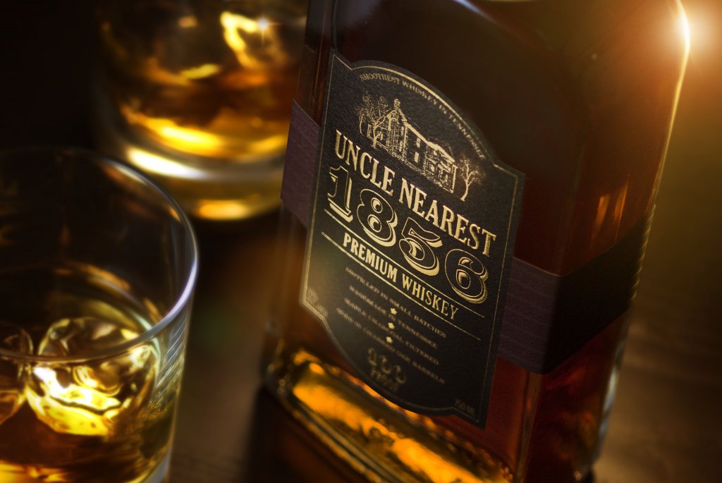
No matter the option, paper gives you a base to help you tell your product’s story. Want to position your whiskey as a premium, high-class spirit? A matte-coated paper stock simply oozes with sophistication. Different textures can also give customers a more enjoyable tactile experience – and that’s especially important when touch can help influence buying decisions.
While paper is a traditional choice, there are plenty of films that can help you enhance your label’s look. Clear, metallic, and other specialty films allow you to incorporate the material into your design, whether you want to show off more of your product or add a more modern, flashy element to your packaging. Films also have the added benefit of water resistance, whereas paper will eventually break down.
Font Selection
The words on a whiskey label do a lot more than provide information. The fonts you choose say a lot about how you want customers to perceive that product, so make sure to pick a personality that suits your spirit.
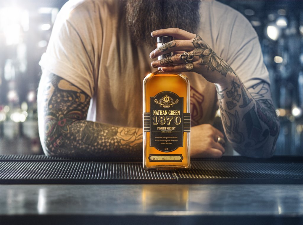
Distilleries are opting to break the mold with more modern fonts like sans serifs or slab serifs. Traditionally, a script font is typically very elegant and sophisticated, whereas a serif font in more traditional and reliable. Those two routes are normal choices for whiskey labels, and for good reason – people naturally equate them as a trusted font for a premium product.
As long as your whiskey is positioned appropriately, this bold approach can give your product a unique aesthetic that let consumers know what type of experience to expect – just make sure that you keep your text legible regardless of your choices.
Color Considerations
Just like fonts, your choice of colors play a pivotal part in showcasing your product’s personality. According to research, 85 percent of shoppers name color as a primary reason for why they buy a particular product. That level of impact makes your color choices extremely important.
Using color psychology can help you influence consumers through your unique whiskey bottles and whiskey label design. For example, the following hues are associated with the following feelings and can help you convey a certain attitude for your target audience.
- Red – Bold and passionate
- Orange – Energetic and invigorating
- Yellow – Joyful and optimistic
- Green – Safe and nurturing
- Blue – Serious and trustworthy
- Purple – Successful and creative
- Pink – Youthful and feminine
- Brown – Reliable and rugged
- White – Clean and pure
- Grey – Versatile and mature
- Black – Luxurious and elegant
Label Decoration
When it’s time to take your label to the next level, decoration is your best friend. Some strategic decorations not only turn your whiskey bottles into a visual spectacle, but also add to the perceived value of your product. That extra decorative flair comes in many forms, all of which can enhance your labels in different ways.
- Embossing – Create a three-dimensional image by pressing a custom pattern into your label material. The resulting raised surface creates an intriguing design that customers can both see and feel.
- Hot foil stamping – Stamp a special design into your label with a specialty foil. This process allows you to create multifaceted compositions through metallic, holographic, matte, and other decorative imprints.
- Spot varnish – Coat your entire label or highlight specific parts of your design with a protective liquid coating that cures and dries in a variety of different forms, including matte, gloss, or soft touch.
- High-build silk screen – Finish your design with a special ink layer that adds a stunning glossy pattern that raises above the rest of your design.
Communicate Quality Through Your Whiskey Bottle Label Design
Let’s face it – whiskey drinkers aren’t lacking for options. That’s why it’s absolutely essential that your whiskey label design not only attracts attention, but looks as good as what’s in your bottles. That need for premium packaging is why Blue Label works with craft distilleries to print professional-quality eye-catching labels that elevate your branding and communicate the quality and character of your whiskey.
Ready to make your custom whiskey label design a reality? Contact us today to get the stunning labels and unmatched customer service your distillery deserves.