What Label Material Is Best for Squeeze Bottles or Flexible Containers?
Labeling a squeeze bottle is harder than it looks. If your label wrinkles, cracks, or peels every time a customer gives the bottle a squeeze, it’s not doing its job. Getting it right comes down to picking the right label material for your container, and the environment it lives in.
If you’re researching labels for a flexible or squeezable package, here’s what you need to know before you spec the wrong material.
Considerations When Labeling Squeezable or Flexible Containers
When you’re comparing label options for squeezable packaging, a few factors rise to the top:
- Flex and memory: how well the film snaps back without wrinkles
- Conformability on curves: especially on oval and contoured bottles
- Adhesive chemistry: especially for plastics like HDPE or polypropylene (the super‑slick plastics most squeeze bottles use)
- Environment: exposure to oils, moisture, heat, or cold
- Converting quality: printing, die‑cutting, and topcoat selection
Why do these factors matter?
Flexible containers, like lotion tubes, condiment bottles, and gel packs, put constant stress on your labels. Every squeeze, bend, and bounce during shipping or daily use pushes the label to flex. If it can’t keep up, you get wrinkling, delamination, or labels that start peeling like a wet sticker at a pool party.
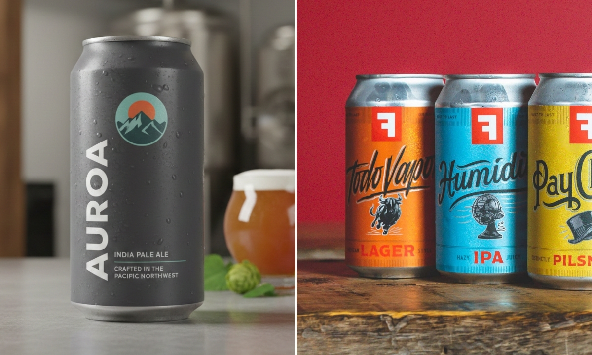
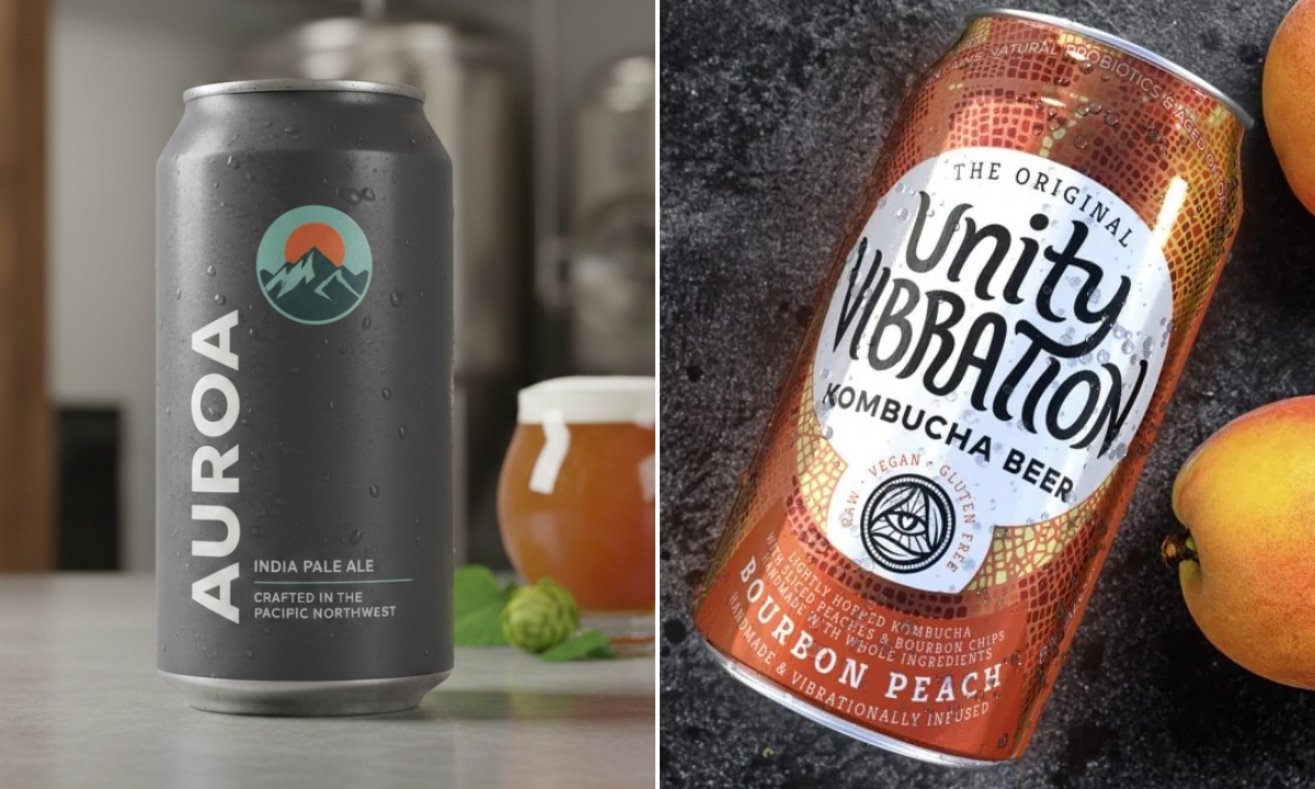
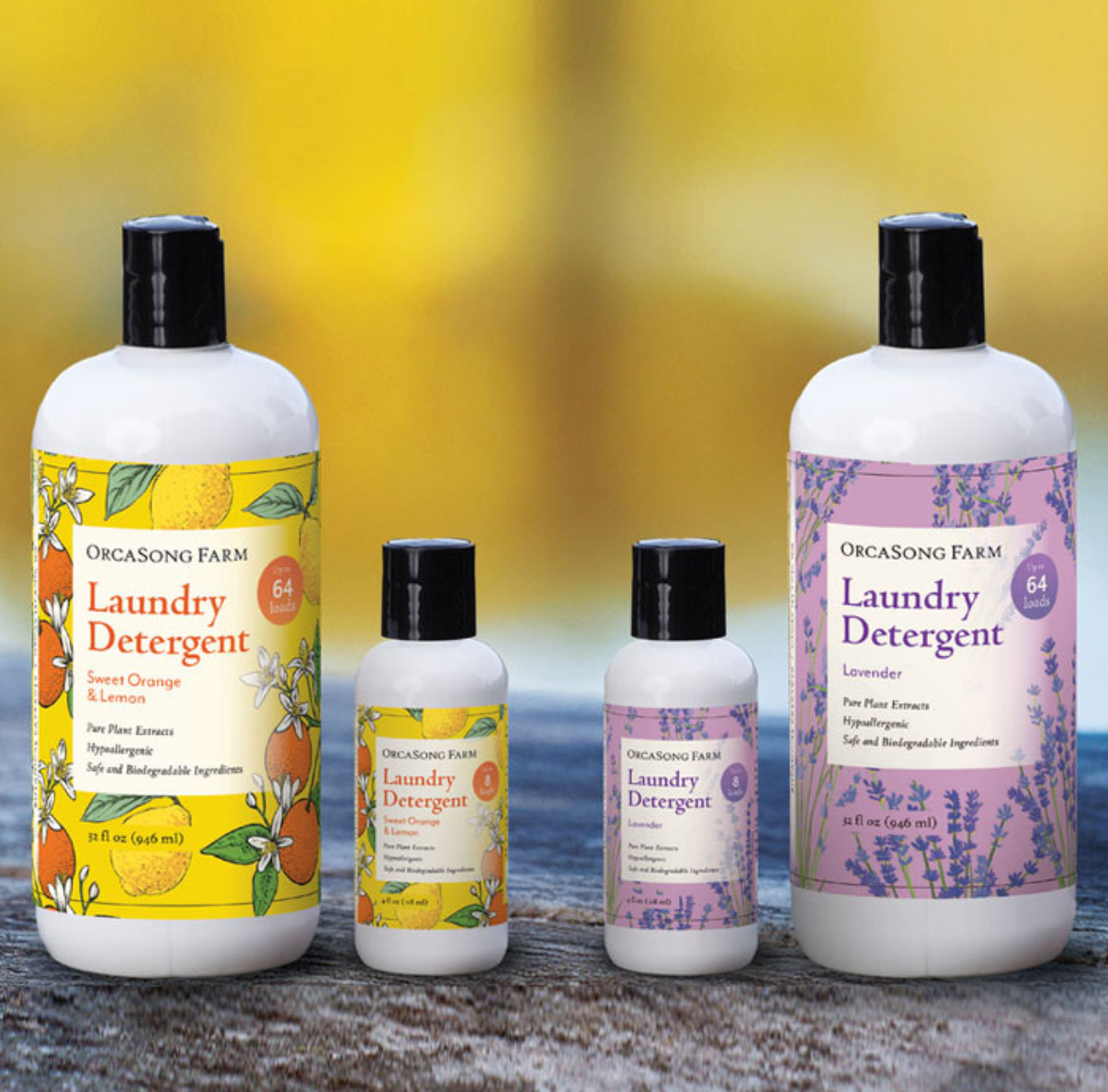
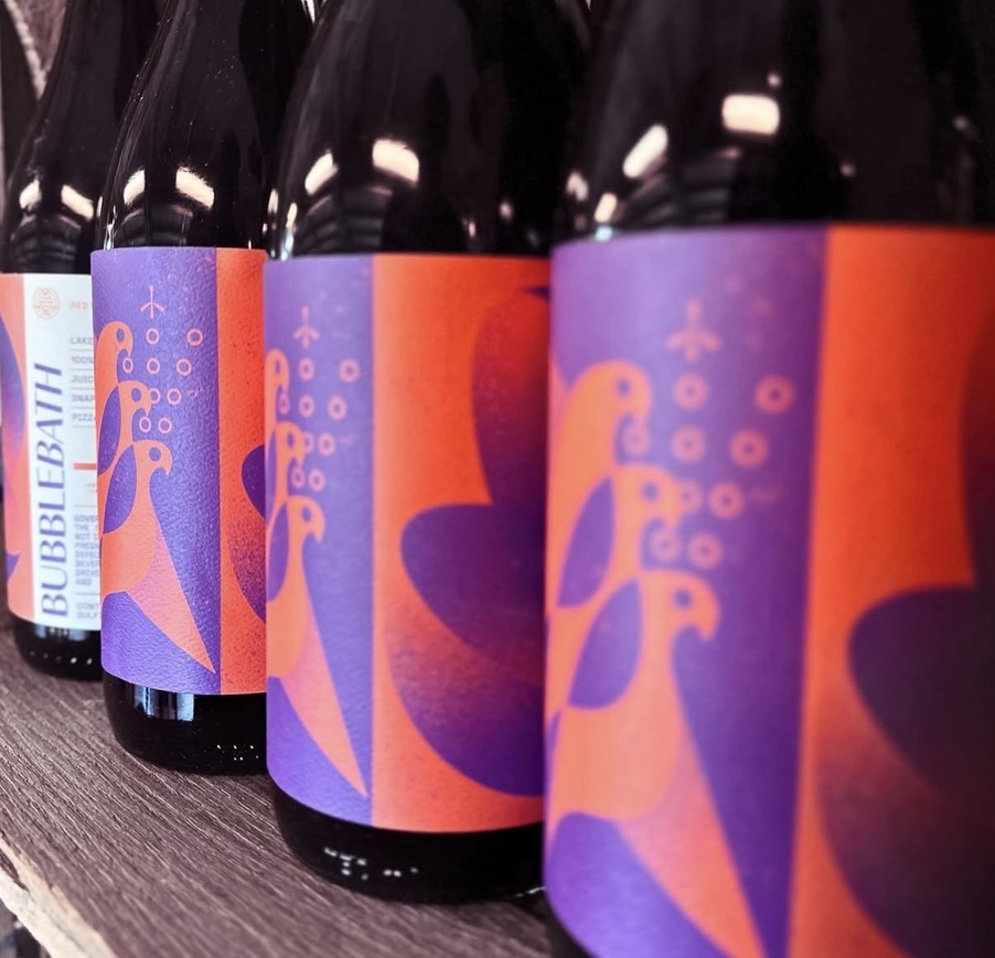
MDO (Machine Direction Oriented Film)
(Common for: personal care lotions and serums, squeezable condiments, household cleaning gels)
This is our top recommendation for squeezable and flexible containers.
Why we recommend it: MDO films go through a stretching process during manufacturing that kind of ‘breaks them in’, like a good pair of jeans that move with you instead of fighting back. That orientation gives the film better flexibility, memory, and shape retention, even after repeated squeezing or flexing.
Benefits:
- Designed to flex repeatedly without wrinkling or cracking
- Great conformability on curved and contoured surfaces
- Holds up to squeezing, pressure, and handling
- Works well with strong adhesives built for slick plastics (like HDPE or polypropylene)
- Can be thinner and lighter, reducing material usage
- Widely used in personal care and food packaging sectors for flex-label applications
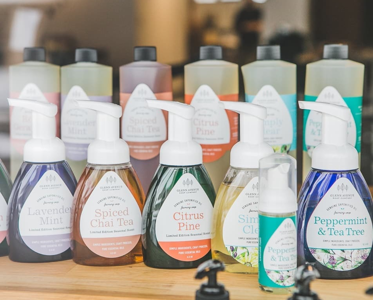
Best used for:
- Personal care bottles (shampoo, lotion)
- Condiment bottles (ketchup, mustard)
- Tubes and semi-rigid containers
Finishing options: Compatible with clear films, matte or gloss overlaminates, and UV varnishes, just make sure your topcoat is flexible, too.
Considerations:
- Choose MDO if your container flexes more than a small amount during normal use
- Make sure your adhesive is compatible with slick plastics like HDPE and polypropylene
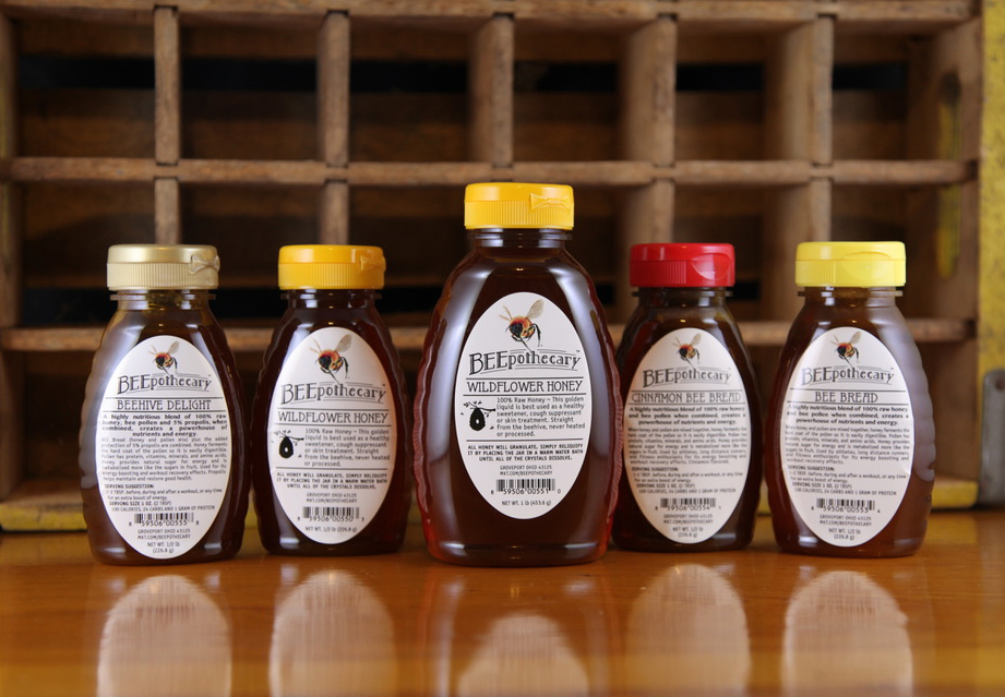
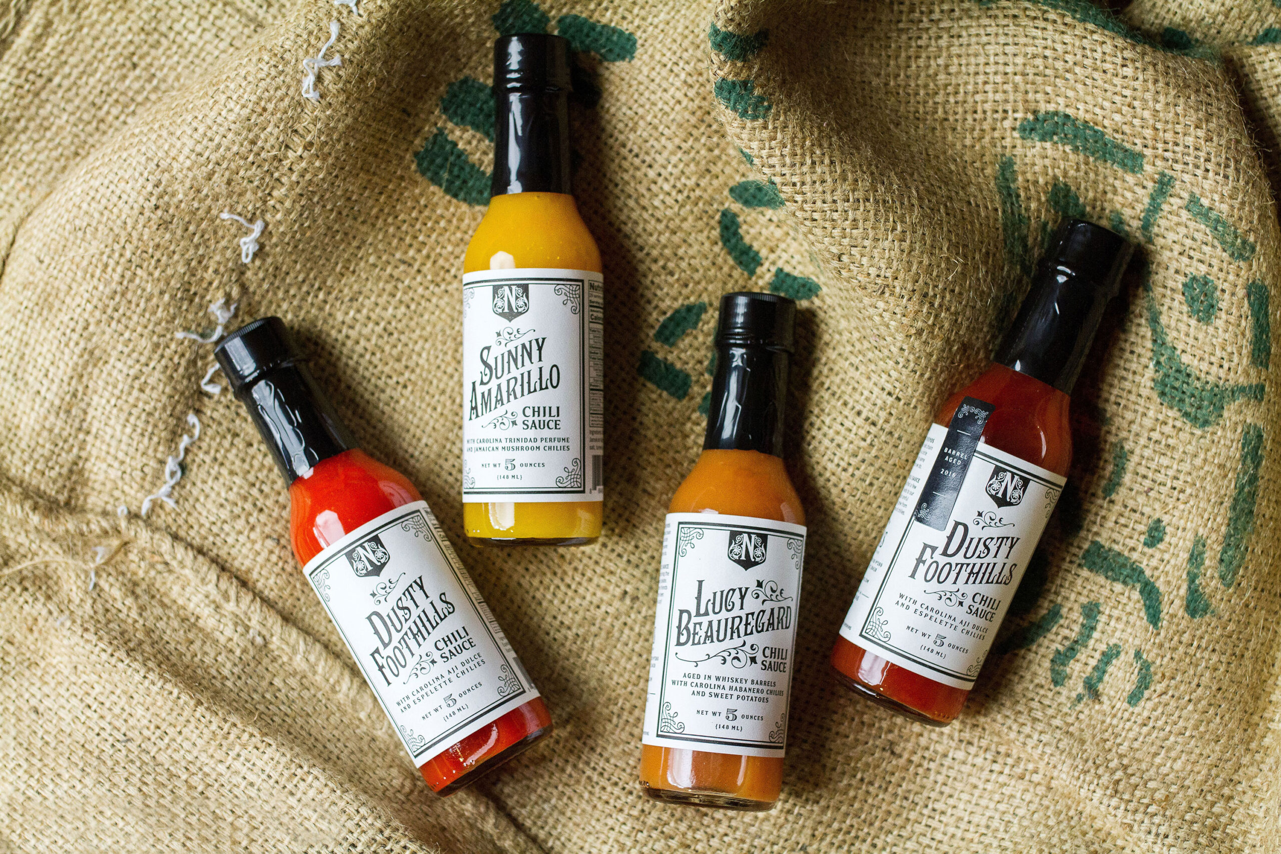
BOPP (Biaxially Oriented Polypropylene)
(Common for: rigid food jars, beverages, pantry products, household goods that don’t flex much)
Why it’s commonly used: BOPP is a durable, moisture-resistant, and cost-effective film used in many labeling applications.
Benefits:
- Affordable and widely available
- Water- and oil-resistant
- Good for semi-rigid containers or less extreme flexing
Best used for:
- Rigid plastic or glass containers
- Flexible containers with low flex stress
- Products stored in dry or room-temperature environments
Considerations: Standard BOPP doesn’t stretch well. On a squeezable bottle, it can wrinkle or lift at the edges, especially if applied to curved surfaces or over seams. It’s not ideal for high-high‑flex areas where the bottle bends.
If you must use BOPP, focus on areas of the container that don’t flex.
Vinyl
(A fit for heavy-duty household cleaners, outdoor products, or hard-use environments)
Why it’s an option: Vinyl labels are flexible, durable, and tough under stress. They work in hard-use conditions and stick well to curved surfaces.
Benefits:
- High flexibility and stretch
- Strong resistance to water, oil, and abrasion
- Good for outdoor use or curved surfaces
Best used for:
- Harsh environments (outdoor, industrial, automotive)
- Products with irregular curves or extreme handling
Considerations: Vinyl is thicker, harder to die-cut, and usually more expensive than MDO. It also doesn’t offer the same premium print finish that many brands expect. Vinyl works well in rugged or outdoor settings, but for brands focused on high-end aesthetics or needing fast, efficient converting, it may not be the best match.
Common Label Issues to Watch For on Squeezable Containers
Before choosing a material, it helps to think about where and how customers will actually use your product. Flexible personal care and food containers are frequently exposed to oils, moisture, steam near stovetops, cold storage, and frequent handling, all of which put extra stress on the label.
If your label is applied to a squeezable or flexible container, these are the failure modes you’re trying to prevent:
- Edge Lift: Corners or sides of the label peel up after application
- Creep: Label slowly moves or shifts over time
- Delamination (layers separating): Label layers (like film and adhesive) separate
- Wrinkling: Visible folds caused by flex or tension during use
You don’t have to see all of these to know something’s wrong. One is enough to signal a mismatch between the material and the environment.
Quick Comparison Table
| Material | Flexibility | Durability | Best Use Case | Risk on Squeeze Bottles |
| MDO | High | High | Full squeeze bottles, curved surfaces | Minimal, best overall pick |
| BOPP | Low–Medium | Medium | Semi-rigid containers | Wrinkling, edge lift under flex |
| Vinyl | Medium–High | High | Harsh environments, high curvature | Expensive, harder to convert |
Summary: What to Use and When
If your container flexes, whether it’s from being squeezed, dropped, or transported, here’s a quick take on what’s worth using.
- Best material for full-squeeze bottles: MDO
Designed to flex, maintains shape, handles repeated stress. - Most cost-effective for semi-rigid containers: BOPP
Just don’t use it on tight curves or squeeze zones. - Best for irregular or curved surfaces in tough environments: Vinyl
Works well, but expect higher costs and more converting complexity.
If your bottle bends, squeezes, or flexes, don’t trust just any label material. MDO is often the smartest place to start, but it’s not the only option. At the end of the day, your container, your environment, and how you apply the label all matter.
Still not sure which material fits your container? Contact us and we’ll help you make the right choice.
 What a Color Management System Can Do