Label Consistency
- color consistency
- color density
- digital calibration
- digital printing
- Labels
- materials
- substrates
Consistency across product lines:
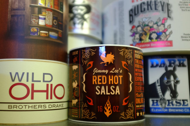
It is common for brands to want a specific spot color for their packaging (Coke Red, Tiffany Blue, etc.). The Pantone Matching System (PMS) exists to ensure that colors are represented consistently across different media. Using the PMS and spot colors, one color can be translated effectively across a variety of packaging and branding materials. The problem is when you have a complex design, with things like gradients, photographs, full color images, or anything else that requires four color printing.
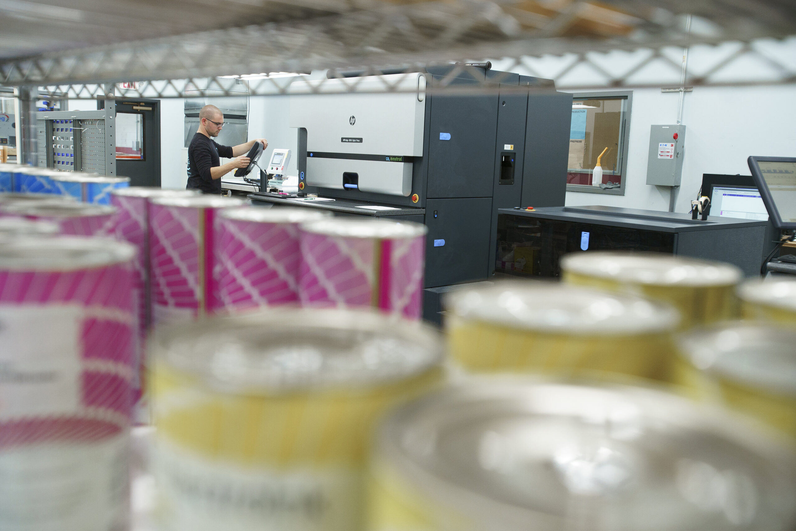
Digital printing uses sensors that are calibrated for a specific type of material (vellum, wine label, films, etc.) to measure the ink density during the printing process to ensure color and image consistency. Flexographic printing relies on operator judgment and scanners that are used post-production to ensure quality of printing. Since flexographic printing checks for print consistency on the finished product, as opposed to in process, it will always allow more faulty printing to be produced. If you want to translate a design across a product line, be it different sizes, regionally specific items, seasonal varieties, or anything else that requires a high degree of consistency across multiple SKUs, digital printing ensures a higher level of quality.
Consistency within a product:
But even more pervasive than maintaining consistent quality across product lines is the age-old problem of variance within a product. Or, to put it simply, that one shipment of labels looks different from the next. Most printers take measures to ensure color quality on a job-by-job basis. They keep samples of previous jobs, print plates from the same files, and maybe even use a spectrophotometer (a device that measures light intensity to quantify color levels) to ensure that color is the same every time they print your label. Since digital printing never prints a plate, and uses sensors to calibrate color levels, it doesn’t require judgment to produce the same image every time. In fact, the presses are built with the intention that color will be managed in file design, not on press. In flexographic printing, the designer painstakingly selects the colors, and then the press operator uses judgment to get as close as possible. Digital printing uses a closed loop system to ensure that the same file will print the same way, every time.
Built in:
With all of this said, it is important to point out that no system is perfect. Some systems, however, are better than others. Digital printing is designed to achieve consistency, whereas flexographic printing is a process that came from a time before we were able to digitally measure color density or electronically produce art files. Even with the best possible printing technology, there is variance in material quality, things get damaged in shipping, there can be errors in finishing, and all number of other areas. We can’t promise perfect quality, but we’ve got a system that will deliver consistency at the highest rate possible. Give it a try and see for yourself.