The World’s Most Enticing Food and Beverage Labels
Your appetite for a certain food or drink probably starts before you even smell or taste it. A high quality, well-designed label can make that product as irresistible to the eyes as it is to the mouth. So what goes into great drink labels and food packaging design? We’ve compiled some of the most enticing product label examples of the custom food and beverage labels we’ve printed to help answer that.
Custom beverage and food package labels you can’t wait to tear into
@baaguadale via Instagram
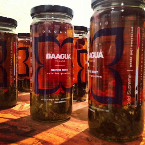
Baagua
Description: Baagua Whole Flower Tea was founded by Dale Stearns who wanted to craft a robust, flavorful experience without the sugar. Baagua is a 2014 Expo West New Hope 360 Editor’s Pick, and has been called out by BevNet as a “top-tier tea.”
Website: http://www.baagua.com
Why We Love This Label: Baagua’s translucent label with vibrant color accents speaks beautifully to the bold flavor housed in its classic glass bottle. Better yet, the cropped label provides a clear view into the dried leaves and fruit that sink to the bottom, which are edible and available for the consumer to re-brew.
Label Printing Techniques Used: For Baagua’s label, we used a clear film with color printing. The bright colors are achieved using a white layer of ink behind the full color printing.
@preconceivedxmotions via Instagram
@recycledrunwayboulder via Instagram
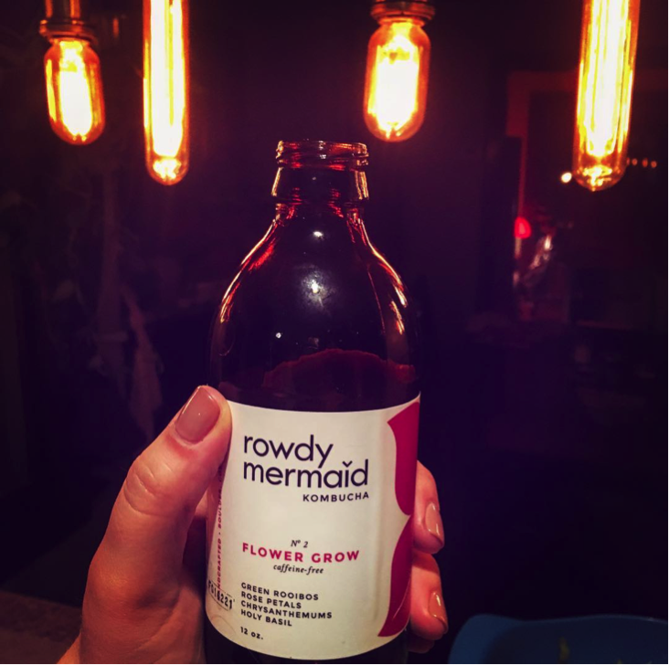
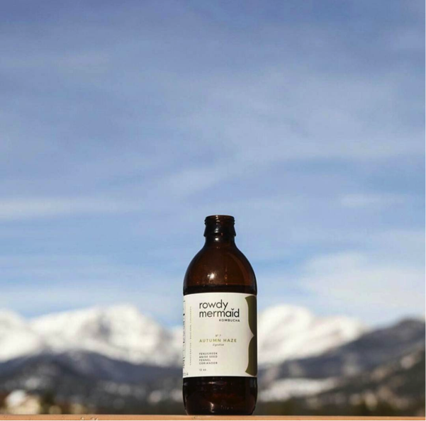
Rowdy Mermaid Kombucha
Description: Rowdy Mermaid Kombucha filters the snowmelt in their home of Boulder, Colorado to brew their handcrafted kombucha, a fermented tea. Exclusively using cold-pressed fruit juice and herbs, Rowdy Mermaid produces an organic alternative to mainstream tea that contains live probiotics and no genetically modified organisms.
Website: http://www.rowdymermaid.com
Why We Love This Label: The cleanly designed label on the Flower Grow bottle focuses on the five all-natural ingredients found inside. The use of bold color accents speaks to the petals used in the brew, and the stark white background to the Colorado snow found in everything Rowdy Mermaid.
Label Printing Techniques Used: The Rowdy Mermaid label uses a durable film with laminate to ensure the bottle can endure refrigeration without any warping or water damage. The bright colors are all achieved with CMYK Indigo printing.
@delocalfood via Instagram
@delocalfood via Instagram
@peltzcreative via Instagram
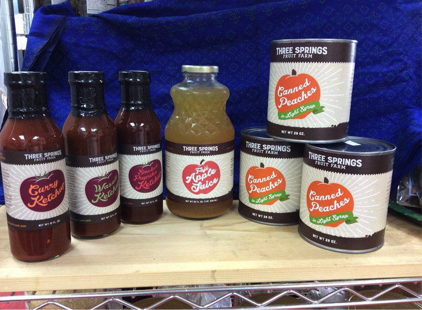
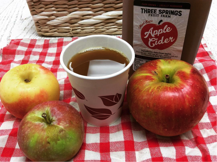
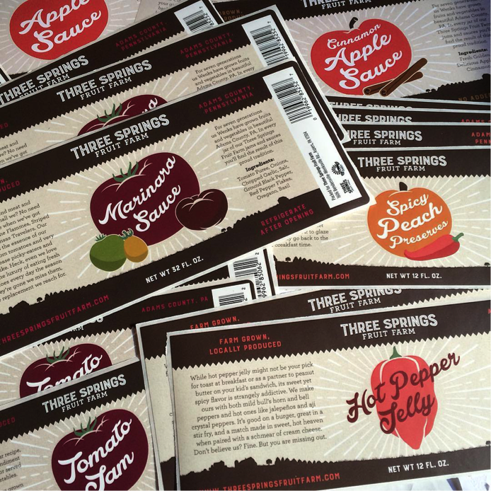
Three Springs Fruit Farm
Description: Three Springs Fruit Farm, founded in Adams County Pennsylvania in 1901, is Food Alliance recognized for their commitment to sustainability and progression. Like Blue Label, Three Springs is a family business with seven generations of goodness under its belt.
Website: http://www.threespringsfruitfarm.com
Why We Love This Label:: Designed by Alex Peltz, whether it’s marinara sauce, peach preserves, or hot pepper jelly, Three Springs Fruit Farm does an excellent job of conveying the homemade quality and delicious farm-to-table taste in their whimsically traditional food label designs.
Label Printing Techniques Used: Due to the large varity of Three Springs products, they use different packaging and labels across their products lines. Some products use ‘cut and stack’ labels that are glued to the container, while others use pressure sensitive labels that stick to the bottles and jars. Three Springs takes advantages of digital printing’s color matching ability to make sure the whole product line is consistent.
@isalymarieliving via Instagram
@kaylapeee via Instagram
@flynnopher via Instagram
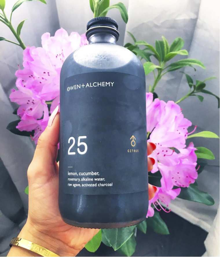
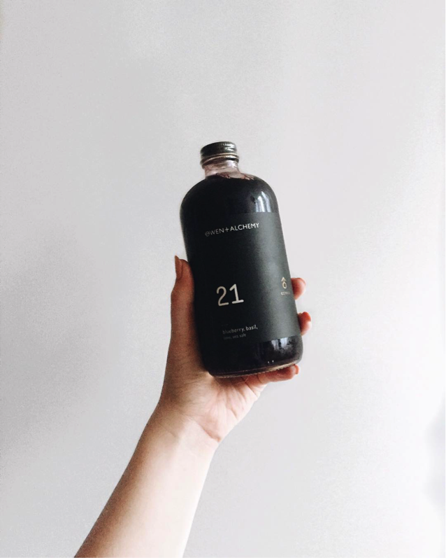
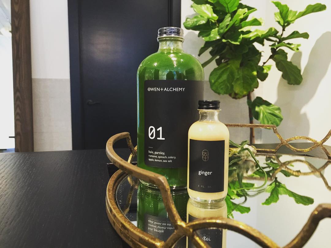
Owen + Alchemy
Description: Owen + Alchemy Elixirs is a juice apothecary who knows you are looking for a healthy remedy in addition to a delicious beverage. They believe in letting “food be thy medicine and medicine be thy food.”
Why we love this label (design commentary): Designed by Jack Muldowney, Owen + Alchemy’s modern beverage labels are sophisticated and intriguing. Their matte black labels contrast to the bold colors of their contents are contrasted graphically by a prescriptive looking number. Perhaps, just what the doctor ordered.
Label Printing Techniques Used: The focus of Owen + Alchemy’s packaging is the product and the ingredients themselves. The packaging and labels are stark and modern. The bold black labels are accented by gold text created using a metallized material with opaque overprinting. This allows Owen + Alchemy to create a hot foil look without the need for costly foil plates.
@northcountrycharcuterie via Instagram
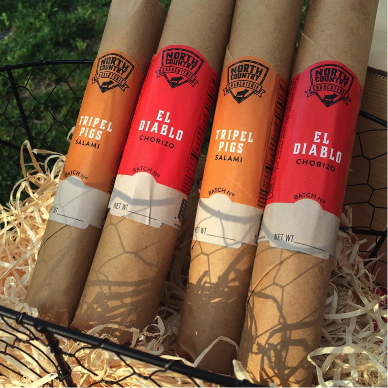
North Country Charcuterie
Description: Columbus, OH is home to family run North Country Charcuterie who sources 95% of their ingredients in state, like craft beer, cheese, wine, herbs and spices.
Website: http://northcountrycharcuterie.com
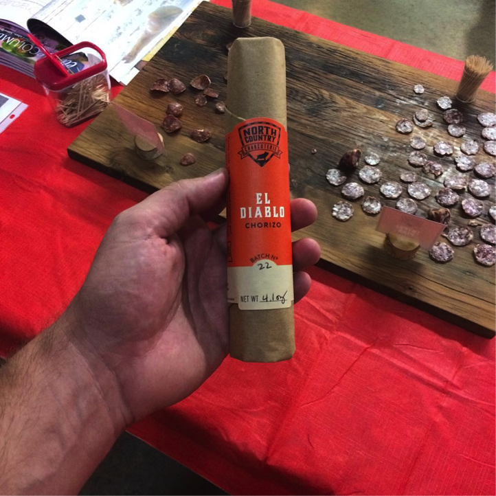
Why We Love This Label:: El Diablo Chorizo is a blend of paprika, cayenne and chipotle spiced Berkshire pork, wrapped in a traditionally designed brown-paper packaging and fire-engine-red pigment. Mouthwatering.
Label Printing Techniques Used: North Country uses a high quality ‘wine stock’ material to indicate the quality of the product within. An additional benefit of the heavily textured material is that it can adhere to itself, thus creating a seal for the butcher paper wrapping. The vibrant colors also play against the paper to create an eye-catching package.
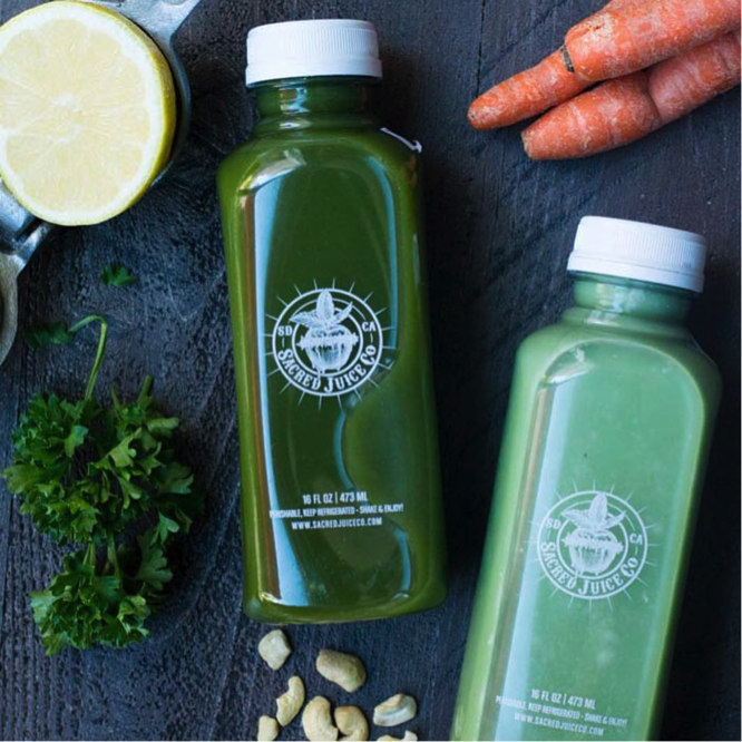
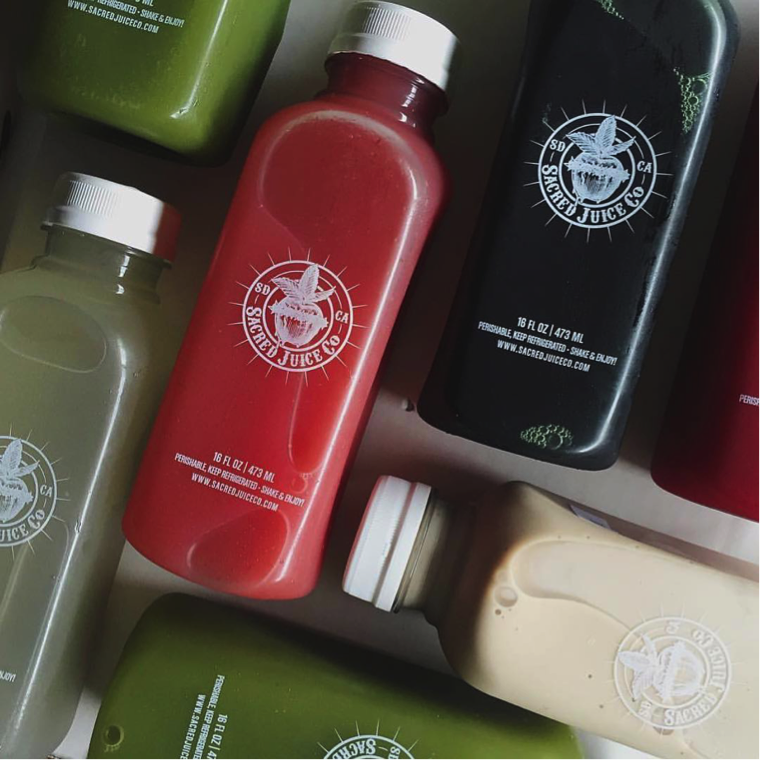
Sacred Juice Company
Description: Born out of a drastic weight loss and life-style change by founder, Jenna, Sacred Juice Co. is a labor of love that exists to honor her biggest supporter: her late mother.
Website: http://www.sacredjuiceco.com
Why We Love This Label: Your body is a temple, right? Sacred juice company makes sure you never forget that with divine designs and spiritual juice names. A consistent label on each juice allows the color and name of each individual product to shine. Holy Kale, indeed.
Label Printing Techniques Used: Sacred Juice Co.’s inspirational story deserves an inspirational label. The design called for gold foil on a clear film to set this package apart. The foil combines with the colorful logo to create a refined label that keeps the focus on the juice itself.
@sunwickfarm via Instagram
@mollyworks via Instagram
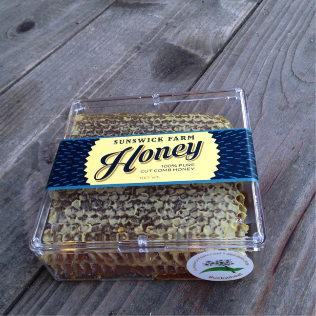
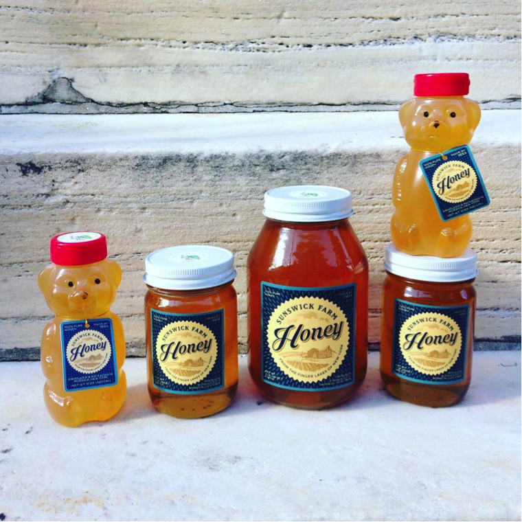
Sunswick Farm
Description: Sunswick Farm is home to over 300 hives in 24 bee yards in the Finger Lakes of New York. Patiently allowing the honey to naturally flow through the duration of the summer is key to their succulent honey.
Website: http://sunswickfarm.com/
Why We Love This Label: Sweet and pure, this classically whimsical label clearly sets the tone for all the goodness that you’re about to squeeze out of it. No extra hype needed, it’s exactly what you wanted: 100% pure honey.
Label Printing Techniques Used: A great example of strong, consistent brand across several different packaging types. Sunswick Farm takes advantage of Blue Label’s ability to match colors across materials. To further set their packaging apart, they have branded hang tangs that are exactly in line with their labels.
@missioncoffeeco via Instagram
@missioncoffeeco via Instagram
@coffeebeerandmounatineers via Instagram
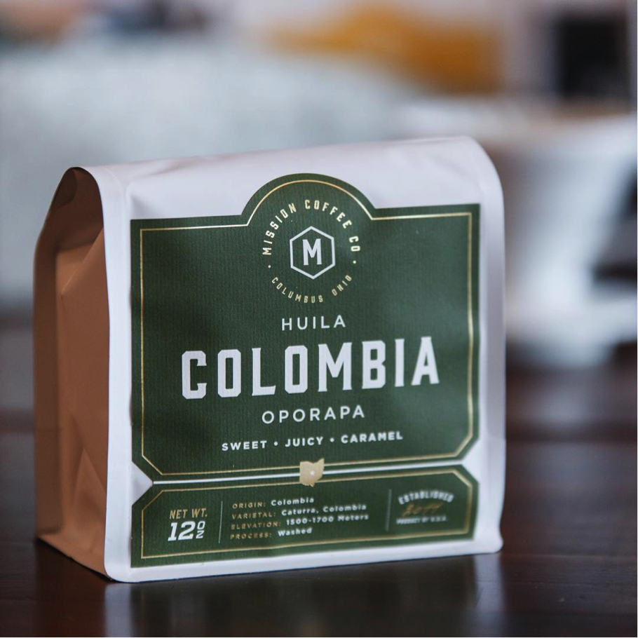
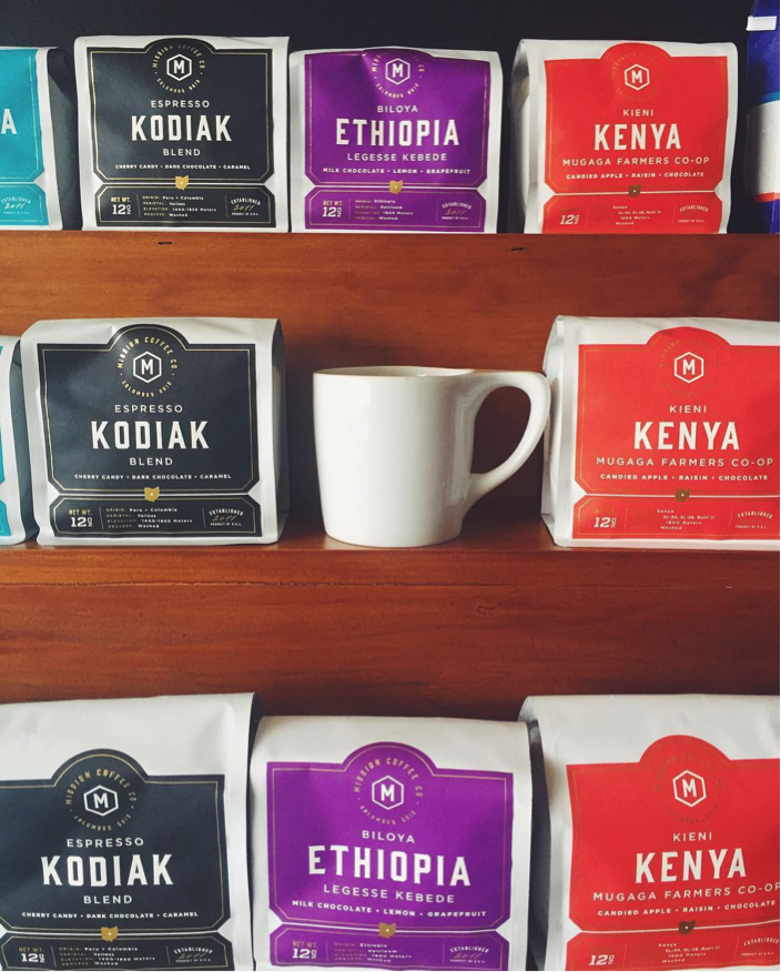
Mission Coffee
Description: Mission Coffee Co. is located in Columbus, OH and committed to the spirit of the city. They proudly serve locally sourced pastries and baked goods while focusing on brew methods like V60 pour-over, Chemex and Siphon.
Website: http://missioncoffeeco.com/
Why We Love This Label: Lifelong coffee drinkers and new java addicts need not be confused. Mission Coffee Co.’s labels clearly let you know what you’re picking up through clean typography, what it’s gonna taste like with descriptively blunt messaging, and where it’s from. All done in comforting warm, earth tones. Now could you just pour it, already?
Label Printing Techniques Used: Mission Coffee Co. needed a label that matched the outstanding quality and dedication to the craft of the product itself. They opted for a custom die cut, foil stamped label with vibrant monochrome colors to represent each blend. The die was designed to accommodate the folded bag they sell their retail coffees in. The contours create a label that’s immediately recognizable.
@citysaucery via Instagram
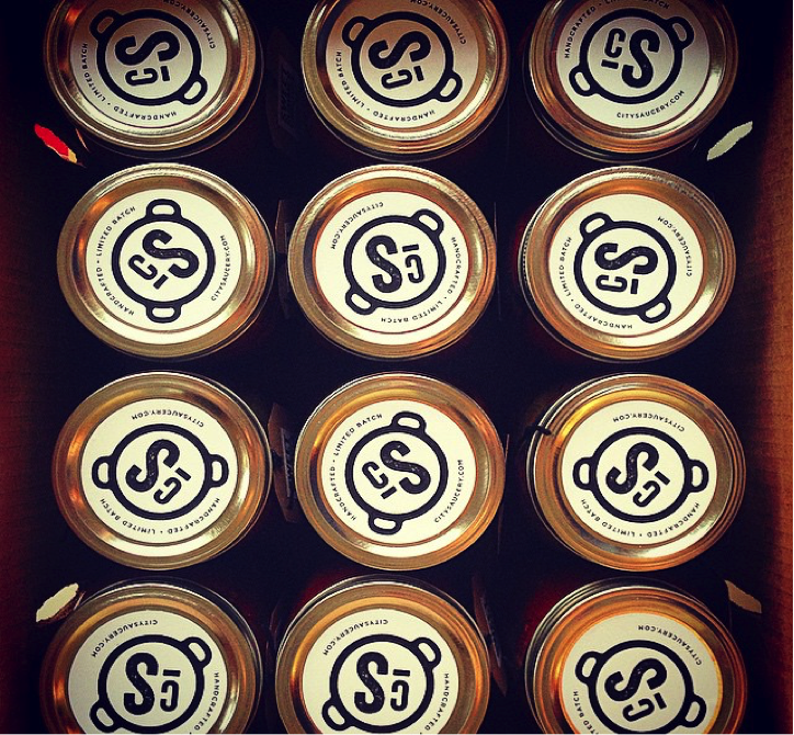
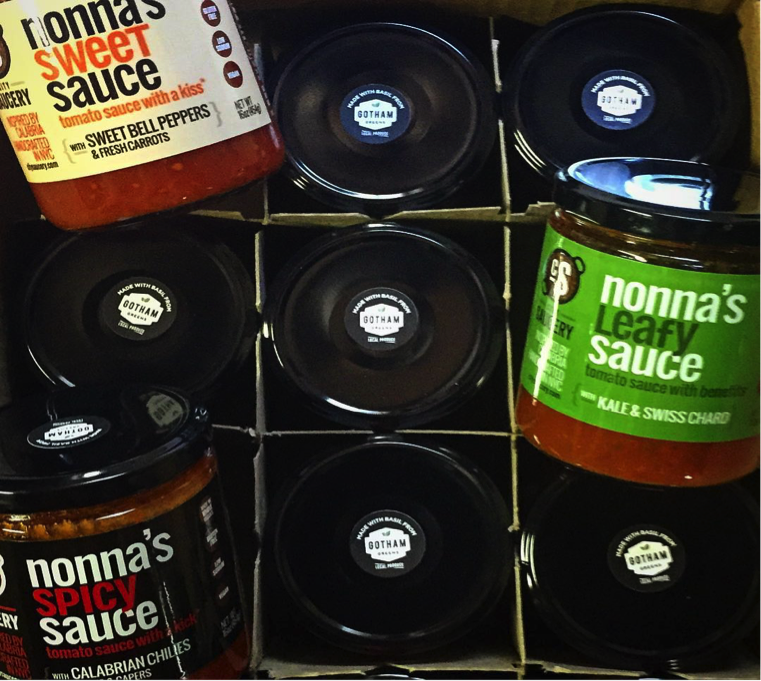
City Saucery
Description: City Saucery takes its inspiration from the “oldest and spiciest Italian region,” Calabria. However, the vine-ripened tomatoes and herbs are grown in New Jersey. Co-founder, Michael, says preserving food was not only important for flavor but essential to survival for his parents. “I was taught to embrace these traditions,” he says, “whether we lived in Brooklyn, NY or Calabria, Italy.”
Website: http://www.citysaucery.com/
Why We Love This Label: It’s not Grandma’s tomato sauce, it’s Nonna’s. And just like her and her special concoction, this label is in your face. The bold, graphic design mimics the unrivaled flavor packed in this jar. Looks like Sunday dinner.
Label Printing Techniques Used: Nonna’s brightly colored, durable labels with a gloss varnish are fun and attention grabbing. The label on top of the lid contributes to the brand’s consistency adds a quality, total design aspect to the package.
@goodrubspices via Instagram
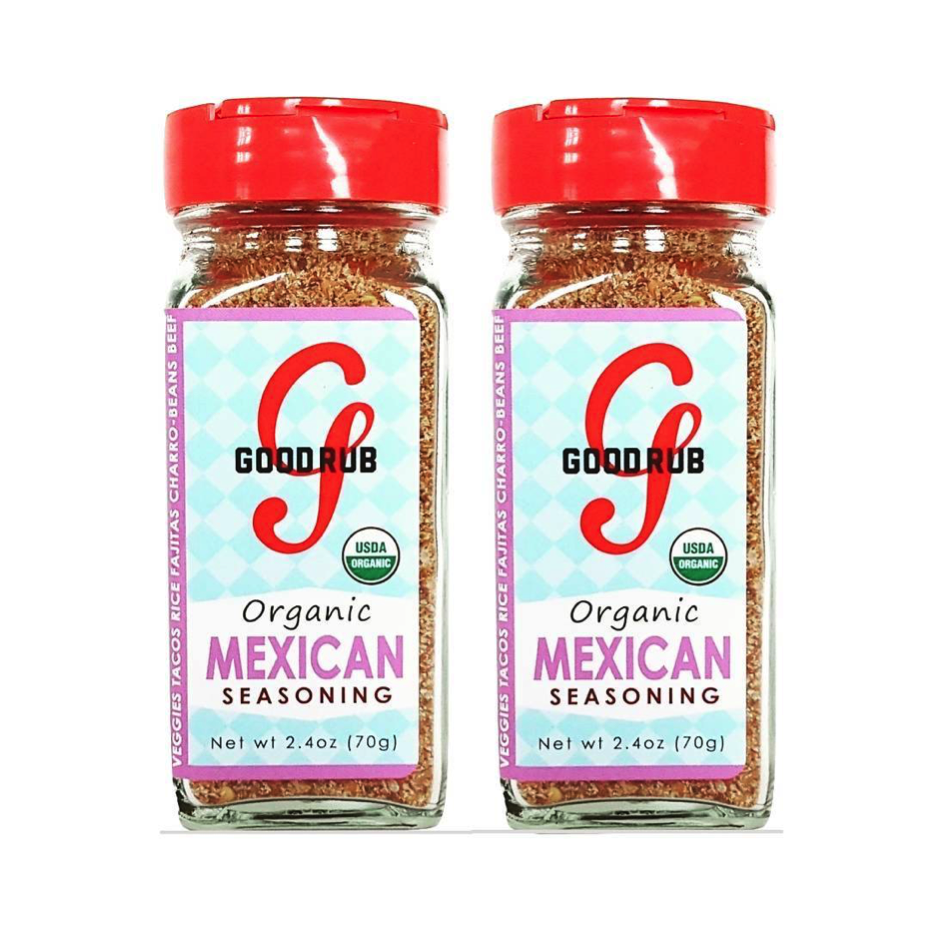
Good Rub Spices
Description: Good Rub is passionate about good food that’s good for you, and good for others. Not only are the spices used 100% natural, but Good Rub proudly gives a portion of their profits to local food banks. Good Rub is truly good for everyone.
Website: http://www.good-rub.com/
Why We Love This Label: Each organic spice offering boasts a pale-blue checkered background that takes its coloring cues from the spice therein. Mexican seasoning has a gentle pink outline, Italian in green, and Cajun in a spicy red.
Label Printing Techniques Used: Bright colors and strongly branded label wrap the container itself. Every version has it’s own personality, taking advantage of digital printing’s ability to print multiple products without the need for costly plates or changeovers.
Is it time for new food and beverage labels for your products?
Digital Printing means no limit to creativity. In fact, it is the catalyst for some of the most robust and enticing label designs for food products and custom beverage labels out on the market today. Order a sample pack or contact us today to take your brand to the next level.
