Choosing the Right Imagery for Your Product Labels: Tips for Effective Design

Apple visionary Steve Jobs once said, “Packaging can be theatre. It can create a story.” Imagery examples, such as minimal and bold like those on an Apple product, locally themed and intricate on a craft beer bottle label, or timeless and luxe like the embossed and foiled label on Godiva chocolates, serve as the lead narrator of your brand’s story.

How all-powerful is product label design? How can you level up your existing label with imagery and accents matching your mission and target customer? Let’s explore four key concepts for creating impactful brand imagery.
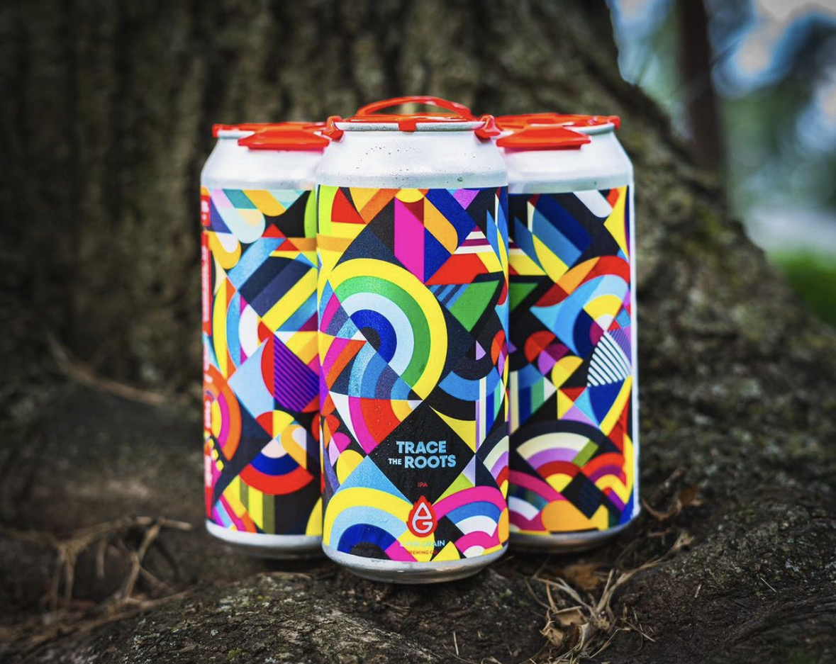
Beer Cans with Labels

1. The Value of Design and Imagery in Product Labels and Packaging

First Impressions Are Crucial

A product that is new to your customer will only get one shot at grabbing their attention. When your product sits on a physical shelf, the imagery on your label is your brand’s last expression and our customer’s first impression. Studies estimate that 60% of consumers decide in the first 30 seconds! How does imagery help your consumer decide?

Evoke Emotions

Imagery evokes emotions — one of the key catalysts for buying behavior. They influence our buying decisions, preferences, and attitudes toward your brand. According to the Harvard Business Review, “emotional motivators” give a better insight into a customer’s future value than any other metric (including brand awareness and customer satisfaction), making them a key driver of growth and profitability.

For example, Nike’s imagery of athletes pushing the limit can spark inspiration and motivation, while depictions of happy people can lend themselves to joy and nostalgia.

Your Label as Brand Narrator

Labels and the imagery you choose to create a visual narrative about your company will shape how your business is perceived. It is your brand’s story and intention in a nutshell, and it should align with your brand identity by bringing photography, illustration, or both together.

You Get One Shot — or 313 Milliseconds — at a First Impression

Your label should provide clarity and relevance. It should act as a key building block to trust building. A visually striking package can capture attention quickly, making it more likely that people will pick up your product out of curiosity and interest. That initial spark of attraction — which one study says can happen in as little as 313 milliseconds — is often the first step toward a purchase decision.

Catch the Attention of New Adaptors

Strong imagery allows your label to attract new customers unfamiliar with your brand. Impactful visuals allow your product to project itself on a shelf amongst a sea of competing items. This gets the attention of new adaptors, who will then go on to evaluate whether this product solves a problem or fulfills a want or need.

2. Eye-Catching Appeal: How to Use Imagery in Label and Packaging Design
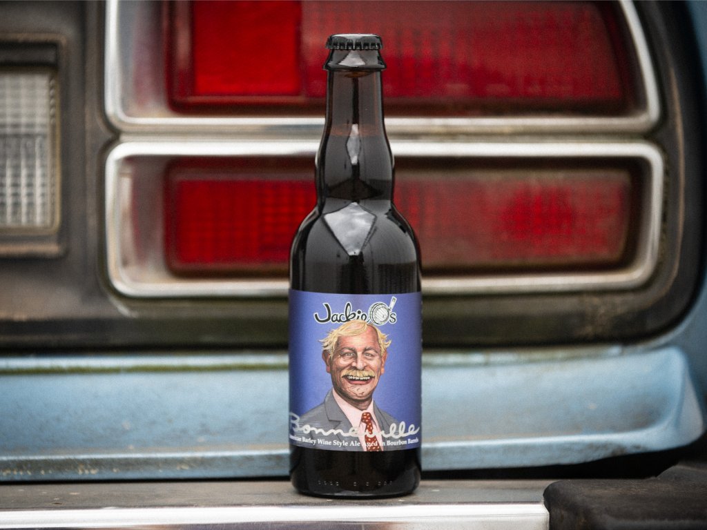
Beer can with photography

Photography vs. Illustration

When should you use photography over illustration? Can you use both in a label design for your product? Real product photography works best for food, beverage, and beauty products where trust and authenticity are important. Illustrations are ideal for abstract or complex concepts — the kind of label where the consumer could look several times and still see different details. Adding illustrations to photography can help fill the gaps for any information the photo doesn’t project.
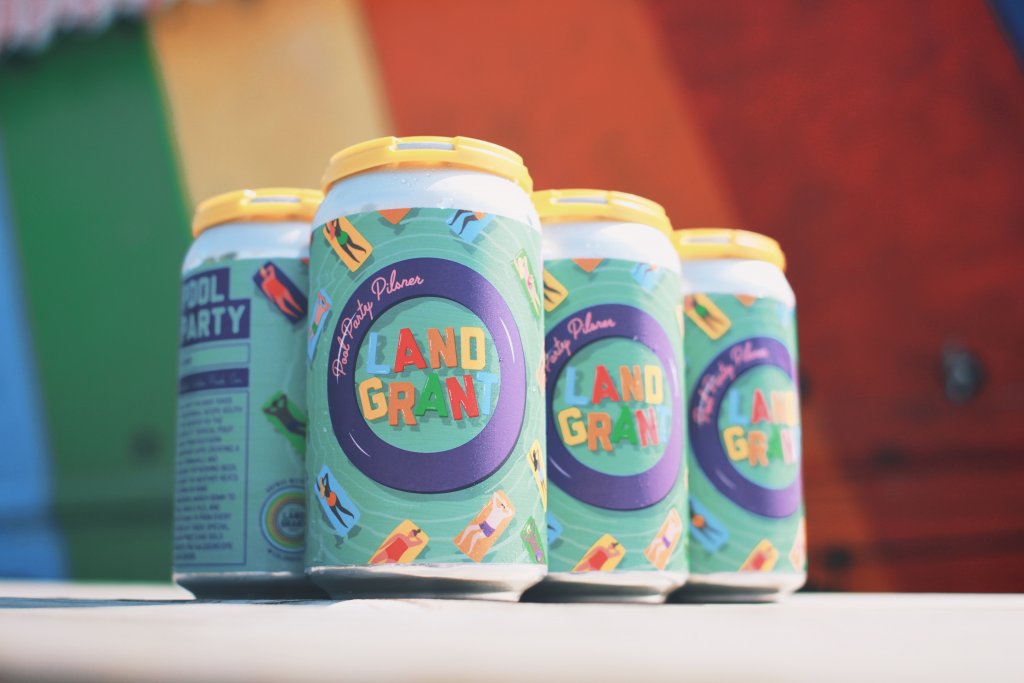
Beer can with typography

Typography as Imagery

Fonts and text placement are the unsung heroes of label design. Bold, creative fonts can become as much a part of the main visual as photography and illustration. Delicate fonts can message sophistication and elegance or become a decorative element. Fonts are also functional, guiding the customer’s eye to important information.

Visual Hierarchy

As we mentioned above, you may have less than a second to talk to a prospective customer. Organizing the label so that imagery, text, and key product information like features and benefits are easily scannable is key to getting your message across quickly and concisely.
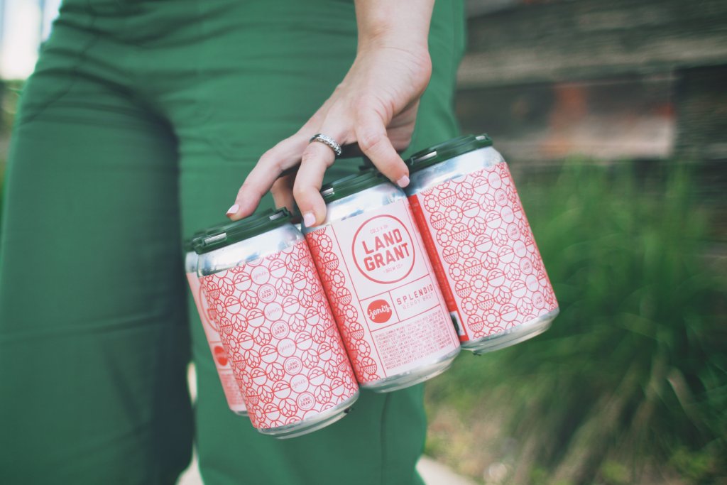
beer cans with pattern on label

Textures and Patterns

Your label may be one-dimensional, but your design doesn’t have to be. Textures can convey a message with just as much impact as imagery. Adding a tactile touch through raised UV coating used in screen printing or embossing can give a luxurious feel.

Visual patterns in your design through debossing or foiling can complement imagery, enhance appeal, and create a sensory connection.
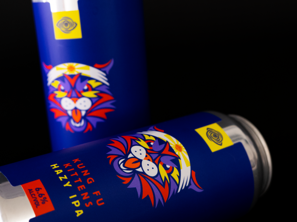
Complimentary colors on labels

Complementary Use of Color

Colors have a psychological impact on our buying. This feeling can trigger the emotions we touched on above. Color experts recommend these colors to enhance the impact of your imagery.

  • Green is associated with joy, tranquility, and nature.
  • White is calming and conveys a sense of cleanliness. It tends to make individuals feel safe.
  • Black is linked to stability and intelligence, sophistication and elegance.
  • Blue inspires creativity and joy; different shades encourage trust and dependability.
  • Orange signifies energy, appetite, and a sense of adventure.

3. Building Trust & Authenticity

Real Product Photography

The first step in gaining consumer trust? Using real product photography, especially in industries like food and beauty, where authenticity is critical. Customers are more consumer savvy than ever and can spot shortcuts, which can build distrust.

Authentic Representation

Building on using real product photos, you can ensure authentic representation by using photographic or illustrated imagery that realistically reflects what’s inside the package. Fool them once, and well — there might not be another time.
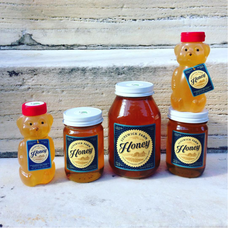
Honey storage container with custom lables

Transparency in Packaging

Discerning customers want to know where their money is going, and a window directly into the product can help! Consider transparent or partially clear packaging to show the actual product and establish trust through honest representation.

4. How Material Choices and Embellishments Can Make Imagery Stand Out

Give your customers a full sensory experience. Materials like the wide range offered by Blue Label Packaging are as important as the images on them. Glossy, matte, or textured labels give different qualities to the appearance of imagery, user experience, and overall impact.
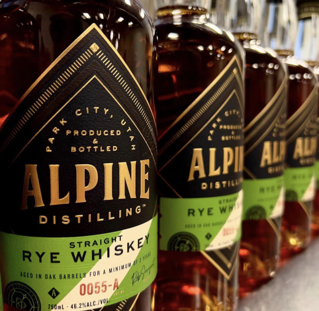
Rye Whiskey bottle with custom label

Embossing, Debossing, and Foil Stamping

These are all excellent accent techniques to add to any product packaging design. They help draw attention to certain priority areas of a label, like the brand name and logo. Features like embossing and debossing can also add depth to the design. Shiny and reflective foil stamping enhances visual appeal by highlighting specific features, such as logos, text, images, and borders.

Let Blue Label Packaging Bring Your Imagery to Life

Well-thought imagery plays a big role in attracting new customers and significantly impacting profitability. What is the key to selecting the right imagery? It truly lies in understanding both your product and the style that aligns with your brand’s identity and also resonates with your target audience.

Remember — it’s not just about aesthetics and what’s trendy. Quite the opposite, it’s about standing apart from the rest and crafting a memorable visual narrative that resonates with your audience.

Blue Label Packaging can help you curate the perfect custom label that will best suit your imagery and user experience. Check out our designer directory, get a sample pack, or request a quote today!
What are Embossed Labels?

⚞ The Highlights:

  • Embossed labels have raised areas you can feel, made by pressing the label between a custom metal die and a matching counter die.
  • Debossing works the other way, pressing the design down into the label.
  • An emboss can be blind (no ink or foil), lined up with printed artwork, or topped with foil.
  • Uncoated, textured, and heavier paper stocks hold an emboss well.

Embossing raises part of a label’s design off the surface so people can feel it. Whether that raised area comes out crisp or muddy depends on the paper you pick, how your artwork is set up, and how much of the design you raise. If you already know the look you want, start with our custom embossed labels.

What Are Embossed Labels?

Embossed labels feature raised designs or lettering that give your labels a three-dimensional look. By pressing a custom pattern into the label material, you not only catch the eye but also invite customers to feel the difference. Embossing is popular on wine, spirits, cosmetics, specialty food, and candle labels.

You’ll also hear embossed labels called embossed stickers, since plenty of people say “sticker” for any label with adhesive on the back. When someone says a logo or a line of lettering is embossed, they mean it stands up from the surface and you can feel its edges with a fingertip.

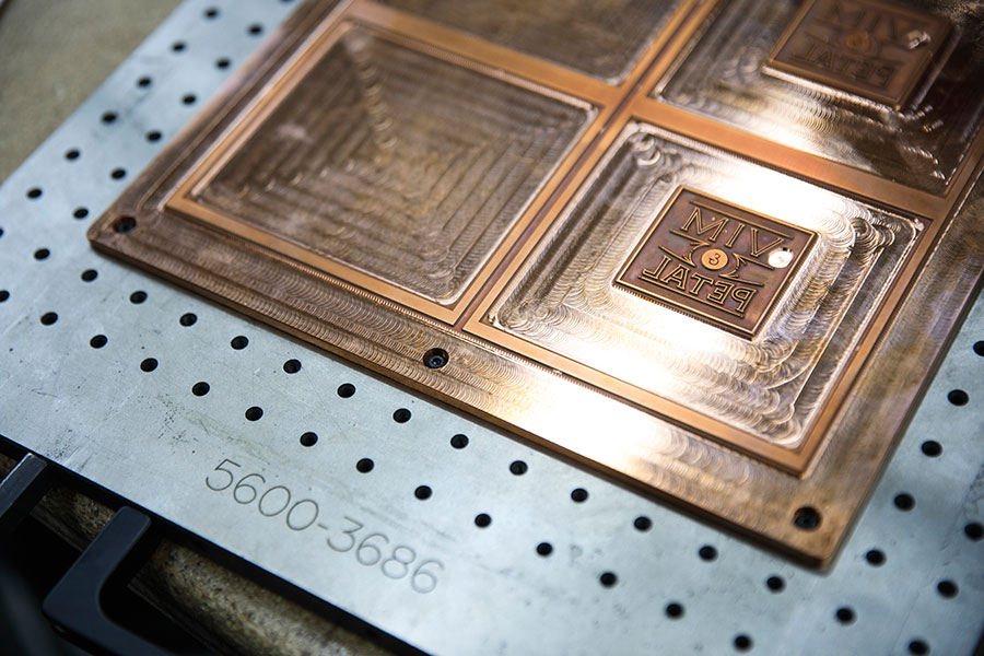
Label embossing die.

How Are Embossed Labels Made?

Custom Die Creation

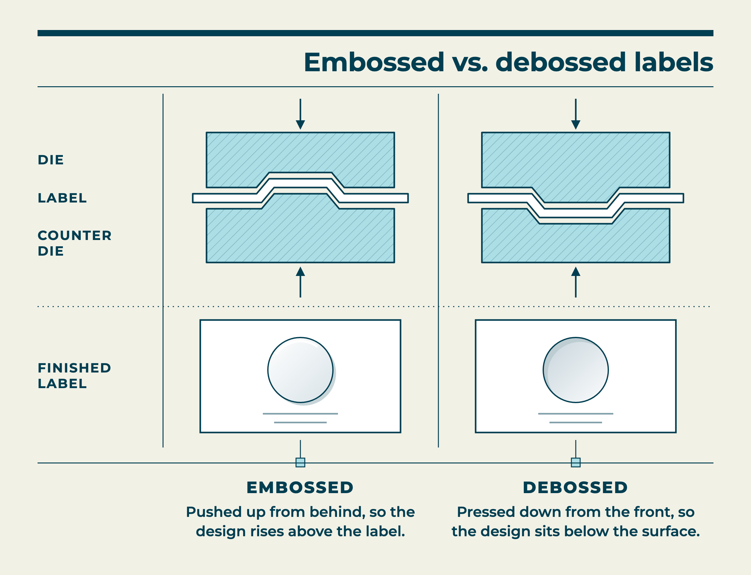
We design a custom die based on your specific requirements (imagine it as a tailor-made metal stencil). This tool can capture everything from individual lettering to intricate patterns or even an all-over design. The die works with a second tool called a counter die, shaped as its reverse so the two fit together. Pressing the label between them pushes the design up from behind.

Pressing Process

Next, the die is pressed against each label, so your design comes out raised and uniform every time. We often pair this with hot foil stamping, where heated, metalized foil is applied to the raised areas to create extra contrast and depth.

Artwork Preparation

Build the areas you want raised as vector artwork (shapes drawn in a design program like Illustrator, rather than a photo or scan) and color them with a spot color named “Emboss” on a layer also named “Emboss,” so we know exactly which parts of the design to raise. Convert any raised text to outlines. Our emboss and deboss file guide walks through each step in Illustrator and Photoshop. The rest of the label follows our usual setup, with images at 300 DPI or higher in a high-resolution PDF or Adobe Illustrator file. Our artwork guidelines have the full checklist.

Embossed vs. Debossed Labels

Embossing and debossing use the same kind of die and push in opposite directions. An embossed design rises above the label. A debossed design is pressed down, so it sits below the surface around it.

Diagram comparing embossed and debossed labels: the die and counter die push the design up for embossing or press it down for debossing.

Embossed Debossed
What happens The design is pushed up from behind The design is pressed down from the front
How it feels A raised shape under your fingertip An edge that dips into the label
How it looks Catches light on top of the raised area Casts a small shadow inside the pressed area
Pairs with foil? Yes Yes

Embossing reads as bolder, so brands often use it on a logo or brand name. Debossing is quieter and suits a small mark or a line of text that people find once they pick the product up. Some labels use both.

Blind, Sculpted, and Foil Embossing

Once you’ve picked embossing, the next decision is what goes on the raised area, if anything.

  • Blind emboss: The design is raised with no ink or foil, so you see it only through light and shadow. Blind embossing is a common request for wine labels and spirits labels.
  • Sculpted emboss: The raised area lines up with printed artwork, like a logo that’s printed in ink and raised at the same spot. This is sometimes referred to as registered embossing. The print and the emboss have to match exactly, so the artwork needs careful setup.
  • Foil emboss: Foil goes on the raised area, so the shape shines and stands up off the label. Foil embossing is bolder than either a blind or a sculpted emboss. See our foil stamped labels for foil options.

With pattern embossing, a texture covers part or all of the label instead of a single logo, so the whole label feels different in your hand. You can also add spot UV (a clear, glossy coating printed only where you want it) to an embossed area so it shines against a matte background. Our label decoration breakdown compares more finishing options.

The Benefits of Embossed Labels

When customers can see and feel the detail in your label, it reinforces the premium quality of your product.

  • Raised detail stands out next to flat labels. On a crowded shelf, a raised logo gives a shopper’s eye somewhere to land.
  • Embossing adds detail without another color. A blind emboss gives a minimal design some texture while the label stays uncluttered.
  • Embossing combines with other finishes. Pair it with foil, spot UV, or a custom label shape to make one detail the focus of the label.

Embossed labels for bottles.

Which Label Materials Hold an Emboss?

Some label materials hold a raised shape better than others. For embossing, we typically recommend:

  • Textured or uncoated papers: Paper without a smooth, glossy coating takes the die cleanly, so the edges of the raised area come out crisp. Felt and other textured wine papers are a classic choice for a blind emboss.
  • Heavier paper stocks: Thickness matters more than texture. The thicker the paper, the deeper we can press, so the raised design stands up more. Heavier papers also hold their shape better if you’re adding foil on the raised area.
  • Paper-film blends: If your label needs to handle some moisture, a blend of paper and plastic film holds up better than plain paper and still takes an emboss.

One thing to watch: A bottle that sits in an ice bucket or a wet cooler usually needs a water-resistant film label, like BOPP (a plastic film). We can emboss film, but it resists the die, so the raised area won’t come out as crisp as it does on paper. For film labels we usually recommend a screen build instead: a thick layer of clear coating, screen printed onto the label, that stands up off the surface so you can still feel the design.

Design Tips for Embossed Labels

An emboss comes out clean when you plan the design around it from the start.

  • Go for clear shapes: Keep your design bold and simple. Overly intricate patterns might not emboss well and could lose clarity.
  • Keep lines at least 0.01 inch thick: Lines thinner than that may not emboss cleanly. The exact minimum depends on the font, so thin or delicate typefaces need a little more weight.
  • Raise one or two parts of the design: Embossing works well on a logo, a brand name, or a border. When everything on the label is raised, no single part of it stands out.
  • Leave the small print flat: Ingredients, alcohol content, contact details, and other small text stay easier to read when they’re flat.
  • Feel the paper first: Embossing is hard to judge on a screen. Our sample pack lets you hold the papers and get a sense of how a raised design will feel on each one. We build each pack around what you’re working on, so ask for an embossed example and we’ll include one.

What Affects the Cost of Embossed Labels?

We quote each embossed job on its own. The price depends on:

  • The die: A new design needs a new die, which is a one-time tooling cost. We store your die for reorders and replace it at no cost when it wears out.
  • Size and detail of the embossed area: A small logo needs a smaller die than an all-over pattern.
  • Foil or other finishes: Foil or spot UV on the embossed area means one more production step.
  • Material: Specialty textured papers cost more than standard stocks.
  • Quantity: The die cost is spread across your run, so the cost per label drops as your quantity goes up.

There’s no minimum order on embossed labels, so embossing works for small runs too. Standard embossed labels are produced in 5 business days after you approve your artwork. A new die usually adds 2 to 3 days, depending on when the tooling arrives from our supplier.

Frequently Asked Questions

What’s the difference between embossed and debossed labels?

An embossed design is pushed up from behind, so it rises above the label. A debossed design is pressed down into the label, so it sits below the surface. Both use a custom die, and both can be paired with foil.

Are embossed stickers the same as embossed labels?

Yes. “Sticker” and “label” both describe a printed piece with adhesive on the back. Embossed stickers and embossed labels both have a raised design you can feel.

What does an embossed logo mean?

An embossed logo is raised off the surface of the label, so you can feel its outline. The raised logo can be left bare (blind embossing), lined up with the printed logo, or covered in foil.

What is blind embossing?

Blind embossing raises a design without any ink or foil on it. You see the shape only through light and shadow, which gives the label an understated look. Blind embossing is common on wine and spirits labels printed on textured paper.

How long do embossed labels take?

Standard embossed labels are produced in 5 business days after artwork approval. A job that needs a new die usually takes 2 to 3 days longer, since the tooling comes from an outside supplier.

Do I pay for the embossing die again when I reorder?

No. The die is a one-time cost. We store it for your reorders and replace it at no cost when it wears out.

What files do I need for an embossed label?

Send a high-resolution PDF or Adobe Illustrator file, with the embossed areas built as vector artwork (drawn shapes, not a photo) in a spot color and on a layer, both named “Emboss.” Our emboss and deboss file guide shows the full setup, and our artwork file standards cover the rest.

Can you emboss film labels like BOPP?

Yes, but film resists embossing, so the raised area isn’t as crisp as it is on paper. For film labels, we usually recommend a screen build, a thick layer of clear coating screen printed onto the label to give the design a raised feel.

Will embossed labels run on my labeling machine?

Yes. Embossed labels run through labeling machines without flattening the raised design.

Let’s Plan Your Embossed Labels

Tell us what you’re labeling, which paper you have in mind, and which part of the design you want people to feel. We’ll help you pick between embossing, debossing, and foil, then build the die to match. Start with our custom embossed labels, or request a quote and we’ll send it within 24 hours.

More on label finishes:

Label Decoration Breakdown: What’s Available and How They Enhance Your Design

Even a good label design can use some extra flair. Label decoration is a great way to enhance your design in cool, creative ways so that your products stand out to consumers. Spot varnishes, hot foil stamping, and embossing can all amplify your label design in different ways and can even combine to turn your product into a visual spectacle. Let’s break down three decorative capabilities and how they can enrich your label’s design.

Spot Varnish

How spot varnishes work

Label varnishes are a protective liquid coating that can help protect the surface of your label and highlight certain features of your design. Varnishing liquids are rolled onto your labels and cured or dried. This process causes the varnish to fill in any nooks and crannies of your label’s surface material, which is especially good for paper materials. While varnishes can coat to the entire label, spot varnishes are applied to specific parts of your design.

How spot varnishes enhance your label

As we just mentioned, spot varnishes are a tremendous way to highlight aspects of your design, such as your logo, an illustration, or some other detail. Spot varnishes come in different forms, such as gloss, satin, and soft-touch. Each option can add a different look – or even feel – to individual parts of your design, which can help attract the attention of discerning consumers.

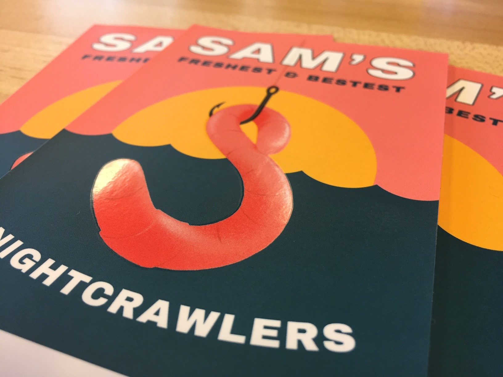
A custom label with a spot varnish highlighting the worm.

Hot Foil Stamping

How hot foil stamping works

Hot foil stamping is the process of pressing a foil, often metallic, into your label material. During this process, an engraved plate is heated up and used to stamp a metalized foil or film into your facestock of choice. The combination of pressure and heat allows the foil or film to stick to your label material with the dry ink in between them. As a result, the engraved design of the plate is left on the label to add a special decorative effect.

How foil stamping enhances your label

Hot foil stamping is an extremely versatile method for label decoration. By pressing engraved foil or film patterns into your label, you can create outstanding, multifaceted compositions that look expensive without drastically driving up printing costs. While hot foil stamping is commonly associated with gold and silver sheens, there are hundreds of different types of foils and films available:

  • Metallic (gold, silver, etc.)
  • Gloss
  • Matte
  • Holographic

These various foils and films give a plethora of design options for your labels. Trying to market your product as a high-quality good that’s worth a higher price point? Gold and silver borders and accents can help your packaging look as high-class as your product. Simply want to make your label look really cool. Holographic films can pack a visual punch that can make sure your label gets noticed. Between different foils and engraving possibilities, hot foil stamping offers plenty of potential for your packaging.

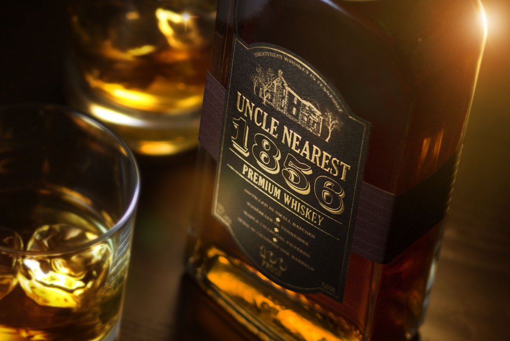
An Uncle Nearest Premium Whiskey bottle with a hot foil label decoration.

Embossing

How embossing works

The embossing process involves pressing an image into the label material. Custom dies are made with a specific pattern – common embossing patterns highlight individual lettering, borders, and specific decorations. The embossing die is physically pressed into your labels as your label is finished. This process creates an imprint that rises above the rest of the label. Embossing can also be combined with hot foil stamping to create a three-dimensional image that users can both see and feel.

How embossing enhances your label

To start, embossing allows your labels to literally stick out more than before. Embossing adds texture that makes products look more sophisticated than the usual flat surface. Combining the raised surface with hot foil stamping adds some complexity to your design. This look can in turn add some intrigue or help improve the perceived value of your products.

Another major benefit is that embossing changes the tactile experience of your products. Research shows that “packaging that encourage[s] people to touch the product may increase the likelihood that consumers will make a purchase.” By embossing a pattern onto your label, consumers can feel the difference between your packaging and less impressive products.

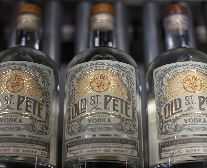
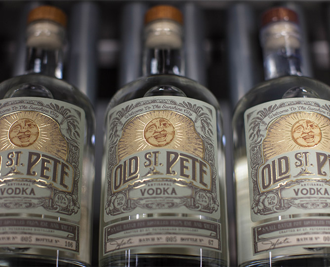
Old St. Pete Vodka bottles with embossed label decorations.

Upgrade Your Packaging Through Label Decoration

A well-decorated label is an impressive sight for potential customers. The right digital printing company can open your packaging up to new design possibilities. At Blue Label, our experts work with you to uncover new label decoration options like spot varnishes, hot foil stamping, and embossing to enhance your design so that you can wow your consumers.

Ready to improve your packaging through cost-effective label decoration? Contact us today to talk to our team about your next label project.

Bottle Label Printing Considerations for Distilleries

No spirits bottle deserves a boring label. Distilleries live and die on the success of their products, and labels give you a chance to tell your story and give consumers a sense about the quality and personality of your products within a few seconds, whether they’re on the store shelf or behind the bar.

Of course, great designs don’t automatically translate into a great spirits labels for distilleries. There are many parts of the bottle label printing process that can factor into the end result, whether it’s a special printing capability or a challenge with the bottle itself. Here are a few factors you should consider when your distillery needs a new bottle label.
(more…)

Designing Beer Labels: Colors and Special Printing Capabilities

The right splash of color or an eye-catching feature can be the key to a successful beer label. Of course, the challenge for a designer is to try and figure out which colors or features make the most sense for the product. Whether you’re trying to decide on the right colors or a special printing capability, here’s what you need to consider.
(more…)