Can Clear Labels Be Used on Dark Containers?

Yes, clear labels can work on dark containers, but only if the material, adhesive, and application setup are properly matched to your container. When done right, you can achieve a “no-label” look even on dark packaging.

We’ll walk through what works, what doesn’t, and what to watch for based on your container type.

Candle with clear label

Labeling Dark Plastic Containers (PET, HDPE, LDPE)

These plastics show up in everything from beverage bottles (PET) to detergent jugs (HDPE) to squeezable tubes and pouches (LDPE), so here’s what you need to know before applying clear labels to each one.

Can clear labels be used on containers made with these materials?

Yes, clear labels can be used on PET, HDPE, and LDPE containers. You’ll get good results as long as the container is properly prepared, the label includes a white underprint for readability, and you choose an adhesive that’s designed to bond well with each plastic type.

What to know

Clear labels can look great on PET, HDPE, and LDPE containers, but each plastic comes with specific challenges. Here’s what to expect and how to solve it:

  • Bubbling from outgassing. Freshly molded containers can release small amounts of gas that get trapped under the label. Let containers sit for 24–72 hours before labeling to reduce bubbling.
  • Poor legibility on dark plastics. Dark containers can wash out artwork or text. Add a white underprint behind any design elements that need to stay readable.
  • Adhesion issues on HDPE and LDPE. These plastics, such as detergent jugs (HDPE) and squeezable tubes or pouches (LDPE), have low surface energy, which makes it harder for adhesives to bond. Use a high-tack adhesive and consider pre-treating the container to help the label stick.
  • Choosing the right film. PET offers stiffness and clarity for smooth, rigid surfaces. BOPP is better for flexible bottles or squeezable containers.
  • Surface preparation matters. Make sure containers are clean, dry, and smooth before applying labels. Even minor oils or residues can cause lift or bubbling.

Finishing Options

  • UV varnish for abrasion resistance
  • Protective laminates if exposure to water or friction is expected
  • Avoid matte finishes that reduce transparency or emphasize surface defects

Labeling Glass Containers (Amber or Dark-Colored)

Clear labels can work well on darker glass, and darker-colored glass actually helps hide the label edges, which brings out the seamless effect.

What to know

  • Artwork can disappear on dark surfaces. Use a white layer (underprint) behind key design elements to keep text and graphics readable on amber, brown, cobalt, or black glass.
  • Curved or embossed bottles may cause wrinkles or edge lift. Choose a slightly more flexible clear BOPP on bottles with heavy curves or embossing.
  • Dust and fingerprints show more on clear labels. Clean the glass before application to avoid trapped particles and visible smudges.
  • Choose the right film for the container. Clear PET works best on smooth, rigid dark glass because of its clarity and stiffness. Clear BOPP can be a better fit for slightly curved bottles.

Finishing Options

  • Gloss laminates enhance clarity and make the label “disappear” into the dark glass
  • Spot coatings add texture or emphasis without reducing the clear effect

Labeling Aluminum or Metal Containers

Clear labels work well on aluminum and metal containers. These surfaces are smooth and consistent, which helps labels bond cleanly and makes it easier to achieve a polished look.

What to know

  • Bubbling or trapped air is more visible on metal. Metal surfaces show imperfections clearly. Consider running a few test labels to confirm clean application and adjust pressure or speed if needed.
  • Any surface flaw will show through the label. Small dents, scratches, or coating variations will become more visible under a clear film. Inspect containers before labeling.
  • Some finishes may require extra prep. Anodized or coated aluminum can reduce adhesion. Use a high-tack permanent adhesive or consider a primer when surfaces are difficult to bond.
  • Choose the right film for the job. Clear BOPP is usually the best match for aluminum because it balances durability, flexibility, and clarity.

Finishing Options

  • Gloss or soft-touch laminates depending on the brand look you want
  • Foil-enhanced elements that play nicely with the metallic background

Comparison Table: Clear Label Use on Dark Containers

Container Material Best Film Adhesive Type
PET (Plastic) Clear BOPP Clear acrylic
HDPE/LDPE (Plastic) Clear BOPP High-tack acrylic
Glass (dark/amber) Clear PET Standard clear
Aluminum/Metal Clear BOPP Strong permanent

Matching Materials and Containers

  • Best material for dark PET bottles: Clear BOPP with acrylic adhesive. It’s clear, flexible, and performs well with careful surface prep.
  • Most forgiving substrate: Glass. High surface energy means great bonding and low bubbling risk.
  • Best for premium gloss finish: Clear PET on smooth glass or metal. This provides superior transparency and stiffness.
  • Most cost-effective for dark plastics: Clear BOPP. It’s budget-friendly but needs good prep and a white underprint.
  • HDPE with low-tack adhesive: High bubbling risk. Avoid untreated or freshly molded containers.

Clear Labels on Dark Containers

Clear labels can absolutely work on dark containers, but success depends on using materials, surface prep, and the application environment.

Request a sample pack or contact us and we’ll show you what works.

Can Clear Labels Be Used on Plastic Packaging?

Yes, they can, and they’re a popular choice for brands that want a clean look without covering up the product itself. Below, we’ll walk through what you need to consider to avoid label issues and get the “no-label look” just right.

Key Considerations

Know Your Plastic

The surface and shape of your packaging can make a difference for a clear label’s performance.

  • PET (polyethylene terephthalate): A clear, rigid plastic often used in beverage bottles and personal care containers. Great for clear labels.
  • HDPE (high-density polyethylene): A more flexible, textured plastic used for shampoo bottles, cleaning products, and more. Adhesion is harder, so use a strong adhesive and flexible film to ensure full contact.
  • PP (polypropylene): A lightweight plastic that’s harder for adhesives to stick to. It’s used in tubs and jars and requires a specially formulated adhesive.
  • LDPE (low-density polyethylene): Very flexible, often found in squeezable tubes for lotions or gels. You’ll need a label film that can bend and stretch without peeling.

Have a curved or tapered container? That’s another challenge. Labels are more likely to wrinkle or lift unless your label film is flexible enough and applied with the right pressure and angle.

Pro tip: If you’re using HDPE or another flexible plastic (like LDPE or soft-touch PP), look for a conformable clear film (like MDO) and a high-tack adhesive built for textured or squeezable surfaces.

E-Juice bottles with custom clear labels

Consider the Product’s Environment

Plan for the environments that your product will encounter during its full life cycle. Where’s this product going next?

  • Cold storage or refrigeration? You’ll need moisture-resistant materials and cold-temp adhesives that can handle condensation without peeling or slipping.
  • Wet environments like bathrooms, ice buckets, or kitchens? Lamination helps protect your label from moisture, scratches, and smudges.
  • Handled often (like personal care, cosmetic, or cleaning products)? Use a scuff-resistant finish to help your labels stay clean and intact.
  • Exposure to oils or chemicals? Choose chemical-resistant label materials and inks that won’t break down.

These details really matter once your labels hit the production line. Clear labels, especially glossy ones, tend to make surface imperfections more visible. If your label scuffs or smudges, it shows.

Design Considerations

Clear labels let your product show through, but they also reveal every bubble, fingerprint, and printing flaw.

Common design pitfalls:

  • Transparent labels (especially important details) over colorful products without a white underprint can completely disappear.
  • Light-colored text becomes unreadable when placed over dark liquids or product backgrounds.
  • Thin lines or lightly printed details can disappear completely once applied.

How to design for clear labels:

  • Use white ink underlays behind important elements so your branding and product info stay legible. Without this layer, your text and logos might vanish once applied.
  • Test your label on a filled container, not just an empty one. The look changes when there’s product behind the label.
  • Focus on contrast, not just aesthetics. For example, avoid placing pale gray type over a dark product without white backing. It’ll be invisible once applied.

If you’re using things like foil, spot varnish, or custom shapes, just double-check that they’ll still look sharp on a clear label. See what finishing options we offer »

Recyclability and Sustainability Goals

Clear labels and plastic packaging can be recycling-friendly if they’re designed with the right materials.

To support recyclability:

  • Match your label material to your container, for example, pair a polypropylene (PP) label with a polypropylene (PP) bottle. This makes the entire package easier to sort and recycle.
  • Avoid full-wrap labels that block optical scanners during sorting.
  • Use labels that meet APR (Association of Plastic Recyclers) standards, like CleanFlake, which cleanly separate from containers during washing in the recycling process.

Quick Checklist: Will Your Clear Label Work on Your Plastic Package?

  • Do you know what type of plastic your container is made from? It impacts adhesive and label material selection.
  • Have you tested for shape challenges (tapered, squeezable, textured)? This prevents wrinkling and lifting.
  • Are you planning for exposure to moisture, oils, or friction? This affects material and finish durability.
  • Is your design legible when applied to a filled container? This ensures branding and info remain visible.
  • Will your label support your recyclability goals? This helps meet sustainability standards.

Want the No-Label Look Without the Headaches?

Clear labels can look amazing if you get the details right. We’ve helped thousands of brands pull it off, and we’re happy to help you too. Contact us and we’ll show you what works.

Can Clear Labels Be Used on Glass Bottles?

Clear labels can absolutely work on glass bottles as long as you’ve got the right materials and process in place. Not all combinations work the same, and issues usually come from skipping key steps (don’t worry, we’ll walk through them below).

Here’s what it takes to get a clean “no-label look” that performs beautifully and consistently on glass packaging. We’ll cover the materials, design choices, and real-world considerations that make clear labels work on glass bottles.

Clear Label

Making Clear Labels Stick (and Stay)

Match Material and Adhesive to Your Bottle

Glass is rigid and smooth. Film materials like BOPP, PET, or vinyl,hold up better when your bottles face moisture, scuffing, or changes in temperature. We often suggest BOPP or PET films paired with protective lamination for durability and polish.

Equally important is the adhesive. For glass, you’ll want a clear permanent adhesive that can handle temperature shifts and moisture without fogging or lifting around the edges. For recyclable bottles, a wash-off adhesive helps labels cleanly separate during recycling.

Consider Shape, Finish, and Surface Texture

The shape and surface of your glass container play a big role in how your label will look and perform. Here are a few things to consider:

  • Shape: Curved or tapered bottles can make it harder for labels to lay flat or align correctly. Choosing a flexible film, like MDO, helps labels conform smoothly to those curves.
  • Surface texture: Uneven or textured glass can cause tiny bubbles or wrinkles during application. A smooth, consistent surface gives the adhesive the best chance to bond cleanly.
  • Glass Finish: High-gloss glass surfaces can make small label imperfections, like bubbles or wrinkles, more noticeable because of how light reflects off the surface. Frosted or matte glass containers, on the other hand, help mask these minor flaws and create a softer, more forgiving appearance. The surface finish of your container can influence how visible label edges appear.

Clear Label on Glass Bottle

Designing Labels for Transparency

Creating a clear label design takes some planning, especially when you want your product to maintain its legibility. Here’s what to think about when designing for transparency:

  • Use a white layer strategically: This is a layer of white ink printed beneath parts of your design so colors stay bold and readable on clear material. Think of it as a background layer that makes your text, graphics, or barcodes visible instead of blending into the bottle. Without it, colors can appear washed out or disappear against the product.
  • Test transparency levels: You don’t need to apply a white layer everywhere. Adjust opacity levels in select areas to control how much of the bottle or liquid shows through.
  • Balance design and legibility: Keep brand colors and small text over printed white, but let less critical elements remain transparent for depth and visual appeal.

Prepare for Real-World Handling

Most products encounter conditions like cold storage, condensation, shipping, and frequent handling. Labels must survive all of that without peeling, bubbling, or fading. In our experience working with beverage, food, and personal care brands, film labels with strong adhesives hold up well through cold storage, transit, and shelf scuffs.

If recyclability is a priority, ask about adhesives that more easily come off with hot water. These let labels cleanly separate from glass during recycling.

Finishing Options for Clear Labels

When planning finishes, start with the most common and impactful design decisions first, matte versus gloss, before layering on embellishments like foil for extra texture and shine.

You can explore more of these finishing techniques here.

Stay Compliant and Scannable

If your product falls under FDA or EU labeling rules, you need to make sure all the required info is easy to read and in the right place, even with transparent materials. If you’re not sure, it’s best to check with your regulatory team or compliance partner.

Quick Checklist: Clear Labels on Glass Bottles

No two bottles or labels are exactly the same, but this checklist covers the big things you don’t want to miss.

  • Pick a clear film and pair it with a laminate (matte, gloss, soft touch) .
  • Evaluate your bottle shape and surface to pair the right materials and adhesives.
  • Add a white layer and test label proofs on actual bottles and contents.
  • Prep for real-world exposure by choosing moisture and abrasion-resistant materials.
  • Use embellishments like  foil to elevate design.
  • Double-check regulatory readability and ingredient placement.

We’ve been helping brands bring clear labels to life across products and packaging types. Need to see it for yourself? Contact us and we’ll show you what works.

A Comprehensive Guide to Clear and Transparent Product Labels

⚞ The Highlights:

  • Clear labels let the container and product show through, which is why they’re popular for beverages, beauty products, and any product where the contents are part of the brand story.
  • Clear labels are always made from film (there’s no see-through paper). Common materials: BOPP, PET, MDO film for squeeze bottles, and HDPE for moisture-heavy applications.
  • Design rule #1: plan for the bottle color to show through. Add white ink layers behind colored elements that need to read accurately.
  • Application matters more on clear labels. Bubbles, fingerprints, dust, and wrinkles all become visible in a way they don’t on white labels.

Clear and transparent labels create a striking look that puts the container, the product, or both at the center of the design. Done well, they give beverages, beauty products, and food brands a clean, modern, premium feel that white labels can’t match. Done without planning, they show every fingerprint, every air bubble, and every color shift that happens when ink sits on top of a colored bottle. Below is what to know before you commit to a clear label.

Custom beverages with clear labels

Clear vs. white vs. metallic labels: how they compare

Label type What it does Best for Cost
Clear / transparent Container and contents show through; design appears to float on the bottle Beverages, premium spirits, beauty products, “no-label” looks Higher (specialty films + white-ink layers)
White Solid white background that prints color predictably; covers the container Most retail products; bold branding; consistent color across SKUs Mid (the standard)
Metallic / silver Metalized substrate gives a reflective, premium finish Premium beverages, spirits, beauty, anywhere “luxe” is the goal Higher (less than hot foil but more than standard)

The short version: clear is for products where the container or contents are visually interesting; white is the default for most retail; metallic is the premium-positioning shortcut when foil isn’t in the budget.

Why clear and transparent labels work

Clear labels do two things at once. They let the product itself become part of the visual identity (the color of a juice, the texture of a serum, the natural look of a sauce), and they signal a “we don’t need to hide it” confidence that buyers tend to read as quality. The “no-label” look is also one of the most consistent visual cues for premium positioning across beverage, beauty, and specialty food categories.

Which products fit clear and transparent labels?

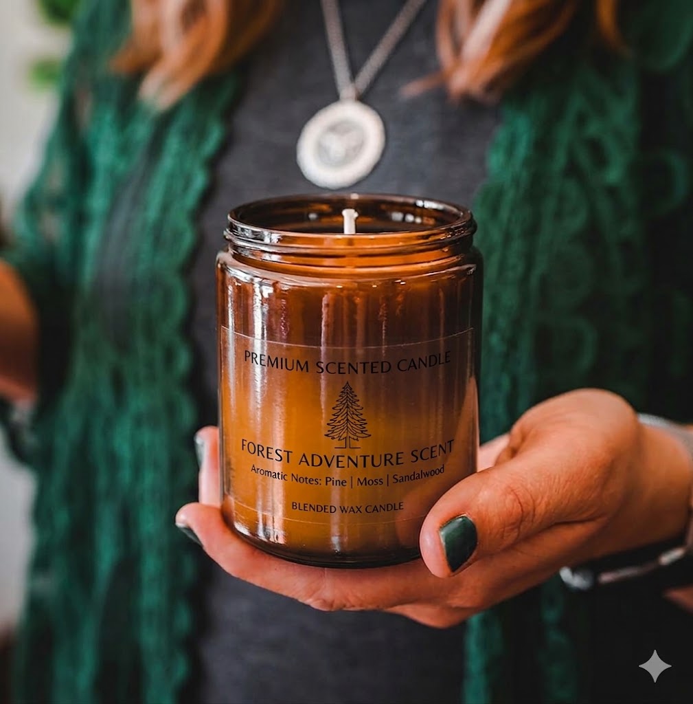
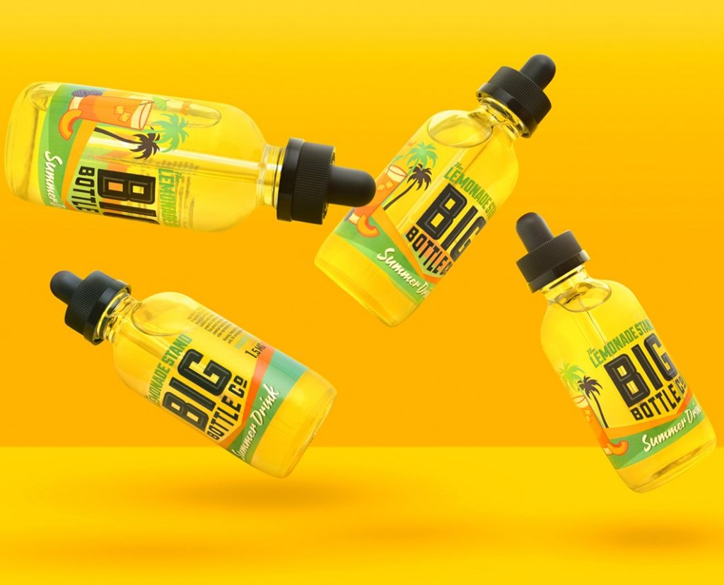
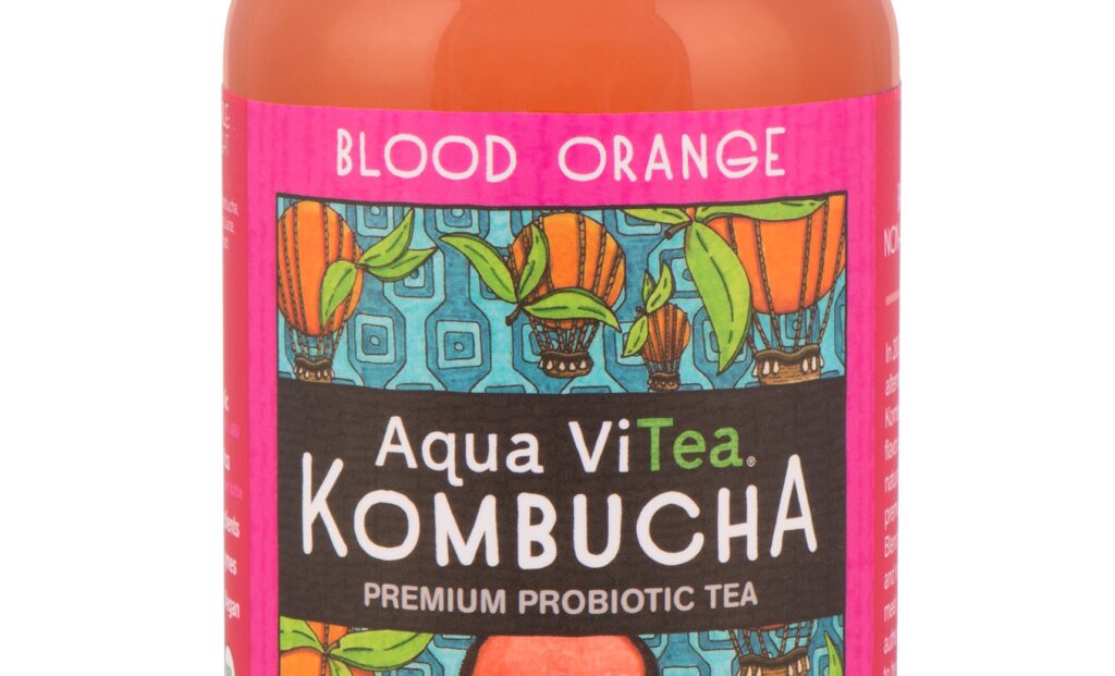
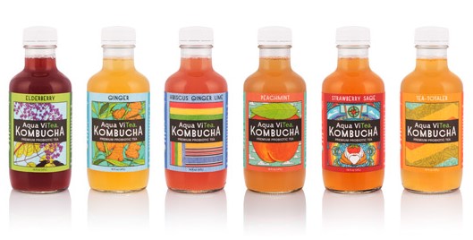
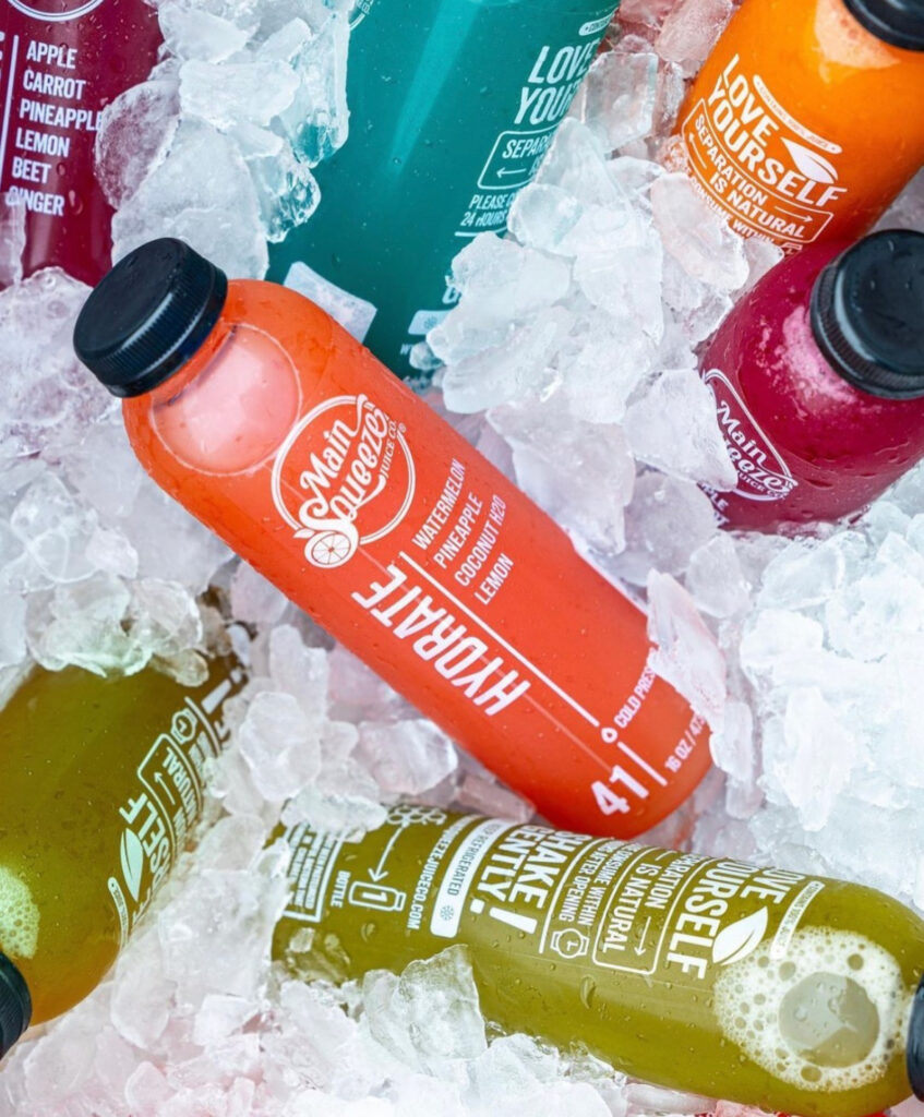
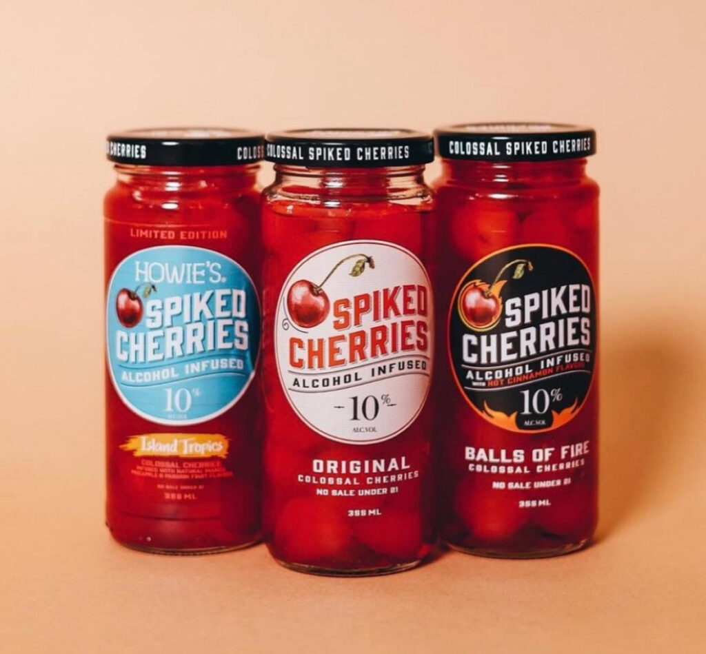
  • Beverages. Clear bottles + clear labels showcase juice pulp, fruit pieces, kombucha cultures, sparkling water bubbles, and the natural color of the liquid itself.
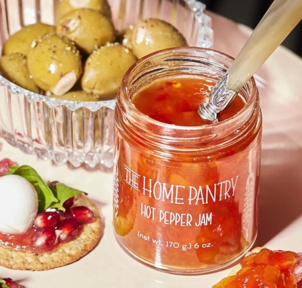
  • Foods. Jams, sauces, frozen fruits, honey, and similar products gain visual appeal when the label doesn’t cover up the ingredients. Clear labels reinforce homemade, artisanal, or natural positioning.
  • Health and beauty. Skincare, serums, perfumes, lotions, and cosmetics. The product color or shimmer becomes part of the design. Clear labels also make shade-matching products easier for buyers to evaluate at shelf.
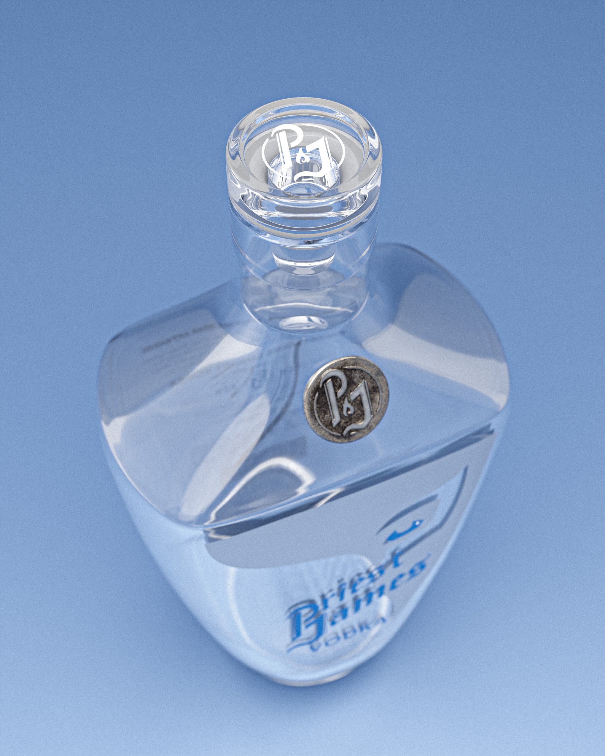
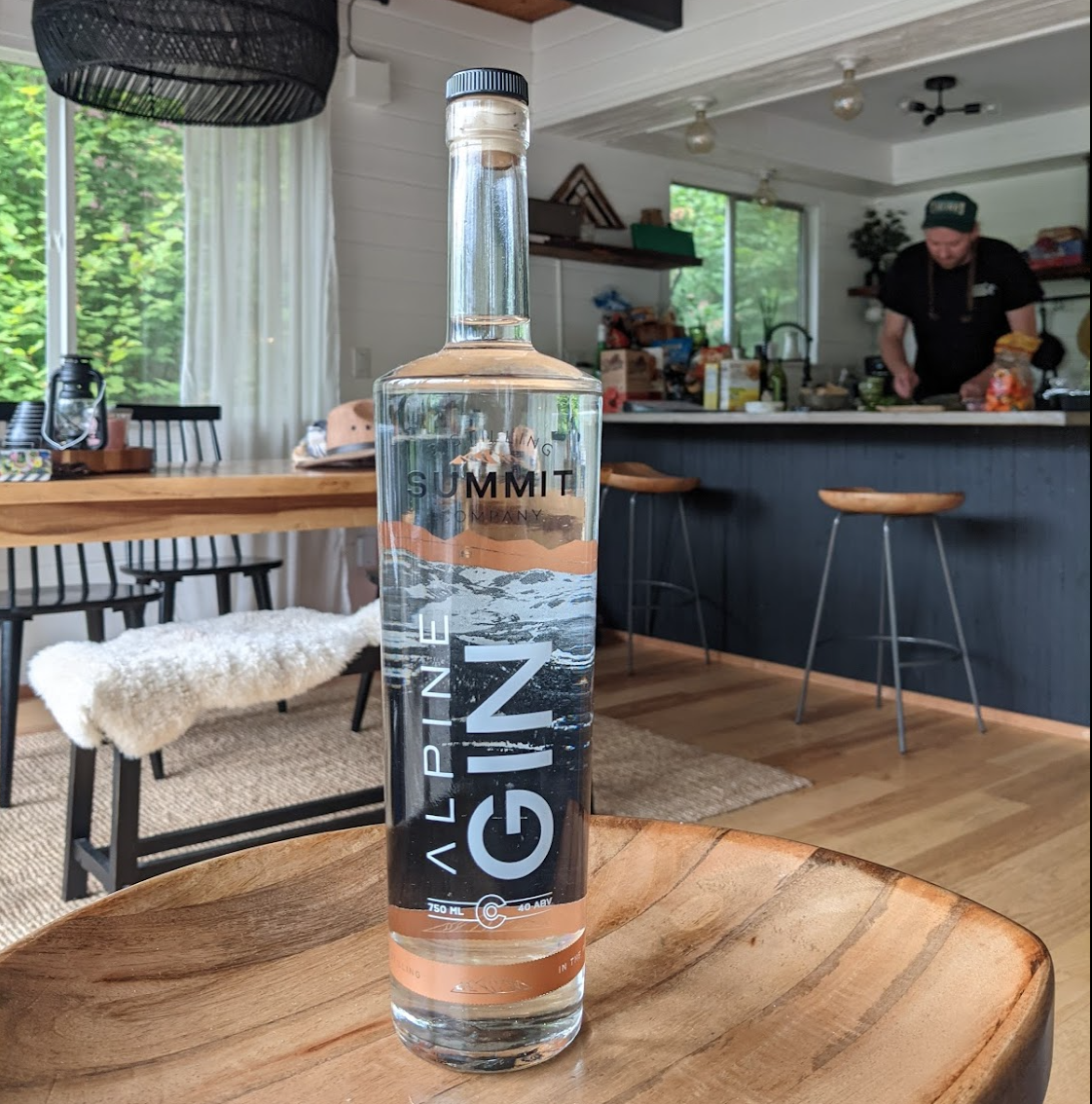
  • Spirits and craft beverages. Premium gins, vodkas, and aperitifs use clear labels to let the bottle’s shape and the liquid’s color do the visual work, with brand marks layered on as accents.
  • Wellness and supplements. Tinctures, vitamins, and supplements where the brand wants to communicate transparency. Both literally and figuratively.

Clear label materials and container compatibility

Clear labels are always made from film. There’s no see-through paper option. Paper substrates aren’t transparent. The most common clear label films:

  • BOPP (biaxially oriented polypropylene). Clear BOPP is glossy, durable, and adapts well to complex shapes. The most common clear label material.
  • PET (polyethylene terephthalate). Crystal-clear polyester that’s especially common in health and beauty for its glassy appearance and durability.
  • MDO film (machine direction oriented polyolefin). Designed for flexible containers. Squeeze bottles, tubes, anywhere the package contorts during use. The label flexes with the package without cracking or wrinkling.
  • HDPE (high-density polyethylene). Strong, moisture-resistant film for tough environments.

The right choice depends on the container. Squeeze bottles need MDO. Glass spirits bottles often pair with crystal-clear PET for the glassy look. Most retail beverage containers work well with clear BOPP. Always pair the film with a laminate or varnish to protect against scratches and abrasions.

Design and color considerations

Color shifts: plan for the background

The colors on a clear label will blend with whatever’s behind them. The bottle color, the contents, or both. Red ink on a blue bottle reads purple. Yellow ink on a clear bottle filled with cola reads brown. To control for this:

  • Add white ink layers behind colored design elements that need to read accurately. Multiple layers of white ink may be needed to fully block out a saturated bottle color.
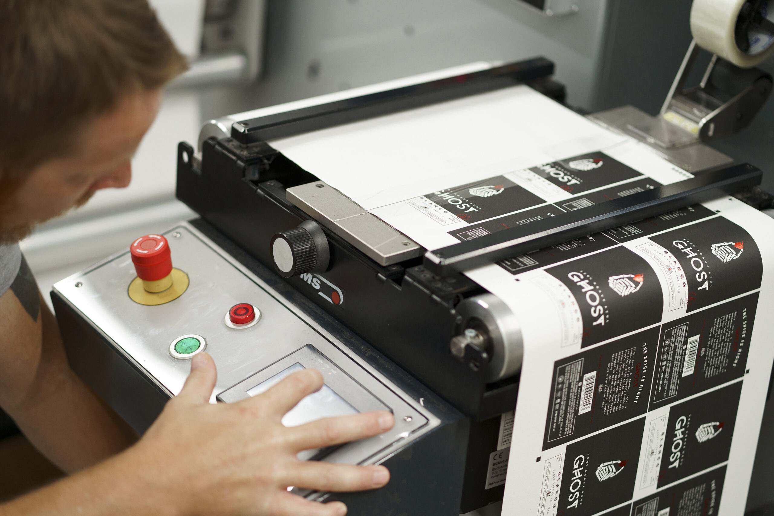
  • Test print proofs on actual containers and contents before approving a full run. Transparent inks on a screen don’t predict how they’ll behave on a colored bottle full of product.

At Blue Label, we can produce physical label proofs applied to your actual container and contents, so you see exactly how the colors will read before committing to a print run.

Custom food jars with clear labels

Size, shape, and die cuts

Clear labels open up shape options that white labels constrain:

  • Non-standard dimensions. Sized to fit the exact contour of the bottle, jar, or container.
  • Rounded corners. Soft or dramatic corner shapes that match the curve of the container.
  • Custom die cuts. Logos, abstract forms, or art-based outlines.
  • Multi-position labels. Front, back, side, and neck labels working together because each one is small and visually quiet, so multiple labels don’t crowd the bottle.

Designing for dark or shiny containers

  • Dark bottle colors restrict visible artwork. Dark backgrounds reduce the colors that read clearly on a clear label. Lean into colors with strong contrast against the bottle color.
  • Shiny materials hide detail. On glass or metalized containers, fine details and thin lines can disappear. Use bolder typography, patterns, and outlines to hold visual presence.

Design moves that work well on clear labels

  • Feature the contents as part of the design. Let appetizing food or beverage colors show through and become the visual centerpiece.
  • Use white ink as a design element, not just a backing layer. White ink on clear film reads bright and clean.
  • Layer artistic patterns, illustrations, or product sketches directly on the see-through material for a “printed on glass” effect.
  • Consider partial transparency. Opaque white ink for required information (regulatory copy, ingredients) and transparent design elements for brand visuals.

What clear labels cost

Clear labels and the printing techniques they require can carry higher costs than standard paper or white film labels.

Material cost

Clear film materials (BOPP, PET, HDPE, MDO) generally cost 10–30% more than paper labels of the same size. The extra cost buys 360° visibility of the contents and the option for the “no-label” look.

Printing cost

Clear labels often need:

  • White ink layers behind designs to prevent color shift, which adds passes through the press
  • Precise registration to line up multiple ink layers, which requires specialized presses and operator experience
  • Specialty inks or finishes (metallic, custom Pantone matches) that increase setup and per-label costs

ROI

The upfront cost of clear labels is higher, but for the right product they pay back through differentiation on shelf, premium positioning, and shopper engagement. If you’re undecided, run a small test on a single SKU before committing across the line.

Preparing artwork for clear labels

File setup

  • Send artwork as print-ready PDFs or high-resolution PSD/AI files so transparent elements render exactly as designed.
  • Review files at 100% scale and maximum quality before submitting.
  • Activate transparency flattening when saving PDFs so artwork layers blend correctly.
  • Confirm acceptable file formats with your printer and ask for a design file review before printing.

Design specifics

  • Use white ink layers behind colored design elements that need to read accurately on colored bottles.
  • Embed or link all fonts and images. Supply high-resolution photos sized 1:1 with the final label.
  • Request test prints applied to sample containers filled with stand-in product. The only reliable way to preview the final result before committing.

Label placement and application

Clear labels show every imperfection that white labels hide:

  • Air bubbles beneath the label become clearly visible.
  • Fingerprints, smudges, dust, and debris all show through the film.
  • Wrinkles and folds stand out, especially on cylindrical containers.

To avoid issues:

  • Use clean application practices. Minimize handling. Use automated label dispensers over manual application when possible.
  • Inspect every label after application. Re-apply any with bubbles, debris, or wrinkles before product goes to shelf.
  • Match the adhesive to the container. Clear labels need permanent adhesives that bond cleanly to smooth surfaces. Peeling or shifting is more visible on clear film than on a white label.

Clear labels reveal the bottle and the contents beautifully. They also reveal application flaws, which is why tight quality control on application matters more here than on most label types.

Custom jam labels with clear labels

Frequently asked questions

What is a clear label made of?

Clear labels are always made from film, never paper (there’s no see-through paper). The most common clear label films are BOPP (biaxially oriented polypropylene), PET (polyester), MDO film (for flexible containers like squeeze bottles), and HDPE (for moisture-heavy applications). The right choice depends on the container and the use environment.

Are clear labels more expensive than regular labels?

Generally yes. Clear film materials cost 10–30% more than paper labels of the same size, and the printing process often needs additional white ink layers behind colored design elements (which adds press passes). Specialty inks and precise multi-color registration can add further setup costs. The trade-off is the premium look and shelf differentiation that clear labels create.

Why do clear labels need white ink behind the design?

Because the colors on a clear label blend with whatever’s behind them. The bottle color, the contents, or both. Red ink on a blue bottle reads purple; yellow on a clear cola bottle reads brown. White ink layers act as a backing that blocks out the background so colored elements read accurately. Multiple layers of white may be needed to block out highly saturated bottle colors.

Can clear labels work on dark bottles?

Yes, but they need different design moves. Dark bottle colors restrict the artwork colors that read clearly through the film. The reliable approach is to use white ink as a design element, lean on colors that contrast with the bottle, or use bold typography, patterns, and outlines to hold visual presence against the dark background.

What products use clear labels most often?

Clear labels are most common in beverages (juice, kombucha, sparkling water, spirits where the liquid color is part of the appeal), foods (jams, sauces, honey, frozen fruit), health and beauty (serums, perfumes, lotions where shade or shimmer matters), and premium spirits where the bottle shape and liquid color carry the brand identity.

Do clear labels show fingerprints and bubbles?

Yes. Clear labels reveal every application imperfection. Air bubbles, fingerprints, dust, debris, and wrinkles all show through. Tight quality control on label application matters more on clear labels than on most label types. Use automated dispensers when possible, minimize handling, and inspect every label after application.

What’s the difference between clear and white labels?

Clear labels let the container and contents show through, with the design appearing to float on the bottle. White labels have a solid white background that covers the container and prints color predictably. Clear labels work well when the product or container is visually interesting; white labels are the default for most retail products where consistent, high-contrast color matters more than transparency.

Find the right partner for your clear product labels

Clear labels are tough to evaluate on a screen. The bottle color shifts the artwork. The contents shift it again. The lighting at retail shifts it a third time. The only reliable way to know how a clear label will look is to see it on the actual container, applied with the actual contents, under realistic lighting.

If you’re considering a clear label, take a look at our clear labels page for an overview, or request a free sample pack to see clear labels applied to real product containers. Get in touch when you’re ready to talk through your project.

Building Trust: How to Promote Brand Transparency Through Packaging

These days, consumers gravitate towards a brand they can trust. According to Inc., the results of a study on brands in the food industry found that “73 percent of consumers say they’re willing to pay more for a product that promises total transparency.” Without that sense of transparency, your product is at risk of becoming just another replaceable commodity on the shelf.

So, how can a company build a connection with customers that goes beyond basic needs? Proper packaging gives you the chance to set the stage for your brand, which means a good product label can help you create an open, honest relationship between your product and the consumer. Here are a few ways you can promote brand transparency through product labels and other packaging.

Show Them What You’re Made Of

Everyone loves a good origin story, even when it comes to the products they buy. Use your packaging to showcase what goes into what you sell.

If you make specialty foods or drinks, transparency includes being very clear about ingredients. For products that are all-natural or organic, make sure your label and other packaging reflects this information. If you make a lip balm that sources local, natural ingredients, incorporate these details into your label design. Forbes reports that 88 percent of people like brands that help them feel more environmentally friendly and ethical.

Even if you can’t talk about all-natural ingredients or other benefits, you can still utilize your labels to give consumers an honest expectation of what’s inside. When a customer buys your product, they want that product to live up to the expectations set by your packaging. Nobody wants to feel like they were let down – or worse, lied to – because of a misleading label or uncommunicated details.

There are a variety of ways that you can be transparent about what customers should expect. The key is addressing potential miscommunications before they happen. For example, let’s say you sell CBD gummies in legally required opaque containers. Customers may have different expectations for how long they may last or the size of the gummies. To address this, consider adding a to-scale drawing or picture of your product on the box or label, along with a more prominent mention of how many gummies come in a container. Taking little steps like this on your label can help your brand feel more transparent about your products.

Clear labels being printed for transparent packaging.

Be Clear with Transparent Labels and Containers

To-scale images and product descriptions can convey a lot of information to an intrigued customer, but sometimes the best way to be transparent is to simply show them what’s inside. See-through labels and packaging bring a more literal meaning to product transparency, allowing the whole world – or at least everyone nearby – to see your product in all its glory.

Take a product like kombucha as a good example of how clear packaging can promote transparency. The natural qualities of the drink play a big part in why people purchase it. As such, using a see-through container and a label that doesn’t hide the natural hues of the drink helps buyers see kombucha for what it is. There’s nothing that screams transparency like stripping away the layers and letting customers judge the look of your product for themselves.

Talk About More Than Your Products

Transparency involves more than just the product you’re trying to sell. Part of being open and honest with your potential customers is to provide information on the who and what behind the products.

A brand is more than just the product. There’s a whole story behind those products, starting with the people behind the brand and what they stand for. Whether it’s a certain value system or goals, sharing these motivations can help people grow an appreciation for your brand that goes beyond what they buy.

Your packaging can help reflect these values or put a personal spin on every product. Do you have a story of why this product came into existence? Tell it on your label. Do you pride your business on operating sustainably? Let that fact be known on recyclable packaging. Are you a small outfit with just a few passionate people? Let consumers get to know the faces behind the product. Don’t be afraid to overshare, because people love to have a reason to care more about what they purchase.

Product labels that provide information about the brand with potential buyers.

Invest in Quality Labels that Promote Your Products

Your packaging says a lot about your brand. Each design decision impacts the way you wish to present your products to the public. As such, it’s important to work with a label printing company that can capture your desired look so that your products make the right first impression.

At Blue Label, we have the experts and technology it takes to help you communicate the right message to your customers. Whether you need a clear label or some other solution, we work with you to help you get the most out of your design. Contact us today to work with us for your next label printing project.

3 Ways to Make Consumers Notice Your Kombucha Labels

More people are looking to buy kombucha every day. Of course, this also means that more businesses want to make their own mark in the kombucha market. In a crowded field, product packaging can be the difference between success and a lack of sales. Here are three kombucha label trends that you can use to promote your products.

Show Off Your Colors (Both Inside and Out)

The natural aspect of kombucha is a major selling point, so don’t be afraid to channel that connection with your product labels. Utilize colors that not only pop, but also mirror the natural side of your kombucha. Full color label printing can help you achieve lush greens, vivacious reds, and other vibrant colors can help attract attention and promote your product at the same time.

The colors on your labels aren’t the only ones that can attract consumers. Clear kombucha labels allow you to show off the contents of your container to the world. Not only can the natural color of your kombucha intrigue consumers, people who like to see what they buy will also enjoy your transparency.

A closeup on a colorful kombucha label.

Showcase the Natural, Healthy Side of Kombucha

A big reason why people choose to buy kombucha is because it’s a better alternative to sugary, unhealthy beverages. Why not reinforce that perception on your label? Be open and honest about everything that goes into your product, especially if you source all-natural ingredients. If you want to be extremely transparent about your kombucha, you can even list the ingredients on the front. You’ll have to include them on the back anyway, so you can help build trust with ingredient-conscious customers by making the contents of your container a main selling point.

Another way kombucha can stand out is through the organic seal. According to Lumina Intelligence, half the kombucha products sold in the U.S. are organic. If that applies to your kombucha, make sure to add the organic seal to your labels. As long as you meet all the requirements for organic labels, that seal can serve as another reason why consumers will choose your products instead of the competition.

There are also other signifiers that can help you promote a healthier product on your label. The U.S. Department of Agriculture (USDA) and Federal Drug Administration (FDA) aren’t as strict about companies labeling their products as “natural,” but the word can still help you build that image for your product. You can also include specific health claims on your label if your kombucha qualifies for them via the FDA’s Food Labeling Guide.

An assortment of kombucha labels that show off the contents of their containers.

Use Your Label to Tell a Story

People want to relate to the products they purchase, and storytelling is a good way to help companies create a connection with consumers. According to an exercise conducted by authors Chip and Dan Heath, a group of Stanford University students shared stories that contained different facts to see what information people would retain. Five percent of students remembered specific statistics, while 63 percent remembered the stories the students told.

You don’t need to take up a lot of real estate on your labels to share your story. You can share a short origin story about your business next to the information panel. Is your kombucha part of a family-owned business? Let your consumers know. Have a funny story about how you started making your kombucha? Share it with the world. Storytelling can range from a simple, short sentence to a complex augmented reality labels, so don’t be afraid to use your packaging to promote your story.

Work with the Right Printer to Give Your Kombucha an Edge

A good label design plays a crucial part in selling your product, which is why it’s important to find a label printing company that can do your design justice. Blue Label Packaging Company has the state-of-the-art equipment and experience to make your products stand out among the competition. Contact Blue Label today to talk to our experts about your kombucha labels.