Hand Sanitizer Labels: Keep Your Labels FDA Compliant and Your Costs Down
- compliance
- FDA
- hand sanitizers
⚞ The Highlights:
- Make sure your hand sanitizer label includes every required element like the proper active ingredient details, concentration levels, and all necessary warnings
- Follow FDA guidelines on text size, layout, and formatting so your usage directions and warnings are clear and easily readable
- Check your final design for common compliance issues like missing ingredient lists or incorrect percentages to avoid any regulatory hiccups
With hand sanitizer at a premium, it’s important to have resources to not only follow regulatory guidelines, but also follow the best, most cost-effective way to label these products. To help, we’ve put together a breakdown of must-follow FDA guidelines and some tips to help you keep your hand sanitizer labeling costs down.
Hand Sanitizer Label and FDA OTC Drug Labeling Requirements
For such a simple product, hand sanitizer label compliance can get tricky. While not a drug in the traditional sense, the Food and Drug Administration (FDA) does classify hand sanitizers as an over the counter (OTC) drug product. This designation means that you’ll need to follow plenty of regulations to keep your hands clean of any label violations.
The FDA’s general labeling requirements for OTC drugs specify not only what information must be included on hand sanitizer labels, but also how that information should be presented on the principal display panel, drug facts panel, and other spaces. As such, it’s important to follow the rules laid out in the Code of Federal Regulations (CFR) for the following aspects of your hand sanitizer labels:
- Business information
- Principal display panel
- Drug facts panel
Business information
Every hand sanitizer label needs to include the name and business address of the distributor, packer, or manufacturer of your product on an information panel. While not required, it’s common for hand sanitizers to include the business name on the front panel for branding purposes.
Principal display panel
The principal display panel (PDP) is the part of a label that will typically be presented or examined when on display for sale. The CFR stipulates that the PDP should be large enough to include all the mandatory label information without obscuring any required details. Hand sanitizers with alternate principal display panels must duplicate mandatory information on each panel. In terms of the size of the principal display panel, the CFR provides varying requirements depending on the container used for the hand sanitizer.
- PDPs must cover at least 40 percent of the product of the height of the container times the circumference for cylindrical or nearly cylindrical containers
- PDPs must make up one entire side for rectangular containers
- PDPs will consist of the entire top surface if the container presents an obvious “principal display panel” such as the top of a triangular or circular package
- PDPs must cover at least 40 percent of the container for any other shapes
In addition to sizing, the CFR also provides details on which information must be included on a PDP. For hand sanitizers, that includes a statement of identification and the product’s net contents.
Statement of identification
The CFR requires the PDP to clearly state what your product is. In this case, the panel should simply include the term “hand sanitizer.”
Net contents
Another important PDP detail is the net weight of your product in milliliters (you may also include fluid ounces as well). The CFR allows the use of common or decimal fractions (although the fraction may not extend past two places). The net contents declaration must appear as a distinct item on the PDP and follow the following rules:
- Net contents should maintain at least a space equal to the height of the lettering used in the declaration from other PDP elements above or below the declaration
- Net contents should maintain at least a space equal to twice the width of the letter “N” of the style of type used in the quantity of contents for any elements appearing to the left or right of the declaration
- Net contents should appear within the bottom 30 percent of the PDP in lines generally parallel to the base of the container (PDPs that are five square inches or less do not need to follow this stipulation)
Drug facts panel
While the PDP is applied to the front-facing part of your hand sanitizer container, the drug facts panel is typically attached to the back of your packaging. If your hand sanitizers are packaged within a container or a wrapper, the drug facts panel information must appear on the outside of your retail package as well. Company names or product trade names are not allowed anywhere within the drug facts panel.
While you have some wiggle room in the overall label design of your PDP and other parts of your label, the FDA is very strict about the drug facts panel layout and how the information within it is presented. According to the FDA, the drug fact panel information “must be organized according to the following headings and must be presented in the following order”:
- Title (i.e. “Drug Facts”)
- Active ingredient(s)
- Purpose(s)
- Use(s)
- Warning(s)
- Directions
- Other information
- Inactive ingredients
- Questions or comments? (optional)
While each of these elements have varying purposes, each of them must follow the FDA’s column format guidelines for OTC drug products:
- Panel text should be one single color on a contrasting background (black text on white is a general go-to combination).
- Each element of the drug facts panel must be “legible and clearly presented, shall have at least 0.5-point leading (i.e., space between two lines of text), and shall not have letters that touch.”
- All elements should be left-justified unless otherwise noted.
- Each section should be separated by a distinctive horizontal barline that extends to each end of the panel (except for when otherwise noted).
- A horizontal hairline that extends within two spaces of either side of the panel should precede any heading following the title.
An FDA example of this format can be seen below.
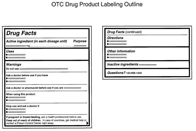
Aside from the main drug facts title, all headings, subheadings, and other information in sections two through nine must be printed in a single, clear, easy-to-read type style with no more than 39 characters per inch. Titles and headings should be done in bold italic, while subheadings are just bolded. Meanwhile, type sizes should be:
- Headings in sections 2 through 9 should be at least 8-point type and at least two point sizes greater than the text size
- Subheadings and all other information should be no smaller than 6-point type
Title
Every drug facts panel must read “Drug Facts” at the top with the first letter of both words capitalized. If your drug fact information appears on more than one panel, every subsequent panel must display “Drug Facts (continued)” at the top of every panel containing such information. In terms of type size, the letter height or type size should be larger than the largest type size used elsewhere in the drug facts panel labeling and no smaller than 8-point type.
Active Ingredients and Purposes
While most drug facts panel sections are separate, the FDA requires you to list both active ingredients and their purposes not only in the same area, but also on the same horizontal line. This is done so that consumers can readily associate the active ingredients for an OTC drug with their intended purposes. The active ingredients are left-justified, while the aligned purposes are right justified.
While some OTC drugs would need to list discrete dosage units, hand sanitizers instead are asked to list a proportion of the active ingredient. For example, “Alcohol 80% v/v” would be an acceptable presentation for FDA guidelines, while “antiseptic” is an appropriate listed purpose for said active ingredient.
Uses
While the FDA is very specific about several elements of the drug facts panel, the requirements for the uses section is mercifully simple – just indicate what the product is used for. One FDA document shared the following as an example use for hand sanitizers: “Hand sanitizer to help reduce bacteria that potentially can cause disease. For use when soap and water are not available.”
Warnings
All OTC drug products are required to include a list of warnings, all of which are listed in detail in CFR section §201.66. Each warning should be separated by horizontal hairlines used to separate titles and subheads.
As you may expect, there are a lot of potential warnings for OTC drug products. Fortunately, you only need to include the alerts that apply to your product of choice. For hand sanitizer labels, that means adding some version of the following warnings.
- External use warning – Necessary for drug products not intended for ingestion. Should be presented in bold lettering, such as “For external use only.”
- Flammability warning – Labels should contain the appropriate flammability signal word(s) in bold, followed by an appropriate warning. For the purposes of hand sanitizer, the FDA suggests “Flammable. Keep away from fire or flame.”
- “Do not use” warning – Include a list of specific situations in which consumers should not use the product (unless permitted by a doctor). Start the warning with “Do not use” and follow with bullet points for multiple disallowed situations. For hand sanitizer, the FDA cites use on “open skin wounds” and “in children less than 2 months of age” as appropriate warnings.
- “When using this product” warning – Add guidelines for what users should avoid when using your product after the initial wording in bold type, along with some guidelines if an incident occurs. The FDA uses the following example for hand sanitizers: “When using this product keep out of eyes, ears, and mouth. In case of contact with eyes, rinse eyes thoroughly with water.”
- “Stop use and ask a doctor” warning – Let users know when they should stop using your product following specific poor reactions or other adverse effects. As with the other warnings, the initial words of the warning should be in bold type. The FDA uses the following as an example: “Stop use and ask a doctor if irritation or rash occurs. These may be signs of a serious condition.”
- “Keep out of reach” warning – Add a warning to keep products out of the reach of children along with guidelines on what to do during an accident. The specific guidelines change depending on the nature of your product. Since hand sanitizers are topical and not intended for ingestion, the FDA recommends the following warning with bolded text: “Keep out of reach of children. If swallowed, get medical help or contact a Poison Control Center right away.”
Directions for use
Every OTC drug product should include instructions on when and how to use said product. The header of this section should read “Directions” followed by bullet point steps for use. The FDA uses the following steps in its hand sanitizer examples:
- Place enough product on hands to cover all surfaces. Rub hands together until dry.
- Supervise children under 6 years of age when using this product to avoid swallowing.
Other information
This section is reserved as a space to share any other pertinent info that isn’t already stated elsewhere on the drug facts panel. For hand sanitizers, this essentially means listing out appropriate storage details for your product. You can also include a tamper-evident statement if applicable.
Inactive ingredients
This section includes a list of all the inactive ingredients used in your product. These ingredients should be listed in alphabetical order by their established names.

Tips to Keep Hand Sanitizer Label Costs Down
Once your hand sanitizer is ready, it’s time to bottle and label it. Of course, packaging affects your bottom line, especially if you’re providing hand sanitizer at cost or giving it away to medical personnel, first responders, and people in need. Here’s what you can do to save on your hand sanitizer labels.
Opt for simple, cost-effective materials
There are a lot of label materials available for different aesthetics. However, fancy wine stocks or other options aren’t necessary if you’re looking for something simple and durable.
Since hand sanitizer is a product that’s used frequently, it’s best to choose a label material that is waterproof and oil-resistant. For cost-effective hand sanitizer labels, a white biaxially oriented polypropylene (BOPP) material with a matte laminate will do the trick. If you don’t want a classic white, a material with the same adhesive is available in clear or silver with either gloss or matte laminates.
In addition to color, you’ll also want to figure out which material works with your specific container. While the aforementioned BOPP would work out well for a small, rigid bottle, a squeeze bottle or a larger container might create problems. For these types of hand sanitizer containers, we could use an MDO material to accommodate for size and needed durability.
Limit the size of your label
You don’t need a big product label to make a big impact. Opting for a smaller label will help cut down on the total amount of material necessary and overall costs.
You’ll want to base your label size off your container of choice – one label size might be right for a small squeeze bottle, but not for a larger glass one. As with label materials, we can work with you to identify a label size that works with your exact container without adding too much to your overall cost.
Use black ink
When you want simple, cost-effective labels, black and white is a good way to go. A simple black ink will cut out added costs associated with multiple inks or color matching, giving you more bang for your buck if you’re aiming for simplicity.
Print Custom Hand Sanitizer Labels
If you’re in need of hand sanitizer labels, we’re here to help. Our HP Indigo digital printing presses provide us with the ability to run labels in small batches and provide turnaround times of just five business days from order approval, all at cost-effective prices.
Contact us today if you have any questions about and our team can be a resource to provide answers and support your project.
