How to Translate Your Brand Identity into Packaging and Labels: A Step-by-Step Guide

⚞ The Highlights:

  • Your brand identity is your visual and verbal signature: name, logo, colors, typography, imagery, and voice. Packaging and labels are where customers meet it.
  • Branding, packaging, and labeling are related but distinct: branding is the identity, packaging is the physical container and its design, labeling is the applied label and its information.
  • Translate your identity by carrying your color palette, typography, logo, and voice consistently onto the label, guided by a brand guide.
  • The catch most brands miss: screen colors don’t print exactly, and material and finish change how your brand reads. Plan for the jump from digital to printed.
  • Consistency across your whole product line is what turns a nice label into brand recognition on a shelf.

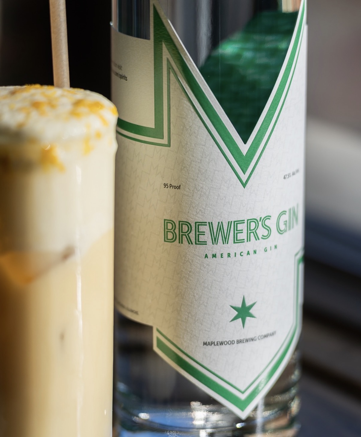
Translating your brand identity into packaging means carrying the same colors, typography, logo, imagery, and voice that define your brand onto the physical product, so a shopper recognizes you at a glance. Your label is often the first and most frequent place a customer meets your brand, so it has to look and feel like the rest of your identity, not like a separate thing.

We help brands make that jump from a brand guide to a printed label every day, so we see where it goes smoothly and where it breaks down. Below, we walk through how the pieces fit together, how to translate your identity onto a label, and the print realities that catch brands off guard.

Branding, packaging, and labeling: what’s the difference?

These three terms get used together so often they blur, but they’re distinct pieces that work as a system. Understanding the difference makes every choice that follows easier.

Branding Packaging Labeling
What it is Your identity: name, logo, colors, voice The physical container and its design The label applied to the product and its info
Job Define who you are and how you feel Protect the product and present the brand Identify the product and carry required info
Example Logo, color palette, brand voice The bottle, can, box, or pouch The printed label with name, ingredients, barcode

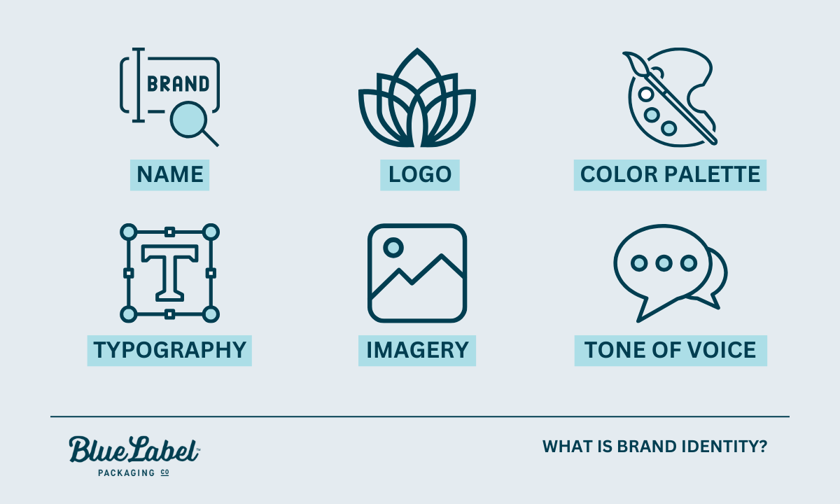
What is brand identity? Infographic

What is branding?

Branding is your identity: the name, logo, colors, typography, imagery, and voice that make your product recognizably yours. It’s the feeling and promise a customer associates with you, expressed through a consistent look and voice.

What is packaging?

Packaging is the physical container and how it’s designed: the bottle, can, box, or pouch that holds and protects your product and presents it on a shelf. Packaging serves a functional job (protection) and a brand job (presentation) at the same time.

What is labeling?

Labeling is the label applied to the product and the information on it. That includes your brand design plus the required details: product name, ingredients, net contents, barcodes, and any regulatory information. The label is usually where your brand identity and the practical, legal requirements meet.

How they work together

Branding sets the identity, packaging gives it a physical form, and labeling carries both the brand and the required information to the customer. When all three align, a shopper sees a coherent product. When they don’t, the product feels off, even if each piece looks fine on its own.

What is brand identity, and why does packaging carry it?

Brand identity is the collection of visual and verbal elements that represent your brand and set it apart. On a shelf, your packaging is the version of that identity a customer actually touches.

The visual elements of brand identity

  • Logo: the primary mark customers recognize.
  • Color palette: the colors that trigger instant recognition.
  • Typography: the fonts that carry your personality.
  • Imagery and graphics: the photo, illustration, or pattern style you use.
  • Voice and tone: how your copy sounds, from playful to refined.

Why packaging is your most-seen brand asset

For a physical product, the package is often the first brand touchpoint and the one a customer sees most: on the shelf, in their cart, at home, in a photo they share. That makes it one of the best places to express your identity. A lot of purchase decisions happen fast and visually at the shelf, so a package that instantly reads as yours helps in the moment someone is choosing.

How packaging shapes what shoppers think

Design choices like color, shape, material, and typography shape how a shopper feels about your product before they read a word. Muted tones and uncoated paper read as natural or premium. Bright colors and glossy finishes read as fun and energetic. None of it is neutral, so every choice should map back to the brand you’re building.

Designing for your target customer

Design for the people you want to buy the product, not for your own taste. Research who they are and what catches their eye, then make choices that fit them. A supplement aimed at serious athletes and one aimed at wellness-focused parents call for very different looks, even in the same category. The clearer your customer, the easier every design decision gets.

How to translate your brand identity onto a label

Here’s how to move from brand identity to a finished label, step by step.

Start with your brand guide

A brand guide is the reference that keeps everything consistent: your logo files and usage rules, exact colors, fonts, imagery style, and voice. If you have one, it’s the source of truth for your label. If you don’t, building even a simple one before you design pays off immediately, and it’s the single most useful thing to hand a designer or printer.

Color

Color is the fastest way people recognize you. Carry your exact brand colors onto the label, and specify them precisely (more on why exact matters in the print section below). Color also carries meaning, so make sure your palette fits the feeling you want, whether that’s calm, bold, natural, or premium.

Typography

Use the fonts from your brand identity, and keep them legible at label size. Your type should feel like the same brand across your website, your ads, and your package. For more on making type work on a label specifically, see our typography tips for product labels.

Logo and imagery

Apply your logo consistently, at a size and clear space that keep it recognizable, and use the same imagery style (photography, illustration, pattern) you use elsewhere. Consistency here is what makes a lineup of products read as one family.

Materials and finish

The material and finish are part of your brand, not just a spec. Uncoated or kraft stock feels natural and honest. Soft-touch matte reads premium and modern. High gloss looks bright and fun, while foil or embossing says luxury. Choose the material that reinforces your identity, not just the cheapest option.

Voice and copy

The words on your label should sound like your brand too. A playful brand can be playful in its product description; a refined brand keeps its copy spare. Voice is easy to forget on a label, but it’s part of the identity you’re translating.


Ready to put your brand on a label?

Send us your brand guide and we’ll help translate it into a print-ready label, matching your colors, choosing the right material, and making sure it looks like you.
Request a Quote Get a Sample Pack


Where brand identity meets the printed label

This is the step brands underestimate, and it’s where we spend the most time with customers. Your brand assets were almost certainly built for a screen, and a label is a physical, printed object. A few things change in that jump, and planning for them keeps your brand looking like itself.

Screen colors vs. printed colors

Screens show color in RGB (light), while labels print in CMYK inks, often with specific Pantone (spot) colors for brand hues. The two don’t map perfectly, so a color that glows on your website can print duller or slightly shifted if it isn’t managed. The fix is to define your brand colors as Pantone or CMYK values, not just a screen hex code, and to check them on a printed proof. For the full picture, see our guide to RGB vs. CMYK color formats.

How material and finish change brand perception

The same design reads differently on different materials. A logo color looks richer on gloss than on uncoated kraft, which absorbs ink and mutes it. A matte finish softens everything; a metallic film adds shine your artwork didn’t have on screen. Because material affects both color and feel, it’s worth choosing it as part of the brand decision and seeing your design on that actual stock before you commit.

What to hand your printer

  • Your brand guide, including logo files and color specs.
  • Vector artwork with fonts converted to outlines (so your type prints exactly, even if the printer doesn’t have your font).
  • Pantone or CMYK values for your brand colors, not just hex codes.
  • Your material and finish preference, or a request for guidance on it.
  • The container details, so the label is sized and shaped correctly.

Hand a printer those, and the translation from brand identity to finished label goes smoothly. Leave them out, and you risk a label that doesn’t quite look like your brand.

Keeping your brand consistent across products

Consistency across your whole product line is what turns individual labels into brand recognition. Use your brand guide to keep the core identity steady across every SKU: logo placement, color system, and typography. Allow thoughtful variation, like a different accent color per flavor, as long as the lineup still reads as one family. When you expand into a new product or market, adapt carefully rather than reinventing, so customers still recognize you. Our post on 8 steps to great label design is a useful companion here.

Frequently asked questions

What is the difference between branding, packaging, and labeling?

Branding is your identity: the name, logo, colors, typography, and voice that make a product recognizably yours. Packaging is the physical container and its design, the bottle, can, box, or pouch that protects the product and presents the brand. Labeling is the label applied to the product and the information on it, including brand design plus required details like ingredients, net contents, and barcodes. Branding sets the identity, packaging gives it physical form, and labeling carries both to the customer.

What is brand identity in packaging?

Brand identity in packaging is how your visual and verbal signature shows up on the physical product: your logo, color palette, typography, imagery, and voice. Because packaging is often the first and most frequent place a customer meets your brand, it’s one of the best places to express your identity consistently.

How do you translate a brand into a label design?

Start from your brand guide, then carry your exact colors, typography, logo, imagery style, and voice onto the label, keeping everything legible at label size. Choose a material and finish that reinforce the brand’s feel. Then account for print realities: define colors in Pantone or CMYK (not just screen hex codes) and check them on a printed proof, since screen color doesn’t map perfectly to printed ink.

Why do my brand colors look different when printed?

Screens display color in RGB (light) while labels print in CMYK inks, often with Pantone spot colors for brand hues, and the two don’t map perfectly. A color that glows on screen can print duller or slightly shifted if it isn’t managed. Define your brand colors as Pantone or CMYK values and confirm them on a printed proof on your actual material.

Why does brand consistency across products matter?

Consistency is what turns individual labels into recognition. When logo placement, color system, and typography stay steady across every product, a lineup reads as one family and customers recognize you at a glance. Thoughtful variation (like a different accent color per flavor) is fine as long as the core identity stays consistent.

Ready to bring your brand to the shelf?

If you’re ready to turn your brand identity into a label that looks like you, we’re glad to help. Request a sample pack to see materials and finishes, or get in touch with your brand guide and we’ll help translate it into print.

More on designing a label that reflects your brand:

A Guide to Water Bottle Labels: Material, Application, and Print Quality

⚞ The Highlights:

  • Water bottle labels should be a waterproof plastic film (BOPP, PET, or vinyl), not paper, because the bottle gets wet, cold, and handled constantly.
  • The adhesive matters as much as the material. You need a permanent, moisture-resistant adhesive that can grip a cold, condensation-covered bottle.
  • Waterproof and water-resistant aren’t the same thing. A water bottle label needs to be genuinely waterproof, often with a laminate on top.
  • Common labels for a standard 16.9 oz bottle run around 8 inches wide by 2 inches tall, but the exact size depends on your bottle. Measure before you design.
  • Print quality comes down to the material, the press, and color accuracy. Clear film gives that popular “no-label look,” while white film keeps colors bold and true.


The best water bottle labels are made from a waterproof plastic film, BOPP, PET, or vinyl, paired with a permanent, moisture-resistant adhesive. Paper labels don’t hold up, because a water bottle spends its life wet, cold, and handled. The label has to survive condensation, ice baths, coolers, and wet hands without peeling, bubbling, or turning to mush.

We print a lot of beverage labels, and water bottles are one of the least forgiving surfaces there is. A label that looks great in a design file can fall apart the first time the bottle sweats. Here’s how to choose the material, adhesive, size, and print that will actually hold up, plus the condensation problem that catches most brands off guard.

What material is best for water bottle labels?

Water bottle labels should be a waterproof film, not paper. The three materials that dominate are BOPP, PET, and vinyl. Each is waterproof and durable; they differ in clarity, feel, and cost.

Why paper struggles on water bottles

Paper is porous, so it soaks up moisture. On a bottle that’s constantly sweating or sitting in ice, a standard paper label wrinkles, discolors, and peels, exactly the “soggy label falling to pieces” problem beverage brands dread. There are wet-strength coated papers that do better, but for a bottle that gets wet by design, a plastic film is the safer choice.

BOPP

BOPP (biaxially-oriented polypropylene, a type of durable plastic film) is the workhorse of water bottle labels. It’s fully waterproof and shrugs off moisture and chemicals. It handles temperature swings, comes in white, clear, and metallic, and doesn’t cost much. For most bottled water and beverage brands, BOPP is where we usually start.

PET (polyester)

PET film is strong and exceptionally clear. It’s also dimensionally stable, which is a technical way of saying it holds its shape and doesn’t distort. It resists UV well, so it’s a good pick when bottles will see sunlight, and it’s recyclable. PET is a step up when you want a durable, crystal-clear label.

Vinyl

Vinyl is tough, waterproof, and conformable, so it wraps curves and irregular shapes without wrinkling. It also holds up to sunlight and chemicals. It usually costs more than BOPP, but it’s a strong choice for bottles that face rough handling or the outdoors. It’s also the material behind most “sticker” style water bottle labels.

BOPP PET (polyester) Vinyl
Waterproof Yes Yes Yes
Clarity Good (clear option) Excellent Good
Durability High High, very stable Very high, conformable
Relative cost Low to mid Mid Mid to high
Best for Most bottled water and beverage brands Premium, crystal-clear looks; sun exposure Rugged handling, outdoors, sticker-style labels

Clear, white, or metallic?

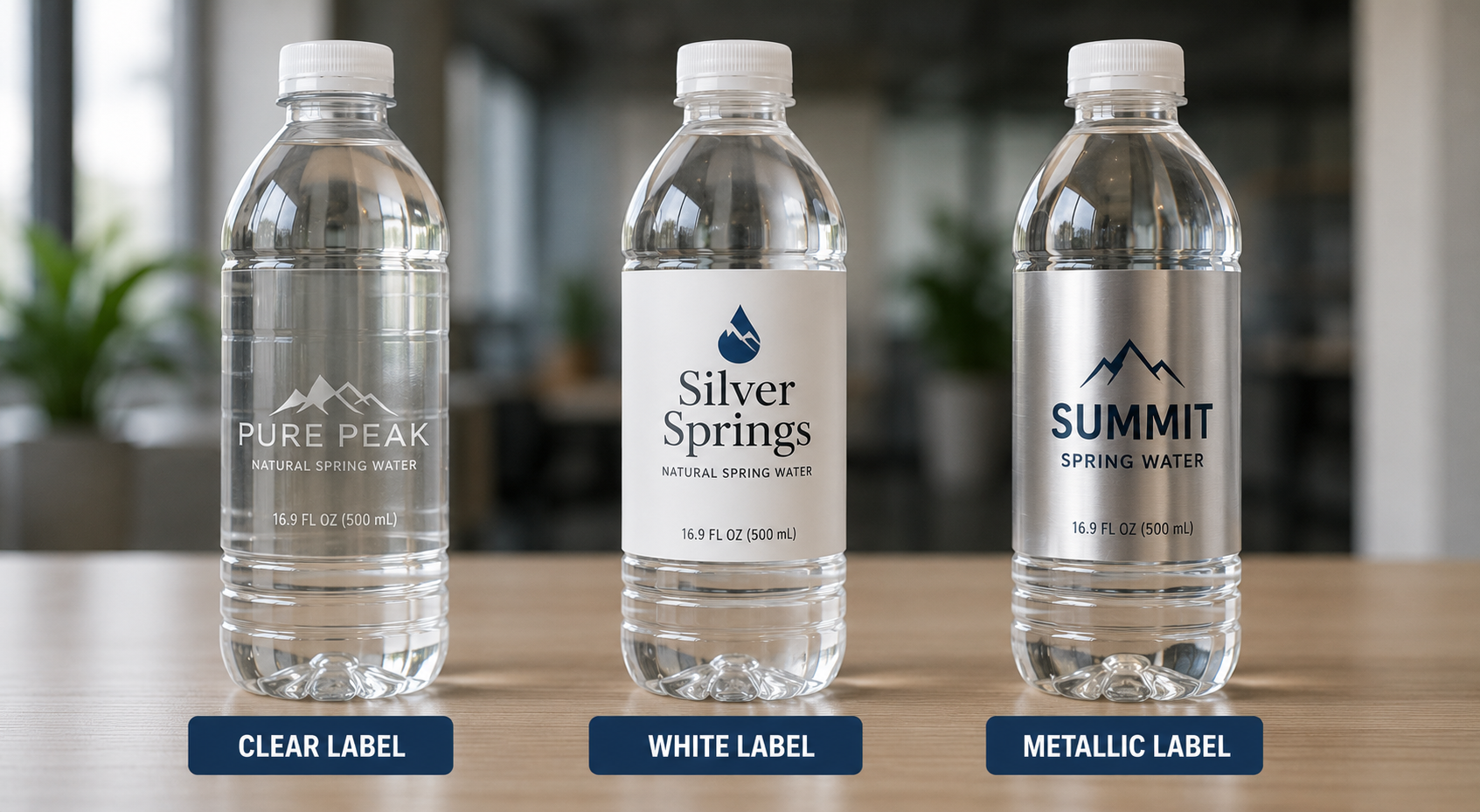
The film color shapes the whole look. Clear film gives the popular “no-label look,” where the design appears printed right on the bottle (this usually needs a printed white layer behind the colors so they stay opaque). White film makes colors bold and consistent regardless of what’s in the bottle. Metallic film adds shine for a premium feel. For a printer’s take on the clear look, see our guide on comparing BOPP vs. vinyl.


Waterproof vs. water-resistant: what’s the difference?

This distinction matters more for water bottles than almost any other product. Water-resistant means a label can handle some splashing or brief exposure. Waterproof means it survives sustained moisture, immersion, ice, and condensation without failing. A water bottle label needs to be genuinely waterproof, which usually means a plastic film, a moisture-resistant adhesive, and often a laminate or waterproof coating over the print to protect the ink. If a supplier only promises “water-resistant,” ask what happens after an hour in a cooler.

Application and adhesive

The material gets the attention, but the adhesive is where water bottle labels quietly succeed or fail. It has to bond to a smooth plastic or glass surface and hold through everything the bottle goes through.

Choosing the right adhesive

Adhesive choice depends on the bottle surface and the conditions. Acrylic-based permanent adhesives generally perform better than rubber-based ones in heat and moisture, which makes them a common pick for beverages. The adhesive also has to match the surface. Plastic (PET bottles), glass, and aluminum each behave a little differently.

The condensation problem

Here’s the detail generic guides miss: water bottles are often labeled cold, or they get cold and wet in use, and moisture is the enemy of adhesion. A standard adhesive applied to a chilled, condensation-covered bottle may never fully bond, so the label lifts at the edges later. If your bottles are filled or labeled cold, or they’ll live in ice and coolers, you need an adhesive rated for damp or low-temperature application. This is one of the first things we check when a beverage label is coming apart in the field, and it’s almost always fixable by matching the adhesive to how and when the bottle gets labeled.

Worth knowing: “The label keeps peeling” is usually an adhesive-and-application problem, not a material problem. Tell your printer whether the bottle is labeled warm or cold, wet or dry, and whether it’ll sit in ice. That one detail drives the adhesive choice more than anything else.

Permanent vs. removable adhesive

Permanent vs. removable adhesive

Most water bottle labels use a permanent adhesive so they stay put for the life of the bottle. A removable adhesive makes sense for reusable bottles, promotional or event bottles guests might want to peel, or recycling programs where the label needs to come off cleanly. Decide which fits your use before you order, because switching later means a new run.


Need water bottle labels that survive the cooler?

Tell us how your bottles get filled, labeled, and stored, and we’ll match the material and adhesive so your labels don’t peel or bubble in the field.
Request a Quote Get a Sample Pack


What size should a water bottle label be?

Label size depends on your specific bottle, but there are common starting points. Measuring your bottle first saves a costly re-do.

Common water bottle label sizes

For a standard 16.9 oz (500 mL) water bottle, a wrap-around label is often around 8 inches wide by 2 inches tall, though the exact dimensions vary by bottle brand and shape. Smaller bottles and taller “slim” bottles use different sizes. Rather than copy a number, it’s best to size the label to your actual bottle.

How to find your bottle’s label size

  • Width: measure the circumference of the bottle where the label sits, then subtract a small gap so the ends don’t overlap awkwardly (unless you want a full wrap that seams).
  • Height: measure the flat labeling area between the shoulder and the base curve, then leave a little margin top and bottom.
  • Check the curve: bottles narrow at the top and bottom, so keep the label on the straight section where it lies flat.

When in doubt, send your bottle specs (or the bottle itself) to your printer and they can confirm the right dimensions and provide a template.

Print quality

Once material and size are set, print quality is what makes the label look cheap or premium. A few things drive it.

What makes a water bottle label look premium?

Sharp resolution, clean edges, and the right finish. A glossy finish looks wet and vibrant (fitting for water), while a matte finish reads more premium and modern. Because clear labels are so common on water, getting a crisp printed white layer behind the design is often what separates a professional clear label from a washed-out one.

Color accuracy

Consistent color is what makes a brand look legit on a shelf and across reorders. Our HP Indigo presses match a high percentage of Pantone colors, which helps your brand colors stay true from run to run. If exact color match matters to your brand, ask for a printed proof on your actual material before the full run.

Sustainability considerations

Sustainability is increasingly part of the water category, sometimes ironically, given the plastic-bottle conversation. On the label side, BOPP and PET are recyclable. Water-based and soy-based inks are gentler on the environment, and digital printing uses only the ink a job needs, with less setup waste. Removable adhesives can also help, since a label that comes off cleanly makes the bottle easier to recycle. If eco-friendly positioning is part of your brand, it’s worth building into the label spec, not just the messaging.

What do water bottle labels cost?

There’s no single price. Cost depends on the material (BOPP is typically the most economical, vinyl the priciest), the size, the run quantity (per-label cost drops as the run grows), the number of colors and finishes, and any lamination. For custom or private-label water, where runs are often smaller, digital printing keeps the per-label cost reasonable at lower quantities. The fastest way to a real number is to share your bottle, quantity, and design.

Frequently asked questions

What material is best for water bottle labels?

A waterproof plastic film is best, not paper. The three common options are BOPP (the cost-effective default for most beverage brands), PET or polyester (very clear and dimensionally stable, good UV resistance), and vinyl (highly durable and conformable, usually the priciest). All three are waterproof; they differ in clarity, feel, and cost.

Are water bottle labels waterproof?

They should be. A water bottle label needs to be genuinely waterproof, not just water-resistant, because the bottle sweats, sits in ice, and gets handled with wet hands. That usually means a plastic film, a moisture-resistant permanent adhesive, and often a laminate or coating over the print to protect the ink.

Why do my water bottle labels keep peeling?

Peeling is usually an adhesive-and-application problem, not a material problem. Water bottles are often labeled cold or get cold and wet, and moisture prevents a standard adhesive from bonding, so edges lift later. If bottles are filled or labeled cold or stored in ice, use an adhesive rated for damp or low-temperature application, and match the adhesive to the bottle surface.

What size is a water bottle label?

For a standard 16.9 oz (500 mL) bottle, a wrap-around label is often around 8 inches wide by 2 inches tall, but the exact size depends on the bottle. Measure the circumference where the label sits for the width and the flat area between the shoulder and base for the height, then leave a small margin. Ask your printer for a template based on your specific bottle.

Should water bottle labels be clear or white?

Clear film gives the popular no-label look where the design appears printed on the bottle, but it usually needs a printed white layer behind the colors so they stay opaque. White film makes colors bold and consistent regardless of what’s in the bottle. Metallic film adds a premium shine. The choice depends on the look you want.

Can you use removable labels on water bottles?

Yes. Most water bottle labels use a permanent adhesive so they stay put, but a removable adhesive makes sense for reusable bottles, promotional or event bottles that guests might peel, or recycling programs where the label should come off cleanly. Decide before you order, since switching adhesive types means a new run.

Ready to print your water bottle labels?

Whether it’s bottled water for retail, private-label bottles for an event, or a new beverage brand, we’ll help you pick the material, adhesive, and finish that survive real-world conditions. Request a sample pack to feel the waterproof films, or get in touch with your bottle and quantity for a quote.

More on beverage and waterproof labels:

What Is a Co-Packer and How Do You Find the Right One?

⚞ The Highlights:

  • A co-packer (short for contract packager) packages your product for retail so you can focus on making it. Some co-packers also manufacture the product for you, which makes them a contract manufacturer.
  • The right co-packer depends on your product type, your volume, the certifications your category requires, and how much of the process you want to hand off.
  • Vet candidates on capacity, quality certifications (SQF, BRC, GMP), relevant experience, minimum orders, and lead times. Then start with a small trial run before you commit.
  • Expect per-unit or per-case pricing plus setup fees and minimum order quantities. Get all of it in writing up front so the quote is the number you actually pay.
  • One detail brands miss: your co-packer’s labeling line has specific requirements for how your labels are made and rolled. Getting the label spec right is the difference between a smooth run and a jammed line.

A co-packer, short for contract packager, is a company that packages your product for retail so you don’t have to. You hand off the filling, labeling, assembly, and packing, and you get back finished product that’s ready for the shelf. The term is often used interchangeably with contract packager, and when a co-packer also makes the product for you, people call it a contract manufacturer or co-manufacturer.

For a growing brand, a co-packer is usually the answer to a simple problem: demand has outrun what you can package by hand. We work with dozens of co-packers to print the labels that go on their lines, so we see both sides of this relationship every week. Below is what a co-packer does, how to find one that fits your product, what to expect on cost, and a label detail that trips up more brands than it should.

What is a co-packer?

A co-packer is a third-party company that packages your product to your exact specifications. That can mean filling bottles, applying labels, assembling multipacks, or boxing finished goods for distribution. The core idea is that you own the product and the brand, and the co-packer owns the equipment, the labor, and the packaging know-how to get it retail-ready at volume.

What does a co-packer actually do?

Most co-packers handle some or all of these jobs:

  • Filling. Putting your product into its container, whether that’s liquid into bottles and cans, powder into pouches, or dry goods into jars.
  • Labeling. Applying labels, shrink sleeves, or other decoration to the container on automated lines.
  • Assembly and kitting. Building variety packs, gift sets, subscription boxes, or promotional bundles.
  • Case packing. Boxing finished units and palletizing them for shipping to retailers or distributors.
  • Sourcing. Some co-packers buy your packaging materials for you, from containers to closures to labels.

The scope varies a lot from one co-packer to the next. Some only handle the packing step after your product is made. Others run the whole process from raw ingredients to a palletized finished product, which is sometimes called a turnkey or full-service operation.

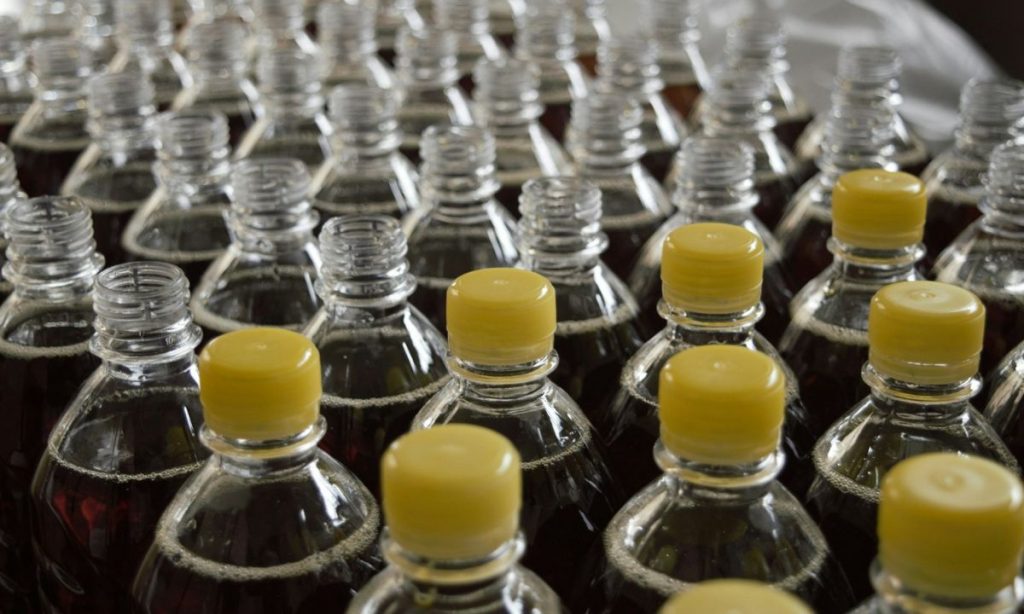
Bottles being packaged

Co-packer vs. contract manufacturer vs. private label

These three terms get mixed up constantly, and the difference comes down to who makes the product and who owns the recipe. Here’s a quick way to keep them straight.

Co-Packer (Contract Packager) Contract Manufacturer (Co-Man) Private Label
What they do Package a product you already made Make and package your product to your formula Make their own product for you to brand
Who owns the recipe You do You do The manufacturer does
Best for Brands that make the product but can’t package at scale Brands with a recipe but no production capacity Brands that want a ready-made product fast
Typical scope Filling, labeling, assembly, case packing Production plus packaging (turnkey) Their recipe, your label

In practice, the lines blur. A single company may offer all three, and a full-service co-packer often does light manufacturing too. The label you put on the product is yours in every case, which is where we usually enter the picture.

What kinds of products use co-packers?

Co-packers work across food, beverage, supplements, personal care, household goods, pet products, and more. Any brand that sells a physical product in volume is a candidate. Think of a hot sauce maker filling and labeling bottles, a kombucha brand canning at scale, a supplement company filling capsule bottles, or a coffee roaster bagging and sealing. Once hand-packing stops keeping up, a co-packer takes over.

Why work with a co-packer?

Most brands bring in a co-packer for one reason: it frees you to focus on the product and the brand. Someone with the right equipment handles the packaging at a speed and scale you can’t match by hand. That trade has real benefits, and a few honest trade-offs worth knowing before you sign anything.

What are the benefits of using a co-packer?

  • Lower cost at volume. Co-packers buy materials in bulk and run efficient lines, so per-unit packaging cost usually drops compared to doing it yourself.
  • Speed and capacity. An automated line packs in an hour what a small team packs in a day, which matters when you’re chasing a retail launch or a seasonal window.
  • Room to scale. You can add SKUs or grow volume without buying equipment, leasing space, or hiring a packaging crew.
  • Compliance help. Experienced co-packers know the food-safety and labeling rules for your category and build them into the process.
  • Fewer headaches. Sourcing, quality checks, and logistics move off your plate and onto a partner who does this all day.

What are the trade-offs to know going in?

A co-packer is a partner, not a magic button. Handing off packaging means handing off some control, so go in with eyes open:

  • Minimum order quantities. Many co-packers set minimums that can feel steep for an early brand. Ask early so there are no surprises.
  • Less hands-on control. You’re trusting someone else with quality and timing, which makes clear specs and good communication essential.
  • Lead times. Your product now sits in someone else’s production schedule. Plan releases around their calendar, not just yours.
  • Setup and change costs. New projects and design changes can carry setup fees. Worth knowing before you iterate on packaging.

Worth knowing: The most common co-packer complaint we hear from brands isn’t price. It’s surprises, like a minimum they didn’t expect or a label that jammed the line on day one. Almost all of it is avoidable with clear specs and a trial run before the full production commitment.

Do you need a co-packer, or a contract manufacturer?

Ask one question: do you already make the product? If you make it and just need help packaging at scale, you want a co-packer. If you have a recipe but no way to produce it, you want a contract manufacturer (co-man) that handles both making and packing. Plenty of brands start with a co-man for production, then keep the same partner for packaging, which is why the roles overlap so often.


Working with a co-packer and need labels that run clean on their line?

We print labels for dozens of co-packers and can match your labels to their applicator specs, so your run doesn’t stall on day one.

Request a Quote Get a Sample Pack


How to find the right co-packer

Finding a co-packer takes a mix of directory research, industry networking, and old-fashioned reference-checking. Most co-packers do very little marketing of their own, so the good ones can be surprisingly hard to surface with a plain Google search. Here’s where to look and how to sort the fit from the rest.

Where do you find a co-packer?

  • Industry directories and associations. The Contract Packaging Association keeps a member directory and a request-for-quote tool. Thomasnet lists thousands of co-packing and contract-packaging suppliers you can filter by location and certification.
  • Matching platforms. Services like PartnerSlate connect brands with co-packers and co-manufacturers by product type and requirements.
  • Category-specific resources. Beverage brands often start with BevNET’s co-packing listings; specialty food brands use specialty-food co-packer directories.
  • Trade shows. Events like PACK EXPO and ProPak put a lot of co-packers in one room, which is one of the fastest ways to compare capabilities in person.
  • Word of mouth. Your peers are the best filter. Ask other founders in your category who they use and, just as usefully, who they’ve left.

What should you look for when vetting a co-packer?

Once you have a shortlist, weigh each candidate against the things that predict a good run:

  • Capacity. Can they scale with you without dropping quality? A facility tour tells you a lot about how they handle peak season.
  • Quality assurance. Look for documented quality-control processes and real certifications, not just a claim on the website.
  • Relevant experience. A co-packer that already runs products like yours will hit fewer surprises. Beverage, food, and supplement lines each have their own quirks.
  • Flexibility. Understand their lead times, minimums, and how they handle a rush or a last-minute change.
  • Communication. You want a partner who answers the phone and flags problems early. This is the single biggest driver of whether the relationship lasts.

Which certifications matter?

The certifications you need depend on your category, but these are the ones that come up most often:

  • SQF, BRC, or FSSC 22000. Globally recognized food-safety standards. Retailers frequently require one before they’ll stock a product.
  • GMP and HACCP. Good Manufacturing Practices and hazard-analysis systems that show a co-packer runs a clean, disciplined operation.
  • FDA facility registration. Required for food and beverage co-packers in the U.S., and a quick thing to verify in the FDA database.
  • Organic, Non-GMO, or kosher. Product-specific certifications you’ll need if those claims appear on your label.

Quick note: If a claim like “organic” or “non-GMO” is going on your label, your co-packer needs the matching certification to back it up. A label claim your packing facility can’t support is a compliance problem waiting to happen.

What questions should you ask before you commit?

Before you sign, get clear answers on the things that turn into disputes later:

  • What’s your minimum order quantity, and can it be split across SKUs?
  • What’s your typical lead time from approved artwork to finished product?
  • Do you source packaging and labels, or do I supply them?
  • What are your setup fees, and what triggers a new one?
  • Can I visit the facility and see a run in progress?
  • Can you share references from brands in my category?

How much does a co-packer cost?

There’s no single price for co-packing. Most co-packers charge per unit or per case, and some charge by production weight or volume, with setup fees for new projects on top. The variables that move your number are run size (bigger runs lower the per-unit cost), product complexity, packaging format, and how much sourcing you hand off. Get a detailed, itemized quote up front so you can compare partners on total landed cost, not just the headline rate.

Why should you start with a trial run?

A trial run is the cheapest insurance you can buy. Before you commit to a long-term agreement or a large volume, run a small batch. It tests their quality control, their communication, and whether your packaging runs cleanly on their equipment. A trial run is also where label problems show up while they’re still cheap to fix, which is where the label handoff comes in.

The label handoff most brands overlook

Here’s the detail that causes more day-one delays than almost anything else: your labels have to be built for your co-packer’s specific labeling line, not just for the container. A label that looks perfect as a proof can still jam an automated applicator if the roll is wound the wrong way or the core is the wrong size. Because we print labels for dozens of co-packers, we see this happen, and it’s almost always preventable.

Who supplies the labels, you or the co-packer?

It goes both ways. Some co-packers source and print labels for you as part of the job. Many others ask you to supply your own labels to their spec, which gives you control over quality and finish but puts the responsibility on you to get the roll format right. Confirm which arrangement you’re in before your first run, because “we assumed you were handling it” is a bad thing to discover on packing day.

What label specs does your co-packer need?

If you’re supplying labels, your co-packer’s line will have requirements for how those labels are manufactured and rolled. The ones that matter most:

  • Unwind direction. Automated applicators need labels wound a specific way (which edge leads, and whether the label faces in or out). Get this wrong and the labels feed upside down or backward.
  • Core size. The cardboard core the label roll is wound on has to fit their equipment, commonly a 3-inch core, but confirm it.
  • Roll diameter. Every applicator has a maximum roll size it can hold. Too big and the roll won’t fit the machine.
  • Label material and adhesive. The material has to suit both the container and the application speed. A label that peels or curls on a fast line will cost you the whole run.
  • Labels per roll and gap. The spacing between labels and the count per roll affect how the line feeds and how often it has to stop for changeovers.

The fix is easy: ask your co-packer for their labeling-line spec sheet before you order labels, and hand it straight to your label printer. If you’d like a primer on one of these, our guide to determining your label unwind position walks through the most common source of confusion.

How do you avoid line jams and delays?

Coordinate the three parties early: you, your co-packer, and your label printer. Share the co-packer’s applicator specs with your printer before the labels are made, run a small proof through the actual line if you can, and confirm barcode placement and scan-readability on the finished container. A little coordination up front is far cheaper than a stopped line and a missed retail date.

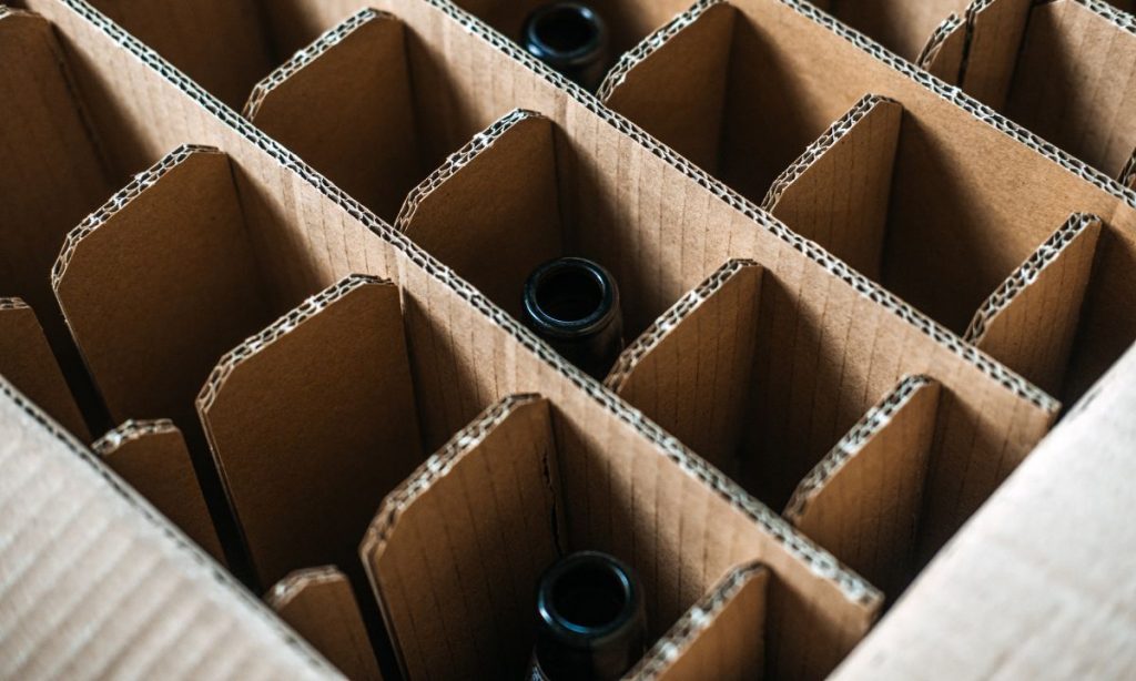
Packaging boxes

Making the partnership work

Finding a co-packer is the start. The brands that get the most out of the relationship treat it like a long-term partnership, not a transaction.

How do you transition packaging to a co-packer?

  • Plan ahead. Talk through timelines, expectations, and likely obstacles before anything moves.
  • Manage inventory. Coordinate existing stock so you don’t run out during the switch or get stuck with waste.
  • Start with a pilot. Run initial batches to catch process adjustments before you scale.
  • Document everything. Materials, artwork files, label specs, and assembly instructions all go in writing, backed by a formal co-packing agreement.

How do you keep the relationship healthy?

  • Communicate regularly. Routine check-ins catch small issues before they become reprints or delays.
  • Review performance. Look at what’s working and what isn’t on a set cadence.
  • Revisit terms as you grow. Volume and SKU counts change. Your agreement should keep up.
  • Keep the feedback two-way. The best co-packers will tell you how to make your product run better, and the best brands listen.

Next steps

If you’re getting ready to bring on a co-packer, three things will make your search smoother: get specific about the challenge you’re solving, write down your non-negotiables (certifications, minimums, timelines), and line up your packaging and labels early so nothing stalls on the first run.

And if labels are part of that picture, that’s where we come in. We print labels for brands and for the co-packers who apply them, so we can help you get the material, finish, and roll format right the first time. Take a look at our six questions to ask a digital label printer, or get in touch and we’ll help you sort out the label side of your co-packing setup.

Frequently asked questions

What is a co-packer?

A co-packer, short for contract packager, is a third-party company that packages your product for retail to your exact specifications. That can include filling containers, applying labels, assembling multipacks, and case-packing for distribution. You own the product and the brand; the co-packer provides the equipment, labor, and packaging expertise to get it retail-ready at volume. When a co-packer also makes the product for you, it’s usually called a contract manufacturer or co-manufacturer.

What is the difference between a co-packer and a contract manufacturer?

A co-packer packages a product you have already made. A contract manufacturer (co-man) both makes and packages your product to your formula. In both cases you own the recipe and the brand. Many brands use a contract manufacturer for production and keep the same partner for packaging, which is why the two terms often overlap.

How do you find a co-packer?

Start with industry directories and associations such as the Contract Packaging Association member directory and Thomasnet, use matching platforms like PartnerSlate, check category-specific resources such as BevNET’s co-packing listings for beverages, meet co-packers at trade shows like PACK EXPO, and ask peers in your category who they use. Because most co-packers do little marketing, referrals and directories often surface better options than a plain search.

How much does a co-packer cost?

Co-packers typically charge per unit or per case, sometimes by production weight or volume, with setup fees for new projects. Your cost depends on run size, product complexity, packaging format, and how much sourcing you hand off. Larger runs lower the per-unit cost. Ask for a detailed, itemized quote up front so you can compare partners on total landed cost rather than the headline rate.

What certifications should a co-packer have?

It depends on your category. Food and beverage brands should look for a recognized food-safety certification such as SQF, BRC, or FSSC 22000, plus GMP and HACCP practices and FDA facility registration in the U.S. If your label makes claims like organic, non-GMO, or kosher, your co-packer needs the matching certification to support them.

Do co-packers supply the labels or do I?

It varies. Some co-packers source and print your labels as part of the job, while many ask you to supply your own labels to their specification. If you supply them, your labels must match the co-packer’s labeling-line requirements, including unwind direction, core size, roll diameter, and a material suited to the container and line speed. Confirm the arrangement and get the applicator spec sheet before you order labels.

Why do my labels have to match my co-packer’s line?

Automated labeling equipment has fixed requirements for how a label roll is wound and sized. If the unwind direction, core size, or roll diameter is wrong, labels can feed upside down, jam the applicator, or not fit the machine at all. A label that looks perfect as a proof can still stop a production line, so match the roll format to the co-packer’s spec before the run.

Should I start with a trial run before committing to a co-packer?

Yes. A small trial run tests the co-packer’s quality control, communication, and whether your packaging and labels actually run well on their equipment, all before you commit to a large volume or a long-term agreement. It’s also where label and application issues surface while they’re still inexpensive to fix.

Ready to get your labels co-packer-ready?

If you’re lining up a co-packer, we can make sure the label side goes smoothly. We print for brands and for the co-packers who apply their labels, so we know what a clean run looks like. Request a sample pack to see and feel the materials, or get in touch and we’ll help you match your labels to your co-packer’s line.

Want to get the label details right before your first run? A few of our other guides:

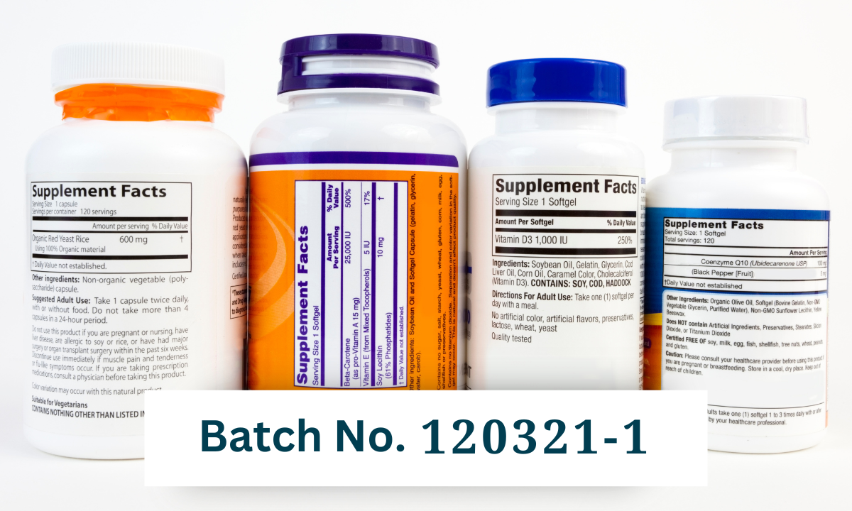
What is a Batch Number and Why Does it Matter for Product Labeling?

⚞ The Highlights:

  • batch number is a unique combination of numbers, letters, and symbols that identifies a specific production run of a product. It tracks the product through manufacturing, processing, and distribution.
  • Batch numbers are required by the FDA for food, beverages, infant formula, and pharmaceuticals. They’re also a quality-control standard under ISO 9001:2015.
  • Batch numbers, lot numbers, and serial numbers are related but distinct: batch and lot are usually interchangeable; serial numbers identify individual units, not groups.
  • Place the batch number in a clearly readable spot on the information panel, with a font size that meets regulatory minimums (typically 1/16 inch)

A batch number tells you which production run a specific product came from. If something goes wrong. A contamination event, a quality issue, a recall. The batch number is the thread that lets you find every other unit affected and pull them off shelves quickly. It’s a small piece of information that does a lot of work.

Batch number vs. lot number vs. serial number vs. SKU

These terms get used interchangeably, but they refer to different things.

Term What it identifies Typical use Example
Batch number A specific production run (group of products made together) Food, beverage, supplements, pharmaceuticals, cosmetics B25315A or 240115-01
Lot number A specific production lot (often interchangeable with batch number) Same as batch in most contexts; sometimes used for raw materials L2024-052
Serial number An individual product unit Items where each unit needs to be tracked individually (electronics, medical devices, firearms) SN-489201
SKU (Stock Keeping Unit) A specific product variant in inventory Internal inventory and stock management SKU-12oz-IPA

The short version: batch and lot numbers identify a group; serial numbers identify a unit; SKU identifies a product type. A single product can carry all four pieces of information on its label or packaging.

Batch number on product label

Understanding batch numbers

According to the FDA’s Code of Federal Regulations, a product batch number is “a distinct combination of numbers, letters and symbols detailing a product’s manufacturing, processing, and distribution history.”

Companies assign codes to groups of products manufactured together during a single production run. That code lets manufacturers, distributors, and regulators track every unit in that batch through the supply chain.

What information do batch numbers typically include?

A well-structured batch number encodes details that uniquely identify the production run:

  • Manufacturing date. When the product was made, often in Julian date format (YYDDD) for compactness. Critical for traceability during recalls.
  • Production time. Some industries, especially food and beverage, encode the production time for quality control and shelf-life management.
  • Location. Companies running multiple production sites include a location code for precise traceability across facilities.
  • Product code. The specific SKU or product variant the batch corresponds to, so distributors can distinguish between product variants in the same batch family.
  • Serial number or sequence. When multiple batches are produced on the same day or shift, a sequence number distinguishes them.
  • Expiration date or shelf-life code. Common in cosmetics, food, beverage, and pharmaceuticals.

Why batch numbers matter for product labeling

The ISO 9001:2015 quality management standard establishes batch numbering as a traceability best practice across production stages. In several industries, it’s a legal requirement.

Traceability

Batch numbers on product labels provide a precise audit trail from manufacturing through distribution. If a quality issue surfaces, the batch number is how you find every affected unit quickly.

Regulatory compliance

Industries with strict regulations require batch numbers:

  • Food and beverage: FDA mandates batch numbers on packaged food products.
  • Pharmaceuticals: Required under FDA pharmaceutical labeling rules.
  • Infant formula: Required by FDA for safety and recall management.
  • Cosmetics: Increasingly expected, especially for products subject to MoCRA reporting.
  • Supplements: Required under DSHEA for dietary supplement traceability.

Inventory management

Batch numbers let you track exactly what’s in stock, by run, by date, by site. That precision feeds better demand forecasting and reduces both stockouts and over-ordering.

Efficient recalls

If a safety issue emerges, a clean batch numbering system means the recall is targeted to affected units rather than blanket. That’s the difference between pulling 5,000 units off shelves vs. recalling an entire product line.

Industry examples of batch numbers in practice

  • Craft beer. Many breweries encode the brew date and tank/batch number in the format YYJJJ-T (year, Julian day, tank). Lets the brewery trace any quality complaint back to a specific brew run.
  • Cosmetics. Often paired with a “PAO” (period after opening) symbol. The batch number tells the manufacturer when the product was made; the PAO tells the consumer how long after opening it remains usable.
  • Supplements. Batch numbers are critical for cGMP (current Good Manufacturing Practices) compliance under DSHEA and for any third-party testing certifications (NSF, USP, Informed Sport).
  • Pharmaceuticals. Batch (or lot) numbers are mandatory and used in serialization and track-and-trace systems under the Drug Supply Chain Security Act.
  • Specialty food. Hot sauces, jams, and sauces often use batch numbers as part of artisan storytelling. “Batch 47” or “Limited Run #12” doubles as both compliance and brand narrative.

Best practices for batch number placement and printing

Placement and printing rules vary by industry, but a few standards apply broadly:

  • Place the batch number on a clearly readable, accessible part of the label. The information panel is the standard location.
  • Use a font size that meets regulatory minimums. The FDA generally requires approximately 1/16 inch for smaller labels (21 CFR §201.15 for pharmaceutical labeling; food and cosmetic minimums vary).
  • Print in high-contrast color against the label background so the batch number is legible after weeks or months on shelf.
  • Keep batch numbers consistent in format across SKUs so anyone reading the label knows where to find them and how to interpret them.

Creating and managing batch numbers

Most companies use software to generate and track batch numbers:

  • Small-scale: Craftbase, Unleashed Software, QuickBooks Enterprise
  • Large-scale: NetSuite, SAP ERP, BatchMaster ERP, Inciflo

For very small operations, a spreadsheet with a structured numbering convention works as a starting point. The system grows as production volume grows.

Adding multiple batch numbers in one label run

If you produce multiple batches but want to print labels in a single run, variable data printing is the answer. It lets the printer change a specific element (the batch number, the date code) on every label or every Nth label without stopping the press. That keeps per-label cost low while accommodating variable batch information.

For most digital label printing setups, variable data printing is straightforward to set up. Send the printer a CSV or Excel file with the batch numbers in sequence and they handle the rest.

Frequently asked questions

What is a batch number on a product label?

A batch number is a unique combination of numbers, letters, and symbols that identifies a specific production run of a product. It allows manufacturers and distributors to track every unit in that batch through manufacturing, processing, and distribution. Batch numbers are critical for traceability during recalls and for regulatory compliance in food, beverage, supplement, cosmetic, and pharmaceutical industries.

What’s the difference between a batch number and a lot number?

In most contexts they’re used interchangeably. Both identify a specific production lot. Some industries use “lot number” specifically for raw materials (an incoming lot of ingredients) and “batch number” for finished products made from those materials. The FDA and ISO use both terms in similar ways. The format and information they encode are essentially the same.

What’s the difference between a batch number and a serial number?

A batch number identifies a group of products produced together in one run (potentially thousands of identical units). A serial number identifies a single individual product unit. Serial numbers are common for items where each unit needs to be tracked individually (electronics, medical devices, firearms). Batch numbers are common for consumer products where group-level tracking is sufficient.

Are batch numbers required by law?

Yes for several industries. The FDA mandates batch numbers on food products, beverages, infant formula, and pharmaceuticals. Cosmetic and supplement industries also have batch number requirements (cosmetics increasingly under MoCRA; supplements under DSHEA cGMP rules). For other product categories, batch numbers aren’t legally required but are still considered a quality-control best practice under ISO 9001:2015.

Where should the batch number go on a product label?

Place the batch number on a clearly visible, accessible part of the label. The information panel is the standard location. Use a font size that meets regulatory minimums (approximately 1/16 inch for smaller labels) and print in high-contrast color so the number stays legible. Keep the format consistent across SKUs so the placement is predictable for inspectors, retailers, and consumers.

How do I generate batch numbers for my products?

Most companies use inventory or ERP software (Craftbase, Unleashed, QuickBooks Enterprise for smaller operations; NetSuite, SAP, BatchMaster for larger ones). For very small operations, a structured spreadsheet works as a starting point. The numbering format should encode useful information. Manufacturing date (often Julian format), location, product code, and a sequence number. So the batch number itself tells you what you need to know about the run.

Can I print different batch numbers on a single label run?

Yes, through variable data printing. The printer can change specific elements (batch number, date code) on every label or every Nth label without stopping the press, so you can run multiple batches’ worth of labels in one production run while keeping per-label cost low. Send your printer a CSV or Excel file with the batch numbers in sequence.

Add batch numbers to your labels

If you’re setting up a batch numbering strategy or moving from manual to printed batch codes, we can help. Take a look at our label printing options, or request a sample pack to see how batch numbers print on real label stock. Get in touch if you have specific questions about variable data printing or batch number placement.

Anatomy of a Wine Label

⚞ The Highlights:

  • U.S. wine labels are regulated by the Alcohol and Tobacco Tax and Trade Bureau (TTB). Required elements include the brand name, class or type designation, alcohol content, net contents, producer and bottler info, the sulfite warning (if applicable), and the federal government warning.
  • Most required information has flexibility on placement: brand label (front) vs. back label vs. either. The brand name and class/type must be on the brand label; everything else can usually live on the back.
  • Vintage year, appellation, and varietal are technically optional but trigger specific rules when included (75% varietal threshold, 75–85% appellation thresholds, etc.).
  • Material choice (paper, BOPP, soft-touch laminate, foil) sets the visual and tactile tone of the bottle as much as the design itself.

Wine labels carry more rules than most product labels because the TTB regulates them under the Alcohol and Tobacco Tax and Trade Bureau’s labeling requirements. The good news: the rules have been stable for years, and once you know what’s mandatory and what’s flexible, designing a compliant label gets straightforward. Below is what every U.S. wine label needs, where it can go, and what to think about for materials and design.

What goes on the front vs. the back of a wine label?

The TTB doesn’t strictly dictate which side of the bottle gets each piece of information. Some elements must appear on the “brand label” (typically the front), but most can go on either label. Here’s how it usually breaks down.

Element Where it can go Required?
Brand name Brand label (front) Yes
Class or type designation (varietal name, “red wine,” “table wine,” etc.) Brand label (front) Yes
Alcohol by volume (ABV) Either label Yes (some classes deduce it from designation)
Net contents Either label, OR blown/etched into the bottle Yes
Producer / bottler name and address Either label Yes
Sulfite warning Either label Required if >10 ppm SO₂
Government health warning Either label (typically back) Yes
Vintage year Either label Optional (with rules if claimed)
Appellation / region Either label Optional (with grape-source thresholds if claimed)
Pairing notes, flavor profile, story Back label (typical) No

What Information is Included on Wine Labels?

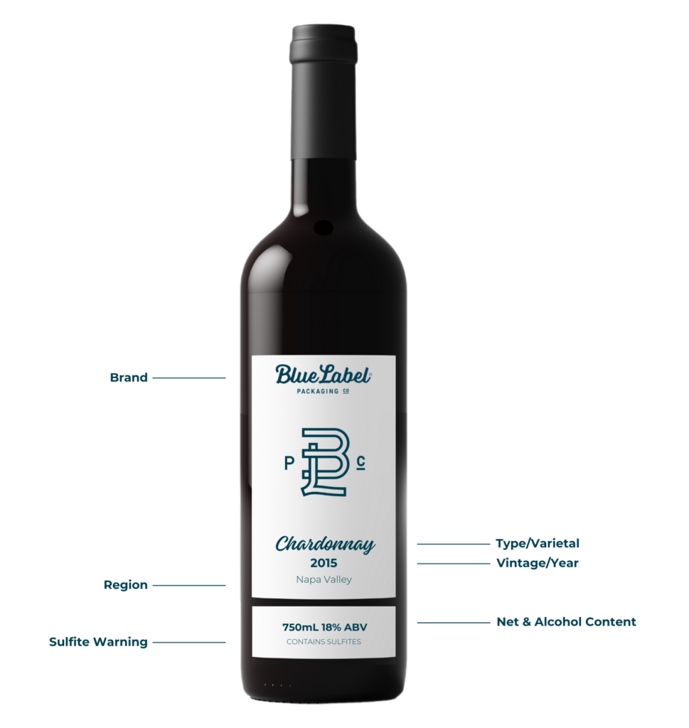
Below is each element in detail, with the rules that apply.What needs to be included on a wine bottle label?


Looking for Custom Wine Labels?

Using high-quality label material, investing in the latest printing technology, continuously improving our processes, and staying on top of industry trends, we make sure wineries around the world are getting the best custom-made wine labels.

Request a Quote    Get a Sample Pack


Brand name

Who made the wine? The winery’s branding usually appears at the top or bottom of the brand label, depending on the design tradition you’re working in (French wines often place the winery prominently at the top; New World wines vary).

Fanciful name

What’s this specific wine called? A fanciful name is a secondary name used to differentiate brands within the same winery. Brengman Brothers’ “Runaway Hen” is one example. Fanciful names are optional, but they don’t replace the need for a class and type designation. When you use one, the TTB requires an additional tax class on the label based on alcohol percentage. For example: “red table wine” or “white table wine” for wines under 14 percent alcohol; “red wine” or “white wine” for wines above 14 percent.

Vintage (year)

When were the grapes harvested? Vintage information isn’t mandatory, but it’s common because it speaks to the quality of the bottle’s contents. Especially if you’re paying attention to year-to-year variation. If you list a vintage, federal rules require that 95% of the wine come from grapes harvested that year (85% for wines from a state or county appellation).

Wine or varietal type

What kind of wine is in the bottle? This is where the grape or varietal type is communicated: Sauvignon Blanc, Pinot Noir, Cabernet Sauvignon, etc. Listing a class or type is required. If you call out a specific varietal name, at least 75 percent of the wine must come from that grape variety. Otherwise, the label needs a generic class designation like “red wine,” “white wine,” or “table wine.”

Appellation (region)

Where was the wine made? Region of origin breaks down differently depending on what you’re claiming:

  • State or county appellation: at least 75 percent of grapes must come from that location (federal rule).
  • American Viticultural Area (AVA, e.g., Napa Valley): at least 85 percent of grapes must come from that AVA.
  • State-specific rules: some states have stricter requirements. California, for example, mandates that 100 percent of grapes come from California if the state name is on the bottle.

Producer and bottler

Where was the wine made and bottled? If the bottling location differs from the winery or vineyard, both names and addresses must appear on the label.

Alcohol content

What’s the percentage of alcohol by volume (ABV)? Required on every label unless it can be deduced from the class designation (table wine implies 14 percent or less). Best practice is to print the ABV explicitly anyway, because consumers and retailers expect to see it.

Net contents

How much wine is in the bottle? Net contents (in milliliters) must appear on every bottle, either printed on the label or blown/etched into the glass.

Sulfite warning

If the wine contains 10 parts per million or more of sulfur dioxide, the label must say “CONTAINS SULFITES” in clear, legible type. Most wines have natural sulfites at levels above 10 ppm, so this warning appears on the vast majority of bottles.

Government warning

Under the Alcoholic Beverage Labeling Act of 1988, every alcoholic beverage label must carry a specific government health warning. The TTB-mandated text reads:

GOVERNMENT WARNING: (1) According to the Surgeon General, women should not drink alcoholic beverages during pregnancy because of the risk of birth defects. (2) Consumption of alcoholic beverages impairs your ability to drive a car or operate machinery, and may cause health problems.

This warning typically lives on the back label. It must be set off from other information and printed in legible type that meets TTB minimum size requirements.

Optional back label content

Beyond the regulatory elements, back labels often include pairing suggestions, flavor notes, and a short story about the winery or vineyard. None of this is required, but it’s the part of the label where consumers actually engage with your brand. Use it.

A TTB compliant wine label featuring necessary legal information.

Wine label materials: choosing the right look and feel

Materials and finishes set the tone of the bottle as much as the design does. Wine is a category where consumers pick up the bottle and feel it before deciding to buy, so the tactile choice matters.

Paper stocks

  • Smooth white paper: clean, modern look. Works for contemporary brands and design-forward labels.
  • Textured papers (felt, cotton, linen): vintage and artisanal feel. Common for premium reds, family wineries, and boutique labels.
  • Estate or rag papers: high-end, hand-feel paper that signals serious craft. Often used for reserve and library wines.
  • Kraft or unbleached paper: earthy, organic, sustainable positioning. Good fit for organic, biodynamic, or natural wines.

Film stocks

  • BOPP / polypropylene: waterproof and durable, works well for wines that will live in damp cellars or ice buckets. Doesn’t have the hand-feel of paper but holds up better.
  • Clear film: makes the design appear printed directly on the bottle. Common for premium and minimalist label designs.

Finishes and special treatments

  • Matte vs. gloss varnish: matte reads understated and premium; gloss reads bright and vibrant. Most premium wines lean matte.
  • Soft-touch laminate: velvety hand-feel that’s increasingly common in luxury wines and spirits.
  • Hot foil stamping: gold, silver, copper, or holographic foil for logos, brand names, or borders. The signature look for premium positioning.
  • Embossing or debossing: raised or recessed elements that add tactile dimension. Often paired with foil for a layered effect.
  • Spot UV varnish: selective glossy coating that highlights specific design elements (logo, illustration) against a matte background.
  • Wet-strength laminate: for wines that will sit in ice buckets or damp cellars, an extra moisture-resistant coating prevents the label from bubbling, peeling, or fading.

The right combination depends on the wine and the brand. Sample packs are the fastest way to feel the difference between paper textures and finishes before committing to a run.

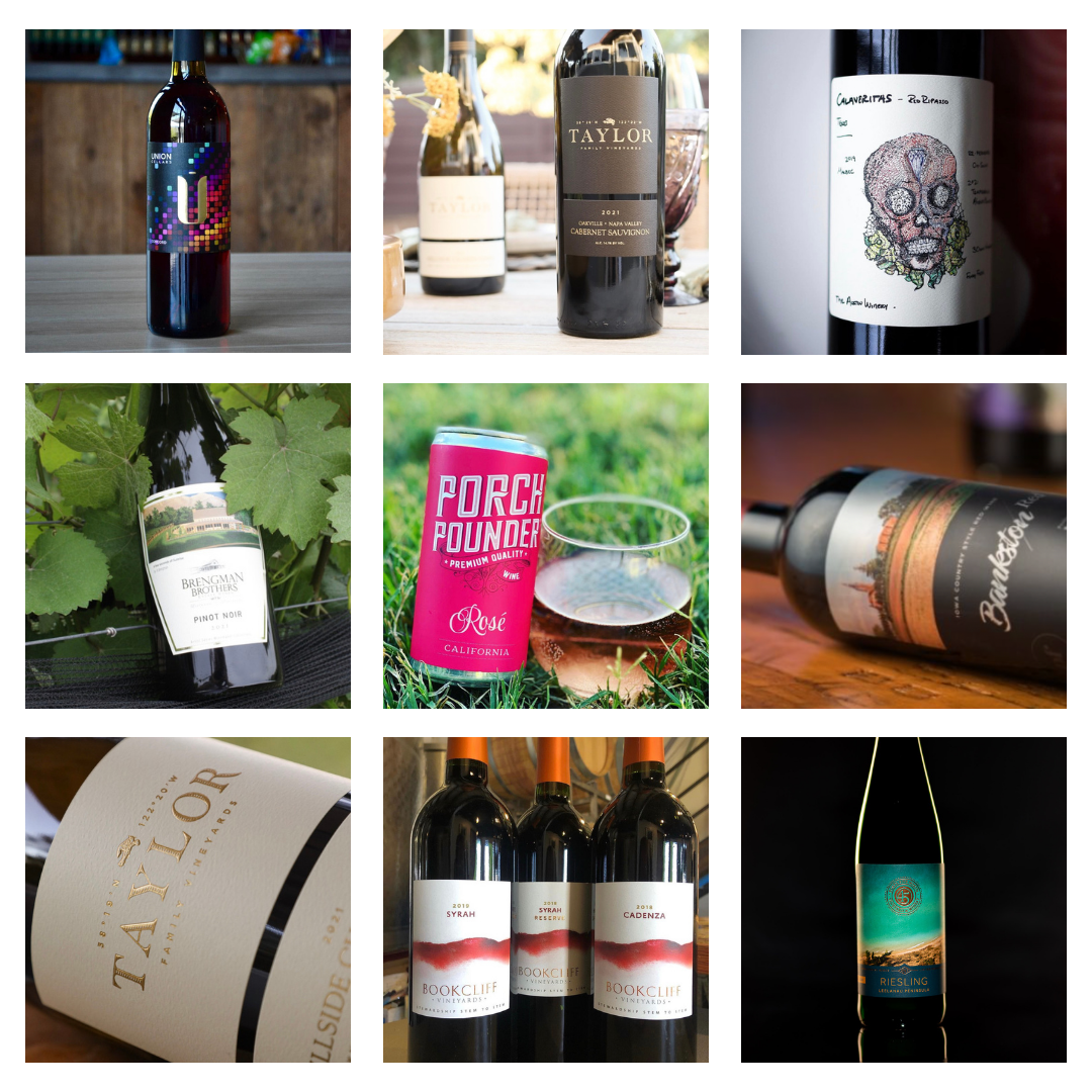
Wine label gallery

Wine bottle design considerations

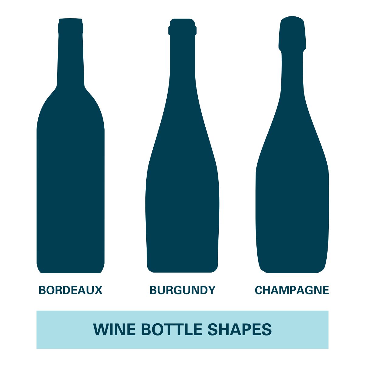
Wine bottles come in standard shapes (Bordeaux, Burgundy, Champagne, Hock) plus custom or asymmetrical bottles. Each shape needs a label that fits its curve and proportions. Practical design rules:

  • Match the label to the bottle’s flat zone. The label should sit on a section of the bottle that’s relatively flat, not on the steepest part of a shoulder or neck.
  • Mirror or contrast the bottle silhouette. Some labels echo the bottle shape (rectangular labels on Bordeaux); others create deliberate visual tension (a circular label on a rectangular bottle).
  • Plan for the front-back relationship. If the front is minimal, the back can carry more story. If the front is detailed, keep the back focused on regulatory copy and a tight description.
  • Consider the cellar. Wines stored on their sides for years are exposed to humidity and condensation. Choose materials that can survive that environment.

For artwork files, send Adobe Illustrator files or high-resolution PDFs whenever possible. They preserve typography, vectors, and layer structure so we can verify dimensions and produce a clean proof before printing.

Wine bottle shapesFrequently asked questions

What information is required on a wine bottle label?

U.S. wine labels are regulated by the TTB and must include: brand name, class or type designation (varietal name or generic like “red wine”), alcohol by volume, net contents, producer and bottler name and address, the sulfite warning (if SO₂ is over 10 ppm, which most wines are), and the federal government health warning. Vintage year, appellation, and fanciful names are optional but trigger specific rules when included.

What does TTB stand for and what does it regulate?

TTB stands for the Alcohol and Tobacco Tax and Trade Bureau. It’s the federal agency that regulates labeling, advertising, and trade practices for wine, spirits, and beer in the United States. Wine labels must receive a Certificate of Label Approval (COLA) from the TTB before the wine can be sold across state lines.

Does my wine label need a vintage year?

No, vintage year is optional. But if you list one, federal rules require that 95% of the wine come from grapes harvested that year (85% for wines from a state or county appellation). Many premium and varietal wines list a vintage anyway because consumers expect it for that category.

What’s the difference between a varietal wine and a table wine?

A varietal wine names a specific grape (Cabernet Sauvignon, Pinot Noir, Sauvignon Blanc) and must contain at least 75% of that grape variety. A table wine uses a generic designation (“red wine,” “white wine,” “red table wine”) when the wine doesn’t meet the 75% varietal threshold or when the producer chooses not to claim a specific grape. Both need to list a class designation; varietal is just more specific.

What’s an AVA and when do I need to list one?

An AVA (American Viticultural Area) is a federally designated grape-growing region. Napa Valley, Willamette Valley, Russian River Valley are examples. Listing an AVA on a wine label is optional, but if you do, at least 85% of the grapes must come from that AVA. Some states (California, for example) have stricter rules that require 100% of grapes to come from the state if the state name is on the label.

Why do wine labels say “Contains Sulfites”?

If a wine contains 10 parts per million or more of sulfur dioxide (SO₂), the TTB requires the label to display “CONTAINS SULFITES” in clear, legible type. Sulfites occur naturally in wine fermentation and are commonly added as preservatives, so the warning appears on the vast majority of commercially produced wines.

Where does the government warning go on a wine label?

The federal government health warning required by the Alcoholic Beverage Labeling Act of 1988 can go on either the front (brand) label or the back label, but most wineries place it on the back label so it doesn’t crowd the brand-side design. The warning must be set off from other information and printed in legible type that meets TTB minimum size requirements.

Do I need both a front and back label on a wine bottle?

Not strictly. The TTB requires certain mandatory information (brand name, class designation, ABV, net contents, producer/bottler, government warning, sulfite warning) but doesn’t dictate that it be split across two labels. Some wineries use a single wrap-around label that covers both sides. Two-label designs (front + back) are more common because they let the front carry brand and the back carry regulatory copy and storytelling.

Make your wine labels stand out

Once the regulatory pieces are in place, the materials, finishes, and design choices are what set the bottle apart on the shelf. We work with wineries on the full range of label types. Paper to film, matte to soft-touch, foil to embossing. And we’ll help you sort through which combination fits the wine.

If you’re ready to talk through a project, take a look at our wine label printing page for an overview of materials and finishes, or request a sample pack to feel the paper, film, and finish options in person. Our facility offers fast processing. Five business days from artwork approval to ship. With no minimums and an expert review on every project before anything goes to press. Get in touch when you’re ready.

Kiss Cut vs Die Cut Labels: Understanding the Difference

⚞ The Highlights:

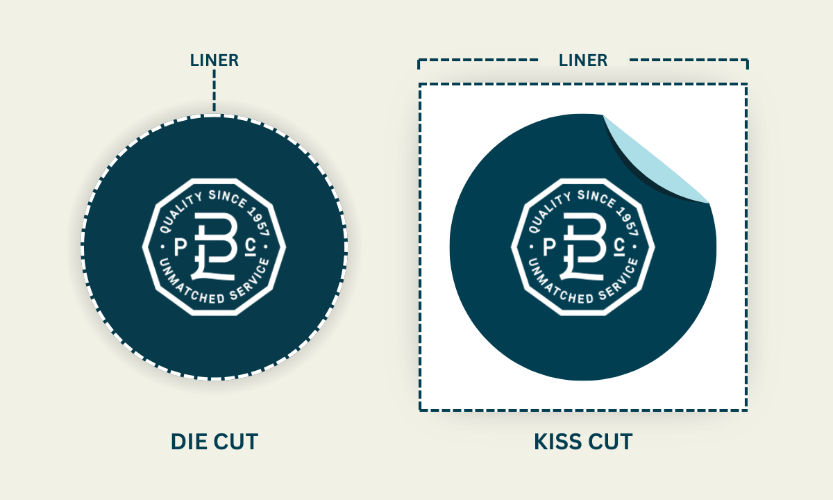
  • Kiss cut labels are cut through the top vinyl only, leaving the paper backing intact. The result is a sticker that stays on a backing sheet until you peel it off.
  • Die cut labels are cut completely through both the vinyl and the backing. The result is an individual sticker in the exact shape of your design, with no extra material around the edges.
  • Kiss cut is faster and usually cheaper. Die cut gives you a cleaner, more premium look on individual product labels.
  • Both can be made in vinyl, paper, or polyester, with permanent or removable adhesive.

The difference between kiss cut and die cut labels comes down to how deep the cut goes. Kiss cut goes through the top vinyl layer only, leaving the backing intact. Die cut goes all the way through both layers, giving you an individual label in the exact shape of your design. Both can use the same materials, the same finishes, and the same adhesives, so the choice is really about how the label needs to look, feel, and apply once it’s in someone’s hands.

We work with brands on both formats every day. Below we’ll walk through how each one is made, where each one fits, and how to decide between them.

Kiss cut vs. die cut labels: side by side

Kiss Cut Die Cut
Cutting depth Through the top vinyl only; backing stays intact Through both the vinyl and the backing
What you get Sticker on a backing sheet (peel-and-stick) Individual sticker in the exact shape of the design
Production speed Faster Slightly slower (precision cutting on each label)
Cost Lower per label Higher, especially for intricate shapes
Application Easy to peel from a sheet; works for batch handouts Each label peeled individually; precise cut means clean edges
Best for Promotional sticker sheets, multi-design batches, packaging where the backing helps with handling Custom-shaped product labels, decorative cutouts, premium packaging
Material options Vinyl, paper, polyester (same as standard labels) Vinyl, paper, polyester (same as standard labels)
Adhesive options Permanent or removable Permanent or removable
Curved or textured surfaces Handles well; backing supports application Works on slightly curved surfaces; harder on highly textured ones

What are kiss cut and die cut labels?

If you’re after a label with a custom shape or an intricate cutout design, these are the two main cutting techniques. Knowing how each one works helps you pick the right one for your product.

Kiss cut labels

Kiss cut labels are cut through the vinyl layer only. The paper backing underneath stays intact, so the label looks like a sticker sitting on a sheet of backing material.

A diagram showing kiss cut vs. die-cut labels

To make them, the design is printed on a vinyl sheet, then a cutting machine slices through the vinyl while leaving the backing untouched. The cutting depth, pressure, and speed are all calibrated to make the cut clean without going through the backing. The result is a sticker that’s easy to peel off and apply.

The intact backing also protects the label until it’s used, which makes kiss cut a good fit when labels need to travel through handling or storage before they’re applied.

Die cut labels

Die cut labels are cut all the way through. Both the vinyl and the backing material are cut to the exact shape of the design, so what comes off the press is an individual label with no excess material around the edges.

To make them, the design is printed on vinyl, then a die (a sharp metal tool shaped to match the design) cuts through both the vinyl and the backing paper. The result is a custom-shaped label that already has its final outline.

Once you know which cut fits your product, get a quote on custom die-cut labels. No minimums, fast turnaround, and an expert review on every project before you commit to a run.

Where each one fits

Both kiss cut and die cut labels can complement existing packaging or stand on their own as the primary product label. Here’s where each tends to fit best.

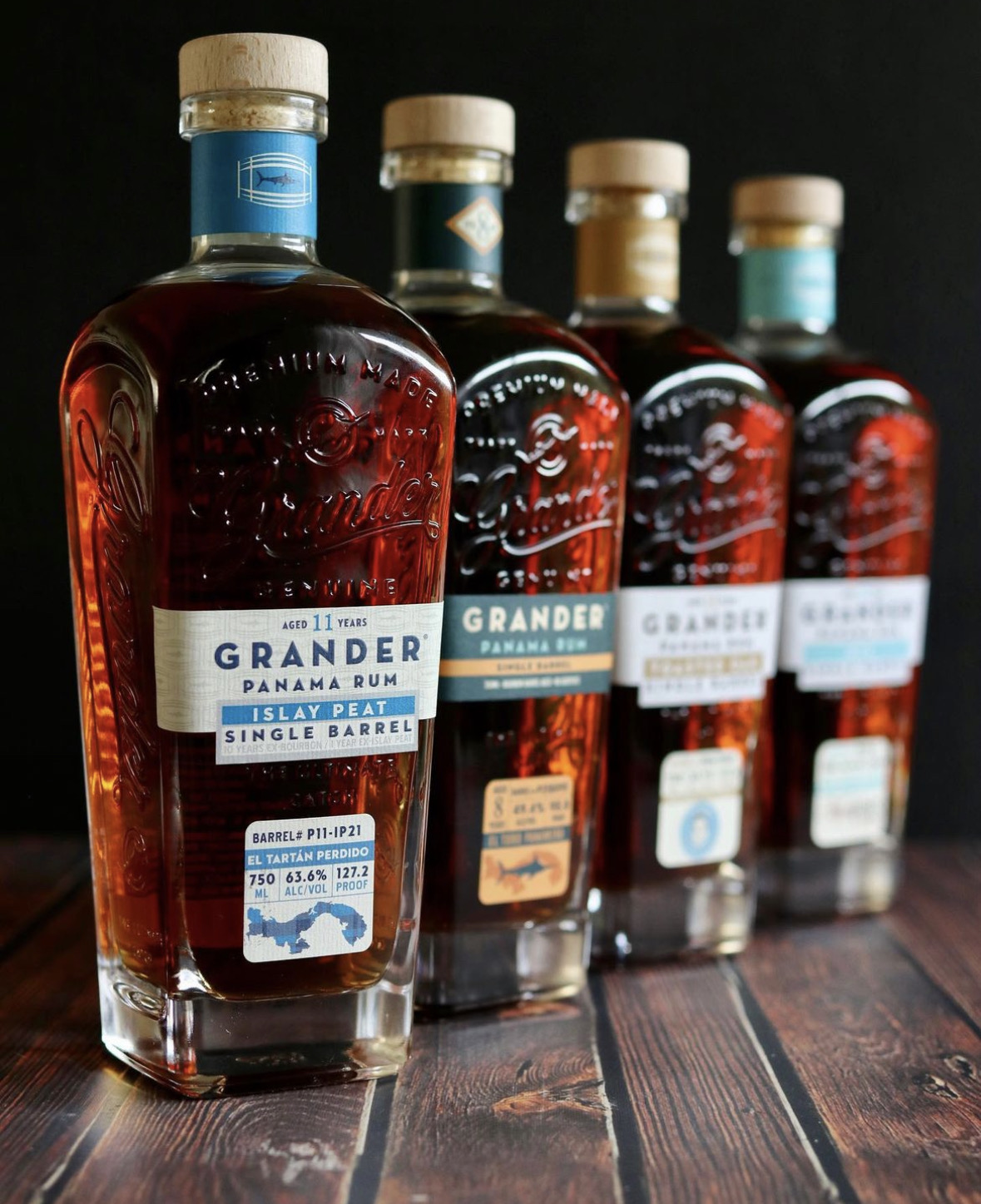
Rum bottle with custom label

Food and beverage products

For craft beverages and specialty foods, both formats can complement existing packaging or become the focal point of the design. Examples we see often:

  • Standard cutout product labels covering branding, product name, ingredients, nutritional information, and required regulatory copy
  • Custom-shaped labels that match the product’s silhouette or echo the design itself, so the label catches the eye on shelf
  • Product identification labels for different flavors or batches, so consumers can tell them apart at a glance
  • Promotional labels for limited-time flavors, seasonal releases, or campaign-driven SKUs
  • Decorative designs for limited-edition or holiday-themed products

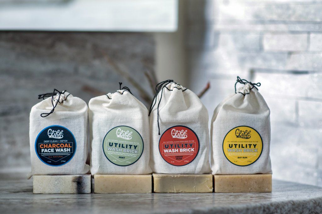
soap with custom labels

Health and beauty products

For personal care and beauty, both formats handle unique packaging shapes and help fit a lot of information into limited space. Examples:

  • Product labels with ingredients, branding, and product name
  • Uniquely shaped labels for perfumes, serums, and other specialty bottles
  • Product differentiation labels to set apart different scents, colors, or formulations
  • Decorative elements like metallic foil or embossed accents that add a premium touch to the existing packaging

Home goods product labelsHome goods

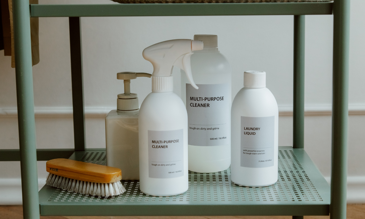
For home goods, candles, cleaning supplies, and decorative items, custom cutouts give the packaging more personality. Examples:

  • Uniquely shaped labels for non-standard packaging on candles, cleaning supplies, and decorative items
  • Product differentiation labels for different scents, colors, or features
  • Feature or callout labels (a “new and improved” formula or a comparison claim like “twice the cleaning power”)
  • Safety warnings to display required precautions clearly

Differences between kiss cut and die cut labels

The comparison table at the top covers the high-level differences. Below, the same details with a bit more context.

Cutting method

Kiss cut labels have only the top vinyl layer cut; the paper backing stays in one piece. Die cut labels are cut completely through both the vinyl and the backing, so each label comes off the press in its final shape.

Size and quantity

Kiss cut labels can be produced as label sheets (multiple stickers on one backing) or as individual pieces. Die cut sizes can vary based on the design shape, but each label is a single piece.

Shape options

The shape of either format depends on your design. Kiss cut starts to face practical limits with highly complex or interlocking designs. Die cut handles complex shapes well, but cost can rise as the shape gets more intricate (the die itself becomes more expensive).

Production speed

Kiss cut runs faster because the cutting process doesn’t have to handle the backing material. Die cut takes slightly longer since the press is cutting precise custom shapes through both layers.

Waterproof qualities

Both formats can be made in vinyl, which holds up well in humid or moisture-heavy environments like coolers, showers, and refrigerators. Material choice, not cut type, drives waterproof performance.

Application

Kiss cut labels are convenient to peel because they sit on a backing sheet that holds them in place during application. Die cut labels are peeled individually from their own backing, but the precise edge means clean removal without tearing.

Durability

The backing on a kiss cut label adds protection before application. It absorbs handling and shipping wear. Once the label is applied, durability depends on the material and adhesive, not on the cut style.

Surface compatibility

Both formats adhere well to flat and gently curved surfaces. Die cut labels can be slightly harder to apply on highly textured or irregular surfaces because the precise edge has less room to flex.

What materials are kiss cut and die cut labels made from?

Both kiss cut and die cut labels can be made in a wide range of materials. Vinyl, paper, and polyester are the most common.

If sustainability is part of the brand story, eco-friendlier options exist:

  • Recycled paper for the label or sticker material
  • Biodegradable vinyl, which breaks down over time
  • Plant-based materials like cornstarch and bamboo, which are still less common but available

The trade-offs to know: eco-friendlier materials usually cost more, and some have lower durability or weather resistance than standard vinyl. Worth talking through your specific use case (indoor vs. outdoor, refrigerated vs. shelf, brief promotion vs. long-life product label) before committing.

What do kiss cut and die cut labels cost?

There’s no single price for either format. Cost depends on a few factors that apply to both:

  • Quantity. Like all printing, per-label cost drops as the run grows. Setup costs are amortized across more labels.
  • Material. Vinyl is mid-priced; paper is typically lower; specialty films, foils, or eco-friendlier materials run higher.
  • Number of colors and finishes. Standard CMYK is the baseline. Metallics, spot UV, and special inks add to the cost.
  • Cut complexity. Simple shapes (rectangles, ovals, basic outlines) are inexpensive. Intricate or unusual shapes cost more, especially for die cut, where a custom die may need to be made.
  • Adhesive. Permanent vs. removable typically costs the same; specialty adhesives (low-tack, freezer-grade) add cost.

In general, kiss cut runs slightly cheaper than die cut at the same quantity and material because the cutting is simpler and the labels stay on a backing sheet (lower handling cost). For a real number on either, send your design, quantity, and material preference and we can quote.

Pros and cons

Kiss cut labels

Pros:

  • Backing protects the label during shipping and handling
  • Easy to peel and apply, especially in batches
  • Flexible for use on a range of smooth surfaces
  • Lower production cost

Cons:

  • Edges can fray over time on lower-quality materials
  • Some adhesives and materials don’t hold up well to prolonged sun exposure
  • Limited for highly intricate cut shapes

Die cut labels

Pros:

  • Custom shapes look clean, premium, and intentional
  • Useful for everything from promotions to long-life product labels
  • Crisp edges that match the design exactly

Cons:

  • Less backing protection during shipping and handling
  • Cost rises with shape complexity
  • Slightly more material waste during cutting

Permanent vs. removable adhesive

Both kiss cut and die cut labels can use either type of adhesive.

Removable adhesives peel off without leaving residue. They’re the right pick for temporary or promotional labels, sample stickers, or anywhere the label needs to come off cleanly.

Permanent adhesives create a strong bond that holds the label in place for the long term. They’re standard for product labels, branding stickers, and anywhere you don’t want the label to lift.

Design considerations

A few practical tips for prepping artwork for either cut style.

Kiss cut labels

  • Define the cut outline clearly so the cutter knows exactly where to go
  • Keep important design elements inside a safe zone within the outline so nothing critical gets clipped
  • Add a border around the outline to keep edges clean and avoid scrap-paper showing through

Die cut labels

  • Add a bleed area that extends past the cut outline, so no white edges show after cutting
  • Round any sharp corners with a small radius to prevent edge tearing during peel-and-stick
  • Maintain a safe zone for all critical design elements, the same way you would on any cutout label

Which one should you choose?

Quick decision framework based on what we see most often:

  • Choose die cut if you need individual custom-shaped labels for product packaging, decorative cutouts, or anywhere the label itself is the visual. The clean exact-shape outline is the look most product brands want.
  • Choose kiss cut if you need stickers on a sheet (multi-design batches, promotional handouts, fulfillment packs), labels that need backing protection during shipping, or simply a lower-cost option for a high-volume run.
  • Either format works for standard product labels with simple shapes (rectangles, rounded squares, ovals). At that point the call usually comes down to whether the labels need to ship and handle as a sheet or as individual pieces.
Worth knowing: If you’re not sure which fits your product, we’ll take a look at the artwork and the application setup and tell you which one we’d recommend, with the why. Sometimes it’s clear-cut. Sometimes either works and the call comes down to your team’s handling preferences.

Frequently asked questions

What’s the difference between kiss cut and die cut labels?

Kiss cut labels are cut through the top vinyl layer only, leaving the paper backing intact. Die cut labels are cut all the way through both the vinyl and the backing, so each label comes out as an individual sticker in the exact shape of the design. Both can use the same materials, finishes, and adhesives. The difference is really about how the label looks, feels, and applies.

Which is cheaper, kiss cut or die cut?

Kiss cut is usually cheaper at the same quantity and material because the cutting is simpler (only the top layer) and the labels stay on a backing sheet, which lowers handling cost. The actual difference depends on quantity, material, and how complex the shape is.

Can I get kiss cut labels in custom shapes?

Yes. Both kiss cut and die cut can be cut in custom shapes. The difference is whether the backing is cut too. Kiss cut starts to face practical limits with highly intricate or interlocking shapes, where die cut handles them more cleanly. For most standard custom shapes, either format works.

Which is better for product packaging?

Die cut is the more common choice for product packaging because the individual exact-shape labels look cleaner and more premium on the bottle, jar, or box. Kiss cut is common for product packaging when the label needs backing protection during shipping or when the production volume justifies a sheet format.

Are kiss cut labels durable?

Once applied, the durability of a kiss cut label is the same as any label of the same material. Vinyl kiss cut labels handle moisture and outdoor conditions well. The backing on a kiss cut label also adds protection before application, which is helpful if labels are shipped or handled before being used.

Do die cut labels need a backing?

Die cut labels are cut through both the vinyl and the backing, so each label comes off the press with its own small piece of backing attached. The label is peeled off that backing piece individually, then applied. So yes, each label has a backing, just not a shared sheet like kiss cut.

Can I use kiss cut for stickers I’ll sell individually?

Yes. Kiss cut works well for stickers sold individually because the backing makes them easier to package, ship, and store. The customer peels the sticker off the backing when they’re ready to use it. It’s a common format for sticker sellers, merch packs, and promotional handouts.

What materials work for kiss cut and die cut labels?

Vinyl, paper, and polyester are the most common materials for both formats. Eco-friendlier options like recycled paper, biodegradable vinyl, and plant-based films (cornstarch, bamboo) are available too, though they typically cost more and may have lower durability than standard materials.

Ready to get a quote?

Whichever cut style fits your product, we can help you sort it out. Take a look at our custom die cut labels page for more on the format, or explore the finishing options we offer for product labels. Request a sample pack to feel the materials and finishes in person, or get in touch if you have specific questions about your design.

Die-cut labels printing

What Label Material Is Best for Oily and Greasy Environments?

Labeling anything coated in oil or grease can lead to labels that slide, peel, smudge, or just plain don’t stick. We’ll walk through which label materials actually hold up, and which ones don’t, so you can pick the right combination for your product.

Scalp and Beard Oil

BOPP: The Most Versatile Label Material for Oily Surfaces

For many light-to-moderate oil exposure scenarios, BOPP is a reliable go-to, especially when paired with the right adhesive and protective layer.

Why BOPP Works:

  • Repels moisture and light oils: Holds up well against ingredients like olive oil, coconut oil, lotions, or other product oils without smudging or peeling.
  • Stays smooth and secure: Resists edge lift and wrinkling during filling, packing, and shelf handling.
  • Prints clean and clear: Works well with most print methods, keeping text, barcodes, and branding sharp.
  • Flexible but durable: Conforms to jars, bottles, and squeeze tubes while staying strong.

When it’s a fit:

  • Your product has light oil residue from ingredients like olive oil, coconut oil, essential oils, or natural butters commonly found in food, beverage, or bath and body products.
  • You need a label that can hold up through filling, packing, shipping, refrigeration, and being handled on store shelves without smudging or peeling.

What to watch for:

  • Not ideal for high-heat applications. Above ~150°F, BOPP may start to lose stiffness or wrinkle especially during hot fill processes like bottling sauces, syrups, or wax-based body scrubs.
  • Heavily contaminated surfaces may still need prep. Oil-tolerant doesn’t mean oil-proof. If the surface is still slick after wiping, a quick clean or light de-grease may help. Want to be sure it’ll hold? Apply a sample label to a real product and check for edge lift after 24–48 hours.

Vinyl: A Flexible Option with Limitations

Vinyl labels are flexible, weather-resistant, and long-lasting. They can work in some oily environments, but they’re not as reliable as BOPP or PET when oil exposure is sustained.

Why some use vinyl:

  • Very flexible: Wraps tightly around curves or irregular surfaces.
  • Strong outdoor durability: Good UV and water resistance.

Where it can struggle:

  • Chemical vulnerability: Certain product oils like essential oils, fragrances, citrus oil, or sunscreen ingredients can cause vinyl to soften or lift over time.
  • Can distort or wrinkle under heat, especially when exposed to warm filling processes like hot sauces, syrups, or body scrubs.

When it works:

  • Outdoor or flexible labeling applications where oil contact is light or intermittent.
  • Tubes, odd-shaped packaging, or squeeze containers where flexibility is key.

In our experience, BOPP and PET consistently outperform vinyl when labeling oil-prone packaging surfaces, like lotion tubes, olive oil bottles, or essential oil containers, or anything exposed to heavy oil.

If you’re considering vinyl, limit it to applications where oil contact is incidental or where flexibility is more critical than long-term durability.

Coated Paper: Higher Risk

If you’re thinking about using paper here, proceed carefully. Even coated paper has a hard time surviving the mess and movement of most real-world settings.

Why it fails:

  • Oil eventually penetrates the coating.
  • Paper fibers absorb moisture and weaken, leading to wrinkles, lift, or delamination.
  • Adhesives often can’t hold through oil residue.

Even so-called “grease-resistant” paper labels may work in theory, but handling, flexing, heat, or prolonged exposure often lead to failure.

If you’re still considering paper, only use it for secondary packaging and ask for the maximum oil exposure rating (measured in hours or type of oil) and guidance for whether a varnish or laminate is required to improve short-term performance.

When it might work (briefly):

  • Low-contact packaging (e.g., dry outer cartons near greasy products).

But in most cases, if the label needs to stick and stay put, paper usually doesn’t make the cut.

small oil bottles with custom labels

Quick Comparison Table

Material Recommended For Less Ideal For Key Considerations
BOPP Oily packaging, lubricated parts, food containers High heat, curved surfaces with heavy oil film Use with oil-tolerant adhesive + overlaminate
Vinyl Flexible packaging, outdoor labels (low oil) Consistent oil or solvent exposure Flexible, but less reliable in harsh oily conditions
Coated Paper High impact packaging with minimal handling Any direct or sustained oil exposure May fail quickly under real-world handling

Additional Selection Considerations

When choosing a label for oily or greasy environments, material is only one piece of the puzzle. Surface type, application method, and storage conditions also affect performance:

  • Surface Type Matters: Smooth, non-porous surfaces like glass, PET plastic, and polished metal generally bond well with BOPP using oil-tolerant adhesives.
  • Automatic applicators (wipe-on, air-blow, or rotary) need stable materials that won’t lift at edges or wrinkle, BOPP with aggressive adhesives work best.
  • Some adhesives improve bond strength after 24–48 hours, especially in cold or oily environments.
  • If your product enters cold chain storage, freezer-grade adhesives paired with BOPP or PET are safer than vinyl or paper.

Label Materials and Oily Environments

There’s no one-size-fits-all label for oily or greasy surfaces, it depends on your oil level, surface type, temperature, and application method. We can help you find the right material and adhesive combo, or send samples you can test directly on your production surface.

Need help narrowing it down? Request a sample pack or contact us and we’ll help you find the right fit for your product and environment.

Can Clear Labels Be Used on Dark Containers?

Yes, clear labels can work on dark containers, but only if the material, adhesive, and application setup are properly matched to your container. When done right, you can achieve a “no-label” look even on dark packaging.

We’ll walk through what works, what doesn’t, and what to watch for based on your container type.

Candle with clear label

Labeling Dark Plastic Containers (PET, HDPE, LDPE)

These plastics show up in everything from beverage bottles (PET) to detergent jugs (HDPE) to squeezable tubes and pouches (LDPE), so here’s what you need to know before applying clear labels to each one.

Can clear labels be used on containers made with these materials?

Yes, clear labels can be used on PET, HDPE, and LDPE containers. You’ll get good results as long as the container is properly prepared, the label includes a white underprint for readability, and you choose an adhesive that’s designed to bond well with each plastic type.

What to know

Clear labels can look great on PET, HDPE, and LDPE containers, but each plastic comes with specific challenges. Here’s what to expect and how to solve it:

  • Bubbling from outgassing. Freshly molded containers can release small amounts of gas that get trapped under the label. Let containers sit for 24–72 hours before labeling to reduce bubbling.
  • Poor legibility on dark plastics. Dark containers can wash out artwork or text. Add a white underprint behind any design elements that need to stay readable.
  • Adhesion issues on HDPE and LDPE. These plastics, such as detergent jugs (HDPE) and squeezable tubes or pouches (LDPE), have low surface energy, which makes it harder for adhesives to bond. Use a high-tack adhesive and consider pre-treating the container to help the label stick.
  • Choosing the right film. PET offers stiffness and clarity for smooth, rigid surfaces. BOPP is better for flexible bottles or squeezable containers.
  • Surface preparation matters. Make sure containers are clean, dry, and smooth before applying labels. Even minor oils or residues can cause lift or bubbling.

Finishing Options

  • UV varnish for abrasion resistance
  • Protective laminates if exposure to water or friction is expected
  • Avoid matte finishes that reduce transparency or emphasize surface defects

Labeling Glass Containers (Amber or Dark-Colored)

Clear labels can work well on darker glass, and darker-colored glass actually helps hide the label edges, which brings out the seamless effect.

What to know

  • Artwork can disappear on dark surfaces. Use a white layer (underprint) behind key design elements to keep text and graphics readable on amber, brown, cobalt, or black glass.
  • Curved or embossed bottles may cause wrinkles or edge lift. Choose a slightly more flexible clear BOPP on bottles with heavy curves or embossing.
  • Dust and fingerprints show more on clear labels. Clean the glass before application to avoid trapped particles and visible smudges.
  • Choose the right film for the container. Clear PET works best on smooth, rigid dark glass because of its clarity and stiffness. Clear BOPP can be a better fit for slightly curved bottles.

Finishing Options

  • Gloss laminates enhance clarity and make the label “disappear” into the dark glass
  • Spot coatings add texture or emphasis without reducing the clear effect

Labeling Aluminum or Metal Containers

Clear labels work well on aluminum and metal containers. These surfaces are smooth and consistent, which helps labels bond cleanly and makes it easier to achieve a polished look.

What to know

  • Bubbling or trapped air is more visible on metal. Metal surfaces show imperfections clearly. Consider running a few test labels to confirm clean application and adjust pressure or speed if needed.
  • Any surface flaw will show through the label. Small dents, scratches, or coating variations will become more visible under a clear film. Inspect containers before labeling.
  • Some finishes may require extra prep. Anodized or coated aluminum can reduce adhesion. Use a high-tack permanent adhesive or consider a primer when surfaces are difficult to bond.
  • Choose the right film for the job. Clear BOPP is usually the best match for aluminum because it balances durability, flexibility, and clarity.

Finishing Options

  • Gloss or soft-touch laminates depending on the brand look you want
  • Foil-enhanced elements that play nicely with the metallic background

Comparison Table: Clear Label Use on Dark Containers

Container Material Best Film Adhesive Type
PET (Plastic) Clear BOPP Clear acrylic
HDPE/LDPE (Plastic) Clear BOPP High-tack acrylic
Glass (dark/amber) Clear PET Standard clear
Aluminum/Metal Clear BOPP Strong permanent

Matching Materials and Containers

  • Best material for dark PET bottles: Clear BOPP with acrylic adhesive. It’s clear, flexible, and performs well with careful surface prep.
  • Most forgiving substrate: Glass. High surface energy means great bonding and low bubbling risk.
  • Best for premium gloss finish: Clear PET on smooth glass or metal. This provides superior transparency and stiffness.
  • Most cost-effective for dark plastics: Clear BOPP. It’s budget-friendly but needs good prep and a white underprint.
  • HDPE with low-tack adhesive: High bubbling risk. Avoid untreated or freshly molded containers.

Clear Labels on Dark Containers

Clear labels can absolutely work on dark containers, but success depends on using materials, surface prep, and the application environment.

Request a sample pack or contact us and we’ll show you what works.

Can Estate Paper Be Used on Wine Bottles?

If you’re wondering whether estate paper can be used on your wine labels, you’re in the right place. We’ll walk you through what matters most so you can trust the label won’t fail when it counts.

Rectangle Wine Bottle Labels

What Is Estate Paper?

Estate paper is an uncoated, textured label material designed primarily for higher-end wines and spirits. It feels high-end, like vellum or bright white felt , and absorbs ink well for textured, detailed designs. These papers are often treated to handle moisture better, so they don’t peel or fall apart when things get a little damp. That treatment is called wet-strength (basically, it’s moisture resistance built into the paper).

It’s a favorite in the wine and spirits world because it looks great, prints cleanly, and works well with high-end finishes like foil and embossing.

Durability

Estate paper with wet-strength treatment holds up well in chilled storage or refrigerated shipping (wet-strength just means the paper’s been treated to resist moisture). But it’s not invincible.

Considerations:

  • It performs well in a wine fridge or tasting room setting with moderate humidity.
  • If you’re chilling bottles in ice buckets or exposing them to constant condensation, you may see edge-lifting or smudging unless the label is protected.

A laminate (clear film) or varnish (a printed-on coating) adds protection against moisture so your labels last longer in damp settings. For high-moisture environments, synthetic or blended materials might be a better fit. Blended materials combine the texture of paper with the durability of film.

If you’re curious about longevity, most wet-strength papers can withstand hours of exposure in humid or chilled environments. They aren’t meant for full immersion or extended ice-bucket submersion.

Matching the Label to Bottle Shape & Application

Estate paper works reliably on standard cylindrical bottles and is compatible with automated bottling lines.

On tapered or curved surfaces, the rigidity of the paper may cause wrinkles or edge-lift during application. If your bottle is narrower at the top than the base or has curved edges where the label sits, it’s worth testing the material before a full run.

For non-standard shapes, more flexible materials like film or paper-film hybrid options are worth considering. If you’re bottling on a mobile or automated line, make sure to test label curl and adhesive setup to confirm smooth application.

Wine bottles with paper labels

Design & Finishing Options

Estate paper enhances premium finishing techniques like foil stamping, embossing, and debossing. Its natural texture helps create depth and contrast, especially when applied with the right pressure and temperature settings.

Some examples:

  • Estate #8: A bright white, subtly textured stock that works well for clean, modern label designs.
  • Estate #9: A cream-toned, laid-finish stock ideal for traditional, artisanal, or heritage branding.

Other textured papers like Cotton or Linen offer similar tactile appeal with slightly different fibers and finishes. They’re worth considering if you’re going for a unique texture or tone. We recommend getting a sample pack to get a feel for how each performs with your brand.

Adhesive Options — Permanent vs. Removable

Most estate paper applications use a permanent adhesive, which helps your label stay put through filling, chilling, and transit.

But if your brand values sustainability, reusability, or bottle collection, you can pair estate paper with wash-off or water-soluble adhesives to make removal easier for the end user. Adhesives are chosen separately from the label material, so you can still use estate paper even if you need a removable solution.

Keep in mind that wash-off adhesives may require specific conditions (like soaking time or water temperature) to work cleanly. If label removal matters to you, definitely test it first so you know exactly what to expect.

Sustainability Options

Plenty of estate paper stocks are FSC-certified (Forest Stewardship Council) and recyclable, so you can keep things premium without giving up your sustainability goals. Some estate papers include recycled content, though availability varies by mill and supplier. Not every version of estate paper is certified, so we’ll help you find the right stock if that’s a priority.

If your bottles end up in ice buckets or get a lot of moisture, a synthetic or blended label might be a safer bet. You’ll avoid issues like peeling or smudging and avoid reprints down the line.

Quick Checklist Before You Order

  • Test the label fit if your bottle has a taper or unusual shape
  • Add a protective finish if you’re expecting any moisture exposure
  • Think through adhesive needs, permanent or removable
  • Consider moisture-heavy use cases before locking in paper-only stock

Yes, estate paper works for wine bottles, and in most cases, it does the job well. Like any material, it has its strengths and tradeoffs. If you want premium texture and dependable performance, it all comes down to pairing the right stock, adhesive, and finish for your environment.

Not sure which label material makes sense for your bottles? Contact us and we’ll walk you through it.

What Label Material Is Best for Squeeze Bottles or Flexible Containers?

Labeling a squeeze bottle is harder than it looks. If your label wrinkles, cracks, or peels every time a customer gives the bottle a squeeze, it’s not doing its job. Getting it right comes down to picking the right label material for your container, and the environment it lives in.

If you’re researching labels for a flexible or squeezable package, here’s what you need to know before you spec the wrong material.

Laundry detergent bottles with custom labels

Considerations When Labeling Squeezable or Flexible Containers

When you’re comparing label options for squeezable packaging, a few factors rise to the top:

  • Flex and memory: how well the film snaps back without wrinkles
  • Conformability on curves: especially on oval and contoured bottles
  • Adhesive chemistry: especially for plastics like HDPE or polypropylene (the super‑slick plastics most squeeze bottles use)
  • Environment: exposure to oils, moisture, heat, or cold
  • Converting quality: printing, die‑cutting, and topcoat selection

Why do these factors matter?

Flexible containers, like lotion tubes, condiment bottles, and gel packs, put constant stress on your labels. Every squeeze, bend, and bounce during shipping or daily use pushes the label to flex. If it can’t keep up, you get wrinkling, delamination, or labels that start peeling like a wet sticker at a pool party.

MDO (Machine Direction Oriented Film)

(Common for: personal care lotions and serums, squeezable condiments, household cleaning gels)

This is our top recommendation for squeezable and flexible containers.

Why we recommend it: MDO films go through a stretching process during manufacturing that kind of ‘breaks them in’, like a good pair of jeans that move with you instead of fighting back. That orientation gives the film better flexibility, memory, and shape retention, even after repeated squeezing or flexing.

Benefits:

  • Designed to flex repeatedly without wrinkling or cracking
  • Great conformability on curved and contoured surfaces
  • Holds up to squeezing, pressure, and handling
  • Works well with strong adhesives built for slick plastics (like HDPE or polypropylene)
  • Can be thinner and lighter, reducing material usage
  • Widely used in personal care and food packaging sectors for flex-label applications

Best used for:

  • Personal care bottles (shampoo, lotion)
  • Condiment bottles (ketchup, mustard)
  • Tubes and semi-rigid containers

Finishing options: Compatible with clear films, matte or gloss overlaminates, and UV varnishes, just make sure your topcoat is flexible, too.

Considerations:

  • Choose MDO if your container flexes more than a small amount during normal use
  • Make sure your adhesive is compatible with slick plastics like HDPE and polypropylene

BOPP (Biaxially Oriented Polypropylene)

(Common for: rigid food jars, beverages, pantry products, household goods that don’t flex much)

Why it’s commonly used: BOPP is a durable, moisture-resistant, and cost-effective film used in many labeling applications.

Benefits:

  • Affordable and widely available
  • Water- and oil-resistant
  • Good for semi-rigid containers or less extreme flexing

Best used for:

  • Rigid plastic or glass containers
  • Flexible containers with low flex stress
  • Products stored in dry or room-temperature environments

Considerations: Standard BOPP doesn’t stretch well. On a squeezable bottle, it can wrinkle or lift at the edges, especially if applied to curved surfaces or over seams. It’s not ideal for high-high‑flex areas where the bottle bends.

If you must use BOPP, focus on areas of the container that don’t flex.

Vinyl 

(A fit for heavy-duty household cleaners, outdoor products, or hard-use environments)

Why it’s an option: Vinyl labels are flexible, durable, and tough under stress. They work in hard-use conditions and stick well to curved surfaces.

Benefits:

  • High flexibility and stretch
  • Strong resistance to water, oil, and abrasion
  • Good for outdoor use or curved surfaces

Best used for:

  • Harsh environments (outdoor, industrial, automotive)
  • Products with irregular curves or extreme handling

Considerations: Vinyl is thicker, harder to die-cut, and usually more expensive than MDO. It also doesn’t offer the same premium print finish that many brands expect. Vinyl works well in rugged or outdoor settings, but for brands focused on high-end aesthetics or needing fast, efficient converting, it may not be the best match.

Pressure Sensitive Labels on honey jars

Common Label Issues to Watch For on Squeezable Containers

Before choosing a material, it helps to think about where and how customers will actually use your product. Flexible personal care and food containers are frequently exposed to oils, moisture, steam near stovetops, cold storage, and frequent handling, all of which put extra stress on the label.

If your label is applied to a squeezable or flexible container, these are the failure modes you’re trying to prevent:

  • Edge Lift: Corners or sides of the label peel up after application
  • Creep: Label slowly moves or shifts over time
  • Delamination (layers separating): Label layers (like film and adhesive) separate
  • Wrinkling: Visible folds caused by flex or tension during use

You don’t have to see all of these to know something’s wrong. One is enough to signal a mismatch between the material and the environment.

Quick Comparison Table

Material Flexibility Durability Best Use Case Risk on Squeeze Bottles
MDO High High Full squeeze bottles, curved surfaces Minimal, best overall pick
BOPP Low–Medium Medium Semi-rigid containers Wrinkling, edge lift under flex
Vinyl Medium–High High Harsh environments, high curvature Expensive, harder to convert

Summary: What to Use and When

If your container flexes, whether it’s from being squeezed, dropped, or transported, here’s a quick take on what’s worth using.

  • Best material for full-squeeze bottles: MDO
    Designed to flex, maintains shape, handles repeated stress.
  • Most cost-effective for semi-rigid containers: BOPP
    Just don’t use it on tight curves or squeeze zones.
  • Best for irregular or curved surfaces in tough environments: Vinyl
    Works well, but expect higher costs and more converting complexity.

If your bottle bends, squeezes, or flexes, don’t trust just any label material. MDO is often the smartest place to start, but it’s not the only option. At the end of the day, your container, your environment, and how you apply the label all matter.

Still not sure which material fits your container? Contact us and we’ll help you make the right choice.