How to Translate Your Brand Identity into Packaging and Labels: A Step-by-Step Guide

⚞ The Highlights:

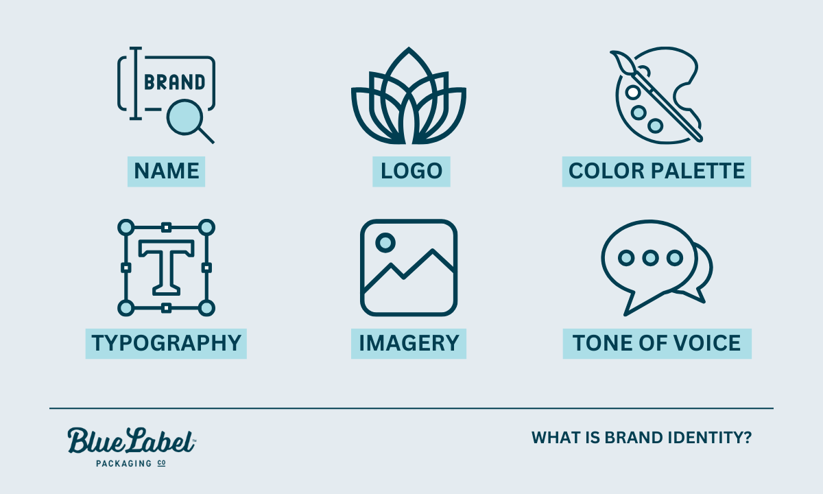
  • Your brand identity is your visual and verbal signature: name, logo, colors, typography, imagery, and voice. Packaging and labels are where customers meet it.
  • Branding, packaging, and labeling are related but distinct: branding is the identity, packaging is the physical container and its design, labeling is the applied label and its information.
  • Translate your identity by carrying your color palette, typography, logo, and voice consistently onto the label, guided by a brand guide.
  • The catch most brands miss: screen colors don’t print exactly, and material and finish change how your brand reads. Plan for the jump from digital to printed.
  • Consistency across your whole product line is what turns a nice label into brand recognition on a shelf.

Translating your brand identity into packaging means carrying the same colors, typography, logo, imagery, and voice that define your brand onto the physical product, so a shopper recognizes you at a glance. Your label is often the first and most frequent place a customer meets your brand, so it has to look and feel like the rest of your identity, not like a separate thing.

We help brands make that jump from a brand guide to a printed label every day, so we see where it goes smoothly and where it breaks down. Below, we walk through how the pieces fit together, how to translate your identity onto a label, and the print realities that catch brands off guard.

Branding, packaging, and labeling: what’s the difference?

These three terms get used together so often they blur, but they’re distinct pieces that work as a system. Understanding the difference makes every choice that follows easier.

Branding Packaging Labeling
What it is Your identity: name, logo, colors, voice The physical container and its design The label applied to the product and its info
Job Define who you are and how you feel Protect the product and present the brand Identify the product and carry required info
Example Logo, color palette, brand voice The bottle, can, box, or pouch The printed label with name, ingredients, barcode

What is brand identity? Infographic

What is branding?

Branding is your identity: the name, logo, colors, typography, imagery, and voice that make your product recognizably yours. It’s the feeling and promise a customer associates with you, expressed through a consistent look and voice.

What is packaging?

Packaging is the physical container and how it’s designed: the bottle, can, box, or pouch that holds and protects your product and presents it on a shelf. Packaging serves a functional job (protection) and a brand job (presentation) at the same time.

What is labeling?

Labeling is the label applied to the product and the information on it. That includes your brand design plus the required details: product name, ingredients, net contents, barcodes, and any regulatory information. The label is usually where your brand identity and the practical, legal requirements meet.

How they work together

Branding sets the identity, packaging gives it a physical form, and labeling carries both the brand and the required information to the customer. When all three align, a shopper sees a coherent product. When they don’t, the product feels off, even if each piece looks fine on its own.

What is brand identity, and why does packaging carry it?

Brand identity is the collection of visual and verbal elements that represent your brand and set it apart. On a shelf, your packaging is the version of that identity a customer actually touches.

The visual elements of brand identity

  • Logo: the primary mark customers recognize.
  • Color palette: the colors that trigger instant recognition.
  • Typography: the fonts that carry your personality.
  • Imagery and graphics: the photo, illustration, or pattern style you use.
  • Voice and tone: how your copy sounds, from playful to refined.

Why packaging is your most-seen brand asset

For a physical product, the package is often the first brand touchpoint and the one a customer sees most: on the shelf, in their cart, at home, in a photo they share. That makes it one of the best places to express your identity. A lot of purchase decisions happen fast and visually at the shelf, so a package that instantly reads as yours helps in the moment someone is choosing.

How packaging shapes what shoppers think

Design choices like color, shape, material, and typography shape how a shopper feels about your product before they read a word. Muted tones and uncoated paper read as natural or premium. Bright colors and glossy finishes read as fun and energetic. None of it is neutral, so every choice should map back to the brand you’re building.

Designing for your target customer

Design for the people you want to buy the product, not for your own taste. Research who they are and what catches their eye, then make choices that fit them. A supplement aimed at serious athletes and one aimed at wellness-focused parents call for very different looks, even in the same category. The clearer your customer, the easier every design decision gets.

How to translate your brand identity onto a label

Here’s how to move from brand identity to a finished label, step by step.

Start with your brand guide

A brand guide is the reference that keeps everything consistent: your logo files and usage rules, exact colors, fonts, imagery style, and voice. If you have one, it’s the source of truth for your label. If you don’t, building even a simple one before you design pays off immediately, and it’s the single most useful thing to hand a designer or printer.

Color

Color is the fastest way people recognize you. Carry your exact brand colors onto the label, and specify them precisely (more on why exact matters in the print section below). Color also carries meaning, so make sure your palette fits the feeling you want, whether that’s calm, bold, natural, or premium.

Typography

Use the fonts from your brand identity, and keep them legible at label size. Your type should feel like the same brand across your website, your ads, and your package. For more on making type work on a label specifically, see our typography tips for product labels.

Logo and imagery

Apply your logo consistently, at a size and clear space that keep it recognizable, and use the same imagery style (photography, illustration, pattern) you use elsewhere. Consistency here is what makes a lineup of products read as one family.

Materials and finish

The material and finish are part of your brand, not just a spec. Uncoated or kraft stock feels natural and honest. Soft-touch matte reads premium and modern. High gloss looks bright and fun, while foil or embossing says luxury. Choose the material that reinforces your identity, not just the cheapest option.

Voice and copy

The words on your label should sound like your brand too. A playful brand can be playful in its product description; a refined brand keeps its copy spare. Voice is easy to forget on a label, but it’s part of the identity you’re translating.


Ready to put your brand on a label?

Send us your brand guide and we’ll help translate it into a print-ready label, matching your colors, choosing the right material, and making sure it looks like you.
Request a Quote Get a Sample Pack


Where brand identity meets the printed label

This is the step brands underestimate, and it’s where we spend the most time with customers. Your brand assets were almost certainly built for a screen, and a label is a physical, printed object. A few things change in that jump, and planning for them keeps your brand looking like itself.

Screen colors vs. printed colors

Screens show color in RGB (light), while labels print in CMYK inks, often with specific Pantone (spot) colors for brand hues. The two don’t map perfectly, so a color that glows on your website can print duller or slightly shifted if it isn’t managed. The fix is to define your brand colors as Pantone or CMYK values, not just a screen hex code, and to check them on a printed proof. For the full picture, see our guide to RGB vs. CMYK color formats.

How material and finish change brand perception

The same design reads differently on different materials. A logo color looks richer on gloss than on uncoated kraft, which absorbs ink and mutes it. A matte finish softens everything; a metallic film adds shine your artwork didn’t have on screen. Because material affects both color and feel, it’s worth choosing it as part of the brand decision and seeing your design on that actual stock before you commit.

What to hand your printer

  • Your brand guide, including logo files and color specs.
  • Vector artwork with fonts converted to outlines (so your type prints exactly, even if the printer doesn’t have your font).
  • Pantone or CMYK values for your brand colors, not just hex codes.
  • Your material and finish preference, or a request for guidance on it.
  • The container details, so the label is sized and shaped correctly.

Hand a printer those, and the translation from brand identity to finished label goes smoothly. Leave them out, and you risk a label that doesn’t quite look like your brand.

Keeping your brand consistent across products

Consistency across your whole product line is what turns individual labels into brand recognition. Use your brand guide to keep the core identity steady across every SKU: logo placement, color system, and typography. Allow thoughtful variation, like a different accent color per flavor, as long as the lineup still reads as one family. When you expand into a new product or market, adapt carefully rather than reinventing, so customers still recognize you. Our post on 8 steps to great label design is a useful companion here.

Frequently asked questions

What is the difference between branding, packaging, and labeling?

Branding is your identity: the name, logo, colors, typography, and voice that make a product recognizably yours. Packaging is the physical container and its design, the bottle, can, box, or pouch that protects the product and presents the brand. Labeling is the label applied to the product and the information on it, including brand design plus required details like ingredients, net contents, and barcodes. Branding sets the identity, packaging gives it physical form, and labeling carries both to the customer.

What is brand identity in packaging?

Brand identity in packaging is how your visual and verbal signature shows up on the physical product: your logo, color palette, typography, imagery, and voice. Because packaging is often the first and most frequent place a customer meets your brand, it’s one of the best places to express your identity consistently.

How do you translate a brand into a label design?

Start from your brand guide, then carry your exact colors, typography, logo, imagery style, and voice onto the label, keeping everything legible at label size. Choose a material and finish that reinforce the brand’s feel. Then account for print realities: define colors in Pantone or CMYK (not just screen hex codes) and check them on a printed proof, since screen color doesn’t map perfectly to printed ink.

Why do my brand colors look different when printed?

Screens display color in RGB (light) while labels print in CMYK inks, often with Pantone spot colors for brand hues, and the two don’t map perfectly. A color that glows on screen can print duller or slightly shifted if it isn’t managed. Define your brand colors as Pantone or CMYK values and confirm them on a printed proof on your actual material.

Why does brand consistency across products matter?

Consistency is what turns individual labels into recognition. When logo placement, color system, and typography stay steady across every product, a lineup reads as one family and customers recognize you at a glance. Thoughtful variation (like a different accent color per flavor) is fine as long as the core identity stays consistent.

Ready to bring your brand to the shelf?

If you’re ready to turn your brand identity into a label that looks like you, we’re glad to help. Request a sample pack to see materials and finishes, or get in touch with your brand guide and we’ll help translate it into print.

More on designing a label that reflects your brand:
Designing Beer Labels: Sizing and Dimensions

⚞ The Highlights:

  • 12 oz can labels are typically around 3.625″–4″ tall by 7.5″–8″ wide. 16 oz can labels run around 5″ tall by 7.5″–8″ wide.
  • Standard 12 oz beer bottle labels are typically 3.5″ by 4″ for the front, with a back label between 2.5″ by 2.5″ and 3″ by 4″. 22 oz bombers use larger labels, often 4″ by 5″ or bigger.
  • Growler labels sit around 4″–5″ tall by 4″–6″ wide. Crowler labels typically run around 6″ by 9.5″.
  • Three formats for cans: pressure-sensitive labels, shrink sleeves (full 360° wrap), or direct-printed cans (no separate label at all).

A good beer label design needs the right canvas. Beer cans and bottles only give you a few square inches to work with, so getting the dimensions right before you start designing is the difference between a clean rollout and a redesign two days before press. Below is a complete sizing reference for the most common beer containers, plus practical guidance for partial wrap, full wrap, custom shapes, and printed cans.

(more…)

Choosing the Right Imagery for Your Product Labels: Tips for Effective Design

Apple visionary Steve Jobs once said, “Packaging can be theatre. It can create a story.” Imagery examples, such as minimal and bold like those on an Apple product, locally themed and intricate on a craft beer bottle label, or timeless and luxe like the embossed and foiled label on Godiva chocolates, serve as the lead narrator of your brand’s story.

How all-powerful is product label design? How can you level up your existing label with imagery and accents matching your mission and target customer? Let’s explore four key concepts for creating impactful brand imagery.

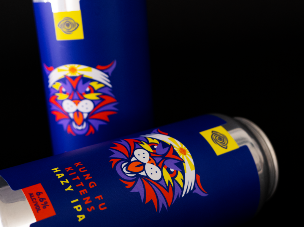
Beer Cans with Labels

1. The Value of Design and Imagery in Product Labels and Packaging

First Impressions Are Crucial

A product that is new to your customer will only get one shot at grabbing their attention. When your product sits on a physical shelf, the imagery on your label is your brand’s last expression and our customer’s first impression. Studies estimate that 60% of consumers decide in the first 30 seconds! How does imagery help your consumer decide?

Evoke Emotions

Imagery evokes emotions — one of the key catalysts for buying behavior. They influence our buying decisions, preferences, and attitudes toward your brand. According to the Harvard Business Review, “emotional motivators” give a better insight into a customer’s future value than any other metric (including brand awareness and customer satisfaction), making them a key driver of growth and profitability.

For example, Nike’s imagery of athletes pushing the limit can spark inspiration and motivation, while depictions of happy people can lend themselves to joy and nostalgia.

Your Label as Brand Narrator

Labels and the imagery you choose to create a visual narrative about your company will shape how your business is perceived. It is your brand’s story and intention in a nutshell, and it should align with your brand identity by bringing photography, illustration, or both together.

You Get One Shot — or 313 Milliseconds — at a First Impression

Your label should provide clarity and relevance. It should act as a key building block to trust building. A visually striking package can capture attention quickly, making it more likely that people will pick up your product out of curiosity and interest. That initial spark of attraction — which one study says can happen in as little as 313 milliseconds — is often the first step toward a purchase decision.

Catch the Attention of New Adaptors

Strong imagery allows your label to attract new customers unfamiliar with your brand. Impactful visuals allow your product to project itself on a shelf amongst a sea of competing items. This gets the attention of new adaptors, who will then go on to evaluate whether this product solves a problem or fulfills a want or need.

2. Eye-Catching Appeal: How to Use Imagery in Label and Packaging Design

Beer can with photography

Photography vs. Illustration

When should you use photography over illustration? Can you use both in a label design for your product? Real product photography works best for food, beverage, and beauty products where trust and authenticity are important. Illustrations are ideal for abstract or complex concepts — the kind of label where the consumer could look several times and still see different details. Adding illustrations to photography can help fill the gaps for any information the photo doesn’t project.

Beer can with typography

Typography as Imagery

Fonts and text placement are the unsung heroes of label design. Bold, creative fonts can become as much a part of the main visual as photography and illustration. Delicate fonts can message sophistication and elegance or become a decorative element. Fonts are also functional, guiding the customer’s eye to important information.

Visual Hierarchy

As we mentioned above, you may have less than a second to talk to a prospective customer. Organizing the label so that imagery, text, and key product information like features and benefits are easily scannable is key to getting your message across quickly and concisely.

beer cans with pattern on label

Textures and Patterns

Your label may be one-dimensional, but your design doesn’t have to be. Textures can convey a message with just as much impact as imagery. Adding a tactile touch through raised UV coating used in screen printing or embossing can give a luxurious feel.

Visual patterns in your design through debossing or foiling can complement imagery, enhance appeal, and create a sensory connection.

Complimentary colors on labels

Complementary Use of Color

Colors have a psychological impact on our buying. This feeling can trigger the emotions we touched on above. Color experts recommend these colors to enhance the impact of your imagery.

  • Green is associated with joy, tranquility, and nature.
  • White is calming and conveys a sense of cleanliness. It tends to make individuals feel safe.
  • Black is linked to stability and intelligence, sophistication and elegance.
  • Blue inspires creativity and joy; different shades encourage trust and dependability.
  • Orange signifies energy, appetite, and a sense of adventure.

3. Building Trust & Authenticity

Real Product Photography

The first step in gaining consumer trust? Using real product photography, especially in industries like food and beauty, where authenticity is critical. Customers are more consumer savvy than ever and can spot shortcuts, which can build distrust.

Authentic Representation

Building on using real product photos, you can ensure authentic representation by using photographic or illustrated imagery that realistically reflects what’s inside the package. Fool them once, and well — there might not be another time.

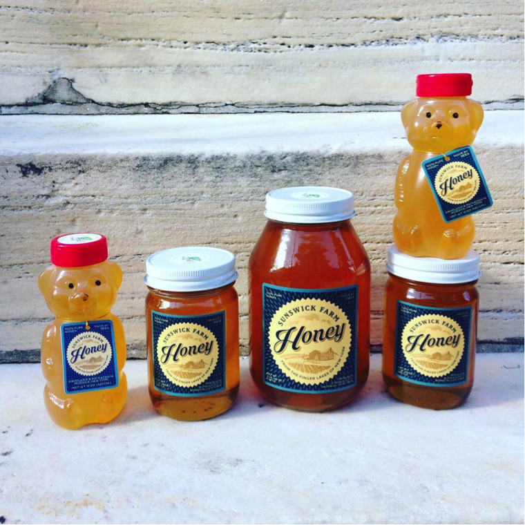
Honey storage container with custom lables

Transparency in Packaging

Discerning customers want to know where their money is going, and a window directly into the product can help! Consider transparent or partially clear packaging to show the actual product and establish trust through honest representation.

4. How Material Choices and Embellishments Can Make Imagery Stand Out

Give your customers a full sensory experience. Materials like the wide range offered by Blue Label Packaging are as important as the images on them. Glossy, matte, or textured labels give different qualities to the appearance of imagery, user experience, and overall impact.

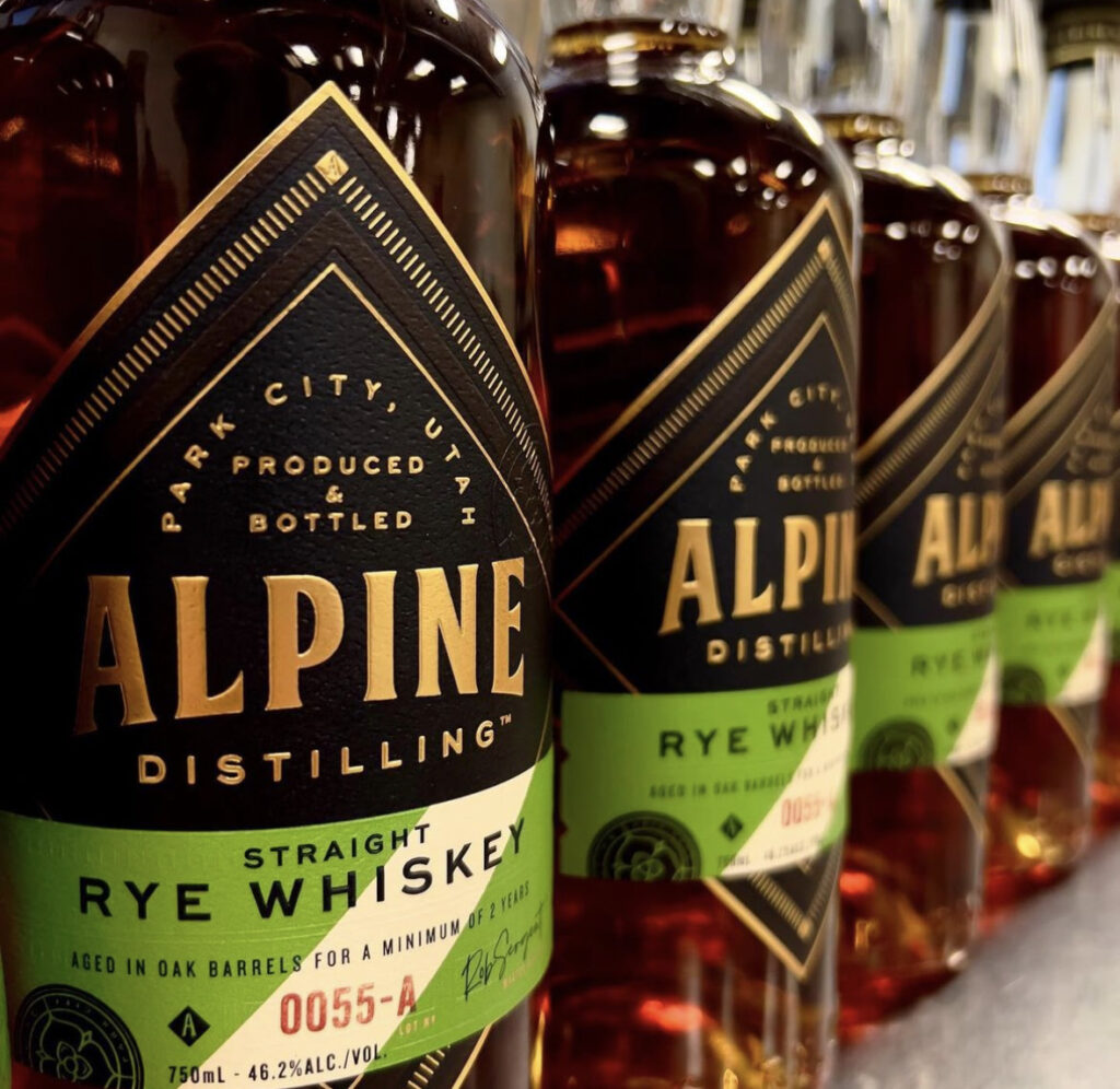
Rye Whiskey bottle with custom label

Embossing, Debossing, and Foil Stamping

These are all excellent accent techniques to add to any product packaging design. They help draw attention to certain priority areas of a label, like the brand name and logo. Features like embossing and debossing can also add depth to the design. Shiny and reflective foil stamping enhances visual appeal by highlighting specific features, such as logos, text, images, and borders.

Let Blue Label Packaging Bring Your Imagery to Life

Well-thought imagery plays a big role in attracting new customers and significantly impacting profitability. What is the key to selecting the right imagery? It truly lies in understanding both your product and the style that aligns with your brand’s identity and also resonates with your target audience.

Remember — it’s not just about aesthetics and what’s trendy. Quite the opposite, it’s about standing apart from the rest and crafting a memorable visual narrative that resonates with your audience.

Blue Label Packaging can help you curate the perfect custom label that will best suit your imagery and user experience. Check out our designer directory, get a sample pack, or request a quote today!

Where Can I Find a Beer Label Designer?

Even a tasty beer can fail if nobody buys it. The craft beer market is growing rapidly, with global data company Nielsen citing that craft sales are up more than 65 percent in the past five years. If you want a nice slice of that multi-billion-dollar pie, you need to make sure your product stands out in a very competitive crowd.

Your beer label is going to be the first thing shoppers will see, so you need to attract their eyes before you can convince their taste buds to go on a second date. A professional beer label designer can create a label that not only sticks out on shelves, but also allows you to tell a story about the beer that you’ve carefully crafted.

Beer can with shrink sleeve

Do You Really Need a Professional Label Designer?

Even if you’re tempted to handle design in-house or try a DIY approach, working with a pro can really take your label to the next level. Professional label designers bring specialized expertise and a proven track record that often translates into higher quality and more effective packaging.

If you don’t believe us, consider these findings from Nielsen’s craft beer design audit:

  • 70 percent of craft beer buyers decide which beer to buy right at the shelf
  • 66 percent of American craft beer buyers say that a beer’s label and packaging are “very” or “extremely” important for getting noticed
  • 60 percent say that a beer’s label and packaging are “very” or “extremely” important in convincing them to give it a try
  • 71 percent of craft beer buyers say they like to try brands with bold and interesting packaging

That’s a lot of people judging a beer by its looks, which is why finding a designer who truly understands your product can be a game changer.

Image of a custom label from a beer label designer.

Getting It Right: Technical and Production Tips

Great design is important—but it’s equally important that your concept translates into the final product. Here’s what you need to know about the technical side:

  • Print Resolution & Color Models: Make sure your artwork is high resolution (at least 300 DPI, meaning it’s sharp enough for printing) and designed in the appropriate color mode—CMYK. This standard printing color model ensures that what you see on your screen matches what comes off the press.
  • Material & Finishing Options: Think about which paper or packaging material complements your design best. Options like matte, gloss, or textured finishes can really change the overall look and feel. Other options like foil stamping, embossing and debossing, and lamination can make parts of the label stand out.

Regulatory & Compliance Factors: Remember, your design needs to follow certain rules—like those in the Alcoholic Beverage Label Act, which spells out what info must appear on your label (health warnings, ingredient lists, alcohol content, etc.). Make sure your designer is aware so you don’t hit any snags during production.

Cans vs. Bottles: Label Design Considerations

When evaluating designers, keep in mind that cans and bottles each have unique design considerations:

  • Label Size and Shape: Bottles often require multiple labels, including front labels, back labels, and neck labels. Each label needs to communicate effectively on its own, but also fit together cohesively. Cans, on the other hand, typically use a single wrap-around label or shrink sleeve, meaning your design needs to work seamlessly from all angles.
  • Visibility and Shelf Presence: Cans offer a continuous canvas that can make bold, graphic-driven designs particularly effective. Bottle labels usually require a more segmented approach, balancing individual elements like logos, text, and mandatory information across multiple labels.
  • Neck Labels and Specialty Areas: Bottles frequently include neck labels, which can enhance brand recognition and premium feel. Ask your designer if they have experience leveraging these smaller labels to make your beer stand out.
  • Material and Finish Differences: Some label finishes and embellishments (such as embossing, foil stamping, or textured papers) might suit bottles better due to their shape and handling. Cans benefit from durable, moisture-resistant label materials and vibrant printing, as condensation and handling can affect how the design holds up over time.

Be sure to discuss your packaging format with your designer early, so your design can maximize its impact, no matter which route you choose.

Beer bottles

Your Pre-Production Checklist

Here’s a quick checklist to make sure everything’s in order before you print.

  • Artwork Quality: Ensure your artwork is at least 300 DPI (for clear, sharp images) and in CMYK (to guarantee accurate print colors).
  • Material Selection: Review material samples—whether it’s matte, gloss, or textured finishes—to decide which look best enhances your design.
  • Compliance Check: Double-check that your design follows the Alcoholic Beverage Label Act and that all mandatory info is included.
  • Printer Consultation: Meet with your printer to confirm that your design files and chosen materials will work during production.

How to Choose the Right Beer Label Designer

Before you hire a designer, it’s important to do your homework to find someone who’s the right fit for your brewery. Your beer is unique, and the market is more crowded than ever. Here’s how you can make the best choice:

  • Evaluate Their Portfolio: Look for designers with specific experience in the beer or beverage industry. Their portfolio should show creativity and a solid understanding of how designs work in the real world.
  • Ask the Right Questions: In your initial conversations, ask about their experience with print production, regulatory compliance, and how they capture your brand’s story.
  • Questions to Consider:
    • What experience do you have with beverage labels?
    • How do you ensure your designs meet regulatory standards?
    • Can you share a case study where your design improved a brand’s sales?
  • Set Clear Expectations: Prepare a detailed brief that outlines your technical needs and creative vision. This minimizes misunderstandings and ensures the final product is exactly what you need.

Beer cans with labels

Consider Artwork Styles That Fit Your Brand

When reviewing a designer’s portfolio, pay close attention to their artwork style to ensure it aligns with your brand personality and your target audience. Consider the following elements:

  • Illustration vs. Photography: Does your beer brand lean toward playful and illustrated graphics or more refined photographic imagery? Choose a designer whose illustrative style consistently matches your intended vibe.
  • Typography Choices: Type plays a huge role in readability and personality. Look at whether the designer’s typographic choices—from bold, eye-catching fonts to subtle, minimalist lettering—match your brand’s tone and the impression you want to make.
  • Color Usage: Evaluate if the designer’s use of color resonates with your brewery’s identity. Bold, vibrant colors attract attention but may not align with every brand story, whereas muted or vintage palettes can convey tradition or craftsmanship.
  • Consistency and Flexibility: Consider whether their style can consistently carry through various product lines or seasonal beers while still offering enough flexibility to differentiate each brew.

Ready to Elevate Your Beer Label Design?

If you need a talented designer who can make your labels stand out while ensuring technical excellence and strategic impact, we’re here to help.

Over the years, we’ve worked with plenty of designers who excel at creating incredible designs and understanding the digital printing process inside and out. You can trust our national network of design experts to help your beer win hearts and shelves alike.

Check out our directory of approved beer label designers today. When your design is all set, drop us a line, and we’ll be happy to talk about digital printing options for your bottles or cans.

From Screen to Product Packaging: How to Make Sure a Label Design will Work in Print

A great label design may look great on a screen, but it won’t mean much if it doesn’t look good in print. Fortunately, there are some steps that you can take to make sure that your design translates to print. Here are some important product packaging design considerations to keep in mind when creating a design for a product label.
(more…)

Designing Beer Labels: Other Design Considerations

Sizing and color selection are two critical parts of label design, but there are several other factors that can impact how you design beer bottle labels and beer can labels. Elements such as custom shapes, mandatory information, and label adhesives are all important to the success of a label. Here’s what you should consider about these features when you design your beer labels.
(more…)

Designing Beer Labels: Colors and Special Printing Capabilities

The right splash of color or an eye-catching feature can be the key to a successful beer label. Of course, the challenge for a designer is to try and figure out which colors or features make the most sense for the product. Whether you’re trying to decide on the right colors or a special printing capability, here’s what you need to consider.
(more…)