Typography Tips: Text and Font Considerations for Product Label Designs

How important is the text on product labels? In a word, very.

The typography used on a label does more than just provide information – it adds a whole new way to express a style or mood for a product. Of course, the design needs to ensure that text can still provide a clear message as well. Here are some tips to help you nail the typography on your product labels.

Invite the Right Guests to Your Font Family

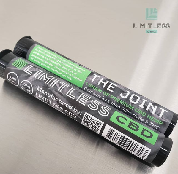
The fonts you choose play a huge role in conveying a brand’s personality. An elegant serif font is a go-to option for a classy wine label, while a more modern sans serif font is a match for trendy kombucha labels. The choice of which fonts depends on what type of message you want to convey – just be careful not to try to take on too many different personalities.

When it comes to different fonts, there can definitely be too much of a good thing. Too many font styles can lead to a busy message.One way to avoid this is to try and stick with a few fonts from the same font family. This practice will help you create a more cohesive look without the threat of distracting contrasts.

Another method involves pairing simpler, less obtrusive fonts with more stylish ones. A flashy display font is great for product names or other headings, while a sans serif font cleanly presents other important information. Play around with what works and what doesn’t to find a combination that’s perfect for your product without muddling your message.

A coffee label design made with carefully selected typography.

Create a Visual Hierarchy

Let’s face it – people don’t always like to read. That’s an issue when you need your label to tell a story about a product. Fortunately, a good visual text hierarchy will help you establish the right viewing pattern and communicate your story in style.

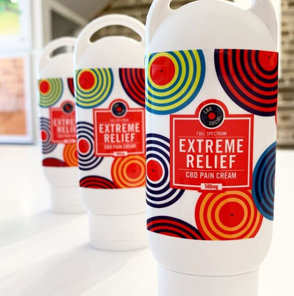
As with any story, your label will need a beginning, middle, and end. Some words are more important than others, which is why you can vary the weight and placement of certain text to call out information in a specific order. Using the same sizes and fonts for everything will make your customers work to determine what’s important. In a business where you have only seconds to make an impression, nobody has time for that.

Instead, plan out what information deserves a heading, a sub-heading, or regular body copy. Big, bold fonts establish a visual hierarchy of what’s first for your audience. From there, you can vary the design of each line to draw shoppers eyes in a specific order. This process helps you highlight the basics of your product – your brand name and what the product is – for people who like to skim.

Make Sure The Text on Your Label is Legible and Readable

If people can’t read your text, something went wrong in the design process. An illegible design makes it difficult for users to distinguish individual characters, while an unreadable design, well, can’t be easily read. Either issue can be caused by a few different factors.

Size

Finding the right text size is a delicate balancing act. If you go too small, your words may be too tiny for the average consumer. If text is too big, it can overwhelm your design. In general, anything smaller than 5 pt. font is fairly difficult to read. It also doesn’t help that text can be more legible on a computer screen than on a physical print. To find the right balance, try printing out a proof of your design at full size. This will allow you to judge the legibility of your design at various distances and adjust the text size as necessary.

There are also occasions where the font size is partially dictated for you. Required elements like ingredients lists and government warnings for beer labels or other federally regulated products have minimum size requirements to ensure that they’re legible for the general populace. As such, you’ll need to make sure your label abides by these rules to avoid any potential consequences.

Spacing

Like text size, the spacing between your words is a Goldilocks situation. The words shouldn’t be too close or too far from each other, and somewhere in between is just right. As with size, what you see on screen can be misleading.

What may seem fine in a design file may not have enough spacing between characters or leading between lines of text. On the flipside, too much space makes it harder for users to quickly process what’s on your label. In general, looser leading is a good way to improve body copy, but you’ll want to check out a test print to verify how it looks for the average passerby.
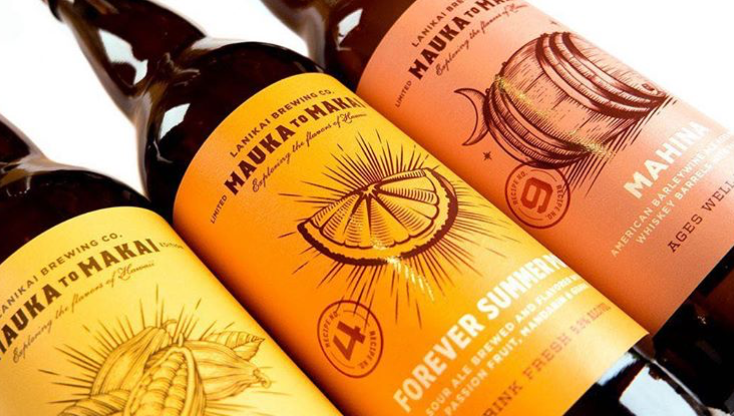
Color Contrasts

It’s no surprise that color selection plays a massive role in label design, but it also has a big impact on text legibility. Certain color combinations may look good together, but can create issues for consumers trying to read your text. Dark-on-dark or light-on-light combinations are particularly tricky for just about any text – for fine print, it’s a recipe for disaster.

The solution? Aim to use contrast colors for text and background. Not only will the combination make it easier to read the words, the disparity between the two colors will help make your messages pop for passing consumers.

Three sour ale bottle labels with clean typography.

Make Your Label Designs Shine with the Right Label Printing Company

Once you’ve spent plenty of time designing your product label – or having someone else do this for you – you still need a label printing company that will help you get the most out of your design.

At Blue Label, we guide you through the printing process to help you invest in the right materials and printing capabilities for your design and performance needs. We’ll also work with you to make sure that your design is ready, which includes checking that your types and fonts are converted to outlines for a successful print.

Ready to work with a label printing company with unmatched quality and service? Contact us today about your next label project.

4 Common Mistakes for CBD Labels

According to Forbes, the CBD market could reach $20 billion by 2024, which is great news for people in the cannabis market. However, that rise also invites more competition.

As the CBD market grows, more products will flood the market. This growth means that your CBD your products need to stand out from the rest of your competitors. That’s where a good CBD label can help. Proper packaging can be the difference from your product being just another item on the shelf or a big success. However, it’s easy to make a few notable label mistakes during the process. Here are four issues you should avoid for your CBD labels.

Some CBD Labels Don’t Include Legally Required Information

What’s tricky for CBD labels is that the federal government isn’t quite clear about the exact guidelines for these types of products. However, it’s a good idea to list out the following details to provide your audience with the right information.

  • The amount of active CBD per serving
  • A supplement fact panel that includes all ingredients
  • Net weight
  • The manufacturer or distributor name
  • Whether the CBD used is full spectrum, broad spectrum, or an isolate
  • A batch or date code
  • The suggested product use

Of course, there may be more to your labeling requirements than just that. CBD products may require some other information depending on how you classify the product. For example, a food product needs to follow the the regulations found in the FDA Food Labeling Guide. However, a healthy and beauty product needs to adhere to the FDA’s rules on cosmetic labeling. Once you take note of how your product is classified, you can then apply those labeling guidelines to your product in addition to including general compliance information for CBD.

Certain CBD Labels Deal with Font Issues

It’s hard to get your product’s message across when there’s something wrong with the type on your CBD labels. Text and font issues can prove problematic for any product. For CBD labels, a wrong font can not only muddle the look of your label, it can also land you into some compliance trouble.

When you deal with labeling requirements set by the FDA or some other administration, there are occasions where you need to use a certain font size or style. These rules are in place to ensure that certain details are easily read, so it’s best to abide by them. However, they may not be as simple as following a set font size.

For example, the FDA requires labels to use “a print or type size that is prominent, conspicuous and easy to read” for information panels. Seems simple right? Just wait, there’s more! The labeling guide also states that labels should “use letters that are at least one sixteenth (1/16) inch in height based on the lower case letter ‘o,’” except in the case of “very small food packages as discussed in 21 CFR 101.2(c) & (f).” Finding the exact type rules for your exact product may require some digging, but it’s still preferable to having a federal organization confiscate your products and fine you for improper labeling.

There are also occasions when the type used isn’t necessarily a legal issue, but does pose some design issues. This problem is especially true for CBD products sold in small containers that only provide a few inches of labeling space. At this point, you’ll need to balance both compliance and design to find a typography compromise [link to new typography tips post when it’s live] that showcases your brand without coming off as busy or boring. Take the label from Limitless CBD pictured below as an example. Despite not having much space to work with, Limitless’ design establishes a clear identity with legible text, all while meeting regulations.

Two Limitless CBD labels for premium CBD hemp packaging.

Other CBD Labels Get Caught Making Health Claims

There may be a lot of studies that suggest that CBD has significant health benefits, but there isn’t enough existing information to convince the FDA of them. The amount of documented information required makes it tricky to legally make a health claim on a label for any product. For CBD products, it’s nearly impossible.

As of now, the FDA’s stance is that “there are many unanswered questions about the science, safety, and quality of products containing CBD.” This position means that federal law does not recognize CBD as a dietary supplement or as a substance that can help prevent, diagnose, treat, or cure serious diseases. The only exception to this is a single prescription CBD product that has been approved to treat rare forms of epilepsy.

Aside from that very specific breakthrough, the FDA will crack down on CBD labels that make health claims about cancer, diabetes, Alzheimer’s, or any other conditions. As such, it’s best to avoid these claims altogether on your packaging if you want to avoid potential legal intervention.

However, the potential dangers of health claims doesn’t mean that you can’t highlight other beneficial features. For example, it’s completely fine to state that your product is organic, GMO free, or something similar as long as your product meets the legal guidelines for such terms, such as the label for Ritual’s Nighttime Tincture pictured below.

Ritual CBD tincture featuring a label with an organic claim.

They Showcase CBD Too Much

As we mentioned eariler, the CBD market is booming at the moment. This has led to scores of new consumers trying to find the appropriate CBD product for them. That increase in potential customers is great if your product meets their needs. However, you have to be careful that your consumers see you as more than just another CBD product.

While a big ol’ “CBD” on the front of your product may attract the random customer, there’s something to be said for subtlety. If a consumer only knows you as “that CBD product I use,” what’s to prevent them from seeing you as interchangeable if a bigger, shinier CBD product emerges? Instead, it’s important to focus on designing your CBD label to focus on your brand and developing a relationship with your intended audience. This way you become a name to them, and it’s easier to create brand loyalty if they remember you as “ABC CBD” than “that green bottle that says CBD on it.”

CBD Social is a great example of establishing an identity that goes beyond the use of CBD. The label pictured below places the emphasis on why the product matter to consumers – extreme relief is awful enticing for someone dealing with pain – and uses CBD to supplement that message in an eye-catching design.

A trio of eye-catching CBD labels made for CBD Social products.

Invest in Professional CBD Labels for Your Products

In a fight for CBD supremacy, the products with the best labels have a massive edge. This is why investing in professionally made, custom product labels can help give your product the boost it needs to tell your story and build a loyal customer base.

At Blue Label, we have the digital printing technology and expertise necessary to create stunning CBD labels for your products. We work with you to determine the best materials and printing capabilities required to meet your performance and budgetary needs without sacrificing on style. If you need one, we can even refer you to our designer directory to find a professional who can balance the creative and legal aspects of your label design.

In a booming market, your CBD products deserve to look as good as they possibly can. Contact us today to talk to us about printing custom CBD labels for your products.