The Difference Between Glossy, Satin, and Matte Labels
⚞ The Highlights:
- Glossy labels reflect light, produce vivid color, and look bright on shelf. They show fingerprints and reflections in strong lighting.
- Satin labels sit between gloss and matte. Soft shine, balanced color, sophisticated feel. The middle ground that fits a lot of brands.
- Matte labels are non-reflective, with a softer, more premium look. Best for understated brands and contexts where glare is a problem.
- The right finish depends on the brand voice (modern bold vs. quiet premium), the product environment (cooler vs. shelf vs. dashboard), and the photography (matte hides reflections better in product shots)
There are plenty of finish options for product labels, but each one creates a different look and feel. Glossy, satin, and matte are the three you’ll see most often. Below is how they differ, where each one fits, and how to decide between them.
Glossy vs. satin vs. matte: side by side
| Finish | Look | Feel | Best for | Cost |
|---|---|---|---|---|
| Glossy | High shine; reflects light; vivid, saturated color | Smooth, slick | Beverages, frozen items, vivid color designs, hair care, products that face moisture | Slightly higher (especially with gloss laminate) |
| Satin | Soft shine; muted reflection; balanced color | Slightly smooth, refined | Candles, beauty products, wine, brands wanting sophistication without high gloss | Mid |
| Matte | No shine; non-reflective; soft, muted color | Velvety, tactile, premium | Luxury goods, organic and eco-positioned brands, vintage and artisanal designs | Generally lower; soft-touch matte slightly higher |
What is a glossy label finish?
A glossy finish is a high-shine effect created by laminate or varnish applied over the printed label. The shine comes from the way light reflects off the smooth coated surface. Sharper color, deeper contrast, more visual impact at a glance.
Two common ways to create gloss:
- Gloss laminate: a thin protective film bonded to the top of the label. Adds durability along with shine.
- Gloss varnish: a liquid coating that cures to form a hard, glossy layer. Slightly thinner than laminate but still protective.
Where glossy labels fit best
Glossy is the right pick for products where vivid color and visual punch are the priority:
- Beverages and frozen items. Gloss handles moisture and condensation well, so the label looks the same coming out of a cooler as it did going in.
- Luxury and premium products. Gloss reads bright and high-impact, especially when paired with metallic foils or vivid color.
- Detailed or colorful designs. Gloss adds depth and contrast, which makes intricate artwork land harder.
- Hair care and bath products. Gloss laminate’s moisture resistance fits the wet environment these products live in.

What are satin and matte label finishes?
Where glossy reflects light, matte and satin do the opposite. They’re both non-reflective or low-reflective finishes that create a softer, more muted look.
The technical distinction: matte typically refers to a laminate (a thin film bonded to the top of the label), while satin typically refers to a UV varnish (a liquid coating that cures to a soft sheen). Both reduce shine and glare, but satin keeps a slight luster while matte goes fully flat.
The “flat” or “soft” effect doesn’t mean boring. It lets other design elements (typography, foil accents, embossing) carry more of the visual weight, which is why matte and satin are common in premium and craft brand contexts.
Where satin labels fit best
Satin is the middle ground between glossy and matte. A soft sheen that catches a little light without overwhelming the design. Common applications:
- Custom candle labels. The muted luster of satin pairs well with the soft glow of candles, and the finish reads premium without competing with the product.
- Beauty products. Lotions, serums, and skincare benefit from the sophisticated touch satin gives the package.
- Wine bottles. Wineries often choose satin for the refined feel that suits dining tables and gifting occasions.
Where matte labels fit best
Matte goes fully non-reflective, which lets the design and typography carry the visual weight. Common applications:
- Luxury goods. High-end brands often lean matte for the understated, “we don’t need to shout” feel.
- Organic and eco-positioned products. The natural-looking, non-glossy surface aligns with simplicity, purity, and sustainability messaging.
- Vintage-style designs. Brands going for nostalgia or artisanal craftsmanship find matte’s textured-feeling background a natural fit.
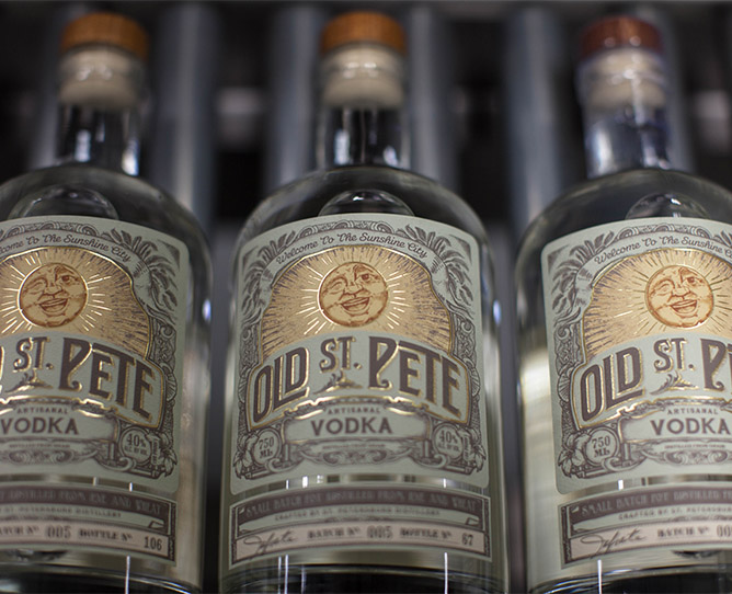
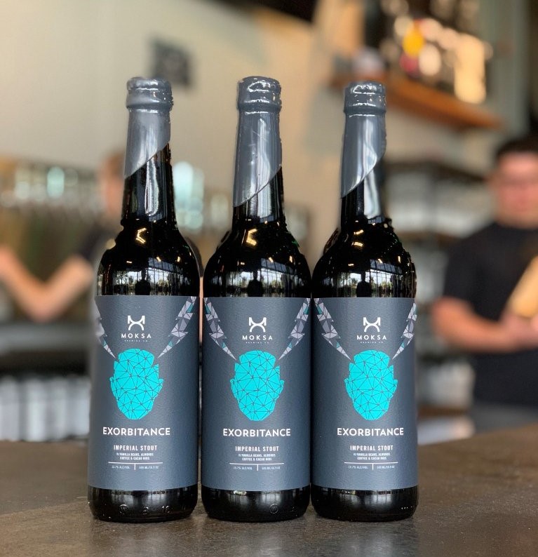
- Spirits and dark-label designs. Matte black labels with foil accents are a signature look in premium spirits.
Practical advantage: writing on matte and satin
Easier to write on. Matte and satin both accept pen ink (Sharpie, paint pen, ballpoint) much better than gloss. If you handwrite batch numbers, expiration dates, or other details on labels after application, matte or satin are usually the practical choice.
Soft-touch matte: a step beyond standard matte
One finish worth calling out separately: soft-touch matte. It’s a specialty matte laminate engineered for a velvety, almost suede-like hand-feel. Soft-touch is the most-requested finish in luxury beauty, premium spirits, and high-end packaging where the consumer’s first interaction with the brand is picking up the bottle.
Soft-touch costs more than standard matte but delivers a tactile cue of quality that flat materials can’t match.

How to choose between glossy, satin, and matte
Most brands settle on a finish by working through three questions:
- What’s the brand voice? Bright, modern, high-energy brands lean glossy. Quiet, sophisticated, premium brands lean matte. Brands in the middle lean satin.
- What’s the product environment? Beverages and bath products see a lot of moisture. Gloss laminate or BOPP-paired satin/matte holds up best. Indoor products without moisture exposure can use any finish.
- How does the product photograph? Matte hides reflections better in product photography. If the product is heavily marketed through photography (Instagram, retail listings, ad creative), matte avoids glare in the shot.
If you’re between two finishes, the sample pack is the easiest way to decide. Hold the labels in your hand, look at them under store lighting, and the right one usually becomes obvious.
Frequently asked questions
What’s the difference between glossy, satin, and matte labels?
Glossy labels reflect light and produce vivid, saturated color with a smooth shine. Satin labels have a soft sheen. Less reflective than gloss, more luminous than matte. Matte labels are non-reflective with a softer, more muted look. The choice depends on brand voice, product environment, and how the product photographs.
Are matte labels more premium than glossy?
Not categorically. Both can read premium depending on the design. Matte tends to feel quietly sophisticated and is common in luxury and eco-positioned brands. Glossy can also feel premium when it’s used deliberately, especially with metallic foils or vivid color. The category and brand voice usually drive the call more than the finish itself.
What’s the difference between satin and matte?
The technical distinction: matte typically refers to a laminate (a thin film bonded to the top of the label), while satin typically refers to a UV varnish (a liquid coating that cures to a soft sheen). Visually, satin keeps a slight luster while matte goes fully flat. In practice, both create a non-glossy, premium-leaning look. Satin just catches a bit of light.
Can you write on glossy labels?
Not easily. Pen ink (Sharpie, paint pen, ballpoint) tends to bead up or smudge on a glossy laminated surface. If you handwrite batch numbers, expiration dates, or other details on the label after application, matte or satin are the practical choice. They accept ink much more reliably.
What is soft-touch matte?
Soft-touch matte is a specialty matte laminate engineered for a velvety, almost suede-like hand-feel. It’s the most-requested finish in luxury beauty, premium spirits, and high-end packaging where the consumer’s first interaction with the brand is picking up the bottle. Soft-touch costs more than standard matte but delivers a tactile cue of quality that flat materials can’t match.
Which finish is best for product photography?
Matte typically photographs better than glossy because it doesn’t create reflections or hot spots under studio or natural light. If your product is heavily marketed through photography (Instagram, retail listings, ad creative), matte avoids the glare problem that glossy labels often create. Satin is a middle-ground option that catches a little less light than gloss without going fully flat.
Which finish lasts longest?
Durability depends more on the underlying material and adhesive than on the finish itself. With proper laminate or varnish, all three finishes can hold up well to handling, moisture, and shelf wear. Gloss laminate offers slightly better moisture and abrasion resistance than satin or matte varnish, which is why beverages and bath products often use gloss. For most retail products, the practical durability is similar across finishes.
Pick the right finish for your products
Whichever finish fits your brand, use a material, adhesive, and finish combination matched to your product’s environment. We’ll help you sort through the options.
The fastest way to compare glossy, satin, and matte is to feel them side by side. Request a free sample pack to see how each finish reads on real label stock under real lighting. Get in touch when you’re ready to talk through a project. No minimums, fast turnaround, expert review on every project before anything goes to press.